Karamello Typeface by SAMPLE
The Karamello Typeface Is a Font That Brings Classic Diploma-Era Elegance Back to Modern Design
Script typefaces have a credibility problem. Too many of them lean saccharine—soft, overly casual, built for cupcake logos, and wellness brands. Karamello, designed and published by SAMPLE, is none of that. It arrives with the quiet authority of a hand-signed certificate from a century ago, carrying institutional weight without feeling stiff or unapproachable. This is a typeface with something to say.
The typeface is available on:
Creative Market YouWorkForThemRight now, designers are genuinely hungry for script fonts that feel earned. The current wave of maximalist editorial design, luxury branding revivals, and heritage aesthetics has created real demand for letterforms that communicate prestige without irony. Karamello lands exactly at that intersection.
Karamello typeface by SAMPLEThe typeface is available on:
Creative Market YouWorkForThemSo what makes it different? And why does it deserve a place in your type library?
What Is the Karamello Script Typeface and Where Does It Come From?
Karamello is an elegant script typeface with a refined, hand-drawn character. SAMPLE drew direct inspiration from vintage certificates and academic diplomas—those meticulously composed documents that used calligraphic letterforms to signal legitimacy, achievement, and permanence.
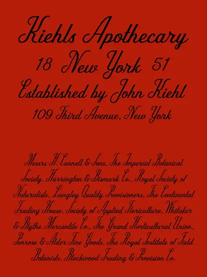
That lineage matters. Diploma scripts carry a specific visual grammar: consistent stroke rhythm, controlled flourish, and a formal axis that signals credibility. Karamello inherits all of that. But it also moves beyond mere revival. The alternate capitals introduce high-contrast moments and decorative flourishes that give the typeface a distinctive rhythm—something you don’t find in straight historical reconstructions.
Think of it this way: most script revivals feel like museum pieces. Karamello feels like something a contemporary art director would actually reach for.
The Prestige Script Framework: How Karamello Earns Its Authority
I want to introduce a concept here that helps articulate what separates Karamello from the crowded script market: the Prestige Script Framework. This framework describes typefaces that successfully balance three qualities simultaneously—calligraphic authenticity, decorative vitality, and typographic restraint.
Most script typefaces nail one of those three. Karamello hits all of them.
Calligraphic Authenticity
The letterforms read as genuinely hand-drawn. The stroke modulation—the transition between thick and thin—follows the logic of a real broad-nib pen. Nothing feels mechanically constructed or digitally over-smoothed. That authenticity is what makes Karamello feel trustworthy at a glance.
Decorative Vitality
The alternate capitals are where the typeface earns its character. These are not simple swash variations. They introduce moments of high contrast and pronounced flourish that create visual rhythm across a line of text. Set a headline using Karamello’s alternates, and the capitals pulse with personality—each one slightly theatrical but never chaotic.
Typographic Restraint
Here is where many decorative scripts fall apart: they overcommit. Every glyph becomes a performance. Karamello avoids that trap. The lowercase letterforms are elegant but measured. The overall texture of set text stays readable. You can use this typeface at large display sizes or—carefully—at smaller scales without it collapsing into visual noise.
Diploma Prestige Aesthetics: The Cultural Context Behind Karamello
Why does the diploma script aesthetic resonate so strongly right now? The answer connects to broader cultural shifts in how brands and designers signal value.
We’re living through a sustained backlash against sterile corporate minimalism. The clean, sans-serif uniformity that dominated brand design for the past decade now reads—fairly or not—as cold, interchangeable, and low-effort. Audiences increasingly respond to visual signals of craft, history, and intentionality.
Academic diploma scripts carry exactly those associations. Historically, diplomas used the best available calligraphers and the most expensive printing techniques. The letterforms communicated that something important had happened—something worth marking carefully. Karamello activates that entire cultural memory.
That makes it a genuinely strategic choice for brands in the luxury, heritage, artisan, hospitality, and education sectors. It also makes it compelling for editorial design, packaging, wedding stationery, and any context where the designer wants to telegraph quality without spelling it out.
How Does Karamello Perform Across Real Design Applications?
Let’s be specific. Where does this typeface actually work—and where does it struggle?
Packaging and Product Branding
Karamello excels here. Set against clean backgrounds or textured stock, the alternate capitals create a visual anchor that pulls the eye immediately. Think premium food and beverage packaging—chocolates, spirits, and confectionery—where the name of the product needs to feel handcrafted but also authoritative. The typeface carries that dual register without strain.
Wedding and Luxury Event Stationery
This is probably Karamello’s most natural home. The diploma heritage reads directly as a formal celebration. It sets beautifully for names, venue details, and headings on invitation suites. The flourished alternates give designers room to make typographic choices that feel personal and composed simultaneously.
Editorial Headlines and Magazine Display
Used as a display typeface in editorial contexts, Karamello commands attention. Pair it with a high-contrast serif for body text, and the combination creates a compelling visual hierarchy. The key is scale: Karamello wants to be seen as large. Small sizes reduce its impact.
Logotype and Wordmark Design
Here, the alternate capitals become a design tool. By selecting specific alternates for key letters, a designer can create a logotype with a genuinely unique silhouette. That kind of built-in customizability is rare in script typefaces and adds significant practical value.
Where It Requires Caution
Extended body text is not Karamello’s territory. No decorative script should be used for long-form reading. Additionally, contexts demanding sharp legibility at small sizes—fine print, captions, UI elements—will challenge the typeface. Use it where it can breathe and perform at scale.
The Alternate Capitals: Karamello’s Defining Typographic Feature
I keep returning to the alternate capitals because they genuinely set Karamello apart from comparable script typefaces. Most scripts offer alternates as secondary options—minor variations on the default forms. In Karamello, the alternates feel like the main event.
The high-contrast approach to these letters creates what I’d call Flourish Architecture—the deliberate use of contrast and decorative stroke extension to build structural rhythm across a word or line. When you set a headline with multiple alternate capitals, the letterforms don’t just sit next to each other. They create a visual cadence, a series of weighted moments that guide the eye through the text.
This is a sophisticated type design. It means the typeface rewards experimentation. Try different combinations of alternates in your layout software. The results change meaningfully depending on your choices—and that’s exactly the kind of engagement that distinguishes a premium typeface from a commodity one.
Karamello Versus Other Elegant Script Fonts: A Comparative Perspective
The elegant script typeface market is genuinely crowded. What does Karamello offer that similar options don’t?
Compare it to broadly popular options like Cormorant Script or Pinyon Script. Both are beautiful and widely used, which is also their limitation. They appear everywhere. Karamello, drawing more directly from the academic diploma tradition, has a distinctive source that gives it a different visual personality: more formal than Cormorant, more architecturally composed than Pinyon.
Against newer script releases, Karamello’s restraint is its advantage. Many contemporary script typefaces chase maximum expressiveness—every stroke stretched to its limit. Karamello understands that prestige communicates through control, not excess. The discipline in the lowercase creates space for the alternates to land with genuine impact.
Practical Tips for Using Karamello in Your Design Work
Here are specific, actionable recommendations for getting the most out of this typeface.
Experiment Aggressively with the Alternate Capitals
Don’t default to the standard capital forms. Open your glyph panel and explore the alternates systematically. Build several versions of your headline using different alternate combinations before settling on one. The right combination will feel noticeably more composed and intentional.
Pair With High-Contrast Serifs for Maximum Impact
Karamello works beautifully alongside typefaces that share its emphasis on stroke contrast. A classical Didone serif—think Bodoni or Didot optical sizes—creates a coherent visual language. Both typefaces speak the same historical grammar. The combination reads as considered and sophisticated.
Use Color and Background Strategically
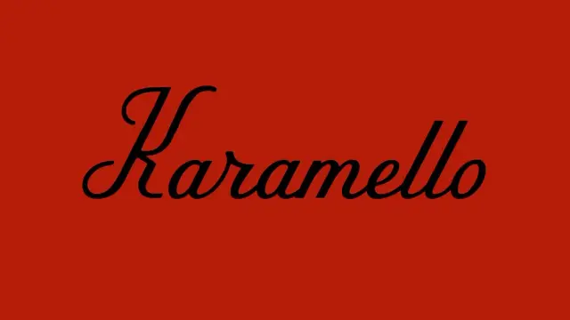
The sample image uses Karamello in black on a deep red ground—and the effect is striking. The high contrast makes the fine hairstrokes visible while giving the bolder strokes full weight. Dark grounds with light text, or cream stock with dark ink, both serve the typeface better than mid-tone backgrounds that flatten its tonal range.
Give It Scale
If Karamello is in your layout, make it the largest element on the page. Let it own the visual hierarchy. Using it as a secondary accent element at small sizes wastes its expressive range. This typeface is built for headlines.
Consider Tracking Carefully
Script typefaces are sensitive to tracking adjustments. Karamello’s connected letterforms mean that aggressive positive tracking will break the visual flow. Minor negative tracking can actually tighten the texture and improve cohesion at display sizes. Test carefully—the difference between well-tracked and poorly tracked Karamello is significant.
The Timeless Appeal of Hand-Drawn Script Typefaces in Contemporary Branding
There’s a genuine paradox at the heart of script typography: the more digital our design tools become, the more we crave letterforms that look handmade. Karamello sits squarely in that cultural dynamic.
The hand-drawn character isn’t nostalgia for its own sake. It signals something designers and brands increasingly need to communicate: that a human being made considered choices, applied real skill, and cared about the outcome. Algorithmic design has made competence cheap. Visible craft has become expensive. Karamello belongs to the expensive category.
For independent designers, boutique studios, and brands with authenticity at the center of their identity, that positioning matters. The typeface becomes evidence. When a brand uses Karamello, it’s making a claim about its own values—care, tradition, quality—that the letterforms themselves support.
Forward Predictions: Where Karamello Fits in the Next Wave of Type Design
Script typefaces with genuine historical grounding will continue to grow in relevance as the pendulum swings away from generic geometric sans-serifs. The current appetite for heritage aesthetics in packaging, branding, and editorial design shows no sign of reversing. If anything, it’s intensifying.
Karamello is well-positioned for this shift. Its combination of diploma-era authority and contemporary alternate character design gives it a double lifespan: it works now in the heritage revival moment, and it will continue working when the pendulum swings toward maximalist expressiveness—because its flourish architecture already anticipates that territory.
My prediction: within the next few years, script typefaces with structured alternate capital systems—what I’m calling the Prestige Script category—will become a distinct and recognized subcategory in type directories. Karamello is an early example of what that category looks like when it’s executed well.
Invest in it now. The design community hasn’t fully discovered it yet, and that window closes.
The typeface is available on:
Creative Market YouWorkForThemFrequently Asked Questions About the Karamello Typeface
What is the Karamello typeface?
Karamello is an elegant script typeface designed and published by SAMPLE. It draws inspiration from vintage academic diplomas and formal certificates, combining hand-drawn calligraphic characters with alternate capitals that introduce high-contrast flourish and distinctive typographic rhythm.
Who designed Karamello?
Karamello was designed and published by SAMPLE, a type foundry offering premium typefaces through platforms including Creative Market.
What is Karamello best used for?
Karamello works best as a display typeface in contexts demanding elegance and prestige—luxury packaging, wedding stationery, editorial headlines, logotype design, and high-end brand identity work. It is not suited for extended body text or small-size applications.
Does Karamello include alternate characters?
Yes. Karamello includes alternate capital letters that introduce moments of high contrast and pronounced decorative flourish. These alternates are a core feature of the typeface, allowing designers to customize the visual rhythm of headlines and wordmarks.
What typefaces pair well with Karamello?
Karamello pairs effectively with high-contrast serif typefaces such as Didone-style fonts (Bodoni, Didot, and their optical variants). The shared emphasis on stroke contrast creates visual coherence between the script and the body typeface.
Is Karamello suitable for logo design?
Yes—Karamello’s alternate capitals make it especially well-suited for logotype and wordmark design. By selecting specific alternate forms, designers can create letter combinations with distinctive silhouettes that feel custom-crafted.
Where can I purchase or download the Karamello typeface?
Karamello is available through Creative Market. Search for “Karamello typeface SAMPLE” to find the current listing and licensing options.
What design styles does Karamello suit?
Karamello suits heritage, luxury, vintage, academic, and editorial design aesthetics. It is particularly effective in contexts where the designer wants to communicate prestige, craft, and tradition through typography alone.
Is Karamello a serif or sans-serif typeface?
Karamello is a script typeface—a category distinct from both serif and sans-serif. Script typefaces simulate handwriting or calligraphy and are typically used for display and decorative purposes rather than body text.
How does Karamello compare to other premium script fonts?
Karamello distinguishes itself through its diploma-heritage source material and its structured alternate capital system. Compared to broadly popular scripts, it offers a more formally composed, architecturally controlled character that communicates authority rather than softness or casualness.
Browse WE AND THE COLOR’s Fonts category for more.
#font #fonts #Karamello #SAMPLE #scriptFont #typeface #Typefaces