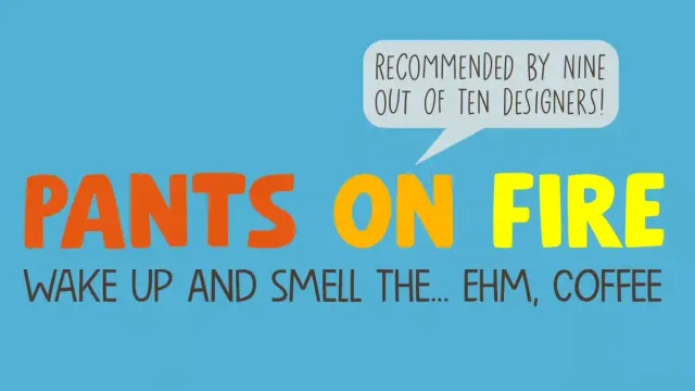
Pants On Fire Font: A Handcrafted Typeface by Hanoded

The Pants On Fire Font Shows Why Handcrafted Typography Is Trending Right Now!

Some fonts whisper. The Pants On Fire font by Hanoded speaks at full volume — and then pulls up a chair and stays. Designer David Kerkhoff has built a typeface family that reads like a personality test: bold enough for a product shelf, light enough for a handwritten note, and precise enough to hold its own in editorial design. That’s a rare combination. Most display faces sacrifice versatility for attitude. Pants On Fire refuses to make that trade.

Right now, handcrafted typography is not a trend. It’s a countermovement. At a moment when AI-generated visuals and algorithmic design templates dominate the creative landscape, audiences are gravitating toward work that feels made by human hands. The Pants On Fire typeface lands squarely in that space — rough where it should be rough, balanced where it counts.

Download the typeface for a low budget from MyFonts

This article covers everything you need to know: what makes this typeface structurally interesting, how each of its three styles performs in actual use cases, and why it belongs in your active font library.

The Pants On Fire font by Hanoded is a handcrafted typeface that speaks at full volume. Download the typeface for a low budget from MyFonts

What Exactly Is the Pants On Fire Font — and Who Made It?

David Kerkhoff is the designer behind Hanoded, his prolific independent type foundry. Kerkhoff has built a reputation for hand-drawn fonts that avoid the twee, overly casual quality that makes so many script or informal faces feel cheap. His work tends to be deliberate, character-forward, and structurally aware.

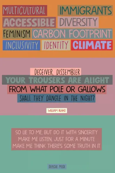
The Pants On Fire font ships as a family of three distinct styles: a rough Bold, an angular Medium, and a lighter, highly versatile Lightweight. Each weight was designed with complementary visual logic — they share a common skeleton but express different temperatures. Use one at a time or layer all three. They hold together either way.

Technically, this is a display family. Kerkhoff designed it with headlines, logos, posters, and packaging in mind. But the Lightweight carries enough evenness to move into body-adjacent territory — think pull quotes, call-to-action copy, or short editorial passages that need warmth without losing clarity.

So, what’s the actual design philosophy at work here? Kerkhoff builds texture into his letterforms without making them illegible. That balance is harder than it looks. Many hand-drawn fonts lean so far into imperfection that they start to obscure meaning. Pants On Fire stays readable first and expressive second — which is exactly the right priority for commercial typography.

Three Styles, Three Jobs: How Each Weight Functions

Bold: Maximum Signal, Minimum Noise

The Bold is the loudest member of the Pants On Fire family — but it’s a controlled loudness. Use it for packaging where a product needs to announce itself from a shelf. You can also use it for poster headlines where the type has to carry the visual before the image even registers. Last but not least, you can use it for brands that want personality without irony.

What makes the Bold work is its roughness-to-readability ratio. The strokes feel deliberately imperfect, like lettered by a skilled hand rather than rendered by a machine. Yet the character proportions remain grounded. Nothing runs too wide or collapses too narrow. As a result, the Bold scales well — strong at large sizes, still legible at smaller.

For food packaging, apparel branding, or any product targeting younger or craft-conscious audiences, this weight delivers. It reads as authentic rather than manufactured. That distinction matters enormously in markets where consumers are increasingly skeptical of polished corporate aesthetics.

Medium: The Editorial Workhorse

The Medium sits between expressive and structured. Its angularity distinguishes it from the Bold’s roughness and the Lightweight’s softness. This is the weight you reach for when the design needs energy but not volume.

Book covers are a natural fit. So are posters for events, cultural institutions, or exhibitions where the type needs to suggest personality without overwhelming the supporting design elements. The Medium works especially well when set large against clean negative space. Give it room and it holds authority.

It also pairs effectively with photography. Set a medium-weight Pants On Fire headline over a full-bleed image and it reads as intentional design rather than a font-over-photo accident. That requires a typeface with visual confidence at its core. The Medium has it.

Lightweight: The One That Surprises You

The Lightweight is, frankly, the most interesting weight in the family. Display fonts rarely produce a light style that’s genuinely usable across multiple contexts. This one does. It carries enough of the Pants On Fire character to stay recognizable but loses enough visual weight to become conversational rather than declarative.

Use it for branding systems that need the Bold for primary marks but want a lighter typographic voice elsewhere — in packaging copy, on social media graphics, in brand guidelines, or in web contexts where the bolder weights might feel too aggressive. The Lightweight holds the identity together without fighting for attention.

It’s also an excellent choice for stationery, invitations, and personal projects where warmth matters more than impact.

The Human-Touch Typography Framework: Why Imperfect Fonts Outperform

Here’s a framework worth naming: Textural Authenticity Gradient (TAG). It describes the spectrum between mechanically perfect type and deliberately imperfect, humanized letterforms. Fonts at the mechanical end of the TAG — think geometric sans-serifs — communicate precision, neutrality, and system-level thinking. Fonts at the humanized end communicate craft, personality, and presence.

The Pants On Fire typeface sits at the high-authenticity end of the TAG. That positioning is a design decision with commercial implications. Brands that live in the craft, food, culture, and lifestyle sectors need type that matches their value proposition. A hand-drawn font on an artisan food package reinforces the product story. A geometric sans on the same package undermines it.

This is not sentimentality. It’s brand semiotics. Typography is the most immediate communicator of a brand’s personality — faster than color, often faster than imagery. The Pants On Fire font communicates warmth, independence, and human authorship in the first half-second of reading. That’s the TAG at work.

So, the practical question is: when does a brand belong at this end of the gradient? Ask whether the product or service derives value from its human origin story. If yes, human-touch typography strengthens the signal. Pants On Fire makes that case compellingly.

Pants On Fire Font Use Cases: Where It Works Best

Packaging Design

The Bold is purpose-built for packaging. Set a product name in Pants On Fire Bold, and the label immediately reads as crafted rather than templated. This matters in specialty retail, farmers’ markets, premium food, and independent beverage brands where shelf presence must communicate provenance.

Combine the Bold for the brand name with the Lightweight for supporting copy — flavor notes, taglines, ingredient callouts. The family’s internal logic means these weights coexist without visual conflict.

Poster and Event Typography

Music festivals, art exhibitions, local markets, independent film screenings — all of these benefit from type that has attitude without being alienating. The Medium handles this context precisely. It reads as confident and designed, not generic. It also plays well with illustration, which is common in event poster work.

Logo and Wordmark Design

A logotype set in the Pants On Fire Bold carries immediate personality. For brand identities targeting younger consumers, independent businesses, or creative services, this is a genuinely strong foundation. It avoids the overused grotesque sans that saturates startup branding and offers a more distinct, ownable visual voice.

One caveat: because this is a display face with built-in texture, use it for wordmarks where the hand-drawn quality supports the brand story. It’s less effective for corporate contexts that require neutrality and system-level flexibility.

Social Media and Digital Content

Short-form content — pull quotes, announcement graphics, story overlays — benefits from type with visual character. The Pants On Fire family, particularly the Lightweight and Medium, performs well at common social image sizes. The texture holds up at screen resolution without dissolving into noise.

How the Pants On Fire Typeface Fits Into Contemporary Type Trends

The current typography landscape is polarizing. On one end: ultra-clean, variable-font, system-adjacent sans-serifs designed for digital interfaces. On the other: expressive, often historical, or hand-drawn type that pushes back against the neutrality of screen-optimized design.

The Pants On Fire font occupies the expressive end with conviction. But it avoids two traps that undermine many fonts in this category. First, it doesn’t collapse into illegibility in the pursuit of style. Second, it doesn’t feel nostalgic or retro in a way that dates it. The design is rooted in a hand-lettering tradition but doesn’t imitate any particular era. That positions it well for longevity.

There’s also a broader cultural current at work here. Post-pandemic design culture has consistently rewarded authenticity signals. Brands across categories — food, fashion, wellness, culture — have moved away from slick uniformity toward visual identities that suggest a human at the origin. Hand-drawn typography is a direct expression of that shift.

The Pants On Fire font is, in that sense, a well-timed release that happens to also be well-executed. Those two things don’t always coincide.

A Personal Take: Why This Font Stays in the Library

Fonts earn a permanent spot in a working library by being genuinely useful rather than just interesting. Many display typefaces are worth admiring and then never actually deployed because they’re too specialized, too fragile in use, or too easily associated with a single project.

The Pants On Fire typeface avoids that fate. The three-weight structure gives it enough range to be reusable across very different projects. The Lightweight, especially, is the kind of font that shows up where you don’t expect to need a hand-drawn face — and then solves the problem better than the cleaner alternatives you were considering.

David Kerkhoff has a particular skill for making rough-textured type that doesn’t wear out its welcome. The Pants On Fire family extends that skill into a more complete typographic system. For designers working across branding, packaging, and editorial contexts, that completeness has real practical value.

Keep it available. You’ll reach for it more often than you’d expect.

Pants On Fire Font Specifications and Where to Get It

The Pants On Fire font is available through Hanoded and distributed via major font marketplaces. The family includes three styles — Bold, Medium, and Lightweight — all designed by David Kerkhoff. Each style ships with a full character set suitable for Western European languages, making it a practical choice for multilingual design work.

For licensing, check the specific terms on the platform where you purchase. Hanoded fonts typically support desktop, web, and app use, though exact licensing tiers vary by platform and use case. Always confirm licensing for commercial packaging or broadcast applications before finalizing a project.

The font is best sourced from platforms that support independent type designers directly — purchasing through foundry-adjacent platforms rather than free aggregators ensures the designer is compensated and that you receive proper licensing documentation.

The Layered Use Principle: Getting More From a Three-Weight Family

Here’s a coined framework specific to multi-weight display families: the Layered Use Principle (LUP). It states that a font family’s full value is only realized when its weights are deployed in deliberate hierarchy rather than independently.

Applied to the Pants On Fire typeface: don’t treat Bold, Medium, and Lightweight as interchangeable options. Treat them as a voice system. The Bold commands. The Medium directs. The Lightweight supports. Build design systems around that hierarchy and the family reveals its full range.

A packaging system using all three weights, for instance, could assign the Bold to the brand name, the Medium to the product variant, and the Lightweight to the descriptor copy. The result reads as a cohesive typographic identity rather than a collection of font choices. The Layered Use Principle converts a font family into a brand system.

Download the typeface for a low budget from MyFonts

This approach also improves scalability. When a brand identity needs to expand — new products, new formats, new media — the LUP provides a ready-made typographic logic. You already know what each weight does. The expansion decisions become consistent rather than ad hoc.

Frequently Asked Questions About the Pants On Fire Font

What is the Pants On Fire font?

The Pants On Fire font is a hand-drawn display typeface family designed by David Kerkhoff and published through his foundry, Hanoded. It includes three styles — Bold, Medium, and Lightweight — each with distinct visual energy suited to different design applications.

Who designed the Pants On Fire typeface?

David Kerkhoff designed the Pants On Fire typeface. Kerkhoff is the founder and primary designer at Hanoded, an independent type foundry known for expressive, hand-crafted fonts.

What is the Pants On Fire font best used for?

The Pants On Fire font works best in display contexts: packaging design, poster headlines, logomarks, event typography, and social media content. The Bold performs well on product packaging and bold branding. The Medium suits editorial and poster work. The Lightweight is versatile enough for a wide range of projects requiring warmth and personality.

Is the Pants On Fire font suitable for body text?

The Pants On Fire typeface is primarily a display font. The Lightweight style can work in short body-adjacent contexts — pull quotes, caption copy, or brief editorial passages — but the family is not designed for long-form reading text.

Where can I buy or license the Pants On Fire font?

The Pants On Fire font is available through major font marketplaces that carry Hanoded’s library. Check platforms that support independent type designers to ensure proper licensing and direct support for the designer.

Can I use the Pants On Fire font for commercial projects?

Yes, with the appropriate commercial license. Licensing terms vary by platform and use case. Always verify the specific license tier for your intended use — especially for packaging, broadcasting, or app embedding — before finalizing commercial work.

How does the Pants On Fire font compare to other hand-drawn fonts?

Many hand-drawn fonts sacrifice legibility for texture. The Pants On Fire typeface maintains strong readability across all three weights, which is less common in this category. Its three-weight family structure also gives it more versatility than most single-style hand-drawn display fonts.

What font pairings work well with the Pants On Fire typeface?

The Pants On Fire typeface pairs best with clean, neutral body fonts that contrast its hand-drawn character without competing with it. Simple serifs or restrained grotesque sans-serifs work well as supporting type. Avoid pairing it with other high-personality display fonts — the visual competition reduces the impact of both.

Does the Pants On Fire font support multiple languages?

Yes. As a Hanoded font, Pants On Fire supports Western European languages with a full character set. Verify specific language support for your target markets when using the font for multilingual design projects.

Is the Pants On Fire font good for logo design?

Yes. The Bold weight, especially, is a strong choice for wordmarks and logotypes in brand identities where personality, craft, and human warmth are central to the brand story. It works particularly well for independent businesses, lifestyle brands, food and beverage, and creative services.

Don’t hesitate to browse WE AND THE COLOR’s Fonts category for more trending typefaces.

#font #handcraftedFont #handmadeFont #Hanoded #PantsOnFire #typeface

The Paris Editorial Font Duo by Letter Fresh

It’s no secret that typography dictates a brand’s voice before a consumer reads a single word. The Paris Editorial font duo creates a specific auditory hallucination for the viewer. It whispers rather than shouts. Designers want typefaces that look credible without feeling cold. Letter Fresh provides this solution. This handmade sans-serif and script font duo offers a distinct advantage in the current design landscape. We categorize this aesthetic advantage as “Visual Empathy.” This article analyzes the Paris Editorial font duo through this new framework. We will examine how this specific playful combination drives engagement.

You can purchase the font duo for a very low budget on these platforms:

Creative Market YouWorkForThem

Why Does Handmade Typography Matter More Than Ever in Digital Design?

Digital homogeneity creates opportunity. Consider how many brands now look identical—same grotesques, same geometric sans serifs, same corporate neutrality. The Paris Editorial duo disrupts this pattern through what we might call Dual-Voice Typography: the strategic deployment of contrasting yet harmonious typefaces that establish both authority and approachability simultaneously.

The rounded sans serif delivers structural integrity. Meanwhile, the script component introduces human variability. This combination solves a problem many designers face daily: how to appear professional without seeming distant.

The Paris Editorial Font Duo by Letter Fresh

You can purchase the font duo for a very low budget on these platforms:

Creative Market YouWorkForThem

The Architecture of Approachability

Letter Fresh built this duo on a specific principle. Call it Tactile Contrast Theory. The concept is simple: when you pair geometric structure with organic movement, you create cognitive resonance. Readers perceive both competence and warmth.

The Paris Editorial sans serif uses rounded terminals strategically. These aren’t purely decorative choices. Research in typography perception shows that rounded letterforms reduce perceived aggression while maintaining legibility. Consequently, the typeface communicates friendliness without sacrificing readability at small sizes.

The script component operates differently. It introduces rhythm and personality through varied stroke weights and natural connections. However, Letter Fresh maintained discipline here. This isn’t a wild calligraphic display face. It’s a functional script designed for real-world applications.

How Does the Paris Editorial Font Duo Actually Work in Practice?

Understanding application matters more than aesthetic appreciation. This duo excels across specific use cases that demand both distinction and clarity.

Product Packaging Applications

Product labels require instant communication. The Paris Editorial font duo solves the hierarchy problem elegantly. Deploy the sans serif for product names and functional information. Use the script for emotional messaging and brand storytelling. This creates visual separation that guides consumer attention naturally.

Artisanal food brands benefit particularly. The combination suggests craftsmanship without appearing pretentious. Beauty products gain sophistication through the script’s elegance while maintaining clarity through the sans-serif’s structure.

Social Media Content Strategy

Instagram and Pinterest prioritize visual impact. The Paris Editorial duo delivers what we call Scroll-Stop Typography: letterforms distinctive enough to halt mid-scroll browsing. The script’s flowing nature creates movement within static posts. Meanwhile, the sans serif anchors headlines and calls-to-action with bold clarity.

Brands targeting millennial and Gen Z audiences need authenticity markers. Handmade fonts signal genuine human effort. This duo provides that signal without appearing amateurish or unprofessional.

Logo Design Framework

Logo creation demands versatility. The Paris Editorial font pairing enables what design theorists call Adaptive Brand Voice: the ability to shift between formal and casual contexts while maintaining identity coherence.

Primary wordmarks can utilize the rounded sans serif exclusively for corporate applications. Then, introduce the script in customer-facing materials, packaging, and social content. This creates a brand system rather than a static identity.

What Technical Considerations Define Professional Font Duo Usage?

Typography selection requires more than aesthetic judgment. Technical execution determines whether designs succeed or fail in production environments.

File Format Compatibility

Letter Fresh provides both OTF and TTF formats. This matters significantly. OpenType features enable advanced typographic controls, including ligatures, alternates, and contextual substitutions. TrueType ensures compatibility across older systems and basic design software.

Professional designers should prioritize OTF files. These formats support expanded character sets and advanced features accessible through Adobe Illustrator’s Glyph Panel or Photoshop’s OpenType Character Panel. This access unlocks the full expressive potential of the Paris Editorial script font.

Licensing Requirements for Commercial Projects

Many designers overlook licensing implications. Letter Fresh explicitly requires license upgrades for specific applications: books, television, commercial exhibitions, films, games, and print-on-demand products. This isn’t optional.

Understanding licensing prevents legal complications. Moreover, it respects the designer’s labor. Handmade typefaces require significantly more development time than algorithmic font generation. Proper licensing supports continued creation of quality typography.

Where Does the Paris Editorial Duo Fit Within Contemporary Design Movements?

Context matters. This font duo emerges from a broader shift toward Neo-Humanist Typography: a movement rejecting pure geometric rationalism in favor of designs acknowledging human imperfection and warmth.

The Counter-Digital Aesthetic

Digital tools enable perfect curves and mathematical precision. Yet audiences increasingly crave imperfection. The Paris Editorial script’s handwritten qualities satisfy this desire. It’s not accidental. It’s strategic positioning against algorithmic uniformity.

Brands using this duo signal values. They’re saying: “We prioritize human connection over corporate efficiency.” This messaging resonates particularly with consumers skeptical of tech-dominated industries.

Post-Minimalism and Decorative Revival

Minimalism dominated design discourse for over a decade. Now, we’re witnessing Expressive Simplicity: the integration of decorative elements within clean, uncluttered layouts. The Paris Editorial duo enables this balance perfectly.

The rounded sans serif maintains minimalist sensibilities through generous negative space and clean geometry. However, the script introduces flourish and personality. This combination lets designers be both restrained and expressive simultaneously.

How Should Designers Approach Paris Editorial Font Duo Implementation?

Theory matters less than execution. Here’s a practical framework for deploying this typeface pairing effectively.

The Hierarchy Decision Matrix

Establish clear rules before beginning any project. Primary information should typically use the sans serif. Secondary, emotional, or narrative content works better in the script. This isn’t absolute, but it provides a starting point.

Consider reading order. Eye-tracking research shows readers process bold, geometric letterforms faster than script faces. Therefore, lead with the sans serif for critical information. Follow with script for supporting messages.

Scale and Spacing Principles

The Paris Editorial sans serif performs well across size ranges. Use it confidently from business cards to billboards. However, the script requires more careful consideration. Below 14 points, legibility decreases significantly. Reserve script usage for display sizes in print materials.

Digital applications need different approaches. Screen resolution affects script readability dramatically. Test thoroughly across devices. Mobile displays may require larger script sizes than anticipated.

Color and Contrast Strategies

Both typefaces feature relatively thick strokes. This characteristic limits certain color combinations. Avoid light weights on dark backgrounds for the script, particularly. The Paris Editorial script font maintains legibility best with dark-on-light pairings.

Experiment with color separately for each typeface. The sans serif can handle more aggressive color contrasts. Meanwhile, the script benefits from softer palettes that complement rather than compete with its organic forms.

What Makes This Font Duo Different From Generic Script-Sans Pairings?

The market offers countless script and sans-serif combinations. Most fail because they lack intentional design relationships. The Paris Editorial duo succeeds through specific differentiators.

Coherent Stroke Philosophy

Letter Fresh didn’t simply bundle two separate typefaces. Both fonts share underlying stroke weight relationships and rhythmic patterns. This creates harmony despite stylistic differences. Notice how the rounded terminals of the sans serif echo the script’s natural curves.

This coherence enables seamless integration. Designers can intermix both typefaces within single compositions without creating visual discord. That’s rare among commercial font duos.

Optimized for Modern Production

Many handmade fonts ignore practical production requirements. They look beautiful but fail in real workflows. The Paris Editorial duo prioritizes functionality. Clean vector paths ensure reliable print output. Extensive character sets support multiple languages and special characters.

Additionally, the OpenType programming enables intelligent behavior. Ligatures connect automatically in the script. Alternate characters provide stylistic variation. These features save time while improving output quality.

Who Benefits Most From the Paris Editorial Font Duo?

Not every typeface suits every designer or project. This duo serves specific audiences particularly well.

Independent Creative Professionals

Freelance designers, illustrators, and photographers need versatile tools that deliver premium results across varied projects. The Paris Editorial font duo provides that versatility without requiring extensive font libraries. Two well-designed typefaces often accomplish more than dozens of mediocre options.

Budget-conscious creatives appreciate the value proposition. One purchase enables branding projects, social media templates, client presentations, and personal promotion materials.

Small Business Owners and Entrepreneurs

Non-designers building their own brand assets face overwhelming typography choices. This duo simplifies decisions through its built-in compatibility. Business owners can create cohesive visual identities without deep typographic knowledge.

The approachable aesthetic suits businesses prioritizing customer relationships. Coffee shops, boutiques, consultants, and lifestyle brands all benefit from the warmth this pairing communicates.

Wedding and Event Designers

Invitation design demands romantic sophistication balanced with practical clarity. The Paris Editorial script delivers elegance. The sans serif provides the necessary information hierarchy. Together, they create invitation suites that feel cohesive across multiple pieces.

Event branding extends beyond invitations. Signage, programs, menus, and thank-you cards all require typographic consistency. Having two complementary typefaces enables variation without chaos.

What Are the Limitations and Considerations?

Honesty matters in typography recommendations. No typeface solves every problem. The Paris Editorial duo has specific limitations designers should understand.

Style Specificity Constraints

This pairing carries inherent personality. That personality works beautifully for certain brands but poorly for others. Tech startups pursuing ultra-modern aesthetics should look elsewhere. Law firms needing traditional authority will find better options.

The rounded friendliness reads as casual in conservative contexts. Consider your audience carefully. What feels approachable to one demographic may seem unprofessional to another.

Script Readability Challenges

All script typefaces sacrifice some legibility for aesthetic appeal. The Paris Editorial script performs better than many alternatives. However, it’s still a script face. Avoid extended text settings. Never use script fonts for body copy, legal text, or technical specifications.

Accessibility considerations matter too. Readers with dyslexia or visual impairments struggle with script typography. Always provide sans-serif alternatives for critical information.

How Will Handmade Typography Evolve in the Coming Years?

Predicting design trends requires analyzing current trajectories. Several signals suggest where typography like the Paris Editorial duo fits in the future.

The Authenticity Economy

Consumer skepticism toward corporate communication continues to intensify. Brands respond by emphasizing authenticity and human connection. Handmade typography serves this strategy perfectly. Expect continued demand for fonts signaling human craftsmanship over algorithmic generation.

However, authenticity becomes performance when everyone adopts the same signals. The Paris Editorial font duo maintains relevance only if designers deploy it genuinely, not cynically. Audiences detect performative authenticity quickly.

Variable Font Integration

Typography technology evolves rapidly. Variable fonts enable dynamic weight, width, and style adjustments within a single font file. Future iterations of handmade duos might incorporate variable technology. Imagine adjusting the Paris Editorial script’s slant or weight contextually based on layout needs.

This technological integration won’t replace current offerings immediately. But designers should anticipate more sophisticated, flexible handmade typefaces emerging.

Cross-Platform Performance Demands

Web, mobile, print, and emerging platforms all require typography adaptation. Successful typefaces increasingly need to perform well everywhere. The Paris Editorial duo’s clean vector construction positions it well for this multi-platform reality.

Expect future updates to include webfont optimization, improved hinting for screen rendering, and additional character support for expanding global markets.

What Concrete Steps Should You Take Next?

Information without action creates no value. Here’s how to actually implement what we’ve discussed.

Audit Your Current Typography

Review your existing projects and brand materials. Identify where the Paris Editorial duo could replace less cohesive font pairings. Look specifically for projects balancing professional credibility with an approachable personality.

Create a priority list. Which projects would benefit most from a typographic refresh? Start there rather than attempting comprehensive changes simultaneously.

Develop Application Guidelines

Download the fonts and experiment extensively before committing to client projects. Create a personal style guide documenting successful pairings, size relationships, and color combinations. This reference prevents inconsistent application later.

Test across different media. Print samples at various sizes. Display mockups on different screens. Send test files to commercial printers if you work in packaging or publication design.

Expand Your Typography Literacy

One font duo won’t solve all design challenges. Use this as an opportunity to deepen your understanding of typographic principles. Study why certain pairings work while others fail. Analyze professional design work featuring script-sans combinations.

You can purchase the font duo for a very low budget on these platforms:

Creative Market YouWorkForThem

Consider investing in quality type foundries beyond Letter Fresh. Explore work by independent type designers. Building a curated font library takes time but dramatically improves your design capabilities.

Frequently Asked Questions (FAQ):

Q: What file formats does the Paris Editorial font duo include?

A: Letter Fresh provides both OTF (OpenType Font) and TTF (TrueType Font) formats. OpenType offers advanced typographic features accessible through professional design software. TrueType ensures broader compatibility across various systems and applications.

Q: Can I use the Paris Editorial font duo for commercial projects?

A: Yes, but license upgrades are required for specific commercial applications. Standard licenses typically cover basic commercial use, like client branding and marketing materials. However, you’ll need extended licenses for applications, books, television, films, games, and print-on-demand products. Always contact Letter Fresh directly for licensing clarification.

Q: How do I access special characters and alternates in the script font?

A: Access extended characters through Adobe Illustrator’s Glyph Panel or Adobe Photoshop’s OpenType Character Panel. These interfaces display all available glyphs, ligatures, and alternates. Most professional design applications offer similar functionality. Consult your software’s documentation if you’re unfamiliar with accessing OpenType features.

Q: What’s the minimum size I should use for the Paris Editorial script?

A: For print materials, avoid using the script below 14 points. Legibility decreases significantly at smaller sizes. Digital applications require even larger sizes due to screen resolution limitations. Test thoroughly across devices. Mobile displays, particularly, may require 18-24 point sizes for comfortable readability.

Q: Does this font duo support multiple languages?

A: The Paris Editorial duo includes extended Latin character sets supporting many Western European languages. Check the character map for specific language support. If you need Cyrillic, Greek, or other non-Latin scripts, contact Letter Fresh to verify availability or request custom additions.

Q: Can I pair the Paris Editorial fonts with other typefaces?

A: While designed as a duo, these fonts can work with additional typefaces in complex projects. The rounded sans serif pairs well with neutral grotesques for body copy. However, avoid introducing additional scripts or decorative faces. Multiple display typefaces typically create visual confusion rather than harmony.

Q: What makes the Paris Editorial duo better than free font alternatives?

A: Commercial fonts undergo extensive refinement that free alternatives rarely receive. Letter Fresh optimized spacing, kerning, and character construction for professional applications. Additionally, proper licensing protects you legally. Free fonts often carry unclear licenses that create risk in commercial contexts. Quality and legal clarity justify the investment.

Q: How often does Letter Fresh update this font duo?

A: Typography products typically receive periodic updates for bug fixes, expanded character support, or technical improvements. Register your purchase with Letter Fresh to receive update notifications. Most foundries provide free updates to licensed users, though policies vary.

Feel free to find other trending typefaces in the Fonts category here at WE AND THE COLOR.

Subscribe to our newsletter!

[newsletter_form type=”minimal”]

#font #fontDuo #fonts #handmade #handmadeFont #handmadeFonts #ParisEditorialFontDuo #sansSerif #script #scriptFont #typeface #Typefaces

🔴 Create a Hand-Made Version of your Favorite Font
by Chris Piascik @chrispiascik

#lettering #handmadefont #illustration

https://youtu.be/xNASXFNd_OQ

Create a Hand-Made Version of your Favorite Font

YouTube