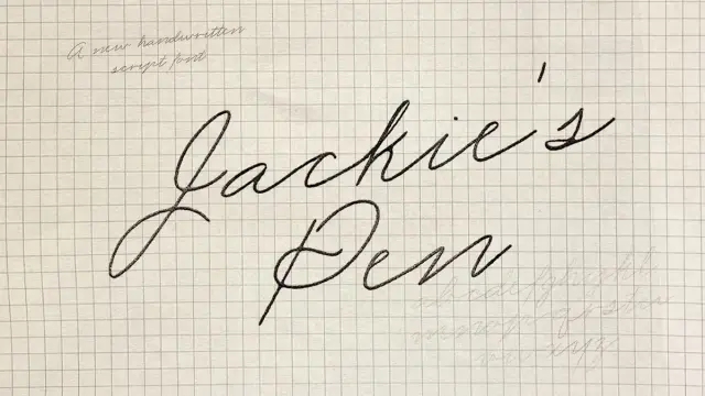
Jackie’s Pen Typeface by Studio Madly Is the Handwritten Script Font That Makes Digital Feel Personal Again
Somewhere between a grandmother’s birthday card and a late-night love letter lives a kind of handwriting that feels impossible to replicate. Jackie’s Pen, a handwritten script font by Studio Madly, comes closer than almost anything else on the market. This typeface doesn’t pretend to be perfect. Instead, it leans into the beautiful messiness of real cursive — the kind written with intention, warmth, and a little bit of ink pressure on paper.
Script fonts are everywhere. Most of them look slick, polished, and completely hollow. Jackie’s Pen breaks from that pattern entirely. It carries the weight of something personal — something you’d tuck into a card or scrawl on a sticky note for someone you love.
So why does this particular font hit differently? And what makes handwriting-inspired typography so urgently relevant right now?
Download the typeface from Creative MarketWhat Makes Jackie’s Pen Different from Every Other Script Font Out There?
Most script fonts mimic handwriting from a distance. They use smooth Bézier curves and even stroke widths to suggest a pen moving across paper. Jackie’s Pen doesn’t work that way. Instead, Studio Madly built this typeface from actual penmanship — the kind of flowing, connected cursive that older generations wrote by hand as a daily practice.
The result is what I’d call Organic Irregularity — a framework for evaluating how closely a digital typeface replicates the natural inconsistencies of human handwriting. Under this framework, Jackie’s Pen scores exceptionally high. You’ll notice subtle shifts in stroke weight, letter connections that feel spontaneous rather than engineered, and a rhythm that breathes.
Specifically, the font captures what I’m calling the Penmanship Fidelity Index: the degree to which a digitized script retains the tactile, imprecise qualities of analog writing. High-fidelity fonts feel written. Low-fidelity fonts feel constructed. Jackie’s Pen is firmly in the first category.
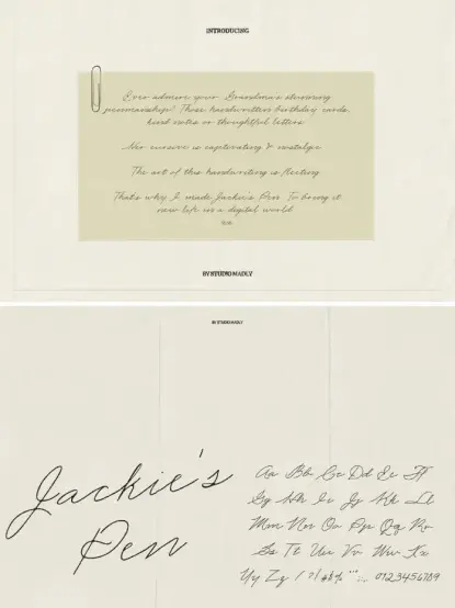
Furthermore, the typeface covers the full character set — uppercase, lowercase, numbers, and punctuation — which means you can use it across real-world applications without hitting gaps. That completeness matters enormously in professional design work.
Jackie’s Pen Is a Handwritten Script Font by Studio Madly. Download the typeface from Creative MarketThe Story Behind Jackie’s Pen and Studio Madly
Studio Madly built Jackie’s Pen around a deeply personal observation: the art of cursive handwriting is disappearing. Younger generations rarely write in cursive at all. Schools have largely dropped it from curricula. Meanwhile, those stunning handwritten birthday cards from your grandmother represent a skill that may never come back at scale.
That cultural loss inspired the font directly. Studio Madly created Jackie’s Pen to preserve — and celebrate — a style of penmanship that deserves to live on in digital design. The name itself feels intimate and specific, which is entirely the point. This font isn’t trying to be universal. It’s trying to feel like it came from one particular person’s hand.
Consequently, Jackie’s Pen sits in a specific emotional register that most typefaces avoid. It isn’t formal enough to be a calligraphy font and isn’t loose enough to be a casual brush script. Instead, it occupies the territory of Everyday Cursive Authenticity — a third category in script typography that I’d argue is wildly underserved.
Why Handwriting Fonts Matter More Now Than Ever
Design culture is actively pushing back against sterile, AI-generated aesthetics. Audiences are craving warmth, imperfection, and humanity in visual communication. Therefore, fonts like Jackie’s Pen aren’t just stylistic choices — they’re editorial statements.
When you set a headline or label in Jackie’s Pen, you’re telling your audience something specific: this came from a person. Additionally, you’re invoking a kind of nostalgia that doesn’t feel manufactured. It’s the difference between a greeting card that looks mass-produced and one that feels like it was written just for you.
Brands, illustrators, social media creators, and wedding designers are all chasing this quality right now. The demand for authentic handwriting fonts is rising steadily, and Jackie’s Pen delivers something genuinely rare in this space.
How to Use Jackie’s Pen in Your Design Projects
Jackie’s Pen works brilliantly across a wide range of use cases. However, knowing where it thrives versus where it struggles will save you a lot of revision time.
Best Use Cases for This Handwritten Script Font
Jackie’s Pen performs at its best in contexts that reward intimacy and personality. Wedding stationery is the obvious starting point — the font brings exactly the right balance of elegance and warmth. Similarly, greeting card design, personal branding, packaging for boutique products, and hand-lettered social media graphics all benefit enormously from this typeface.
Additionally, Jackie’s Pen works well as an accent font in editorial layouts. Set a pull quote in Jackie’s Pen alongside clean serif body text, and the contrast creates an editorial tension that feels sophisticated. Alternatively, use it for signatures, signoffs, or short headers where you want a human presence in an otherwise clean design system.
It’s also worth noting that small-detail applications — product labels, tags, stamps, and notepads — absolutely shine with this font. Studio Madly specifically designed it for those “messy notes or small details,” and the proportions support that use case perfectly.
What to Avoid When Using Jackie’s Pen
Long body text at small sizes doesn’t suit Jackie’s Pen. The organic irregularity that makes it beautiful at display size becomes harder to parse at 10pt or 12pt. Likewise, avoid pairing it with other expressive script fonts — the visual noise will undermine both typefaces.
Instead, pair Jackie’s Pen with minimal serifs or clean sans-serifs to let the handwritten quality breathe. Give it space. Let it carry emotional weight in a layout rather than fighting for attention with competing visual elements.
The Nostalgia Fidelity Framework: How Jackie’s Pen Triggers Real Emotion
I want to propose a specific analytical framework for evaluating handwriting-inspired fonts called the Nostalgia Fidelity Framework. This model evaluates typefaces across three dimensions: Source Authenticity (does it feel derived from real handwriting?), Emotional Register (what specific feeling does it evoke?), and Contextual Precision (how narrow or broad is its appropriate use range?).
Under this framework, Jackie’s Pen scores high on Source Authenticity and Emotional Register. The font clearly derives from real cursive penmanship rather than stylized brush lettering. Moreover, the emotional register is specific — warmth, intimacy, nostalgia — rather than vague. The Contextual Precision score is deliberately narrow, which is actually a strength. Knowing exactly where a font belongs is enormously useful for designers.
This contrasts sharply with generic “handwritten” fonts that score low across all three dimensions. Those fonts feel neither authentic, nor emotionally specific, nor contextually clear. They’re trying to serve everyone and end up serving no one particularly well.
Jackie’s Pen and the Shift Toward Human-Centered Typography
Typography is in the middle of a significant cultural shift. For roughly two decades, the design world chased legibility, system efficiency, and digital optimization. Therefore, humanist sans serifs and geometric typefaces dominated. They still do in many contexts. But something has changed.
Designers and brands now actively seek what I call the Human Trace Principle — the visible evidence of a human hand in digital design. This isn’t purely aesthetic nostalgia. Rather, it’s a strategic response to a visual culture that has become over-optimized and under-humanized.
Jackie’s Pen fits directly into this shift. It provides proof of humanity in your design. Consequently, it resonates with audiences who are increasingly skeptical of AI-generated polish and algorithmically smooth aesthetics. In short, imperfection has never been more valuable.
Predictions for Handwriting Fonts in Design Culture
Looking forward, I predict that handwritten script fonts with genuine source authenticity — like Jackie’s Pen — will command increasing premium placement in design systems and brand identities. Furthermore, the gap between authentic handwriting fonts and generic cursive fonts will widen as audiences develop better visual literacy for detecting the difference.
Brands that invest in fonts with real character, real story, and real penmanship origins will differentiate themselves meaningfully. Consequently, typefaces like Jackie’s Pen won’t just be decorative choices — they’ll become trust signals.
Technical Specs and What You Need to Know Before Downloading
Jackie’s Pen is available through Studio Madly as a downloadable font file. The typeface includes a full character set covering the complete Latin alphabet in both upper and lowercase, numerals, and punctuation. Additionally, the font supports smooth, connected letter flow that makes cursive legible across different design applications.
Before you integrate Jackie’s Pen into a commercial project, confirm the licensing terms directly with Studio Madly. Personal and commercial licenses often differ, and a font this distinctive deserves proper attribution and legal clarity.
In terms of file format compatibility, Jackie’s Pen works across standard design applications, including Adobe Illustrator, Adobe Photoshop, InDesign, Canva, Procreate, and Figma. Therefore, you’ll have no trouble incorporating it into your existing workflow regardless of your platform preference.
Final Thoughts on Jackie’s Pen as a Typeface Worth Owning
Jackie’s Pen isn’t for everyone. It isn’t supposed to be. Studio Madly built a font with a clear emotional purpose and a specific aesthetic identity. That specificity is exactly what makes it powerful. When you use it in the right context, it doesn’t just look beautiful — it communicates something that polished, engineered typefaces simply cannot.
Personally, I find this typeface genuinely moving. There’s something about seeing a font that clearly started as real handwriting, preserved and digitized with care, that feels meaningful in a way that purely constructed scripts don’t achieve. The grandmother connection in Studio Madly’s origin story isn’t just marketing copy. You can feel it in the letterforms.
Download the typeface from Creative MarketUltimately, Jackie’s Pen is a reminder that design’s most powerful tool isn’t technology. It’s humanity. And sometimes, the best way to express that humanity is through the trace of a pen moving across paper — even when that paper is a screen.
Frequently Asked Questions About Jackie’s Pen
What kind of font is Jackie’s Pen?
Jackie’s Pen is a handwritten script font by Studio Madly. It replicates the flowing cursive penmanship of traditional handwriting rather than stylized calligraphy or brush lettering. The typeface falls into what designers call the everyday cursive authenticity category—personal, warm, and organically irregular.
Who designed Jackie’s Pen?
Studio Madly designed and released Jackie’s Pen. The studio created the font as a tribute to traditional cursive penmanship, specifically inspired by the elegant handwriting of older generations who wrote letters, birthday cards, and personal notes by hand as a daily practice.
What are the best use cases for Jackie’s Pen?
Jackie’s Pen works best for wedding stationery, greeting cards, personal branding, boutique packaging, social media headers, product labels, and editorial pull quotes. It pairs most effectively with clean serif or minimal sans-serif typefaces that let the script carry emotional weight without visual competition.
Is Jackie’s Pen suitable for body text?
No. Jackie’s Pen performs best at display sizes — headlines, headers, accents, signatures, and short decorative applications. The organic irregularity that makes it beautiful at large sizes reduces legibility at small text sizes. Use it intentionally and sparingly for maximum impact.
What fonts pair well with Jackie’s Pen?
Jackie’s Pen pairs naturally with clean, minimal typefaces that contrast its expressive quality. Consider pairing it with refined serif fonts for editorial elegance or neutral sans-serifs for modern brand applications. Avoid pairing it with other expressive script or brush fonts, as the two competing styles will undermine each other.
Where can I download Jackie’s Pen?
Jackie’s Pen is available through Studio Madly’s official channels. Check their profile on major font marketplaces or their own platform directly. Always verify licensing terms before using the font in commercial projects to ensure you have the correct license for your intended application.
Why are handwritten script fonts trending right now?
Design culture is actively reacting against over-polished, algorithmically smooth aesthetics. Audiences increasingly respond to visual warmth, imperfection, and humanity. Handwritten script fonts like Jackie’s Pen provide what designers call the Human Trace Principle — visible evidence of a real person behind the design — which builds trust and emotional connection in ways that purely constructed typefaces cannot replicate.
Check out other popular typefaces here at WE AND THE COLOR.
#font #handwriting #handwritten #JackieSPen #scriptFont #StudioMadly #typeface