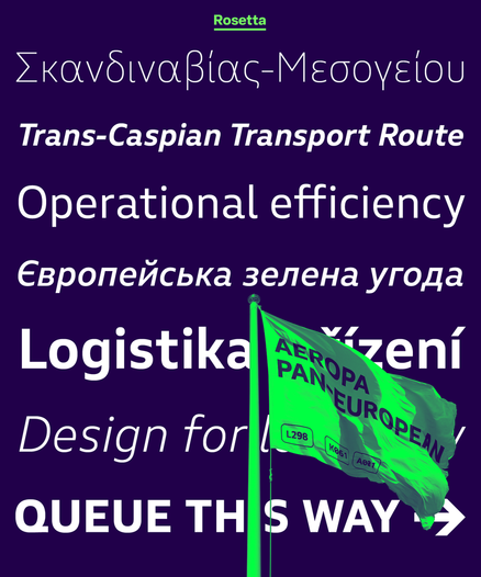
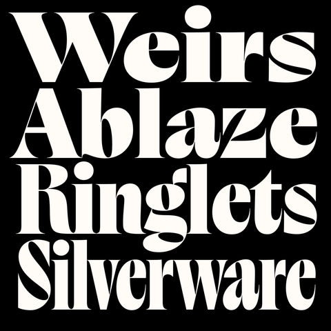
NEW WORK🔥: Aeropa PE by Nick Job

https://rosettatype.com/AeropaPE

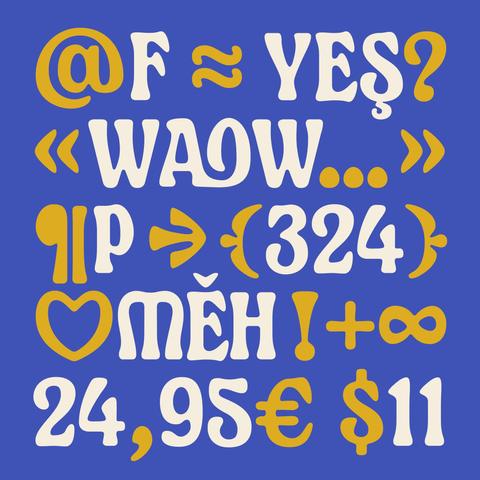
Designed for Latin, Greek, and Cyrillic scripts, Aeropa comes in six weights with duplexed italics. Nick, as always, packed it with a ton of extras — different numerals, fractions, arrows, and over 450 alternates to play around with.

#typeface #newfont #multilingual #cyrillictype #greektype #typeinspiration

NEW FONT ALERT!
Introducing Chunky Funky – a bold, playful, and colorful font that brings pure FUN to your designs!

Perfect for posters, kids’ projects, branding, social media graphics, and more.
Available in OTF & TTF files.

ON SALE NOW – grab it today and add some funky vibes to your creative projects!

Link in bio to download

#FontDesign #NewFont #ChunkyFunky #TypographyDesign #GraphicDesign #CreativeFonts #FontAddict #DesignResources #OTF #TTF #FontLove #CustomFont #TypographyInspiration

Butik by Anna Štepanovská 

rosettatype.com/Butik

A buoyant Didonesque display typeface with a full palette of weights and widths and ensemble of lively alternates, swashes, and expressive ball terminals. These days, we rarely see refined drawings such as these.

#fontstyle #newfont #font #typeface #typography #typedesign #graphicdesign #designedbywomen #postmodern #designtrends #fonts #rosettatype #didone #bodoni #displayfont
As part of our programme to broaden the reach of Adapter World, we invited Ana Sanikidze to work with us and design Adapter Georgian Text, a universal monolinear typeface with contemporary aesthetics. The text oriented styles with a wide range of weights are packed into a single variable font.

Design: Ana Sanikidze
Art-direction: David Březina
Font engineering: Johannes Neumeier

#fontstyle #newfont #font #typeface #typography #typedesign #graphicdesign #designedbywomen #postmodern #designtrends #fonts #rosettatype #adaptergeorgian #georgianfonts #georgian #TDC
Adapter Mono PE is a monospaced type family with an editorial state of mind. It features a range of weights, strongly inclined italics with cursive alternates, and numerous stylistic sets to meet all your fixed-width letter needs.

Design: Tania Chacana
Art-direction: David Březina
Font engineering: Johannes Neumeier
Cyrillic consultancy: Maria Doreuli
Greek consultancy: Irene Vlachou

#fontstyle #newfont #font #typeface #typography #typedesign #graphicdesign #designedbywomen #monospaced #postmodern #designtrends #fonts #rosettatype #adaptermono

A typeface like no other!
Gilway Paradox dances between widths to bring energy and rhythm to your designs. Soft curves, bold personality.
 Discover the beauty of contrast.
🔗 Link in bio to explore!

#typedesign #newfont #fontlaunch #gilwayparadox #creativefonts @Typetopia #typomania

RL Folklor is a distinctive display #typeface designed by Radek Łukasiewicz. It explores the dynamic interplay of positive and negative space, resulting in bold, blocky letterforms with a carved aesthetic. #RLFolklor draws inspiration not from specific #typefaces but from craftsmanship, particularly the textures and forms of #woodcut aesthetics. https://radluka.com/rl-folklor

#typedesign #newfont #fontdesign #typefacedesign #fonts #graphicdesign #radeklukasiewicz #certainmagazine

RL Folklor

👓 I can't resist trying my next font, GILWAY PARADOX, inspired by the #Severance amazing series! 💾

Gilway Paradox will be available in Light, Regular, and Bold weights with matching italics, offering endless possibilities for unique designs.
Stay tuned for the official release date and get ready to embrace the Paradox!

#GilwayParadox #NewFont #Typeface #Typography #typographie #motiondesign #FontDesign #DualWidth #typeinmotion

Bitzer is the latest #typeface by James Plattner, now available on Future Fonts @futurefonts Designed for headlines, #logos and editorial design, Bitzer’s narrow proportions allow for efficient #text arrangement without compromising #readability. 🔗 https://futurefonts.xyz/james-plattner/bitzer

#variablefonts #newfont #typedesign #typefacedesign #typefaces #fontdesigner #fonts #fontdesign #variablefont #futurefonts #jamesplattner #therightfont

Bitzer by James Plattner - Future Fonts

An experiment in testing boundaries, Bitzer selectively observes and breaks the established rules of Latin flat brush calligraphy. Bitzer speaks with a voice that is equal parts trustworthy and contemporary. Cutting edge without feeling overly irreverent. A visual balance of order and chaos… you get the idea. Bitzer was designed for use in headlines, logotypes and editorial design. Its narrow proportions aren’t exaggerated but allow for succinct delivery within a few lines of text. Sharp twists of the pen give the letters a bottom-heavy quality, adding a sense of gravity into the visual texture, which becomes more pronounced in heavier weights. For trial fonts or inquiries, please write [email protected] :)

Future Fonts

Something exciting is brewing in the world of type... 🤫 I'm thrilled to give you a sneak peek at my latest font project: Gilway Paradox!
This typeface blends a friendly, contemporary feel with unexpected dynamism. Its dual-width characters will create a striking visual rhythm, perfect for adding a touch of excitement to any design.
Stay tuned for the official release date and get ready to embrace the paradox!

#GilwayParadox #NewFont #Typeface #Typography #FontDesign #DualWidth #DynamicType #