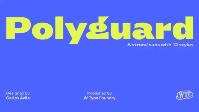
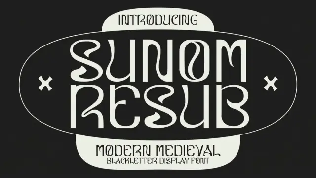
Polyguard Font Family by W Type Foundry
The Polyguard Font Family Brings Industrial Strength and Typographic Character Together
Some typefaces arrive quietly. The Polyguard font family is not one of them. Designed by Carlos Avila for W Type Foundry, Polyguard enters the display type scene with a kind of controlled aggression that feels both timely and deliberate. It carries industrial roots but refuses to stay mechanical. That tension — between structure and personality, between weight and agility — is exactly what makes this family worth talking about right now.
Get the typeface from MyFontsDisplay typography is having a moment. Brands want to say something louder than a wordmark alone can manage. Editorial designers push headline fonts to do conceptual work. Packaging designers need letterforms that hold authority at arm’s length. Polyguard was built for all of these moments, and it handles them without breaking a sweat.
Polyguard Font Family W Type Foundry Get the typeface from MyFontsSo what exactly is the Polyguard typeface, and why does it work? Let’s get into it.
What Makes the Polyguard Typeface Different from Standard Industrial Sans Fonts?
The word “industrial” gets thrown around loosely in type design. Most so-called industrial fonts are simply wide, heavy, and structurally blunt. Polyguard earns the label differently. It grounds itself in industrial aesthetics — the sense of engineered precision, structural load-bearing, and purposeful mass — but it doesn’t stop there.
Carlos Avila built something more nuanced. The typeface uses vertical stroke terminals combined with slightly extended endings that generate visual tension at the letterform’s edges. This is not an accident or a stylistic flourish. It is a deliberate design decision that gives Polyguard a strong typographic identity without sacrificing legibility.
Think about what that actually means in practice. A font with too much personality at the terminal often loses readability at small sizes or in complex compositions. Polyguard manages the balance. The slightly wide proportions anchor each character on the baseline, giving the family its characteristic stability. Meanwhile, the extended terminals keep it from feeling static or generic.
This is a typeface that carries visual weight without feeling heavy-handed. That’s a harder balance to achieve than it looks.
The Role of Proportion in Polyguard’s Visual Identity
Proportion is arguably the single most important decision in any sans-serif display font. Too narrow and the letterforms feel compressed. Too wide and they dominate space in ways that resist flexible layout work. Polyguard lands in a slightly broader-than-neutral zone that I’d describe as assertive without being oversized.
This proportion gives headlines built with Polyguard an immediate visual presence. You notice them. Furthermore, the breadth of each character contributes to what I call the Structural Gravity Principle in type design — the idea that slightly wider proportions create a perceived center of mass that the eye trusts instinctively. Polyguard embodies this principle clearly and consistently across all six weights.
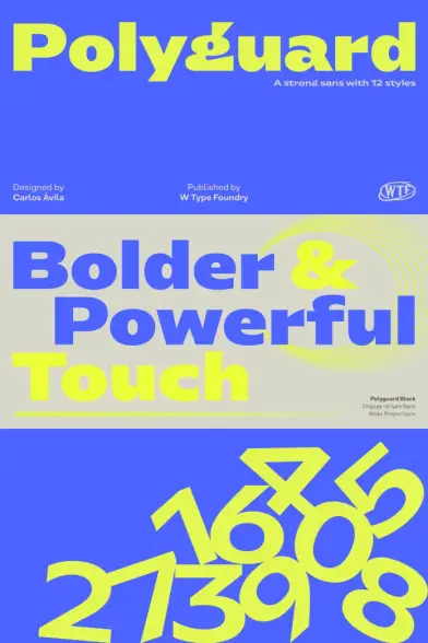
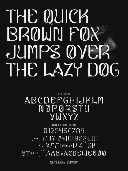
Polyguard Font Family: Six Weights, One Coherent Voice
The Polyguard font family ships with Thin, Light, Regular, Semibold, Bold, and Black cuts. Each weight arrives with a matching oblique. This is a thoughtful range for a display family. Many display typefaces sacrifice the lighter weights entirely, betting everything on heaviness. Avila chose differently, and that choice pays off.
The Thin and Light weights perform particularly well in editorial contexts where designers want the Polyguard character — those vertical terminals, the extended endings, the confident proportion — without the full visual mass of the Bold or Black. Used at large sizes in magazine layouts, they carry an architectural quality that heavier cuts can’t reproduce.
Conversely, the Bold and Black weights do what display fonts are supposed to do at their most essential: they command attention. Applied to product packaging, signage, or brand identity systems, they project exactly the kind of authority that makes a visual identity memorable.
Why Matching Obliques Matter More Than Most Designers Realize
Many foundries treat the oblique as an afterthought. They mechanically slant the upright and ship it. W Type Foundry took a different approach with Polyguard. Each oblique accompanies its weight as a genuinely useful companion, not a technical obligation.
For commercial and editorial work, this matters. The oblique extends the typographic range of the family, allowing designers to introduce rhythm, emphasis, and hierarchy without switching to a different typeface entirely. This is what I call the Internal Hierarchy Framework — building emphasis through weight and angle variation within a single type family rather than importing contrast from outside it. Polyguard supports this approach across all six weights.
Where the Polyguard Typeface Performs Best
Polyguard was designed specifically for high-visibility environments. The foundry describes it as ideal for branding, packaging, signage, editorial work, and commercial graphics. That’s a broad mandate, and Polyguard actually delivers on it — which is rarer than it sounds.
Many display fonts claim this kind of versatility but fall apart outside one or two specific applications. Polyguard holds together because its design logic is consistent. The structural decisions that make it excellent for a packaging headline — the stable proportion, the distinctive terminals — also make it work for a magazine cover or a brand identity system.
Here are the contexts where Polyguard consistently delivers strong results.
Brand Identity and Logo Systems
For brand identity, Polyguard brings both strength and flexibility. The typeface works as a standalone logotype in its heavier weights and equally well as a supporting display face in lighter cuts. Brands in sectors like technology, sportswear, architecture, automotive, and consumer goods will find Polyguard sits naturally in their visual language.
Moreover, the family’s internal range — six weights plus obliques — means a single typeface purchase can support a coherent multi-weight type system. This is efficient and consistent. It reduces visual entropy in brand communications while maintaining enough variation to build hierarchy.
Packaging Design
Packaging design demands that type perform under extreme constraints. Small surface areas, competing visual elements, and the need for shelf presence all put pressure on the typeface. Polyguard handles this environment naturally. Its proportions read clearly at moderate sizes. Its distinctive visual character stands out without requiring oversized treatment.
Additionally, Polyguard’s slightly extended endings become an asset in packaging contexts. They add micro-detail that rewards close inspection without demanding it. This creates what I’d call the Near-Far Resolution Effect — a design that reads as strong and cohesive from a distance and reveals intentional detail at close range.
Editorial and Magazine Typography
Editorial designers need display typefaces that carry a strong visual identity without overwhelming the image content they work alongside. Polyguard, particularly in its Thin through Semibold weights, threads this needle effectively. It brings personality to a headline without fighting the photograph or illustration it accompanies.
Furthermore, the slightly industrial undertone of Polyguard pairs well with contemporary editorial aesthetics that borrow visual language from architecture, fashion, and design culture. This cross-disciplinary relevance makes it a strong choice for publications targeting design-literate audiences.
Signage and Environmental Graphics
Signage is perhaps the most unforgiving application for any typeface. Legibility across distances, angles, and lighting conditions is non-negotiable. Polyguard’s stable proportions and clean structure make it reliable in signage contexts. The vertical terminals keep letterforms crisp, and the wider proportions ensure adequate spacing between letters even in bold-weight applications.
The Design Philosophy Behind Polyguard: Carlos Avila’s Approach
Understanding a typeface fully requires understanding the designer’s intent. Carlos Avila built Polyguard around three core concepts: strength, movement, and agility. These aren’t marketing terms layered on after the fact. They show up in the actual letterforms.
Strength appears in the proportion and weight distribution. Movement appears in the tension created by those extended terminals — the letterforms feel like they could shift, like they carry kinetic potential even at rest. Agility appears in the family’s range, its ability to perform across contexts without losing coherence.
This is what I’d call the Kinetic Structure Model in type design: letterforms that feel like they contain motion even while standing still. It’s the typographic equivalent of a runner in starting position — loaded, stable, and ready. Polyguard achieves this quality more convincingly than most display fonts in its category.
Industrial Roots, Non-Mechanical Execution
The tension between industrial origin and non-mechanical execution is central to understanding what makes Polyguard interesting. Purely industrial typefaces often sacrifice warmth and character for geometric rigor. They’re consistent, but they’re cold. Polyguard imports the structural logic of industrial design without importing its emotional distance.
This produces a typeface that feels both engineered and expressive. It has the confidence of something built to last. Yet it also has the kind of typographic personality that invites second looks. That combination is uncommon and commercially valuable.
How Polyguard Compares to Similar Display Sans-Serif Families
Placing Polyguard in the broader display sans-serif landscape helps clarify its specific contribution. Several strong families compete in similar territory: wide-proportion industrial display fonts, bold branding typefaces, and multi-weight display families with distinctive terminal treatments.
Polyguard distinguishes itself through the specificity of its terminal design. The combination of vertical stroke ends and slightly extended endings is not common. Most competitors choose between blunt cuts for a hard industrial look or angled terminals for a more dynamic feel. Polyguard creates a third option — vertical precision with extended reach — that reads as both controlled and energetic.
Furthermore, the six-weight range with matching obliques gives Polyguard practical breadth that many single-axis display families lack. For studios and designers who work across brand, editorial, and environmental applications, this range translates directly into workflow efficiency.
Polyguard for Branding vs. Strictly Display Use Cases
One worthwhile distinction for designers evaluating the Polyguard typeface: it performs differently in branding versus pure display contexts. As a branding typeface, it benefits from the full weight range and rewards systematic use across touchpoints. As a strictly display font used for one-off headlines or editorial moments, even a single weight delivers strong results.
This dual applicability — call it the Dual-Context Utility Principle — is a meaningful advantage. Designers can invest in a single family that serves both long-term brand systems and immediate typographic needs. Polyguard earns that investment.
Practical Usage Tips for Getting the Most From Polyguard
A typeface is only as good as the design decisions made around it. Here are some concrete approaches for working with the Polyguard font family effectively.
Weight Pairing Within the Family
The most natural pairings within the Polyguard family are Thin with Bold and Light with Black. These high-contrast pairings exploit the full visual range of the family. They create hierarchy without requiring any additional typeface. The Semibold works especially well as a mid-weight for subheadings or callout text in editorial layouts.
Spacing and Tracking
At large display sizes, Polyguard benefits from slightly reduced tracking. The slightly wide proportions mean letterforms already occupy comfortable horizontal space. Tightening the tracking slightly at headline sizes produces a more cohesive word shape and amplifies the font’s natural sense of stability.
Conversely, at smaller sizes or in signage applications, standard tracking or even a modest positive adjustment improves readability. The vertical terminals need space to read correctly at moderate viewing distances.
Color and Background Pairings
Polyguard handles reversed-out applications — white type on dark backgrounds — particularly well. The consistent stroke weight and clean terminals retain their structure without filling in, even in bold and black weights. This makes it reliable for dark packaging, environmental graphics, and digital applications with dark interfaces.
Why the Polyguard Font Family Matters for Contemporary Design
Type choices reflect cultural moments. The current appetite for typefaces that combine structural confidence with expressive character reflects something real about how brands want to communicate right now. Less neutral, less safe, more distinctive. More willing to take up space with a clear point of view.
The Polyguard typeface slots into this moment naturally. It doesn’t hedge, and it doesn’t compromise its character in pursuit of universal applicability. It makes clear choices and owns them. For designers who are tired of safe, interchangeable display fonts, that quality is genuinely refreshing.
My honest take: Polyguard is one of the more interesting display family releases of recent months. The design logic is coherent, the weight range is practical, and the visual identity is strong enough to be useful without being so niche that it limits where you can apply it. Carlos Avila made real decisions here, and they show.
If you work in brand identity, packaging, or editorial design and you’re building or refreshing your type toolkit, the Polyguard font family deserves serious consideration. Its combination of industrial backbone and expressive terminal design creates a typographic voice that feels current, confident, and durable.
Where to License the Polyguard Font Family
The Polyguard typeface is available through MyFonts. Licensing options cover desktop, web, app, and commercial use cases. As with any professional display typeface, checking the specific license terms before deploying across brand, packaging, or digital applications is worth the time.
Get the typeface from MyFontsFor designers who buy fonts through type marketplaces, Polyguard may also be available via partner distributors. Searching for “Polyguard W Type Foundry” will surface the current licensing options quickly.
Frequently Asked Questions About the Polyguard Font Family
What is the Polyguard font family?
The Polyguard font family is a sans-serif display typeface designed by Carlos Avila and published by W Type Foundry. It features slightly wide proportions, vertical stroke terminals, and extended endings that create a strong visual identity suited to branding, packaging, signage, and editorial design. The family includes six weights — Thin, Light, Regular, Semibold, Bold, and Black — each with a matching oblique.
Who designed the Polyguard typeface?
Carlos Avila designed the Polyguard typeface for W Type Foundry. Avila built the family around three guiding principles: strength, movement, and agility. These concepts shape the proportion decisions, terminal design, and weight range across the full family.
What are the best uses for the Polyguard font?
Polyguard performs best in high-visibility design contexts. Strong applications include brand identity systems, product packaging, environmental signage, magazine headlines, and commercial advertising. The family’s six-weight range makes it flexible enough to support both large-scale brand systems and individual headline applications.
How many weights does the Polyguard font family include?
The Polyguard font family includes six weights: Thin, Light, Regular, Semibold, Bold, and Black. Each weight includes a matching oblique, giving the family twelve fonts in total. This range supports typographic hierarchy within a single family without requiring additional typefaces.
Is Polyguard suitable for body text or only for display use?
Polyguard is a display typeface designed primarily for headlines, branding, and high-visibility typographic applications. Its slightly wide proportions and distinctive terminal design are optimized for large-scale use. For body text, designers typically pair it with a neutral, highly legible text face that complements its character without competing with it.
What makes Polyguard different from other industrial sans-serif fonts?
Most industrial sans-serif fonts prioritize geometric bluntness or mechanical rigidity. Polyguard takes a different approach by combining structural stability — through its wide proportions and vertical terminals — with a sense of kinetic energy generated by its extended endings. This produces a typeface that reads as both engineered and expressive, which is an uncommon combination in the display sans-serif category.
Does Polyguard work well for packaging design?
Yes. Polyguard is particularly well-suited to packaging design. Its proportions hold structural presence at moderate sizes, its distinctive terminals add detail that rewards close inspection, and its heavier weights project shelf authority effectively. The family also handles reversed-out applications — white type on dark backgrounds — without losing terminal clarity.
What type of brands should consider using the Polyguard typeface?
Brands in sectors that value strength, precision, and visual authority will find Polyguard a strong fit. These include technology companies, sportswear and activewear brands, architectural firms, automotive brands, and premium consumer goods. Editorial publications targeting design-literate audiences are also well-positioned to use Polyguard effectively.
Where can I license the Polyguard font family?
The Polyguard font family is available through MyFonts. Designers can search for the family directly through the foundry’s website or through authorized type distributors. Standard commercial licensing covers desktop, web, app, and print applications.
How should I set tracking when using Polyguard for headlines?
At large display sizes, a slight reduction in tracking — typically between -10 and -20 units depending on the application — produces a more cohesive word shape and amplifies the font’s natural sense of visual stability. At smaller sizes or in signage applications, standard or slightly positive tracking improves readability by giving the vertical terminals adequate space to register clearly.
Check out other popular typefaces in the Fonts category here at WE AND THE COLOR COLOR.
#displayFont #font #fontFamily #Polyguard #typeface #WTypeFoundry