| futurefonts.xyz | https://www.futurefonts.xyz |
Future Fonts
- 651 Followers
- 71 Following
- 37 Posts
Thanks for the shout out! The YouTube live can be watched here;
https://www.youtube.com/live/1yWAogdTMS0?si=hY4tkuvJGL5TNW7l

HyperTalks 3.0
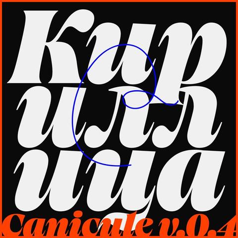
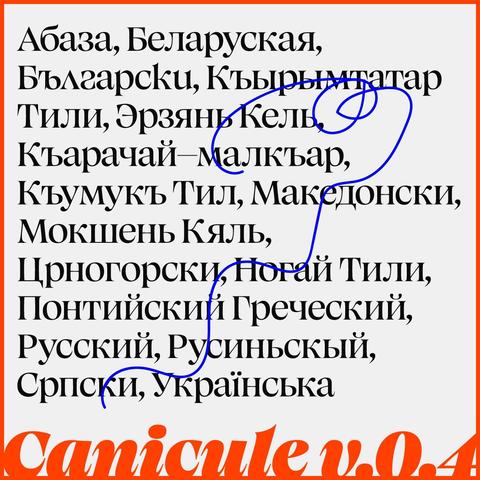
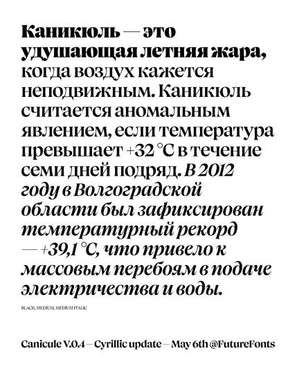
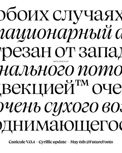
💥I just launched Canicule v.0.4 update on @futurefonts . This one brings Cyrillic support!
Kudos to @zacan_macan for lending a helpful eye with the Cyrillic
Go check it out!
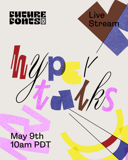
Tomorrow is HyperTalks 3.0! This year we have seven lightning talks from type and graphic designers in the Future Fonts community. It’s free, and will stream live at 10am PDT. Friday, May 9th (Tomorrow).
Watch here: https://www.youtube.com/watch?v=1yWAogdTMS0

HyperTalks 3.0
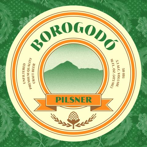
Borogodó 0.3 is out on Future Fonts 🙂
15 styles now, 42 in total coming soon. Priced at Naipe's single style price point so really a steal.
Trial fonts are free, boosting this post too!

Borogodó by Naipe Foundry - Future Fonts
Borogodó is a high contrast sans-serif in three optical sizes, bringing couture looks with a tropical feel to any part of your design project. Borogodó in Brazilian Portuguese is often used to describe someone or something that has a special charm, charisma, or appeal, and our Borogodó is meant to add this swag to your branding, packaging and editorial projects in any size you may need it. Use Borogodó for projects where text is not afraid to stand out.
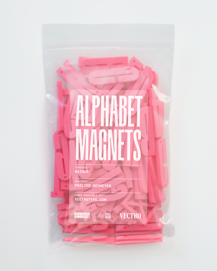
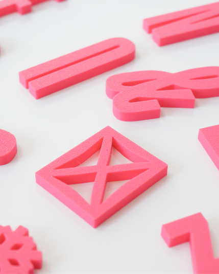
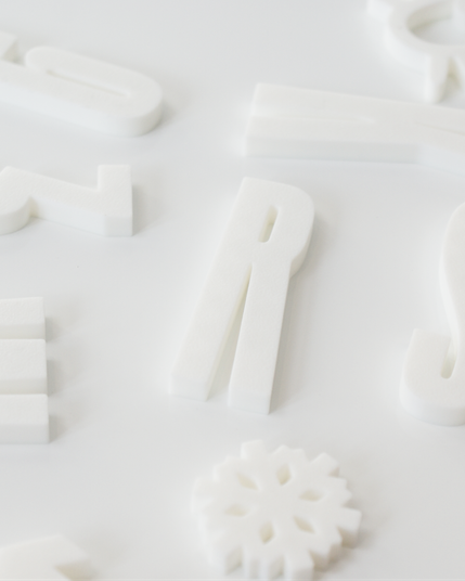
We’ve turned Rainer, by Philipp Neumeyer, into magnets! In case you wanted nice type on your fridge, mailbox, filing cabinet, or car. Available in pink or white. Available at https://goods.future-fonts.com
We added the much requested static instances, to support software that does not yet support variable fonts.
Get your free update (if you already purchased version 0.1) or get it now at @futurefonts
Up next: diacritics!
Tegner v0.3 by Linda Hintz. This update includes a small character set extension, as well as a cat to join its friend, the owl! And just like Tegner, that should make anyone soft on the inside, regardless of the hard exterior. Next up new widths.
New release Pétanque, by Spaghetype, is a display sans serif with rational geometry and irrational pizzazz. Its distinctive feature is playing with the exact same circle on lowercase and uppercase letters, as well as on diacritic and punctuation marks. Taking cues from the early experimental stages of Fat Faces (Robert Thorne & William Thorowgood circa 1820), Pétanque characters are drawn so all the balls fit in a fun yet judicious way.
Pétanque by Spaghetype - Future Fonts
What happens if you replace a ball terminal with a sport ball? Pétanque is a display sans serif with rational geometry and irrational pizzazz. Its distinctive feature is to play with the exact same circle on lowercase and uppercase letters, as well as on diacritic and punctuation marks. Inspired by the early experimental stages of Fat Faces (Robert Thorne & William Thorowgood circa 1820), Pétanque characters are drawn so all the balls can fit in a fun yet judicious way.
