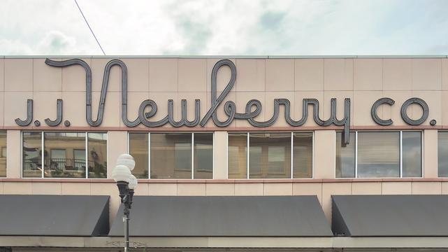
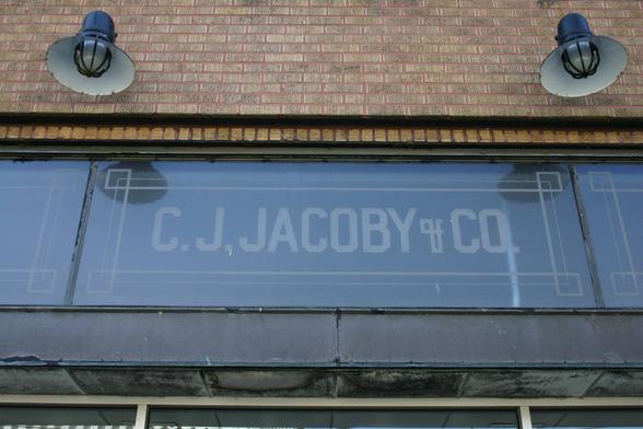
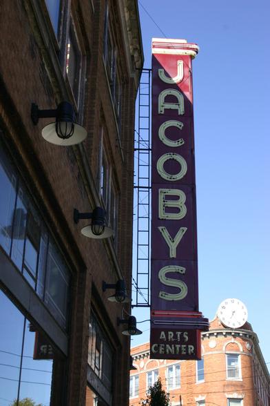
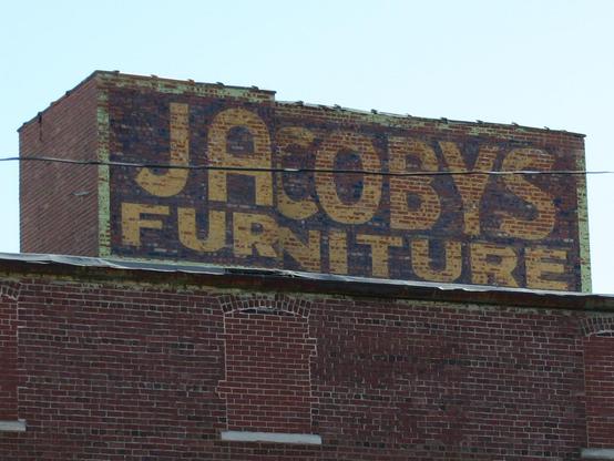
Just back from a quick trip to Portland. One of the finer signs we saw on the way home:
https://www.flickr.com/photos/stewf/55275669932/
Four-stroke neon upright script with small caps. The beauty of this letter design is there is a common baseline that can sit on top of those windows – no flat vs. round letters to negotiate (all overshoot). Well, except for the y, but that’s a small price to pay for a stunner of a sign.