Skeuomorphism in Design: Why Your Phone Once Looked Real (And Why It’s Happening Again)
Do you remember the old Apple Notes app? The one that looked like a yellow legal pad, complete with a torn paper edge at the top. Or the bookshelf app that was, quite literally, a digital wooden bookshelf? If you nod your head, you’ve experienced skeuomorphism in design. It was the reigning philosophy that made our digital world feel strangely… real. For a long time, everything on your screen tried its best to imitate a physical object you already knew. The buttons looked glossy and pressable, the calendars had leather stitching, and the garbage can icon even crinkled when you deleted a file.
But then, almost overnight, it all vanished. The wood grain, the leather, and the realistic shadows were replaced by clean lines, bold colors, and stark, flat shapes. We entered the era of Flat Design. Have you ever stopped to wonder why that massive shift happened? What was the point of all that realism in the first place, and why was it so abruptly abandoned? The story of skeuomorphism in design isn’t just a footnote in tech history; it’s a fascinating cycle that reveals how we think, how we learn, and what we crave from our technology. And guess what? It’s starting to come back.
What Exactly Is Skeuomorphism in Design? Your First Digital Teacher
Imagine meeting a total stranger who doesn’t speak your language. How would you communicate? You’d probably use gestures, pointing to objects to get your meaning across. In the early days of personal computers, the digital world was a stranger. Concepts like “files,” “folders,” and “applications” were completely abstract. People needed a guide.
This is where the genius of skeuomorphism in design comes in. Designers at places like Xerox PARC and, most famously, Apple, decided to make the digital world look like the physical one.
- A stack of digital documents was placed inside a graphic that looked like a manila folder.
- Deleting a file meant dragging it to an icon that looked like a trash can.
- A program to perform calculations was designed to look exactly like a pocket calculator.
These weren’t just cute decorations. They were a brilliant teaching tool. In user experience (UX) design, there’s a concept called “affordance.” An affordance is a visual cue that tells you how to use something. A doorknob, for example, affords turning. A chair affords sitting. Skeuomorphism gave digital objects clear affordances. A button looked raised and shadowed, practically begging you to press it. It was a bridge built on familiarity, reducing the fear and confusion of a new frontier. It made computers approachable for everyone, not just engineers.
The Golden Age: When Realism Ruled Our Screens
As technology improved, so did the realism. Faster processors and higher-resolution screens gave designers a powerful new canvas. Suddenly, they could render incredibly detailed textures, lifelike shadows, and glossy reflections. This led to the peak era of skeuomorphism in design, particularly in the early versions of Apple’s iOS.
Do you recall the Game Center app? It was covered in a felt green texture, just like a poker table. The Find My Friends app was famously (or infamously) slathered in stitched leather. This design philosophy was a celebration of what was technologically possible. It made digital interfaces feel substantial, premium, and meticulously crafted. For a while, the more realistic an app looked, the higher its perceived quality. This approach to skeuomorphism was about creating a rich, tactile world inside a flat piece of glass. It wasn’t just about function anymore; it was about feeling.
The Great Backlash: Skeuomorphism vs. Flat Design
So, if it was so helpful, what went wrong? Why did Apple get rid of skeuomorphism so dramatically with iOS 7? A few critical things changed.
First, the users changed. A new generation grew up as “digital natives.” We no longer needed a digital bookshelf to understand what an e-reading app was. The visual metaphors went from being helpful teachers to condescending crutches. They felt dated and, to some, a bit tacky. The stitched leather wasn’t helping you find your friends any faster; it was just visual clutter.
Second, the design philosophy began to feel dishonest. A digital calendar doesn’t need paper-like constraints. It can be infinite, searchable, and collaborative. Forcing it to look like a physical desk blotter was limiting its true potential. Critics argued for a design language that was “honest” to the digital medium. Why should a screen pretend to be wood or paper?
Finally, a huge technical problem emerged: the rise of multiple screen sizes. The highly detailed, ornate look of skeuomorphism that was beautiful on a large desktop monitor couldn’t scale down elegantly to a small smartphone screen, let alone a watch. It was a nightmare for responsive design.
In response, the pendulum swung hard in the opposite direction. Flat Design arrived, led by Microsoft’s Windows Phone and later adopted by Google and Apple. It stripped away every non-essential decoration.
- No more drop shadows.
- No more realistic textures.
- No more gradients.
Instead, the focus was on typography, solid color blocks, and simple icons. It was clean, minimalist, fast, and, most importantly, it looked great on any screen size. The war of skeuomorphism vs. flat design had a clear winner, and our screens became beautifully, and sometimes confusingly, flat.
Is Skeuomorphism Making a Comeback? Meet Neumorphism
For years, Flat Design was the undisputed king. But it had its own usability problem. Without shadows or borders, it was sometimes hard to tell what was a button and what was just a label. Is that piece of text clickable? You often had to poke it to find out.
This led designers to slowly reintroduce subtle layers and soft shadows, a style sometimes called Flat 2.0. But a more interesting trend has emerged, one that feels like a direct descendant of skeuomorphism. It’s called Neumorphism.
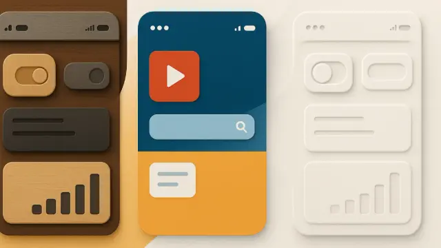
Neumorphism (a mix of “new” and “skeuomorphism”) is the strange and beautiful child of skeuomorphism and flat design. It doesn’t try to imitate leather or wood. Instead, it imagines your screen as a single, soft, continuous surface, like a piece of clay or pliable plastic. Elements like buttons and cards aren’t placed on top of the surface; they seem to be extruded out of it or pressed into it. This effect is created using very subtle inner and outer shadows.
The goal here isn’t to teach you what a button is. You already know. The goal is purely about feeling. In a world of hard, cold glass screens, neumorphism offers a simulated softness and tactility. It’s a quiet, minimalist aesthetic that brings back a sense of dimension. However, it’s not without flaws. A major critique of neumorphism design is its accessibility issues, as the low-contrast elements can be very difficult for people with visual impairments to see clearly. Despite this, its popularity shows that we’re craving depth and materiality once again.
Your Interface, Your Experience: The Future of Digital Design
So, what does this cyclical journey of skeuomorphism in design mean for you? It shows that the way your phone and computer look isn’t arbitrary. It’s a constant negotiation between a few key forces:
Teaching vs. Assuming: Does the design need to teach you, or can it assume you already know what to do?Realism vs. Authenticity: Should it imitate the real world, or should it be authentic to its own digital nature?Function vs. Feeling: Is the goal purely to get a task done efficiently, or is it also to create a pleasant sensorial experience?The journey from skeuomorphism to flat design and now toward neumorphism is a story of our own evolving relationship with technology. We first needed a teacher, then we wanted an efficient tool, and now, it seems, we want a tool that also feels good to use.
As we move toward even more immersive technologies like Augmented Reality (AR) and Virtual Reality (VR), this cycle will undoubtedly continue. How do you design a button that floats in mid-air? You’ll probably need new metaphors—a new form of skeuomorphism in design—to make that feel natural.
The next time you tap an icon on your phone, take a closer look. Is it perfectly flat, or does it have a soft shadow? Does it try to look like something else, or is it something entirely new? You’re looking at a single frame in the incredible, ongoing story of how we make the digital world our own. What do you think will come next?
Further Reading & Sources
If this sparked your curiosity and you want to explore the principles behind interface design, here are some of the foundational books and resources that informed this article. They are fantastic reads for anyone interested in why things look the way they do.
The Design of Everyday Things by Don Norman- This is the essential book on user-centered design. Norman is the person who coined the term “user experience” and introduced critical concepts like “affordances”—the very idea that an object’s appearance should suggest how it’s used. It’s the “why” behind early skeuomorphism’s success.
Don’t Make Me Think, Revisited: A Common-Sense Approach to Web Usability by Steve Krug- A fun, quick, and incredibly insightful read. Krug’s book is the bible for making technology intuitive. While not directly about skeuomorphism, his principles of clarity and reducing cognitive load explain why designers eventually moved away from skeuomorphism’s visual clutter toward the simplicity of flat design.
Steve Jobs by Walter Isaacson- This biography provides the fascinating, real-world backstory to the great design shift at Apple. It details the tension between Scott Forstall (the champion of skeuomorphism in iOS) and Jony Ive (the minimalist who ushered in the era of Flat Design), giving a human face to this major philosophical change in tech.
Google’s Material Design Guidelines- If you want to understand the principles of modern “Flat 2.0” design, there’s no better source than the official documentation from Google. Material Design is a comprehensive system that explains how to use layers, shadows, and motion to create interfaces that are both clean and intuitive. It’s the rulebook for much of the design you see today.
“Neumorphism in user interfaces” by Michal Malewicz (and subsequent articles on UX Collective/Medium)- Neumorphism is a recent trend born from online design communities. Articles like Malewicz’s on the UX Collective blog were among the first to define the aesthetic, give it a name, and explore its potential (and its accessibility problems). These articles are a great example of how design philosophy evolves in real-time online.
Feel free to find other trending topics in WE AND THE COLOR Design and Web Design categories, or read more about Skeuomorphism in Design in an article on our Reddit group.
#design #flatDesign #interfaceDesign #skeuomorphism #ui #uiDesign #ux
