I wrote a piece in our weekly charts blog format at @datawrapper.
https://www.datawrapper.de/blog/migration-mediterranean-sea
#migration #mediterranean #weeklycharts #datawrapper
I wrote a piece in our weekly charts blog format at @datawrapper.
https://www.datawrapper.de/blog/migration-mediterranean-sea
#migration #mediterranean #weeklycharts #datawrapper
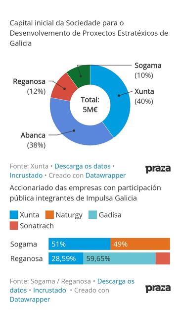
Accionariado das empresas con participación pública integrantes de #ImpulsaGalicia
@Xunta #Naturgy #Gadisa #Sonatrach
#Sogama
51%
49%
#Reganosa
28,59%
59,65%
Fonte: Sogama / Reganosa
Creado con #Datawrapper
#altrinon
Damit habe ich jetzt eine erste Tabelle mit allen Städtenamen, den Koordinaten und der Bevölkerungszahl im Jahr 2025. Die kommt jetzt mal in #Datawrapper.
Vor fünf Jahren hab ich die Karten mit #Tableau erstellt, das erschlägt mich aber, wenn ich da jetzt wieder reingucke. Mal gucken, ob @datawrapper damit klarkommt.
Loading takes a while, so be patient.
I also added two graphs, that I built with #DataWrapper.
Sorting by "Last Status" seems to not work totally right, and I really don't want to know, how it looks on mobile (yet) 😉
There is a search box, that works really nice.
Any suggestions, comments, help and ideas are welcome. But please keep in mind, this is something, I'm working on in my free time – of which there is even less, now that my sons are older.
In my digital history class this semester, we were originally going to do some topic modeling work with MALLET but students struggled to get it installed.
So we pivoted and a few weeks later, used #Voyant to do the modeling, then Datawrapper to play with visualization.
Was a real success, and bringing #Datawrapper into the mix really helped compensate for Voyant's limitations in terms of visualization. The students really enjoyed trying different visualizations out, even if they were a bust, and trying to make sense of what they were seeing.
Planning to type up some notes as a more formal lesson plan. If I ever get a website up and running again, I'll share it there (someday).
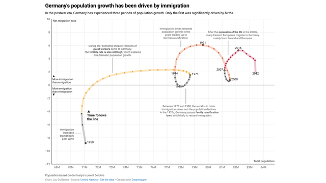
Very nice connected scatterplot made by Luc Guillemot from #datawrapper: “Connecting the dots of population growth in Germany”
More: https://blog.datawrapper.de/germany-population-connected-scatterplot/