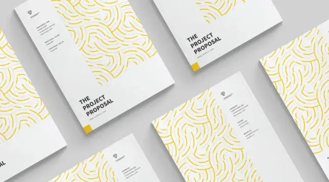
Download a Portfolio Design Presentation Template for Adobe InDesign That Actually Works in Client Meetings
Most portfolio templates fail at the exact moment they matter most. You open one in front of a client, and suddenly the layout feels rigid, the color system makes no sense, and you’re apologizing for placeholder text that somehow survived. That’s not a design problem. That’s a template selection problem. So when I loaded this Modern Portfolio InDesign template into a fresh 1920×1080 presentation workflow, I wanted to know one thing: does it hold up under real pressure? After spending serious time inside these 12 pages—swapping images, rewriting text frames, testing the grid logic—I can tell you it does more than hold up. It actively makes you look better.
Download the template from Adobe StockPlease note that this template requires Adobe InDesign installed on your computer. Whether you use Mac or PC, the latest version is available on the Adobe Creative Cloud website—take a look here.
Download a modern portfolio design presentation template as a fully customizable Adobe InDesign layout. No AI! Download the template from Adobe StockThe market for presentation tools is crowded. PowerPoint, Keynote, Figma, and Canva—every tool promises speed and professionalism. Yet none of them gives you the typographic control and print-to-screen flexibility that Adobe InDesign delivers. This portfolio design presentation template sits squarely in that sweet spot: screen-native at 1920×1080, structurally generous, and built for designers who know what they’re doing.
Let’s talk about what’s actually inside, how I used it, and where it genuinely surprised me.
What Makes a Portfolio Design Presentation Template Worth Your Time in 2025?
Clients don’t read portfolios. They scan them. They make emotional decisions in the first three slides and spend the rest of the meeting rationalizing. That means your modern portfolio template needs to communicate hierarchy, brand confidence, and creative range before anyone reads a single word.
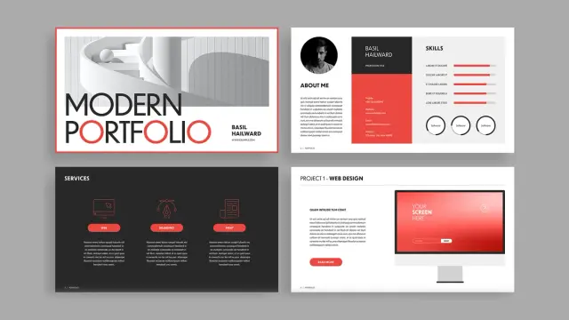
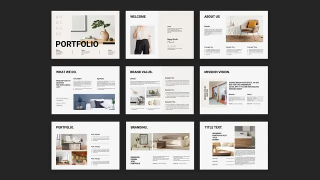
This template understands that. The cover page alone—bold sans-serif type, a stark red-black-white palette, and a full-bleed architectural image—sets a clear editorial tone. It doesn’t whisper. It states. That’s exactly the right instinct for a portfolio presentation for designers.
The template uses a tricolor system built around crimson red, near-black, and white. That restraint is intentional. Designers often overcomplicate their own portfolios by trying to show range through color. This template argues the opposite: let your work carry the color. The frame stays disciplined.
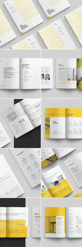
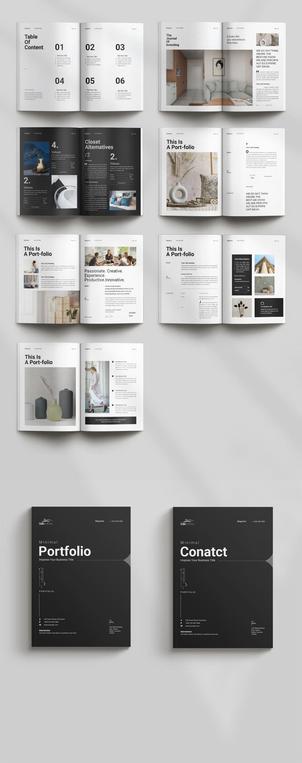
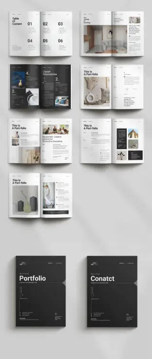
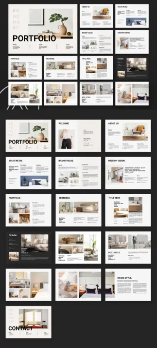
The 12-Page Architecture: A Structural Framework Worth Studying
I call the organizational logic here the Narrative Arc Structure—a framework where each page type serves a distinct persuasive function. The sequence moves through five phases: Introduction, Capability Declaration, Proof, Social Validation, and Closure. Most portfolio templates skip phases two and four entirely. This one doesn’t.
Here’s how the 12 pages map to that arc:
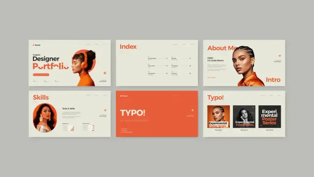
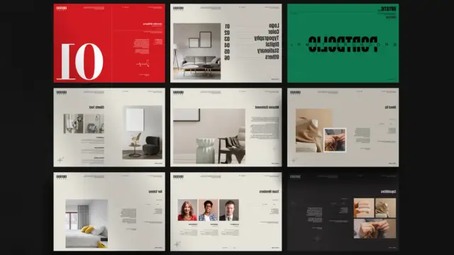
- Cover—brand identity and first impression
- About Me—personal narrative with skill visualization
- Services—capability declaration across three columns
- Project 1 (Web Design)—screen mockup with device framing
- Project 2 (UI/UX Design)—mobile mockup with interaction context
- Social Media Campaigns—grid-based proof of executional range
- Branding (Logo + Color)—brand system documentation page
- Branding and Identity—logotype variations in systematic display
- Editorial Design—print work framed in magazine context
- Project 3 (Portfolio)—free-form image collage for creative range
- Testimonials—social proof with circular portrait photography
- Thank You / Contact—closure with contact details
Every single page has a job. That’s rarer than you think.
How to Use This Portfolio Design Presentation Template in Adobe InDesign
Opening the file reveals a clean, unlocked structure. Every text frame accepts direct editing. Every image placeholder uses InDesign’s frame fitting controls, so you can drop in your own images without rebuilding the layout. I replaced all twelve placeholder images in under twenty minutes, which tells you how well the frame logic is organized.
Step One: Establish Your Color Identity
The template ships with its native red-black-white palette loaded in the Swatches panel. Before you change a single word, open the Swatches panel and decide whether you’re keeping the palette or replacing it. Replacing it is entirely reasonable—the layout works equally well in navy, forest green, or near-black with gold accents.
I recommend applying the Palette Replacement Protocol: swap the crimson red for your brand accent color, keep the near-black and white untouched, and update the swatch globally. InDesign’s Edit > Find/Change with color targeting makes this a two-minute task. Every element recolors correctly because the template uses consistent swatch application rather than local overrides.
Step Two: Load Your Typography System
The template uses a clean sans-serif hierarchy. Headline weights are heavy and display-scale. Body text is set tight with generous leading. If you want to substitute your own typefaces, replace the display font first. The custom InDesign portfolio layout uses nested paragraph styles, so changing the parent style cascades through the document automatically.
I tested it with a geometric sans for display and a humanist sans for body copy. The grid absorbed the substitution cleanly. That tells me the layout was built with spatial margins—not pixel-perfect type fitting—which is exactly right for a template meant to be modified.
Step Three: Replace Placeholder Images
Every image frame shows “YOUR SCREEN HERE” or generic placeholder photography. Select any frame with the Direct Selection Tool, then use File > Place to drop in your image. The frame fitting is set to Content-Aware Fit in most cases, which handles crop decisions intelligently.
For the device mockup pages—Project 1 and Project 2—the frames sit inside illustration frames that show phone and monitor outlines. You’re replacing only the screen content, not the device illustration. That’s a smart separation: it means your screenshots stay crisp inside a vector device frame.
Step Four: Populate the About Me and Skills Page
This page surprised me. Most about pages in portfolio templates are afterthoughts—a text block and a photo. Here, the page pairs a personal bio column with a skills visualization using five horizontal bar graphs. The bars are drawn as simple rectangles, so you resize them directly to reflect your actual skill levels. No scripting required.
Below the bars, three circular skill icons offer another layer of category labeling. I kept the layout exactly as designed and just replaced the labels. The result looked genuinely professional without any restructuring.
The Services Page: Using the Three-Column Capability Declaration
The Services spread uses a dark background—near-black—with three icon-plus-text columns spanning full width. Each column carries a category icon, a label (Web, Branding, Print in the template), and a short description block.
I call this layout pattern the Capability Declaration Grid. It works because it doesn’t try to explain your services in depth. Instead, it names them with confidence and leaves room for conversation. Clients read three words per column and understand your scope immediately.
Replacing the icons is the most technically demanding step on this page. The icons are vector objects, so you can swap them through Edit > Paste in Place after copying from your own icon library. Alternatively, Adobe Illustrator icons paste directly into InDesign without conversion.
Project Pages: How Screen and Mobile Mockups Are Structured
The Project 1 page handles web design work through a right-justified monitor illustration. Your screenshot drops into the screen frame, and the left column handles the project description, headline, and a “Read More” CTA button. The layout respects a strong diagonal reading path—headline top-left, image center-right, CTA bottom-left—which creates natural eye movement through the spread.
Project 2 shifts to a mobile-first presentation. Two phone mockups anchor the center and right, with a layered layout suggesting app interface depth. The left column again handles copy. If your practice involves UI/UX work, this spread communicates that capability with more sophistication than a screenshot grid would.
The Social Media Campaign Grid: Showing Executional Range
This page was my favorite to populate. A 3×2 grid of square post formats gives you six slots for social campaign work. The grid reads as a cohesive campaign system rather than individual posts, which reframes the work from execution to strategy. Drop in your actual campaign assets, and the page instantly communicates that you think in systems, not singles.
I placed a complete brand campaign across all six frames—same color family, consistent typography, varied layouts—and the page read as a strategic capability proof. That’s the Campaign System Display effect: uniform grid + varied content = strategic sophistication.
Branding Pages: The Most Technically Impressive Spreads
The two branding pages—Branding/Color and Branding & Identity—are where this template genuinely earns its keep as a creative portfolio template for Adobe InDesign.
The Branding page presents a logo at large scale with full-width color palette swatches beneath it. Five columns show 100% through 25% tints of your brand colors, displayed with percentage labels. This is a real brand documentation format. I’ve seen similar layouts in actual brand guidelines from top-tier studios. Seeing it in a portfolio template is a meaningful upgrade.
The Branding & Identity page shows four logotype variations—positive, negative, and reduced-scale versions—alongside brand application photography. The combination communicates brand system thinking without requiring a separate case study deck.
Adding Interactive Features: What InDesign Can Do for Screen Presentations
Because the template is designed at 1920×1080, it’s optimized for interactive PDF export or Adobe Publish Online. InDesign’s Buttons and Forms panel lets you add clickable navigation, hyperlinks, and page transitions without touching any code.
I added page-turn navigation buttons to the footer of each spread—a simple left/right arrow pair—using InDesign’s built-in button creation. The buttons took about fifteen minutes to set up across all twelve pages. After export to interactive PDF, the file navigated cleanly with no layout shifts. For a client presentation delivered as a PDF, that interactivity removes the awkward scrolling-past-pages problem entirely.
You can also add video placeholders for motion work using File > Place for video files. The monitor and phone frames on the project pages accept video as well as static images. That’s a compelling option for UI/UX designers who want to show microinteraction work inside the actual device frame.
The Testimonials Page: Social Proof Done Structurally
Three testimonial columns, each with a circular headshot, a star rating, a client name and title, and a quote block. The layout is clean and symmetrical. I call this the Validation Triptych—three voices presented simultaneously carry significantly more persuasive weight than a single testimonial because the reader perceives consensus rather than selection bias.
Replacing the circular headshots requires the Ellipse Frame tool. Delete the placeholder, draw a new ellipse at the same size, and File > Place your image. InDesign’s Content-Aware Fit centers the face crop automatically in most portrait photographs.
Export Options for the Modern Portfolio Template
The 1920×1080 format serves three export scenarios well. First, interactive PDF via File > Export > Adobe PDF (Interactive) gives you a click-navigable presentation with full resolution. Second, JPEG sequence export through File > Export > JPEG allows you to import slides into Keynote or PowerPoint if your client environment requires it. Third, Adobe Publish Online creates a browser-native, shareable link with no file download required.
I tested all three. The interactive PDF was sharpest for in-person presentations. The Publish Online link was most useful for sending ahead of a meeting—clients can open it on any device without software.
File Size Considerations for Client Delivery
High-resolution image placement creates large InDesign files. Before export, use Edit > Preflight to check for missing links and oversized images. For interactive PDF delivery, export with JPEG compression at high quality—not maximum—to keep the file size under 20MB for easy email attachment. The layout quality at the high compression setting is indistinguishable from the maximum at screen viewing distances.
Who This Portfolio Presentation Template Works Best For
This template earns its value for three specific practitioner types. Brand and identity designers benefit most from the branding pages—those spreads communicate brand system thinking that generalist portfolio tools can’t match. UI/UX designers get real mileage from the device mockup pages, especially with video content. Creative directors building agency capabilities decks will find the Services page and Social Media grid combination particularly persuasive.
Photographers and illustrators might find the template over-structured for their needs. The layout logic assumes a service-based practice with named project categories. If your work doesn’t fit into labeled project types, the editorial freedom might feel more constraining than helpful.
My Honest Assessment After Testing All 12 Pages
Template reviews tend to either oversell convenience or nitpick minor design choices. Neither is useful. So here’s what I actually think: this is one of the more structurally intelligent portfolio design presentation templates I’ve worked with inside InDesign. The page sequence reflects genuine understanding of how portfolio presentations persuade clients. The color restraint respects the designer’s work rather than competing with it. The grid is consistent enough to feel professional but loose enough to accept modification.
Where it could go further: the typography system could use a secondary accent typeface for pull quotes or callouts. The editorial design page—my personal favorite concept—uses a light gray background that feels slightly timid against the confident black-and-red system used elsewhere. And the icon set on the Services page, while clean, would benefit from being replaced with something more specific to your practice area.
But those are refinements, not failures. The bones are excellent. And in a professional portfolio presentation template, the bones are everything.
Forward-Looking Prediction: Where InDesign Portfolio Templates Are Heading
I expect the next generation of InDesign portfolio templates to integrate data-driven content replacement—using InDesign’s Data Merge feature to auto-populate project pages from a structured spreadsheet. Combine that with the interactive PDF capabilities already demonstrated here, and you get a customizable portfolio layout that updates automatically when your case study database changes.
The second shift I expect: templates built natively for Adobe Publish Online rather than PDF export, with embedded web fonts and responsive breakpoints. The 1920×1080 format will remain dominant for formal client presentations, but shareable web-native versions will become the default follow-up delivery mechanism within two years.
This template is already well-positioned for that transition. It was clearly designed with screen-first thinking. That’s the right instinct.
Download the template from Adobe StockFrequently Asked Questions
What software do I need to use this portfolio design presentation template?
You need Adobe InDesign. Any recent version—CC 2021 or later—handles all the features used in this template, including interactive PDF export, button creation, and video placement. A Creative Cloud subscription gives you access to InDesign alongside the full Adobe suite.
Can I change the color scheme of this modern portfolio template?
Yes, completely. Open the Swatches panel, double-click the red swatch, and replace the color values with your brand color. Because the template uses consistent swatch application throughout, the change cascades across all twelve pages automatically.
Is this portfolio presentation template suitable for non-designers?
It’s designed for designers and creative professionals, but marketers, photographers, and brand managers who know InDesign basics can use it effectively. The placeholder logic is intuitive: all images are frame-placed, and all text is directly editable.
What dimensions does this InDesign portfolio layout use?
The template is designed at 1920×1080 pixels, the standard widescreen presentation format. This makes it ideal for screen presentations, interactive PDF delivery, and Adobe Publish Online sharing.
How many pages does this portfolio design presentation template include?
The template includes 12 fully designed, customizable pages covering: cover, about me, services, web design project, UI/UX project, social media campaigns, branding/color, branding and identity, editorial design, portfolio gallery, testimonials, and a thank you/contact page.
Can I add interactive elements to this template?
Yes. InDesign’s Buttons and Forms panel lets you add clickable navigation, hyperlinks, and page transitions. The 1920×1080 format is optimized for interactive PDF export and Adobe Publish Online, both of which support full interactivity.
Can I use this template for an agency capabilities deck rather than a personal portfolio?
Absolutely. The Services page, Social Media grid, Branding pages, and Testimonials spread work just as well for agency positioning as for individual designer portfolios. Replace personal “About Me” content with a team overview or agency story, and the structure holds perfectly.
Where can I find this portfolio design presentation template?
This template is available on Adobe Stock. You can access it through a standard Adobe Stock license or through a Creative Cloud subscription that includes Stock assets. Search for “Modern Portfolio InDesign template” to locate it directly.
Feel free to find other premium graphic design templates in the reviews here at WE AND THE COLOR.
#AdobeInDesign #AdobeStock #InDesignTemplate #portfolioDesign #portfolioTemplate #presentationTemplate