Hey UI folks.
Which one's ON and which one's OFF?
Can we please get checkboxes back?


A while back I got a new digital 'scope. The one I'd been using was okay, but only 8-bit and had some other limitations. The vertical resolution was actually starting to make it difficult to get accurate-enough readings of some things I was working with.
The new one is 12-bit. That is likely to be better than I will ever need. I'm happy with it. Being several years newer (and a different brand) it brings some new #features to the table.
One is that you can use it as a digital logic analyzer - it can sample a whole lot of inputs (rather than just 4 analog channels) quickly if it only has to tell on from off. But you have to get a whole lot of #signals into the #scope before you can do that, so you need a #connector with a lot of pins/signals.
You could use something standard for this type of application (which is still going to be a limited-audience part), or a custom thing, but those options are expensive. So instead, if you're the manufacturer, you find a common (and therefore #cheap) #connector with lots of #pins, and you re-use that. Done and dusted!
They picked ... the HDMI connector. It's there at the bottom of the middle of the control panel. And in the manual is the prominent (not) warning:
> WARNING: Non-standard HDMI interface, Siglent device ONLY, or you will damage your device.
Yes, if you plug anything HDMI-related into this obvious #HDMI port, you will cause damage to your 'scope, or your other device.
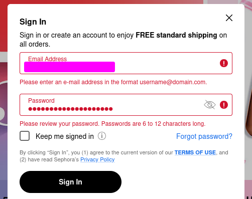
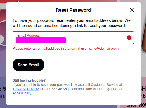
Once upon a time I created a Sephora account
Trying to log into it now, they have different validation on sign in than when I created the account, preventing me from logging in with my password
When trying to reset the password, it incorrectly validates my email address because it's not one of the 4 TLDs we used in 1990
Don't be like Sephora
Hostile Volume – A game about adjusting volume with intentionally bad UI
#HackerNews #HostileVolume #Game #BadUI #VolumeControl #IndieGames
And today I finished the annual "if you aren't gonna die you gotta pay taxes" ritual. I've taken over from my wife who had been doing it with TurboTax so I keep that going even though it's a bit pricey. I hate filling out forms and scanning PDFs in is a breeze.
On the minus side, every fourth fucking screen was an upsell attempt for something called MAX.
Every.
Fourth.
Screen.
Come on guys. They also have a few misleading "click this box" places where a purchase is next to an acknowledgement of "yes I read this required verbiage".
YouTube search is literally unusable now that they removed date sorting in search results.
I mean, Seriously?
The first thing I did after searching in YouTube was to sort by date. I have never used any of the other filter options. Not even the facets that remove search results.
