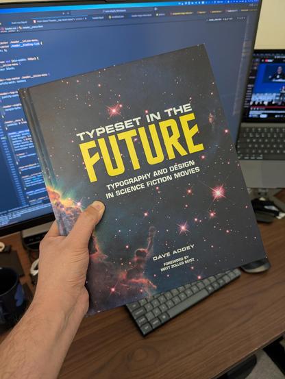
I'm glad there was a copy of this on eBay.

| Me | https://jamesbasoo.com |
CSS now has a new, alpha only, relative color syntax.
alpha(from var(--mycolor) / calc(alpha * 0.6))
Result is in whatever color space the origin color is. Just the alpha is changed or overwritten.
On the 20-step problem and the economics of agentic AI.
I’m looking for anyone in my circles who:
• is a front-end web developer
• has some design sense
• understands the allure of buying a Linux computer
• is open to paid work
A Linux computer company reached out asking if I was available for paid work on their website and while I would love to, I’m just not able to find the time right now. But they’re a great company and I would love to connect them with someone!
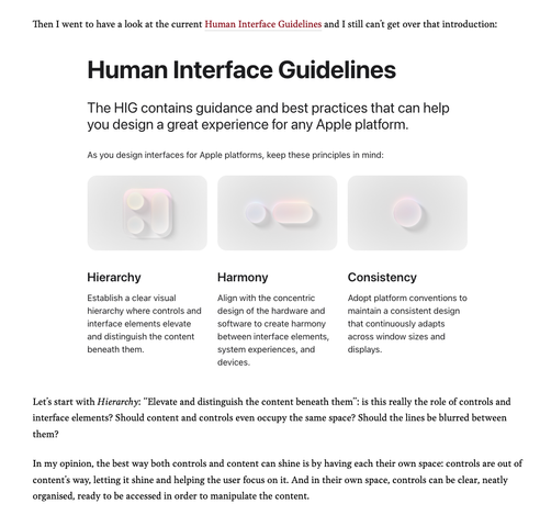
You know, I could write a whole blog post about this—and I might—but I think we need to start addressing the very likely possibility that the *entire thesis* that “UI should get out of the way” and “apps should focus on content” is wrong.
Apps aren’t just for looking at photos or videos. They’re for navigating through these things, organizing them, editing them. The tools to do those things should not get out of the way. They should be clearly defined and separate from the content.
But here we are with a new visual design language that somehow manages to compromise on both the content area *and* the UI.
I’m *living* on macOS Tahoe and I’m here to tell you that the apps that are a pleasure to use are the ones that haven’t adopted Liquid Glass (in essence... all the third-party apps.)
This should be a blog post. But I need to collect my thoughts and write it all better. So consider this a beta version. lol
@louie > But here we are with a new visual design language that somehow manages to compromise on both the content area *and* the UI.
This. So much this. I’ve had this truth before my eyes for the past 3 weeks, and I couldn’t condense it in so few words.
@louie I'm taking away a lesson from this: UI should be visually apparent such that it is easily found and recognized when needed. The user needs UI to interact with the content, so why shouldn't it have a distinct presence?
UI usually shouldn't be so flashy that it draws attention away from the content, but simultaneously it should not fade into the background and become illegible. Somehow Apple seems to be missing the mark on both of these points.
Using the AVP as a point of inspiration for the UI of their other OSs is a big mistake I think. It's more of a neat science project than a successful product.
Or they want it to be for consuming content - F1! Intruding into a space near you! - and nothing else.
@Middaparka @louie it can be both, but used to be they were tools first and now are consumption devices first.
Which may be one of the main reasons the macOS UI changes of the last years have rubbed so many people the wrong way. They are still meant to be tool-first devices but are being evolved with the sensibilities of consumption-first devices.
@gruber @louie I am trying to make sense of one more thing, why glass?
When Google introduced material design, it was inspired by paper & ink which makes sense tbh. We write on paper and we interact with paper in real life.
But why glass? I get that glass is a real life thing, but where do we see this liquid glass in real life? Or am I missing something and I am dumb?
@Himalaya @gruber @louie You’re not dumb, but I don’t think Material Design is all that useful either. Translating paper and ink into a glass screen makes less sense (to me) than trying to make it feel like you’re directly interacting with the glass.
I think Liquid Glass is a great direction, but v1 definitely has some poor implementations.
@chockenberry @gruber @louie Wait, what are you implying here? They do the UI design directly in Keynote? :)
Who is Mica for then?
@mrudokas @chockenberry @gruber @louie
The underlings who implement the bad ideas?
@jonhendry @chockenberry @gruber @louie Looking at the Icon Composer and how it was presented during the WWDC, I kind of don’t know what to think.
I know it’s v1, but it’s like doing the handoff to yourself, over, and over, and over again – more or less.
If that is the understanding of the proper tooling and development convenience, then it’s really fucked up – the bicycle for your mind ideology may be gone. But how? There are smart people inside, guaranteed!
@jonhendry @chockenberry @gruber @louie
Best course of action after beta period? What would be the modern version of pitch forks and torches in this situation?
1. Lawsuit based on demanding accessibility rights.
2. Infiltrate Apple, teach good taste.
3. Show how it is done from outside. (No leverage to apply force.)
4. Infiltrate Apple, steal the macOS source code, release as torrents, die in jail.
5. Hack Apple, steal the macOS source code, release as torrents, live anonymous.
...
@jonhendry @chockenberry @gruber @louie
6. Bring back the modding, the skinning, the Winamp/beOS era through OS patches without having source code, use other UI frameworks, build new ones.
7. Build fucking web apps.
8. Write angry blogposts and tweets, if you can see where to click to send those.
9. Do nothing. Wait for RC. Die in despair.
10. All move to EU, pass laws from there.
...
@jonhendry @chockenberry @gruber @louie
11. Mass-downgrade. (Global user base will not follow, can’t make apps as business without new versions of toolchains).
12. Pitch forks and torches.
@gruber @louie I’m reading these posts in Ivory on iOS 18 on an iPhone 16 Pro and noticing how this huge tall screen has plenty of space for the reading material *even with* solid zones at the top and bottom where the buttons are. It suddenly strikes me that it’s like an iPhone 7 with the controls moved off to the forehead and chin, and it feels right. I wish there were one persistent full-screen toggle button (onscreen *or* physical) to show/hide the UI.
I honestly still miss the home button.
@louie If you’re interested in other takes, I’m using iPadOS 26 full-time, and I like it.
It feels physical. Controls feel like they’re ‘on top’ of the content the same way tools sit on top of a desk.
For gallery apps (Files, Reminders, Photos), the use of floating buttons, rather than solid toolbars with empty portions at many window sizes, is a much better use of space.
Button grouping is useful.
It also just fits well with the shape of the screen and the device, and looks cool.
@SalvagedTechnic Yes, where the answer is “well of course we still have delineated toolbars.”
They know they can’t apply this everywhere.
@louie Yeah! Perhaps having more choice in design approach between apps with different goals is a deliberate move?
We’ve only seen one editor app from Apple so far with the new design, and there are more to come, and designers at Apple knew this. They’re smart people too. I think it’s interesting to try and get inside their heads through their decision process, and I think it starts from seeing the minimal toolbars in consumer apps and wanting a better answer for those cases.
@louie Because for sure, there are problems with the new design.
But a lot of the critiques I’ve seen so far just throw everything out and come up with a new design, or suggest the old design but modified. Which then doesn’t actually go into the problems with this design in much detail or depth, it becomes more of a ‘Look, I can design better than Apple’.
@louie Fair! I’ve been critiquing some of the new stuff, and would love new perspectives on it where it can make me feel better about the changes.
Looking forward to the article! I think with your experience you’ll put the issues into focus better than I could!
@louie people get lost in their tools all the time - how many coders do you know who are only interested in doing a project if they get to use their preferred language, or dev environment to do it.
Same thing here... someone was so busy making Liquid Glass "cool", they're too deep in emotional sunk cost to consider if it's good. It's been clear for a long time that Apple has been decorating macOS to look like a VR environment fanfic UI, this is just another step.