Perfect MacOS 26 Tahoe screenshot from the Journal app. Apple shipped this.
@gruber I think this is the BorderedButtonStyle that has been around on iOS for a few years. It’s definitely not new, though maybe it wasn’t used on macOS before. So, I assume it follows the old iOS rule: it uses the tint color so it’s active. Otherwise it would be desaturated.
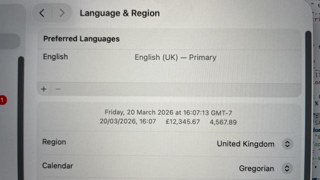
Legible? Definitely not.
@tuomas_h @gruber Yep, sadly nothing new — just more of untested, fresh, and exciting colors.
Graphite was mutilated for a while now, I stopped using it long ago because of contrast issues. As designers are the primary audience, you would think it would get attention at the supposedly design heavy company.
Yellow also always was more or less a complete disaster.
Me too. Tho' I'm not optimistic about the future direction if 26 is any guide.
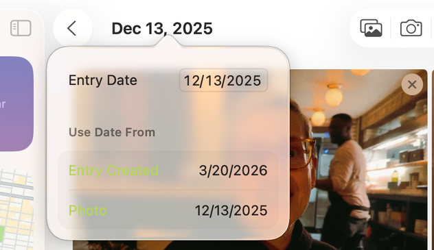
@gruber So many notes. Where to start? Let’s even forget the transparency. I wonder, is it:
- Dec 13, 2025
- 12/13/2025 (with looser letter spacing)
- 12/13/2025 (with tighter letter spacing)
@gruber yesterday, a huge iPhone hack for iOS 18 involving Safari began to be mentioned in the press.
I’ve been unwilling to update to iOS 26, due to all the problems with the new design language.
I was hoping that iOS 27 would fix all of this issues, but it seems that Apple will not be changing Liquid Glass, that they’re quite happy about it.
I think I’ll be forced to move to 26, in all the devices, soon: