Does anyone know anything about the broken slash that sometimes appears in precomposed fractions – whether there was a clear first precedent, or if it goes back to metal?
@w__h_ the first time I recall seeing it was in Recursive but I wouldn't be surprised if it predates that
@sajatype @w__h_ Recursive is definitely post IBM Plex Mono, that is shown in the sample.
Let’s ask @boldmonday, if there was a historic example for this.
@eWalthert @sajatype @w__h_ oh wow, this would be recent !?
@eWalthert @sajatype @w__h_ not that it helps but I remember seeing it in @ohno Covik, released in 2018.
@triple @eWalthert @sajatype @w__h_ @ohno
Broken fraction bars were already part of Nitti (2007) before we developed IBM Plex Mono in 2016. I guess historical examples can be found in typewriter typefaces. But Pieter @cakelab is the best person to ask about this.
@boldmonday @triple @eWalthert @sajatype @w__h_ @ohno @cakelab Here’s an example from the realm of metal type, shown by Pittsburgh Type Founders in 1918. Not a systematic approach, but definitely fractions with broken bars.
@fhardwig @boldmonday @triple @eWalthert @sajatype @w__h_ @ohno @cakelab FWIW, British road signage omits the fraction slash entirely, as in ‘1¹₂ miles’
@timahrens @fhardwig @boldmonday @triple @eWalthert @sajatype @w__h_ @ohno @cakelab Barless fraction on an English roadsign, after a design by Margaret Calvert and Jock Kinneir. Photo at the Central Lettering Record, Central St Martins. https://collections.arts.ac.uk/collections/clr
@triple @sajatype @w__h_ @ohno @cakelab That’s what I remembered, that there are typewriter examples already using that. But I assumed @boldmonday would know the examples. Thanks @justvanrossum for pulling them out.
@fhardwig even finding a letterpress example is really surprising!
@boldmonday @triple @eWalthert @sajatype @w__h_ @ohno I started designing Nitti in 2006 as a typeface for use in my own correspondence. At first, the fraction used a continuous line rather than a broken one. I felt the fractions didn’t look good that way. I remember seeing a percent symbol in some kind of monospaced typeface that used a broken line, unfortunately I don’t remember which typeface it was. I liked it and adapted the idea for the fractions in Nitti. Since than I use a broken fraction for all monospaced designs.

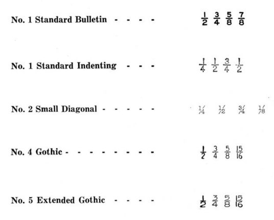
@justvanrossum @eWalthert @sajatype @w__h_ @boldmonday As @klim mentioned, the broken bar was common in Linotype Legibility series fractions at small sizes, usually aimed at stock listings.

I believe @frerejonestype picked up on this up in the original styles of Retina for the Wall Street jounral.

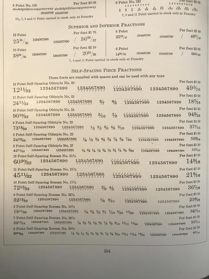
Here’s an interesting fraction approach from the 1923 ATF catalog that combines two separate pieces, each with part of the fraction. While not intended to print broken, you can see that sometimes it did. Which may have suggested the Lino Legibility approach to lightening that center convergence.

@kentlew Great to see this thank you