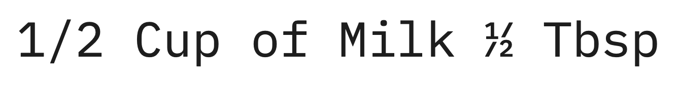
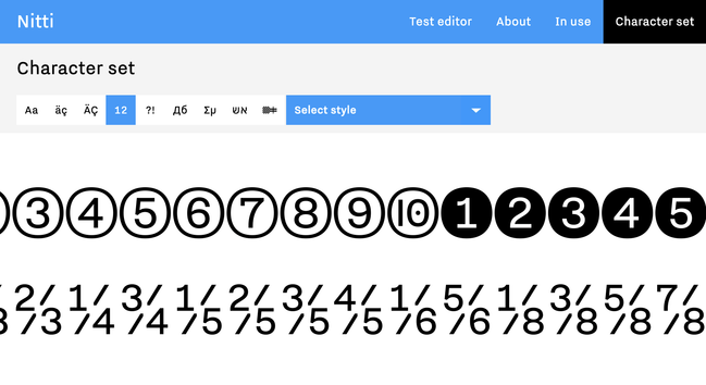
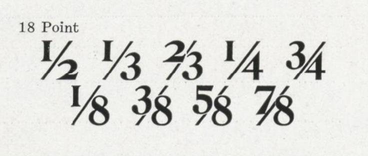
@boldmonday @triple @eWalthert @sajatype @w__h_ @ohno I started designing Nitti in 2006 as a typeface for use in my own correspondence. At first, the fraction used a continuous line rather than a broken one. I felt the fractions didn’t look good that way. I remember seeing a percent symbol in some kind of monospaced typeface that used a broken line, unfortunately I don’t remember which typeface it was. I liked it and adapted the idea for the fractions in Nitti. Since than I use a broken fraction for all monospaced designs.