Florian Hardwig

@fhardwig
1.1K Followers
514 Following
1.3K Posts
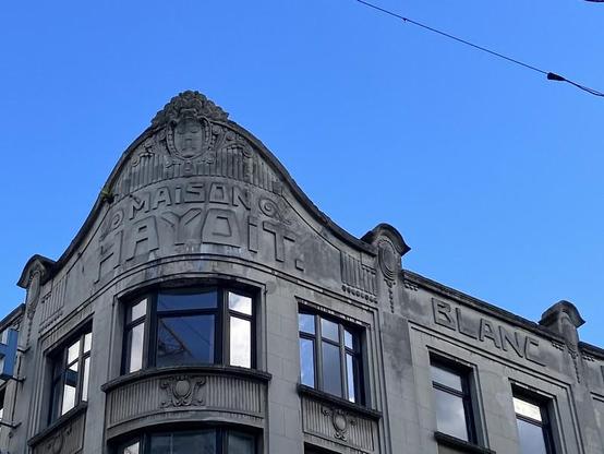
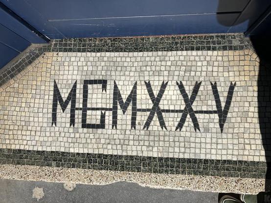
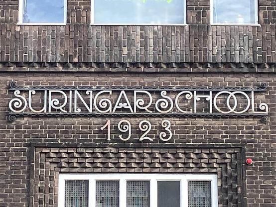
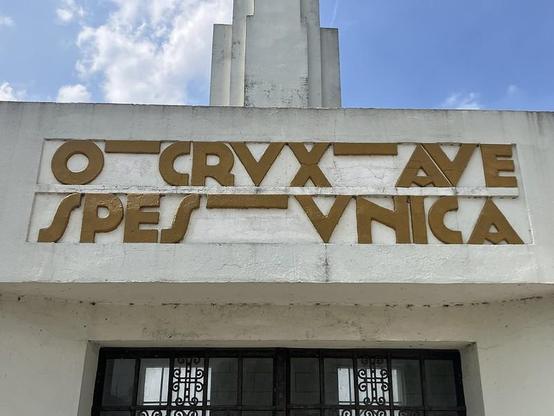
Over on Flickr, Armina Ghazaryan just dropped hundreds of photos of lettering examples from Belgium, the Netherlands, France… There are carved, painted and tessellated letterforms, with contemporary examples next to such from Art Deco, Art Nouveau, the 1970s. Browse ’em all: https://www.flickr.com/photos/arm79/

Sastre, the typeface I started 11 years ago at Reading University, is now available at NM type. If you want to know more, visit the site we’ve created for the release: https://sastreweb.nmtype.com

#fontrelease #typeface #news

Starting with the sign that inspired to look for similar attempts.

Fietstop
C. van Eesterenlaan 31, 1019 JK Amsterdam

Pro: The logo looks professional and type is well readable
Fail: Combining the letters with the bike feels forced and messes up the spacing
Rating: 🚲🚲🚲☆☆

#Cyclography #BikeLogos #GraphicDesign #Stickers

RE: https://typo.social/@jaf/116675372411996691

👀 Easily in my top three of best books on type design. Happy to see a new edition in the works. If you don’t have it already, make sure to secure a copy. More info on Tim & Shoko’s website:
https://justanotherfoundry.com/size-specific-adjustments-to-type-designs

A (new?) trove of issues of Romanian interwar graphic design publications Arhiva Grafică and Grafica Română have been digitized by Biblioteca Academiei Române!

https://e-acad.biblacad.ro/opac/advancedsearch?do_file_type=all&level=all&limit=20&material_type=all&ob=asc&q=all_titles%3Aarhiva+grafic%C4%83&q=cota%3Ap.ii.6911&s_source=local&sb=datap&so=and&usage_class=all&view=TILES&wi=false&wo=false

e-Acad > Biblioteca Academiei Române | Căutări › Căutare Avansată

TinREAD Opac

Indie type foundries, 2026.
Indie type foundries, 1893.

A single letter, drawn during a moment of inner peace. No concept, no goal, just tranquility. The designer and artist Jan Gerner, known as @yanone describes the state of deep relaxation and mental clarity he experienced in a remote forest cabin as almost sacred. In that moment, he had not created a form, but found it. It wasn’t a finished idea or full alphabet — just a feeling that would grow into a special typeface over the next ten years. #ad

Meet Sukoon: https://fontwerk.com/fonts/sukoon
Read the story: https://fontwerk.com/text/sukoon

🇫🇷 Theosophy and Lettering
Author: Mathieu Lommen @MathieuLommen
at De Gruyter Brill
@degruyterbrill.bsky.social
Klaas van Leeuwen’s Letterboek voor den teekenaar en ambachtsman, 1907

#KlaasVanLeeuwen #ArtNoveau #typography #TypeSpecimen #Theosophy

https://brill.com/view/journals/qua/55/2/article-p141_3.xml

And, here’s a cool project from Alja Herlah, ‘Signage Rebirth’, recreating the logotypes of former Slovenian brands:

http://aljaherlah.com/signage-rebirth/

Echoes of Juan Nava’s Letras Recuperadas (recovered letters):

https://bl.ag/juannava

#Sloveina #Logotypes #Brands #Lettering