This is a thread of beautiful or interesting computer-y things I scanned at the Museum of Printing this weekend.

(Eventually all of this will be processed and deposited at Internet Archive!)

1. You don’t see a lot of yellow in computing.

2. Autologic had a very good photographer.
3. This could’ve been me if I played my cards right.
4. Both of these machines (Linotext MBK 500/600) are very cool-looking.
5. Need a typeface fast? Call Type Express.
6. Some evocative Comp/Edit product photos.
7. Now LaserMaster™ Compatible
8. Micomp High Speed Programmable Keyboards.
9. Charles Darwin would have approved of Linoterm.
10. You could have a 1,000 tries, and you would never guess how VariTyper named its Helvetica knock-off.
11. Holy lord, look at this colour-coordinated Avis setup from 1979.
12. This photo from the same Harris brochure is also cool.
13. Just this aesthetic.
14. I associate compact cassettes with cheap home computers, but that hasn’t always been the case.
15. This cool drawing of a keyboard for a manual, with a lot of corrections and whiteouts (if you look closely).
16. Bad Boys (1995)
17. More red computing.
18. This company is called G. O. GRAPHICS. Cute.
19. I would have put this in my book in an instant.
20. More cool keys from the Photon.
21. The keyboard of Comp/Set 4800, and an 8" floppy disk.
22. Kinda looks like an Ouija board.
23. A single stroke of this key.

24. This keyboard is yet another entry in the classic Return/Enter story!

The main paragraph break (Enter) is a ¶ pilcrow, which is amazing. Above it is QC (Quad Center, or Enter + Align Center) and QR (Enter + Align Right), and even QM (Quad Middle? Not sure what that means).

And you can see New Line, or today’s Return, in the vicinity.

25. Not fully altogether onboard with this colour scheme.
26. A very interesting typewriter wraparound with more function keys.
27. Super interesting to see Bill Gates like this.
28. These photos are very regal.
29. Also, this ligature is kind of nice!
30. This logo is interesting. 1980s were once the future!
31. Xenotron went for green.
32. More brown Linotype machines, in reverse screen size order.
33. Extreme Severance vibes.
34. Weird that these promotional photos have blank keycaps.
35. Loving this green portrait CRT with a key lock in the middle.
36. I think this machine is really ugly, but the X/Y keys are interesting.
37. More red! This is an OCR machine.
38. This OCR machine went with blue.
39. This one is a bit more… homely.
40. Big screens reign supreme.
41. Weirdly liking this strange style.
42. Is this blue stripe working or not? Not sure.
43. Imagine choosing a font like this!
44. Some good old DEC terminals.

45. This could’ve been me if I played my cards right.

That’s it! I think I’m done.

@mwichary MISSION CONTROL: LATIN SCRIPT 1 DO YOU READ ME
@mwichary Do you mean "imagine using a mechanism like this to choose a font" or "imagine choosing a font that looks like this"? I saw the toot yesterday and thought it was the latter, but seeing it again today, I think you might mean the former.
@mwichary It's kind of like an inverse computer mullet: Business all over, party along a narrow strip in front.

@mwichary

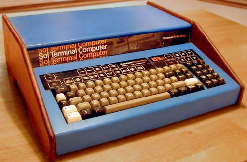
The blue strip is what makes the whole thing work. Replace it with grey and you'll be asleep in minutes.

@airwhale I’d try to color coordinate with some of the hues below…

@mwichary

Hmmm, let's take a look then…

@mwichary looks like painter’s tape trying to hold the lid down!
@mwichary I love how much the interior design and staging reveal the era even if the computers didn't.
@mwichary Oh, but the colorful keyboard makes up for it! I'm a sucker for a colorful keyboard.
@mwichary rude. the dress is maybe not a good fit for her but sheesh
@mwichary
Somebody should try to cheer it up. Have it OCR some jokes!
@mwichary I like* the pseudo-WYSIWYG on-screen representations. True WYSIWYG was considered beyond the capabilities of current technology (at least, until the Macintosh showed up), but you could get an approximation with several sizes of placeholder pixel fonts.
@mwichary that’s the ignition key!

@mwichary Also, too, rather a lot of keys.

Alphabet-neutral promo photos? Has that ever been a thing?

@ppk That’s an interesting idea!

@mwichary

When I took typing in middle school I sat at a typewriter with blank keycaps. I loved it. Little did I realize a few weeks we were soon to play musical chairs and move to different typewriters. I got one with non-blank keycaps.

My speed and accuracy never recovered. And that was decades ago when only colleges big banks and utilities had computers.

@mwichary This aesthetic... 🤌
@mwichary
What do 1 and i look in that font?
@mwichary I kind of want a ball terminal on the right side of the cap V but maybe that would be too precious
@mwichary Love aesthetic of the keyboard in the shot with the three button mouse - you don’t often see the “circular top” key caps in different colours on the same board.
@middaparka Here’s a lil close-up if you want!
@mwichary Quite likely unpleasant to type on, but it’s a nice look. 🫡
@mwichary those knobs have to be a problem for touch-typing? I guess your hands are supposed to hover rather than rest at the front of the keyboard, but I'm sure they'd be a huge nuisance for most folks, or hand rests wouldn't be a popular thing for modern keyboards.
@swelljoe @mwichary I gather that write rests weren't a thing when manual typewriters were still common, and typists were trained to hover and strike each key like a muscle-bound cobra.
@NF6X @swelljoe Yeah, there was a great flattening throughout the 20th century. Selectric is already a lot flatter than the typewriters decades before, but nowhere near what we expect now. I think wristrests maybe only started happening when computers came into offices in the 1980s.
@mwichary
Before I zoomed in, I thought that was a marble run sticking out of the side...
@mwichary The yellow page background looks a bit intense to me, but the machine itself is beautiful!
@mwichary Nice wood grain Sol-20 vibe.