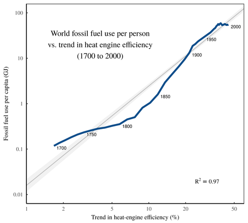
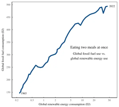
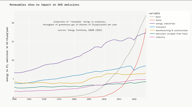
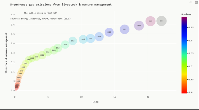
"It is not uncommon for an analyst to conduct a supervised analysis of data to detect which predictors are significantly associated with the outcome. These significant predictors are then used in a visualization (such as a heat map or cluster analysis) on the same data. Not surprisingly, the visualization reliably demonstrates clear patterns between the outcomes and predictors and appears to provide evidence of their importance. However, since the same data are shown, the visualization is essentially cherry picking the results that are only true for these data and which are unlikely to generalize to new data."
Wrote Max Kuhn and Kjell Johnson, 2019, in "Feature Engineering and Selection: A Practical Approach for Predictive Models" https://bookdown.org/max/FES/
#correlations #NoFreeLunch #electricity #agriculture #livestock #renewables #dataViz #emissions #GHG #methane #GreenhouseForcing #dataScience #featureEngineering #correlation
