#rstats #stats #dataviz
BIG DAY here in Vis-MLM land, https://friendly.github.io/Vis-MLM-book/
I finished this round of editing, checked off the remaining TODOs and am ready to send it in to my editor at CRC Press.
#rstats #stats #dataviz
BIG DAY here in Vis-MLM land, https://friendly.github.io/Vis-MLM-book/
I finished this round of editing, checked off the remaining TODOs and am ready to send it in to my editor at CRC Press.
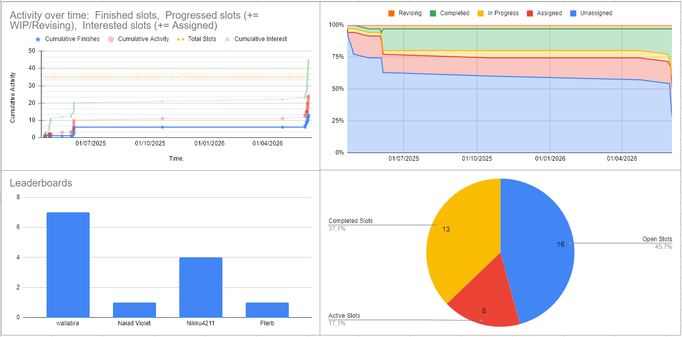
was messing around with some data viz stuff for my doom 2 tracker music community project https://www.doomworld.com/forum/topic/152631-doom-ii-tracker-music-community-project-1335-slots-completed
#doom #doomworld #dataviz #datavisualization #dashboard #music #openmpt #trackermusic #communityproject