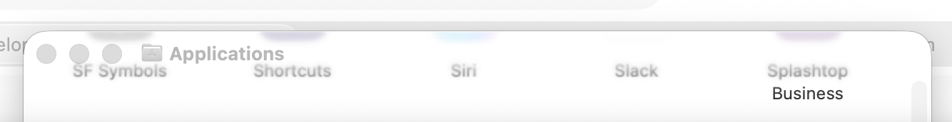
Even after using Tahoe for months, I’m still regularly struck by something on my screen that I instinctively interpret as some kind of graphical glitch only to realize that it’s “working as intended” and that someone thought this design was a good idea.

For example, check out the weird smudges at the top of this Finder window. Surely some kind of error, right? But then you notice the text competing with the window title. And then you connect the text to the smudges and realize what’s going on.

This is not a “staged” screenshot, BTW. This is something that organically appeared on my screen while using my Mac with Tahoe RC, and my legitimate reaction was to do a double-take because it looked like an error to me.
@siracusa As someone who works *a lot* with text and regularly has dozens of text-heavy document windows open on his Desktop, this is the stuff of nightmares, and one of the many reasons I just cannot install and use Tahoe on my production Mac.

@siracusa There’s no way I’ll update my laptop to this.

Is liquid the only design style available in Tahoe or can we stick to Sequoia style?

Edited: it was Sequoia, not Sonoma.

@siracusa I have the same on iPad where te other day I thought there was a smudge on my screen, wiped it, it was still there and realised it was some sort of background color splotch poking through the semi transparent foreground window
@siracusa well it may be done on purpose, but it’s an error nonetheless.
@siracusa Without a clear separator, they turned window dragging into trial and error. Courage!

@siracusa

Is it due to the window underneath showing through and glass-distorted? I notice that the blur above "Siri" is colored and the others aren't.

@jonhendry It's *not* due to the window underneath! Those smudges are from the icons in the Applications window itself! As you scroll, the window contents go up under the window title bar and show through it.
@siracusa First though: Hey, they're emulating the pink fringes the iMac 5K displays got after a while in software now!
@siracusa It's like a horror movie, where the ghost of Siri is writing its name in spooooooky letters.
@siracusa
Oh my goodness this happens to me constantly - when I get migraines it affects my vision, and so many weird design choices have me frequently wondering if a migraine is coming on. Weird gradients for no reason are the worst one, but also odd splotchy patches or busy background imagery. Ugh.

@[email protected]@disabled.social @[email protected]@mastodon.social

I feel the same!

I urged #Apple to add a #health #warning to macOS "smear", but they have ignored it.

All these weird optical perversions in #macOS 26 are very serious migraine triggers.

🤮🤮🤮

@siracusa Tim Cook only cares about selling new devices and how much money that will make him.

User needs? Pah!

@philsherry @siracusa

I honestly think this new OS will serve to NOT sell new devices. I’m not going to buy if I have to live with Tahoe and other os26 variants.

And a lot of third party developers still coding for the Mac are not going to attempt writing a compatible version, nor recommend Tahoe. Because the OS itself affects usability.

Perhaps all old apps will work fine, but complicated ones like DAWs might find something broken

@Chancerubbage @philsherry @siracusa From what I’ve seen the extra GPU draw from Liquid Glass is noticeable both on iOS and macOS. It was abysmal on my iPhone 13 so I reverted to iOS 18. The improvement is massive on iOS 18.
Apparently even M1 Mac’s are stuttering.

Tim wants everyone on iPhone 15 and older to upgrade. As well as anyone on M1 and older.

Luckily my Mac’s are stuck on Big Sur so they are working perfectly.

@philsherry @siracusa
Users and customers. Every manager hates when these two distinct groups intermingle.
@siracusa I’ve turned off automatic updates for macOS. I’m gonna skip it until all of this is fixed. All of the bugs you’ve pointed out are absolutely intolerable.
@vjgoh This is not a bug! This is working as designed!

@siracusa I guess? But it’s a design bug! It’s meaningfully worse to use!

But I guess that’s honestly worse for my prospects—that seems so bad I don’t want to use the new macOS and I can’t hope for fixes if they think that’s the right way to do it. :/

@siracusa Liquid Glass: forged from the tears of developers!
@siracusa this looks ugly in sooo many ways 😮
@siracusa That’s fugly. I’ve always been an early adopter of the new macOS, but not this time. I’ll be sticking to Sequoia as long as I can.
@siracusa That looks like an absolute mess and even though it seems to be intended, I think it would technically BE a glitch (but largely in the minds/style book of those who created this mess). Right?
@siracusa some windows vista-ass nonsense
@archaica @siracusa even Microsoft knew back in 2006 transparent UIs require heavy frosting, smearing, glow and drop shadows, all at once to be legible
@siracusa I loathe this as well. I also loathe that you can't adequately see the grab-able title bar. My current workaround is to give icon view a background color. This makes the issue you highlight maybe 1% less annoying, but it helps...