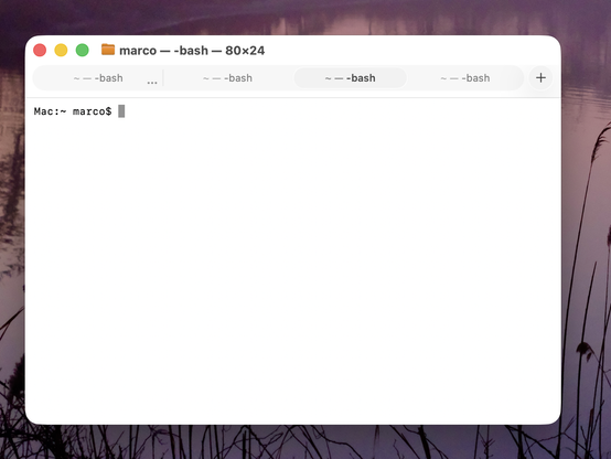
Honestly, this is making Terminal (and Safari) in Tahoe VERY hard for me to use.

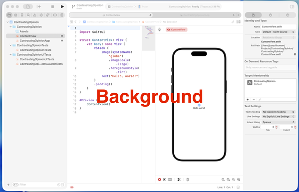
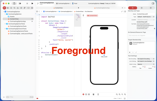
Tabs in Tahoe are extremely difficult to distinguish from each other and from the active tab.

I've never switched away from Safari, and I've never investigated third-party terminal apps, but if this ships in the fall, I'll most likely need to do both. And I really, really don't want to.

Please, Apple, fix your design. Computers aren't passive "content" viewers — they're tools.
https://www.manton.org/2025/07/05/minor-nitpick-in-macos-tahoe.html

@marcoarment iTerm as Terminal replacement should not be a huge deal. I don't know if its tabs in Tahoe will look as the Terminal ones, though
@marcoarment Ooof. That’s really too subtle even for me.
@marcoarment The left-aligned title bar is really triggering.
@marcoarment I hadn't thought about how this impacted Terminal because I'm only on the beta on my iPad, but boy is it messing with tabs in Safari. I honestly think only a @gruber -style what are you fucking doing? post like on the colored icons might get them to change.

@marcoarment I've liked iTerm and Ghostty the best so far.

Browsers are complicated. Recently switched to Safari trying to degoogle-ify. Hopefully they reverse course or Mozilla gets their act together with Firefox.

@marcoarment Seconding iTerm2 as the GOAT of replacements for Terminal on the Mac. Been using it for years, and it's pretty great. Apple Terminal honestly feels barbaric in comparison now.
Or if you want to try the shiny new thing, I think Ghostty is pretty great. It's opinionated, low-config, and does the right thing out of the box. https://ghostty.org/
iTerm: https://iterm2.com
1.3.0 - Release Notes

Release notes for Ghostty 1.3.0, released on March 9, 2026.

Ghostty
@traal @marcoarment Another vote for trying out Ghostty, it’s very fast, highly compatible, and great defaults out of the box.
@marcoarment Are there ways (at this point) in Settings to affect either or both the tab background color and divider?

@marcoarment
I thought they were ruining it to make it pretty. But *that* is just... Windows-esque.

I was about to say ugly, but it doesn't even qualify for that. It's not ugly in the same way that an empty white wall is not ugly.

@leeloo @marcoarment "windows-esque" ... my terminal on windows looks better than whatever this is...
@patrick_h_lauke @leeloo @marcoarment Which of those tabs is active? The brown one or the black one? (Hopefully it’s not the third one that’s coloured like the rest of the title bar). None of them look particularly “connected” to the content below to my eyes, but maybe it’s because I’m missing context on how the theme colours work on the rest of your desktop.
@alextm @patrick_h_lauke @leeloo @marcoarment For context, the first one that's "brown" is probably because the background color of that tab is "brown".
The default #WindowsTerminal theme looks more like:

@alextm @patrick_h_lauke @leeloo @marcoarment and of course, you can customize the theme to whatever you want really. I like accent colors in my titlebar, so I do this.

(more details: https://learn.microsoft.com/en-us/windows/terminal/custom-terminal-gallery/theme-gallery)

@zadjii @patrick_h_lauke @leeloo @marcoarment Thanks. Yes, that’s much clearer with only 2 tab colours and the terminal background matching/connecting with the tab. And way more readable than the new Mac version.
@leeloo yeah, no need to dis Windows Terminal. It’s open source, actively developed, highly configurable, with good defaults and functionality, and some whimsy fun like optional retro CRT effects. 😎 It’s miles better than whatever the heck Apple are doing — or not doing — with their terminal for the past decade.

@traal
I did not say Windows Terminal. In fact I don't remember having heard of Windows Terminal before. My first thought when I hears Windows Terminal was Hyperterm.

I was talking about Windows in general (win10 I think), flat white everything.

@leeloo Ok, that's fair.

I tend to want to let people know that the native terminal on Win11, which is a free and highly recommended Windows Store download on Win10, is pretty awesome. Microsoft these days actually *want* developers to like them and their platforms. 😊 I use both Mac, Win11 and various Linux servers for development, and Win11 honestly compares pretty well, out of the box, with great options for further customization.

@marcoarment jeez the tabs look like a segmented control, (if you can see them.) We're kinda mixing metaphors and losing metaphors here. But at least we have more padding and white space! For "content."
@marcoarment The good news is this seems like a simple change. That selected tab background color is barely different than other tabs right now. I know my eyes aren’t that bad. Also notice how it’s oddly more distinct when the window isn’t in the front.
@marcoarment go use ghostty instead of terminal. You’ll love it!
@marcoarment Are there any safari plugins that increase the contrast of the tabs?
@marcoarment I am sure others have already mentioned it but Ghostty is a awesome terminal app, I switched to it after being a iTerm user for over 10 years.
@marcoarment iTerm2 works a treat but there are many others like Warp that work very very well.

@marcoarment defaults write -g NSSolariumWindowTabs -bool NO

(ymmv)

@marcoarment Just a honest question: did you ever consider switching to Linux with Gnome?
@Ivovanwilligen I like your thinking. That way he'd be too task saturated fixing his bluetooth to notice how disgusting and unusable everything is.
@marcoarment And Mail with Calendar, while at it, please! Thanks! We work here!
@marcoarment honestly why the absolute fuck can we not be allowed to choose our own highlight, active, text etc colour, size, styles i mean fucksake!
@marcoarment, wezterm by @wez is great!
@marcoarment I gave up on Terminal years ago - I'm a Panic Prompt stan @panic
@marcoarment I’d heavily bet whoever designed this is very young (and uneducated about how human eyes degrade w age).
Shocking no one more senior blocked it.
@marcoarment Thank you so much for the post. I use terminal often. I guess I will stay on Sequoia

@marcoarment
Tahoe hack. I call it “The Background Process”. Put your app in the background to quickly see your active tab.

And yes, I have actually done this a few times. Which is… well… sigh.

@marcoarment Hey, hey! Fixed in Beta 3. No more squinting.
@marcoarment Marco or someone else with a large following, please start an online petition for Apple to reverse or strongly tone down this liquid glass madness. We’ll make sure it goes viral. We all want something that looks cool, but it has to be functional.
@marcoarment I guess just threatening did the job 😜.
@marcoarment @rstockm If #Whitespace takes over …
I hate it. I want information, not white space.
@marcoarment I actually think it's pretty easy to tell which one is active.

@oversteer @marcoarment interesting, not having used Tahoe and based solely on the screenshot it took me a hot minute.

First I thought it was the tab with the ellipse; only next that one of the tabs; title had a slightly heavier font weight.

I have never been a fan of theses sorts of bubble tabs. IMO the active one should visually connect to some part of the window, either wraping around the content e.g. the original safari tabs or hanging from the title bar e.g. Sequoia finder iTerm2 etc.

@marcoarment Don’t worry, WARP (terminal) and Firefox Developer Edition are welcoming you, wide arms open !! 🤗
@marcoarment If it's really bothering you right now, Terminal in dark mode has fine, identifiable tabs.