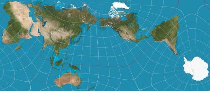
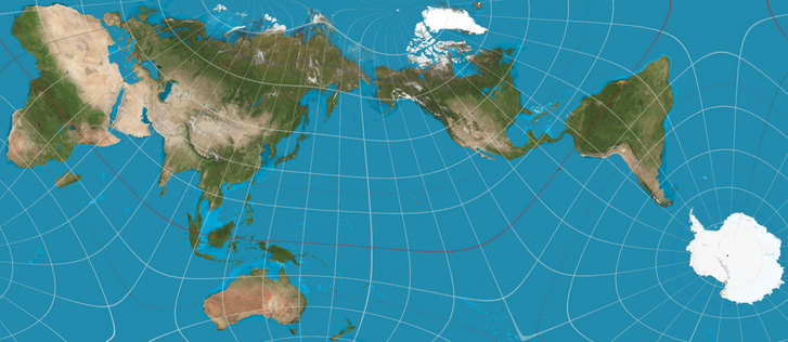
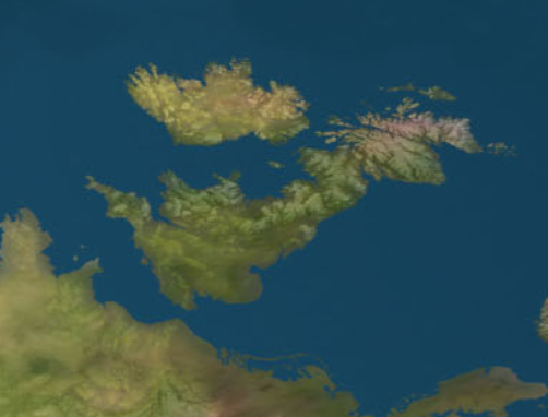
New view of the world:

'Tokyo-based architect & artist Hajime Narukawa won Japan's prestigious Good Design Award for developing the AuthaGraph World Map, a groundbreaking projection that preserves the true proportions of continents & oceans.

By dividing the globe into 96 triangles, then transferring these to a tetrahedron & unfolding it into a rectangle, the AuthaGraph map eliminates the distortions found in both the Mercator & Dymaxion maps'

#politics

h/t Phillip Richardson/LinkedIn

@ChrisMayLA6 it makes France look small in comparison to Britain which I expect the Elyéese Palace would have an opinion on.
@wilpercy @ChrisMayLA6 Elysée palace may have an opinion but don't worry, most french people don't care and just want the whole thing to burn with an actively working guillotine in front of it
@ChrisMayLA6 time for an update to this I guess https://xkcd.com/977/
Map Projections

xkcd

@jetsoft

Ha ha, never seen this; made me smile (and boosted), thanks

@jetsoft @ChrisMayLA6 Heh. I had the Peters Projection (as it was generally known back then) on my wall from sometime around 1987 or so. What does that make me? 😀
@ChrisMayLA6 Ah ha, so those flat earthers were right! 😉
@ChrisMayLA6 Unless it’s for sailing across the Pacific, I’m not sure of the utility of a map where the land where people live is consigned to the edges and it’s impossible to accurately infer which way is north. If you’re desperate to accurately view the relative sizes of land masses then buy a globe. It’s definitely a sign of the times though that the British Isles is virtually off the edge of the map.
@christineburns @ChrisMayLA6 The point of this projection is to show the relative sizes. It's interesting to see that Africa is huge and Russia not as big as I thought. France is tiny. Etc. You obviously can't see all of the surface of a globe at once. It's insufferable when people see a fun new thing and immediately try to dunk on it for reasons *addressed in the very description of the thing.*
@christineburns @ChrisMayLA6 I think the focus on Japan is because the author is from there

@christineburns @ChrisMayLA6 Yes, there's several ways to display the world, based on what's important (for example, north is not really important unless you're navigating, or maybe thinking of things like climate).

But in terms of population, or "land where people live", the central location of Asia is of course absolutely a well founded choice, like this other map, where countries are scaled for population, shows.

@christineburns @ChrisMayLA6

It's a Japanese map and it puts Japan on the centre. Supposedly you could use the same projection to put Europe or NAmerica to the centre if wanted.

(But I feel that for all its PR it does distord, and is not really better than any other projection. Maps should be made for the use intended. One-size maps are always problematic.)

@christineburns @ChrisMayLA6 I’ve always thought that the main/best purpose of maps like this one is to make evident the distortions/assumptions/intentions of other maps, and of maps in general.
@ChrisMayLA6 it might reduce distortions, but it definitely doesn't eliminate them.

@ChrisMayLA6

There are some politics in putting Europe to the corner and distorting its form, putting Japan to the centre, etc.

A 2D map can not be apolitical. It can only change toward which the map is biased for.

The answer can't be an one-size-fits-all, but rather creating maps tailored to the place where they're being sold.

And ofc, for electric maps like the one provided by Google, having the map be an azimuth that's regenerated when focus is moved would probably be the best bet.

@ChrisMayLA6

Well, the distortion falls into the sea.

@ChrisMayLA6 - that is horrible - both latitude and longitude are distorted across land masses (in particular eastern Russia). It's neither equal area, nor conformal; angles, great circles and rhumb lines and distance are all distorted. A conformal map projection cannot be equal-area, and vice-versa (Lambert was the first to realise this - subsequently proven by Euler in 1775).
@ChrisMayLA6 I really like the design. Had it as my desktop wallpaper for part of 2024!
@ChrisMayLA6
Good to see, although exaggerated, South America east of North America. Here in Chile we are on +3 UTC, a long way from the Pacific NW which is mostly +8.
@ChrisMayLA6 @Fasgadh to the right of, not east of.
@ChrisMayLA6
So Africa is really, really big!
@ChrisMayLA6 I'd hate to try navigating with that 😉

@ChrisMayLA6
Another one that preserves neither bearing nor scale, but with bonus crooked parallels/meridians. Afff.

I'll stick with Mercator and make another data point for XKCD #977 :)

@ChrisMayLA6 Reminds of th good ol' West Wing Episode:
https://www.youtube.com/watch?v=LA0BLrLW0PE
Mercator vs Peters projection on West Wing - Cartographers for Social Equality

YouTube
@ChrisMayLA6 I like that Antarctica isn't smeared across the bottom like an afterthought.
When I first saw that seemingly gigantic land that nobody ever talked about it freaked me out, like it was a big secret we weren't supposed to acknowledge (child logic)
@ChrisMayLA6
Clarification: this is not a newly-developed projection. It was created in 1999, and it won the Good Design Award in 2016 according to [Wikipedia](https://en.wikipedia.org/wiki/AuthaGraph_projection).
AuthaGraph projection - Wikipedia

@ianrbuck

Aha, I just picked it up from an account on LinkedIn that seemed to imply (if not state) that it was recently done....

@ianrbuck @ChrisMayLA6

And it's a special case of a polyhedral map projection [1]. My guess is that it's the Lee conformal world in a tetrahedron projection [2]. Cut the corners of the triangle and rotate and paste back together the cut pieces and the triangle becomes a rectangle where the mapping is continuous internal to the rectangle.

[1] https://en.wikipedia.org/wiki/Polyhedral_map_projection

[2] https://en.wikipedia.org/wiki/Lee_conformal_world_in_a_tetrahedron

Polyhedral map projection - Wikipedia

@raulinbonn @ChrisMayLA6 What sea-level was used here? Seems half of the Netherlands (bottom-center) is flooded

@ChrisMayLA6

I can't believe @jwz isn't already tagged on this.

#maps #projection #map #globe

@ChrisMayLA6 Very misleading to say that map eliminates distortions... OK, eliminates distortions found in certain specified projections, but it replaces them with others. Every grid cell touching the equator should be exactly the same shape and size - and clearly is not! For the record, all flat maps of a sphere are distorted.

@PhilStooke

Yes, this has been a theme in many replies to the original post, and is a fair comment - the interesting thing is, of course, that it also makes one wonder about the distortions in the commonplace projection(s)

@ChrisMayLA6 Yes, it's a good way to draw attention to the fact that no projection is without distortions of one kind or another.
@ChrisMayLA6 Cahill-Keyes is my favorite. Not completely unlike the AuthaGraph map, but the ocean isn't stretched to fill in the otherwise non-contiguous bits. (xkcd just briefly mentions it in his, as usual, excellent cartoon.)
The Most Accurate Flat Map of Earth Yet

A cosmologist and his colleagues tackle a centuries-old cartographic conundrum

Scientific American