Quick UI roundup; I can see a path towards completing and shipping this app before WWDC, on iPad. I don't know that I'll be able to hit that target before distraction comes knocking, but it's worth a try. I've made quite a bit of progress in the past day, and it's starting to look good
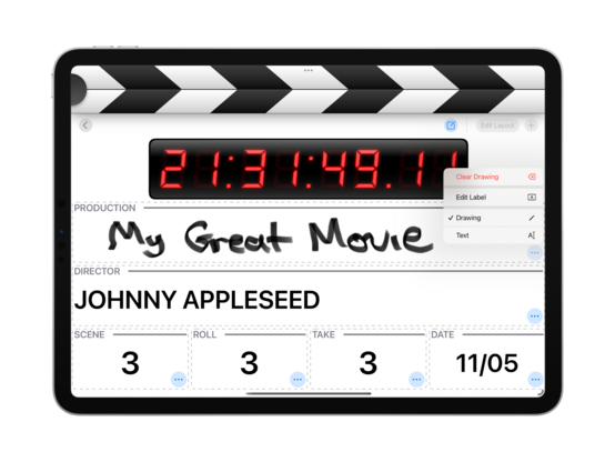
Doing away with the context menus frees up some confusion with Pencil usage. Trying out a dashed line pattern too, though it might still need some tweaking. I also cleaned up the @takeoneapp Mastodon profile a tad
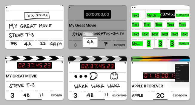
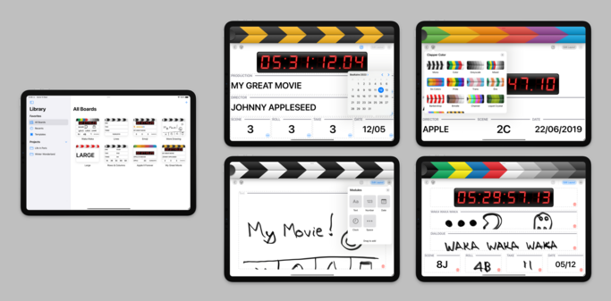
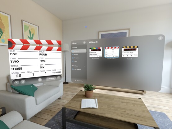
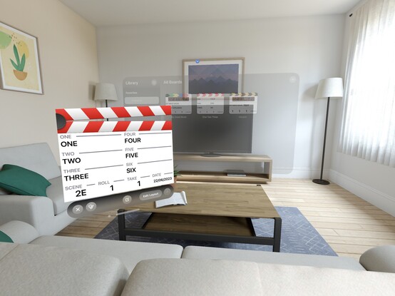
Here's a bunch of screenshots from the early development of @takeoneapp, in June 2019, since I haven't posted them over here. That’s before I'd started work on Broadcasts or Pastel, in a very different era of iPad app development. In hindsight, the improvements to the iPad SDK vis a vis UIKit & Mac Catalyst have been tremendous in the past 4 years. All of that effort is going to pay off for an AR headset built around the iPadOS app platform, if the rumors are true
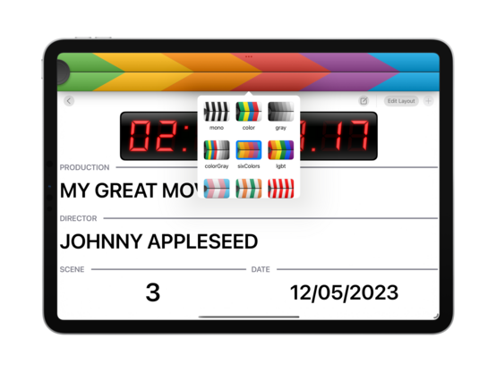
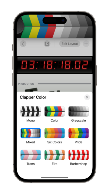
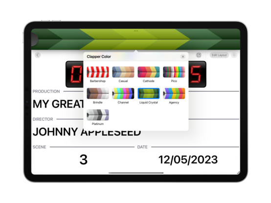
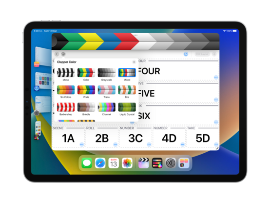
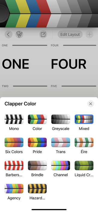
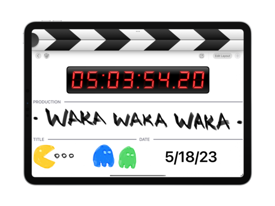
Reimplemented the stripes color picker as a collection view, works nicely 👌
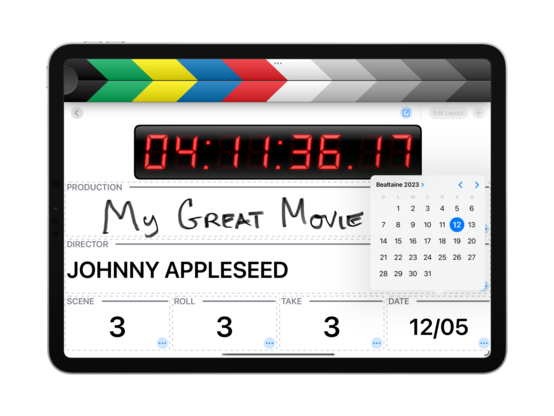
Those popovers adapt to my favorite sheet style on iPhone, custom title and close button included 😄
Very easy to add new palettes too — I can copy paste them into the codebase directly from @pastelapp 😄
I'm quite partial to the hazard stripes!
End of day 2! @takeoneapp is starting to look so good that if I don't ship this at the end of this sprint, I will be so mad at myself. Apart from the major areas I have yet to implement, I think the UI is nearly at a production-ready level — you'd easily mistake it for a shipping app. I maaay do a TestFlight run of this before release, but no promises. I expect pricing to be very similar to Broadcasts and Pastel, so free to try + $5 ish IAP to make more than one board (or something like that)
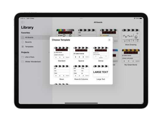
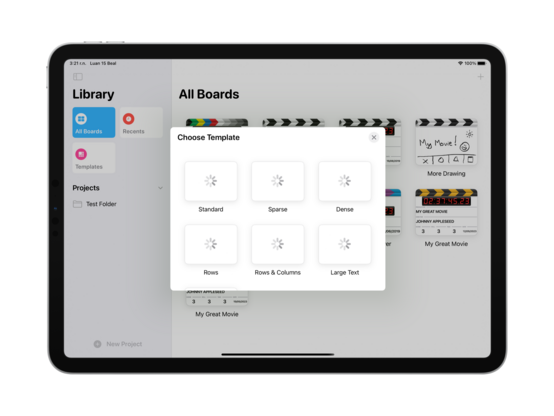
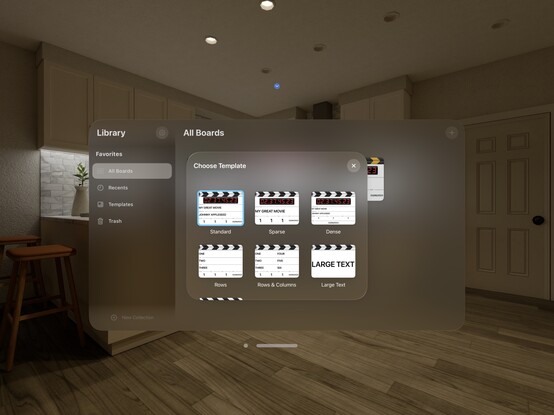
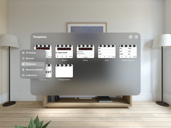
Instead of struggling with PencilKit for the rest of the day, I went ahead and built a template picker instead. Another item checked off the todo list ✅
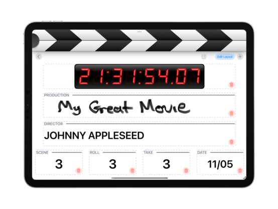
One way for me to punt the PencilKit scaling issue down the road a bit is to ship with UIRequiresFullScreen=YES 🤔 It would mean explicitly opting out of splitscreen and Stage Manager resizing for the time being, but that actually might be OK in this case? It's a very fullscreen-centric app, and that changes a release blocker to minor user annoyance. May just be the way to go
Just because the individual windows need fullscreen doesn't mean I can't still do multiwindowing — it actually works quite nicely in Stage Manager
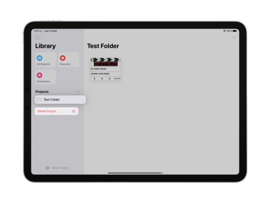
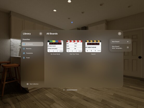
I was out today, so didn't get much work done — but I refactored 
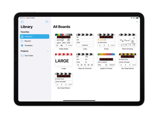
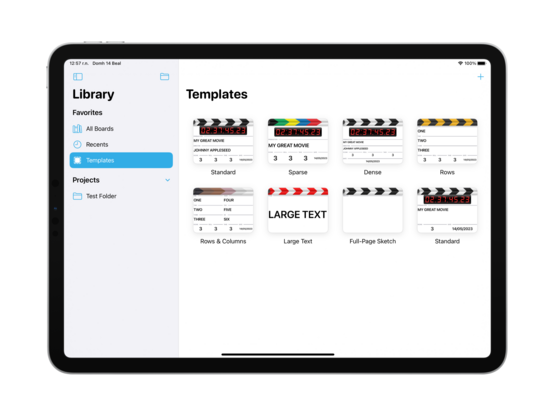
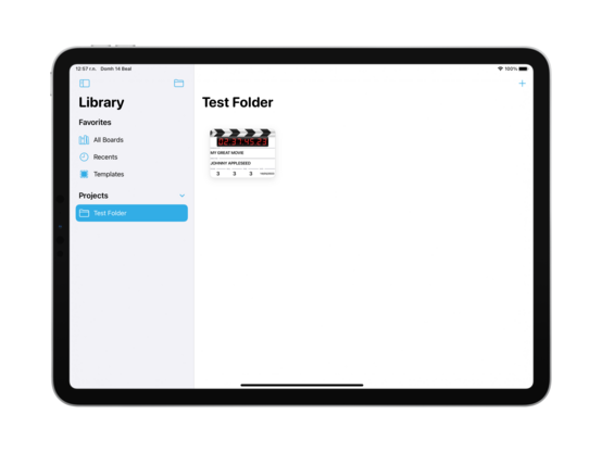
@takeoneapp’s data model to let me create and save to folders. Part of that involved wiring up the templates store so I can create/edit/delete templates too
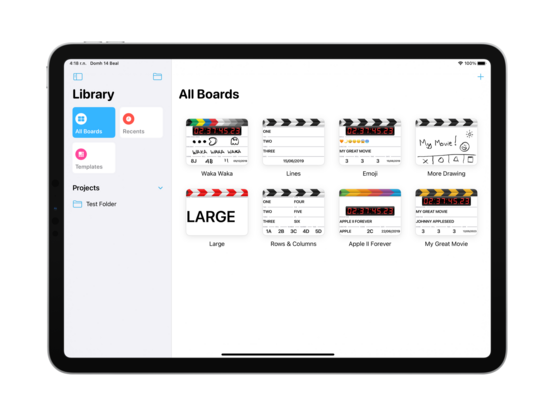
Unifying a little bit of the design language with Pastel, I’m going to use the same Reminders-style sidebar on iPad for @takeoneapp. Also injects a splash of color into a very black & white out-of-the-box experience
End of day UI roundup; getting closer to a MVP 😄
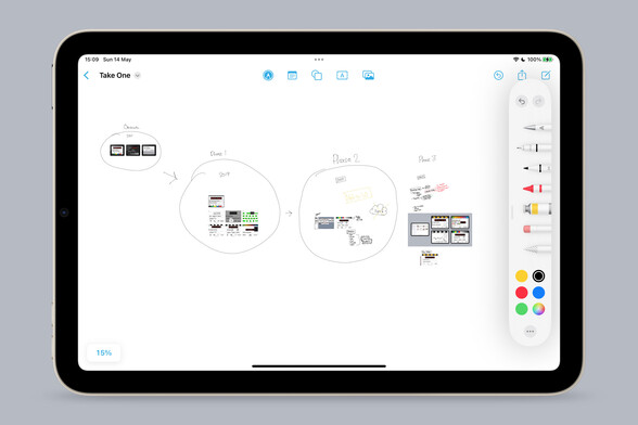
I don’t have complex development notes for this app, but I am enjoying Freeform as an infinite canvas to dump images onto so I can annotate and do a basic bit of mind mapping. It really makes me yearn for an iPad mini Pro with an M-series chip and ProMotion, though — what a fun desktop companion that would be
It’s always nice that the iPhone version picks up everything I’ve been working on for iPad without me thinking about it. Universal development is my jam
Got some odds and ends done today; worked on keyboard focus, styled the 'new folder' button as per @pastelapp, and do a bit more lazy thumbnail generation. It is looking increasingly likely that I actually finish this app this time, which has me extra motivated to work on it 🤓
Also pretty confident in the post-launch roadmap, too, since I know I'll need to ship iPhone+Mac, iPad splitscreen, and sync, and most of that work has already been done
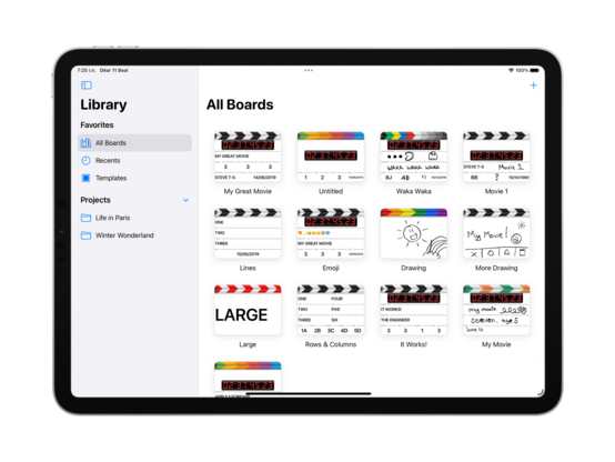
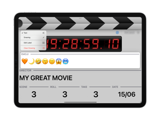
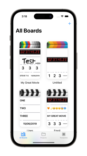
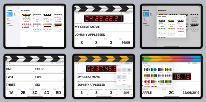
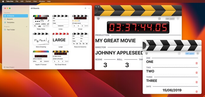
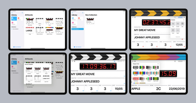
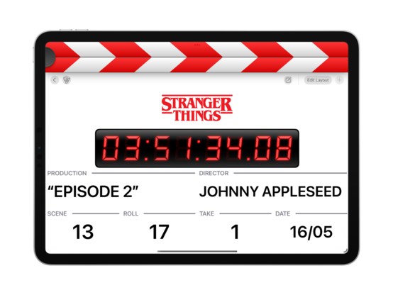
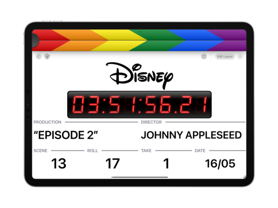
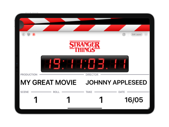
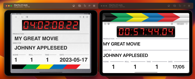
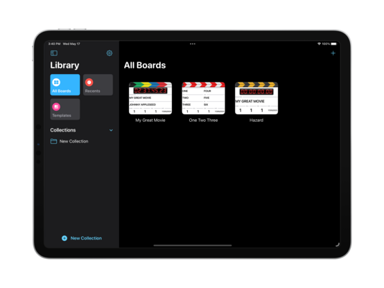
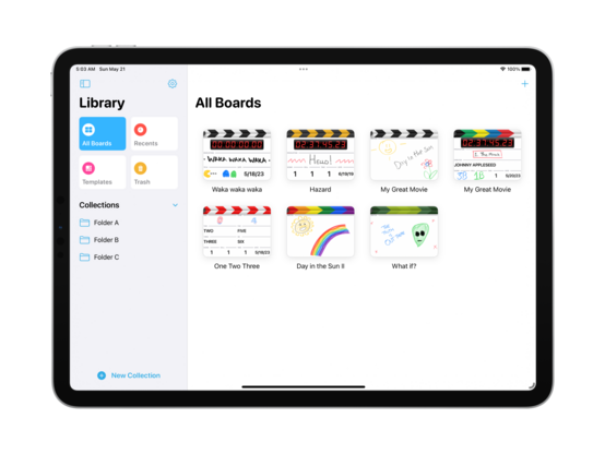
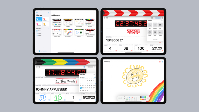
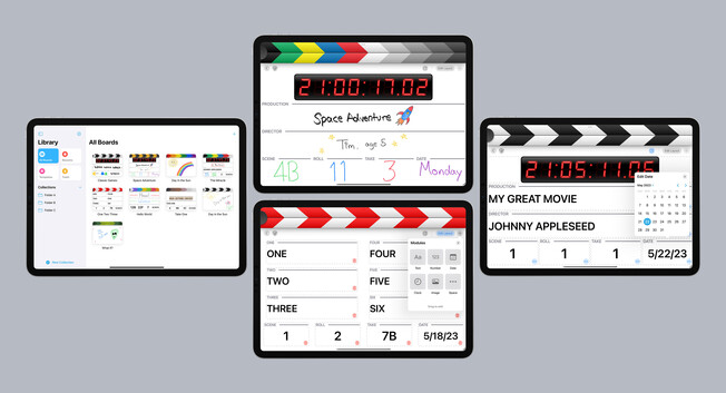
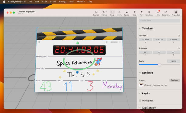
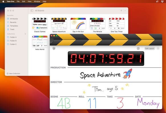
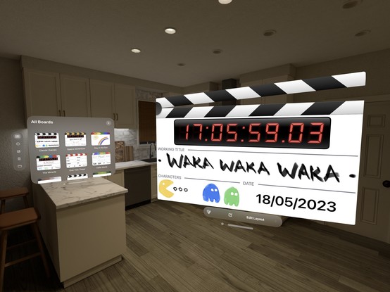
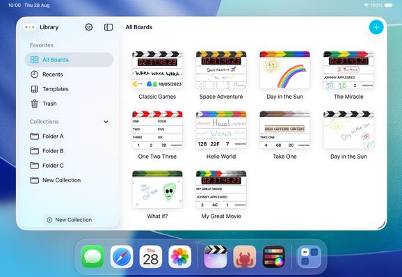
I'm pretty happy with the two basic screens of @takeoneapp; it looks modern and fresh, without entirely sacrificing the skeuomorphic elements that made the original so pleasant. The splash of color in the clappers and sidebar makes all the difference. I think I have the balance right?
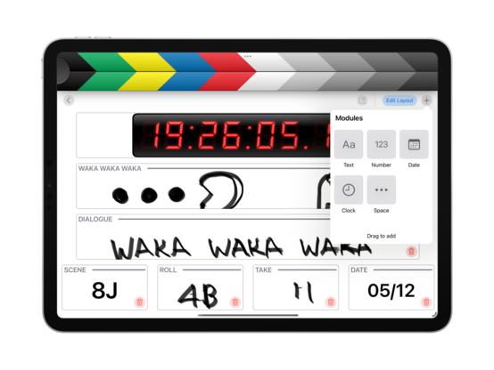
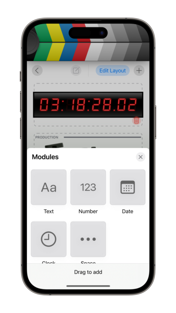
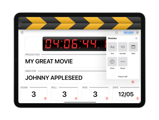
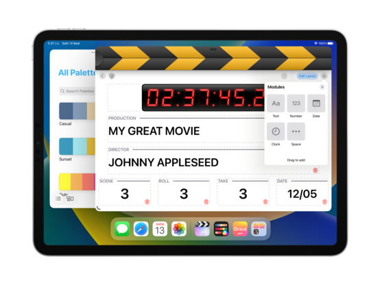
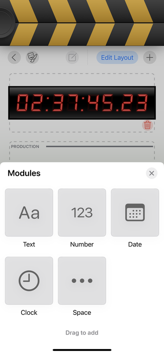
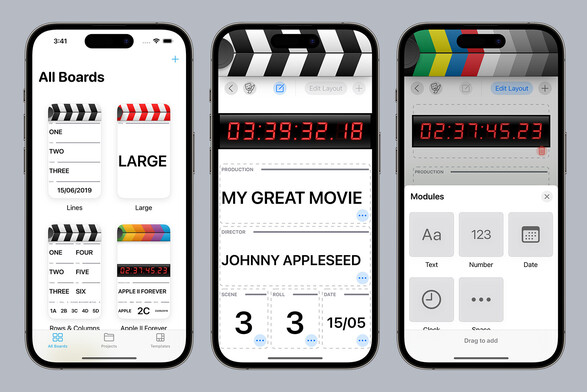
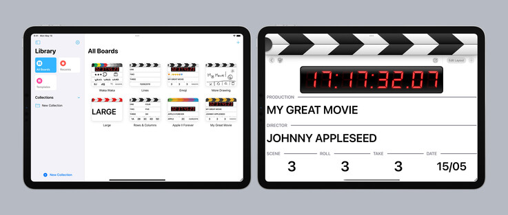
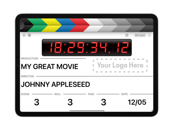
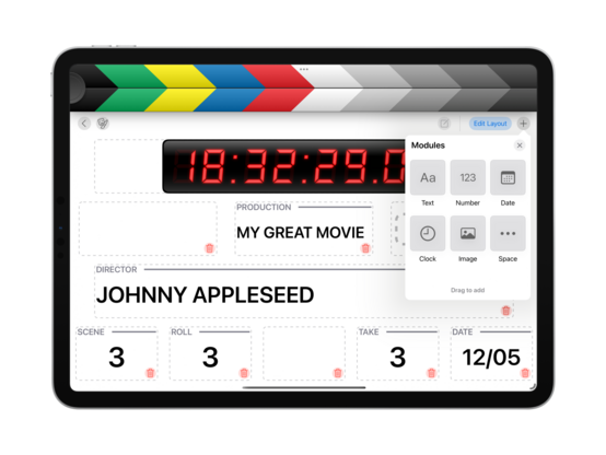
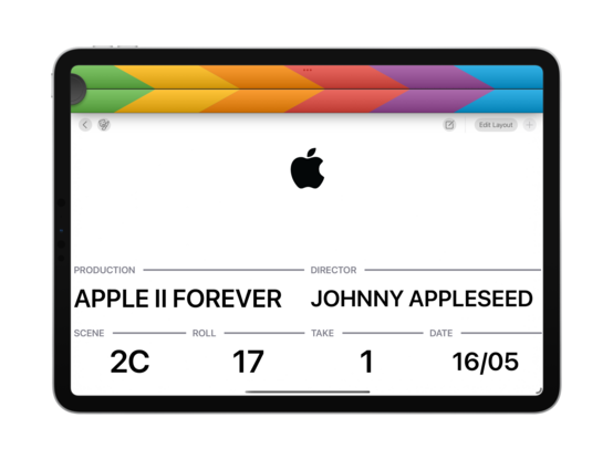
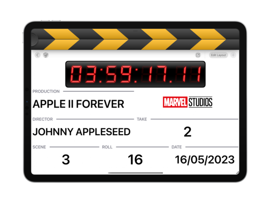
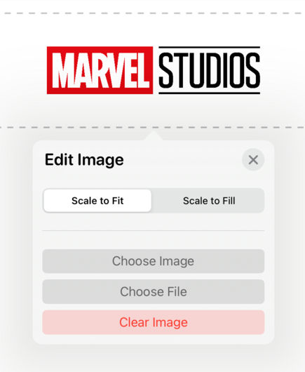
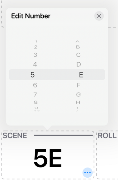
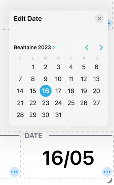
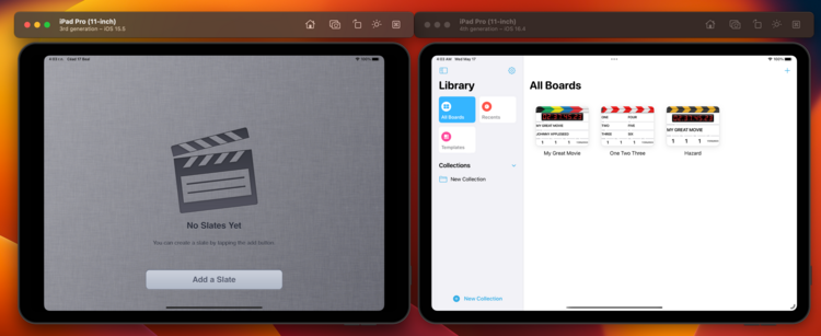
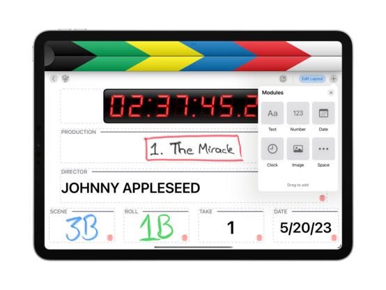
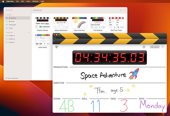
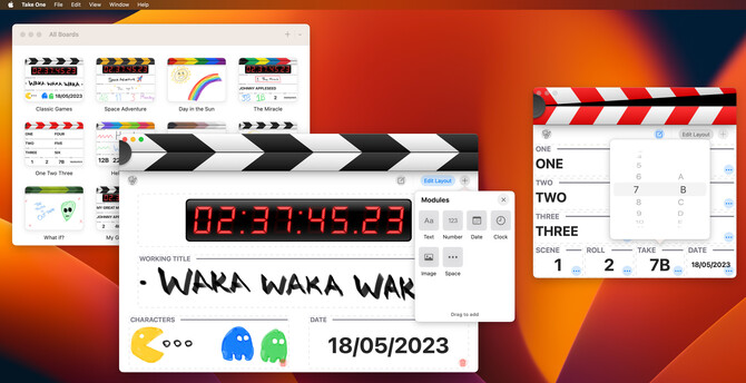
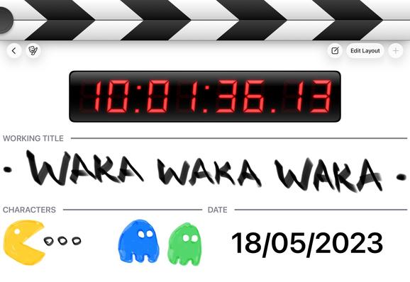
…and here's the current state of all the auxiliary screens and modes. I still have to design editors for the various module types (numbers, date, etc), so I'll work on that this week
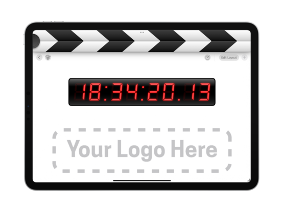
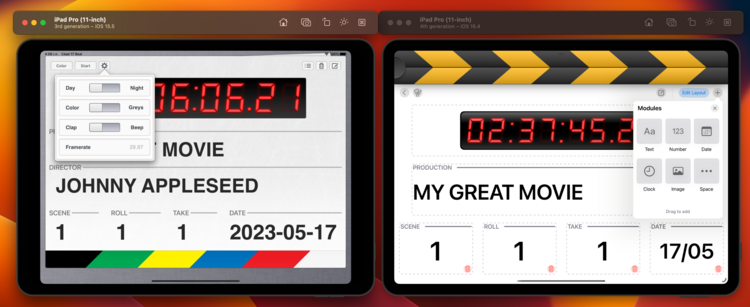
New module type — image! Somewhere you can put your production logo, perhaps? I have working spacers now too
I added a little wiggle animation (thanks ChatGPT!) for when you're tapping one of the modules without edit mode being on. I might add color to make it less subtle, but the wiggle is great! Communicates what I intended
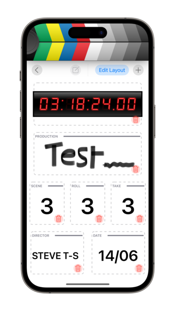
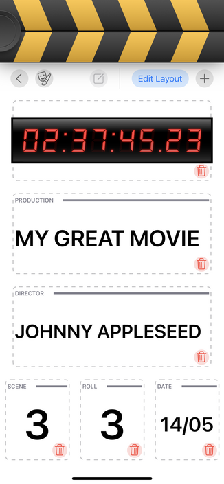
Spent some time today getting the field editors functional and styling them up a little. And I added double and triple tap gestures to increment/decrement the number counters. Powering through the todo list!
Some fun examples of how one might use the image module on a board 😎
Very simple field editors for v1.0, but they do the trick. They're going to need a rework for the Mac version, as Mac-Idiom Catalyst does not allow for spinny picker controls, but that's a ‘later’ problem
Shocked to find that iOS just doesn't have an API to tell whether the mute switch is on or not 😅 You've gotta jump through hoops playing silent audio clips and checking how long they actually took to play — so I've done that, and now have a mute indicator in @takeoneapp
I did a quick test and, aside from an SF Symbol or two I can backport, there's nothing in @takeoneapp that would prevent it from running on iOS 15. I may then take that as the baseline, once I charge up my testing iPads and give it a full run through. Everything seems to work as intended on iPhone, though
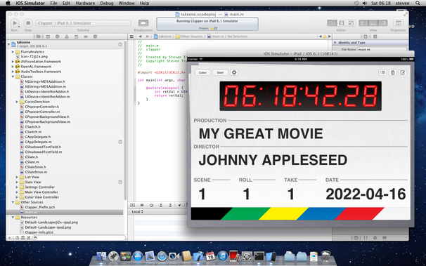
I pulled the original version of @takeoneapp (2011) from GitHub to run it side by side with the new app. Amazingly, it came right up with only a single line of code changed. Fun to see an iOS 5 app beside an iOS 16 one
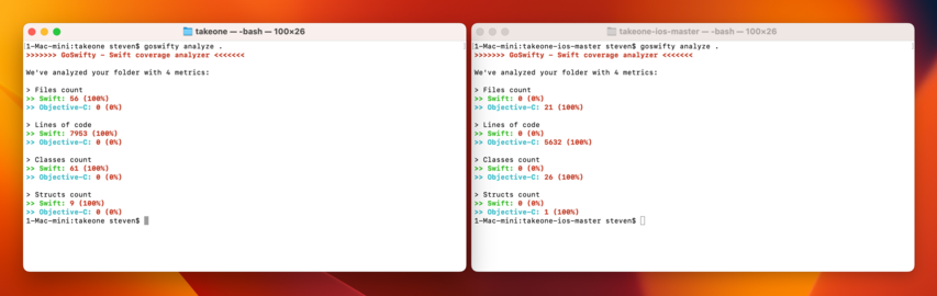
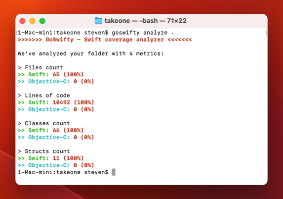
New @takeoneapp is nearly 8 kloc now, with double the classes of the original. Though not a line of it survives, as I started afresh
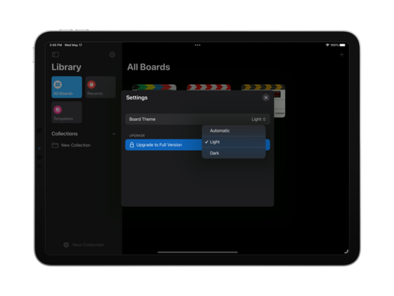
It was a feature I wanted for myself, so there's now a setting to always have white boards in dark mode (or vice versa). It is quite nice how easy UIKit makes this
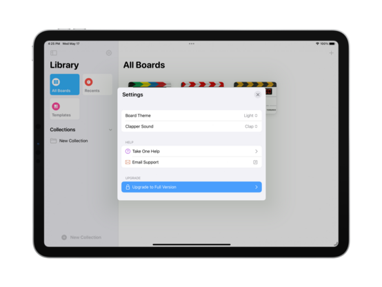
Since I did go ahead and build a whole library for this, I might as well integrate a Help bundle into @takeoneapp. I'll see how quickly I can put together worthwhile documentation if I get a chance before 1.0
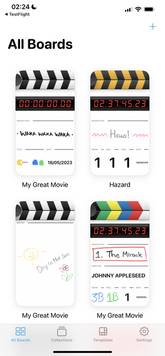
⭐️ I am opening up an initial @takeoneapp TestFlight for iPad users! There are still missing features, but I have a good-enough chunk of the app ready that I want to start getting your thoughts. It would be really great to get this 1.0 over the line by early next week, alongside Final Cut Pro for iPad https://testflight.apple.com/join/qSyBk0i6
Join the Take One beta

Available on iOS

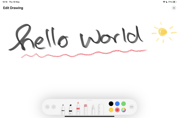
I'm getting precariously close to the point where I’m just going to avoid using PencilKit directly in my apps — genuinely not sure how I'm going to salvage this. I think I need to present the drawing surface as a separate modal view, and just render it to an image to show in the board fields. Using PKCanvasView directly as a resizable subview does not seem like the way to go at all

OK. Doing it modally has so many benefits.

Downside:
• You can't ‘just draw’ directly on a module

Upside:
• You get a full canvas to draw on, pinch and zoom
• Drawing is thus available to finger users and not just Pencil
• You have an undo stack
• You can lasso-select and move things around
• Showing the tool picker lets you use different colors and tools
• Scaling just works — it's just an image, so it aspect fits any size

I think my mind is made up on this one

Working on a whole grab-bag of features and improvements for 
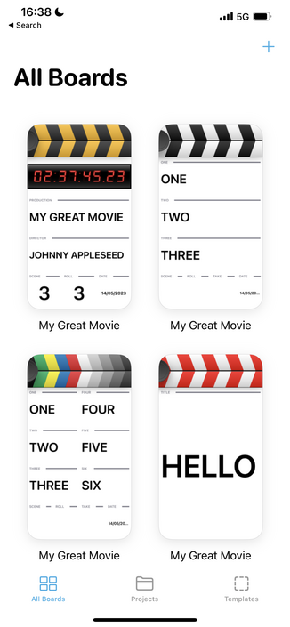
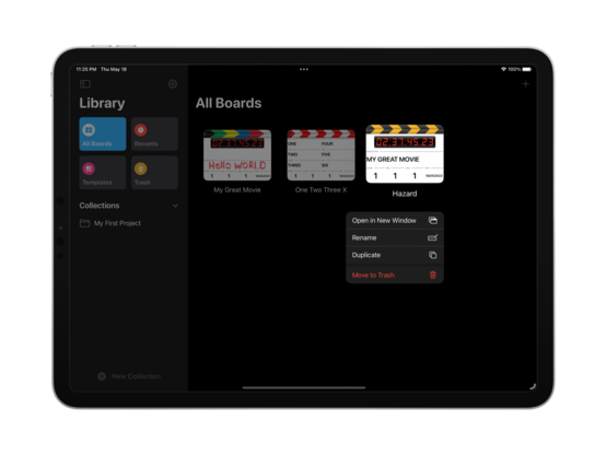
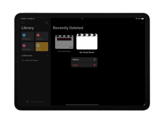
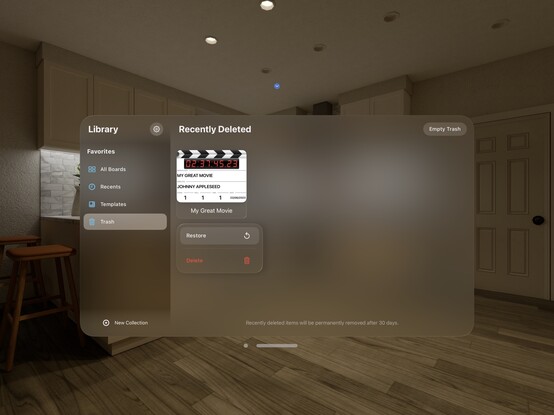
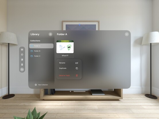
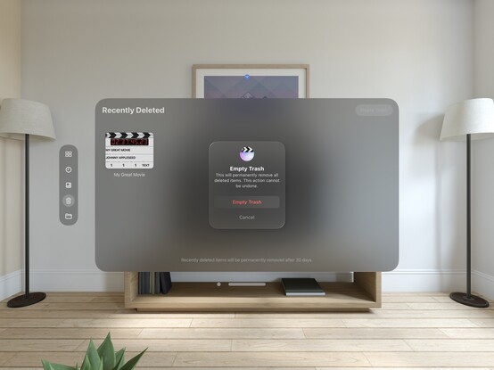
@takeoneapp today after making my mind up on the pencil drawing issue (the new drawing UI is live on TestFlight, btw!). Now deleted boards go to a 'recently deleted' section, so they can be undeleted or permanently removed at will. I have nearly hit my target for 'feature complete’, which is exciting 😄
Since I'm getting closer to finalizing v1.0 of @takeoneapp, it's time to work on features like in-app purchase. I spent some time engineering a decent prompt for Midjourney that has produced a variety of header images I'm happy with, and this is my favorite so far — a young filmmaker or student for which this kind of app would be ideal
I was slightly ahead of where I'd planned to be on @takeoneapp, so putting that extra time into getting iCloud sync and iPhone support in ship shape 😎
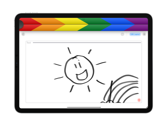
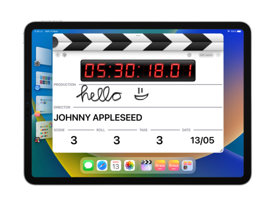
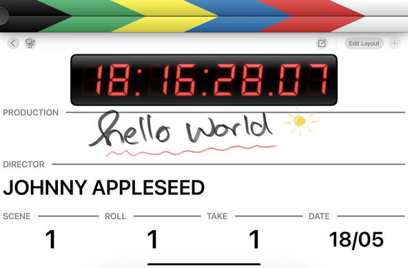
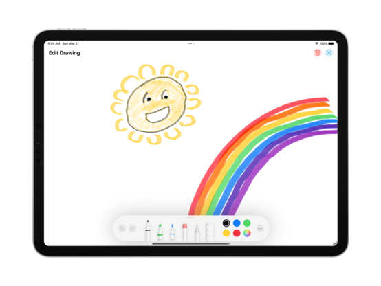
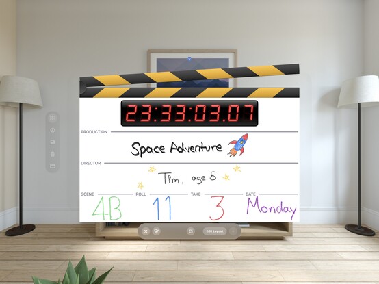
I am so glad I moved to a fullscreen PencilKit canvas in @takeoneapp, it made everything so much easier, and now boards look fun and creative. Very happy with how it's turned out
Tomorrow’s tasks are sync and performance improvements, plus a few bug fixes and UI tweaks. After that, I think it’s going to be time to craft all my marketing screenshots and submit to App Review 😄 The plan now is to have iPhone + iPad at launch, with iCloud sync. I think I have a compelling 1.0, with room to grow, and a Mac version 80% done
Today is the day I hit v1.0 🤞 There will be a few more builds sent to TestFlight as I check off the remaining tasks, but @takeoneapp is ready to go out into the wider world. I'll schedule a launch after App Review has had their say, but hopefully it will be early in the week
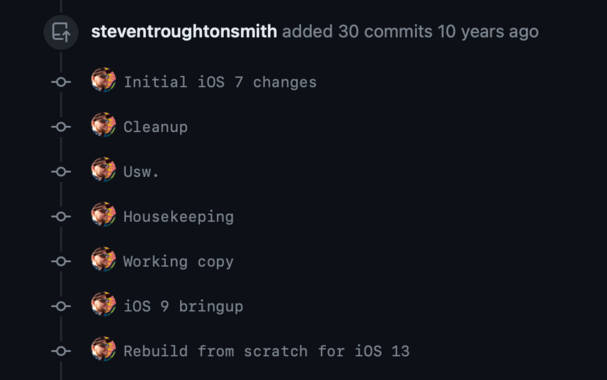
The pull request for the @takeoneapp rebuild is wild. I created this branch for iOS 7, ten years ago, and it's only just coming to fruition now 😧
…and if you're curious where the codebase landed, as I cut the first release candidate build we're at 10,492 lines of code, all Swift
🥳 I made it through! Take One, my modular clapperboard app, is available from the App Store for iPhone & iPad. There's so much more I want to do, but you gotta ship sometime. I just think it's neat, and after four years of sitting on my shelf it's finally time to share with y'all https://apps.apple.com/us/app/take-one/id1586051943
‎Take One

‎Whether you're a student, an amateur enthusiast, or a budding filmmaker, Take One has got you covered. EASY TO USE Get ready to shoot with ease in a stunning and user-friendly interface. Take One allows you to effortlessly create, type, and clap your way into action. Simply double- or triple-tap nu…

App Store
Seeing all the custom UI in Apple's Pro Apps reminded me that I spent some time earlier this year making a whole modular, flexible keyboard system that sure would be of benefit to my editor panels in @takeoneapp 👀 I think I may just do that
Easy numpad. I'll transplant this in a future update and see how it goes
Speaking of old iOS SDKs, here's what @takeoneapp development looked like ten+ years ago 😄

Do you know what might work particularly well in AR? A skeuomorphic clapperboard app…

'Just in case', I've gone and added debug code to let me layout the app such that the clapper sticks break out of the parent view bounds, and rendered out a snapshot I can play with in AR in lieu of an actual UI framework

Hey XR @ Apple, 🤙 call me 😂
Starting to make the changes necessary to get @takeoneapp fully-functional on macOS. It is, of course, not the kind of app that needs to adhere strictly to the Mac idiom, so I'm going to try to avoid writing alternate desktop-specific UI for components I've already built. Some elements are unavoidable, though, like the PencilKit drawing toolbar which needs to be created from scratch on macOS (😒)
Bringup of @takeoneapp on visionOS was rather painless, but I'm currently battling UIToolbar which is determined to draw a visual punch-through effect no matter what I tell it to do. On the plus side, the work I put in to make the clapper sticks break out of the window bounds works out of the box on visionOS, which is fun 😄
I am honestly surprised at how straight a port this was. I opt-in to the Mac behavior of spawning new windows, break out of the window bounds, and now I have a little hand-held clapboard I can take with me around the room on visionOS
Take One feels pretty ace in visionOS!
Now that the core app works, I can play around a little with the structure on visionOS to see what feels right
This bottom toolbar is specifically against the HIG, buuuut I'm not convinced that removing the button shapes would make it better
Crossed the last few hurdles blocking me from finishing off @takeoneapp for macOS, so looks like that's gonna be my first major post-WWDC release 😄 Still have some interaction aspects to clean up, but should be easy from here
To say @takeoneapp had a tepid soft-launch would be an understatement 🥲 The audience for this app, if it exists, does not intersect with my Mastodon followers, so I’ll have to put some effort into getting visibility. This is why I haven’t prioritized shipping the Mac counterpart, though I think a Mac App Store editorial feature would be a lot easier to work towards than on iOS, and would bump both OSes. It's something I need to just get done before the end of the year
Quick pass on @takeoneapp to make some progress on visionOS. This one will definitely have to wait until I get time with a device; I hadn't really thought much about it earlier, because it seemed like the concept was silly on the platform — until I saw just how much POV footage has become a thing with Vision Pro 😂 So maybe the app in XR is more of a fun novelty than outright ridiculous

Another TestFlight over the line (after 3 days in the review queue): @takeoneapp is also pretty much ready for iPadOS 26 and Liquid Glass, so I'm reopening public tester slots here too! There is also an initial macOS build, something I never shipped the first time round

https://testflight.apple.com/join/qSyBk0i6

@stroughtonsmith Once I find a rugged enough iPad case to feel comfortable bringing it on every set, I will absolutely be using this
@stroughtonsmith I’ve seen you talk about this app a lot on here but for some reason today’s the first time my brain read it as lyrics to that A-Ha song, and now I can’t I hear it.
@stroughtonsmith it might be slightly nicer with reduced padding
@harlan Is there an API on the SwiftUI side that can hide the glass material of a view? I tried ".glassBackgroundEffect(displayMode: .never)" but it doesn’t do anything... On UIKit side I can get the material to go away fine.
@khaost .windowStyle(.plain) on the WindowGroup
@harlan Thanks! That's an interesting API design... with the existence of `automatic` and `volumetric`, I kinda assumed that the `plain` is just the glass one 😅
@stroughtonsmith That looks great! I’m excited to go through the same process for one of my apps.
@stroughtonsmith there’s NO WAY that TV stand can hold the weight of that TV 🤦🏻‍♂️
@stroughtonsmith A clapboard that can’t do it’s job in the camera video stream due to visionos restrictions on camera recording!
@stroughtonsmith I love this idea of a 2d experience spawning AR-specific experiences out of the container. That’s a nice repeatable pattern.
@stroughtonsmith After studying other apps, I think the punch through gradient can be regarded as a hint that navigation bars and toolbars are not a place for important controls on visionOS. We need to put them outside the window, similar to what Freeform does on visionOS.
@stroughtonsmith that UI makes me wonder how much more joyful and discoverable SwiftUI’s edit/preview split UI might be if it weren’t integrated in the main Xcode window but rather had room to breathe. A toolbar and a sidebar!
@stroughtonsmith sooooo... basically the same 🙃
@stroughtonsmith @takeoneapp this is such a good habit to take screenshots of what you’re working on at regular interval! If I wanted to see old projects I’d have to source an old Mac, install an old version of Mac OS X and install an old version of Xcode 😅
@stroughtonsmith @takeoneapp aah, gradients, shadows, colours, unique shapes, reflections
@stroughtonsmith man, I miss those glass covered status windows in the top center. It was a great UI element, the perfect sprinkling of skeuomorphism and charm. The old iTunes one always reminded me of the LCDs of CD players and later iPods.
@stroughtonsmith I'm not even remotely in that industry, but this looks fantastic. Nice work Steve! It makes me want to switch industries just to use it!

@stroughtonsmith

Congrats! I’ve been following and very much enjoying Take One’s road to App Store.

I just tried it out on my iPhone and there’s one thing I’m slightly confused about — the two edit modes.

I’m wondering, is there something that prevents you from combining them into a single one? Purely from the experience side, it would make sense to see Delete under (or next to) the ellipsis button and the drag-n-drop gesture working in the read-only compose mode.

@taimar earlier builds had just one edit mode; interaction overload. It's better with distinct modes — and gives me room to expand each with different types of UI

@stroughtonsmith Got it. Maybe it’s the name “Edit” that confuses me the most. I want to *edit* the content but Edit button brings me where I’m only allowed to play with the layout.

What if the edit buttons were switched? “Edit” for editing the content and something like ‘square.grid.2x2’ for layout customization?

@taimar I'll likely change the labels on iPhone. It's shortened from 'Edit Layout’ to fit the screen

@stroughtonsmith Congratulations! 🎉

Btw, is it supposed to prompt me for a rating the very first time I launch it?

I just downloaded it, opened it for the first time and got the “Enjoying Take One? Tap a star to rate it on the App Store.” dialog.

@overengineer sounds like a bug, I'll look into it!
@stroughtonsmith awesome, thank you!! I can’t wait to have a tutu (even though idk the next time we’re shooting anything)
@stroughtonsmith I’m a film student in college and this is so freaking cool! If you added the ability to sync with the timecode of a camera or sound recorder this app would be the bomb!
@bonnyag I have a feeling that's gonna be a popular request! Though the other apps that do so start to get a lot more expensive…

@stroughtonsmith Congratulations, Steve! 🥳 Been following your progres and admiring the results along the way (even though I am admittedly not the target audience for the app, I can appreciate the craftsmanship 🙂)

Wishing you lots of success for the launch and some well-deserved rest 😊

@stroughtonsmith So much admiration for not giving up on the project, I have a few apps that sit there at 80% (at the time 😜)…
@stroughtonsmith congratulations with releasing the app. Even though I have no real use for this app, I have really enjoyed playing with the beta’s and submitting two bug reports through TestFlight (which you addressed)
@stroughtonsmith will definitely give it a try!

@stroughtonsmith lovely app.

I do some fun videos for work, and this will be a useful tool!

Unsure if feedback is wanted, so please ignore as you prefer.

1. 4Mb - wow the app is so tiny - nice work!
2. The clap doesn’t sound very ... clappy?
3. The clapper works well on iPhone 13 in portrait mode, and looks squished in landscape mode
4. I couldn’t find a way to hide the toolbar - I was thinking of minimalist mode with no App UI, only the Board UI modules, if that makes sense?

@stroughtonsmith dumb user question, how do I get sound? I'm trying on an iPad, the "My Great Movie" flavor. The clapper graphic opens and closes but no sound? Volume is almost full on the iPad..
@gordwait you might have the system mute switch enabled (it should show a red indicator)

@stroughtonsmith

Debug: sound works on my iPhone, although the sound is not affected by the phone volume control? Aha, that’s an iPhone setting.. resolved.

No sound on the iPad, confirmed that mute is not set.. Aha, the iPad ringtone and alert volume was set to zero. All good now!
I have sounds on both.
Resolved

While making my last video I realized I could really use a clap board, I’ll give this a try!

@stroughtonsmith I'm gonna show that to colleagues if they complain about long-lived branches. It's all relative.
@stroughtonsmith I’m more interested in “usw” – the only thing I can think of is “und so weiter,” which I haven’t seen for ages! But then I guess these commits are also a touch dated 😅