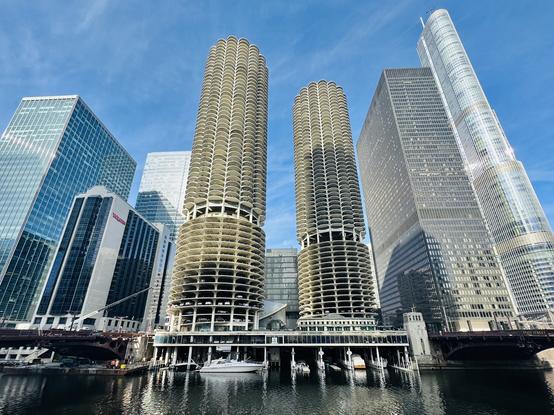
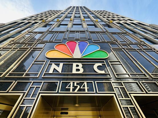
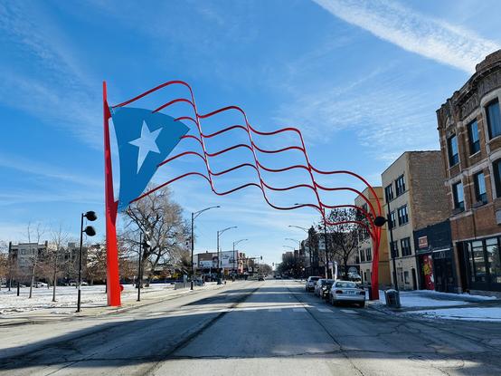
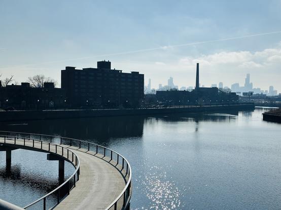
Chicago in Chicago

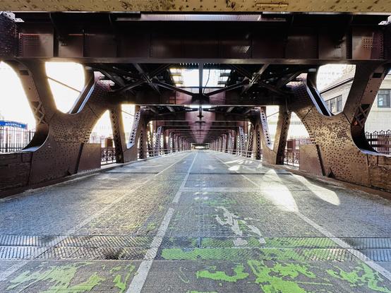
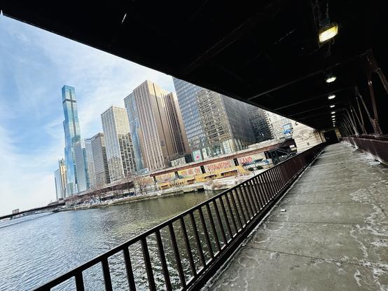
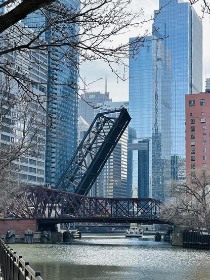
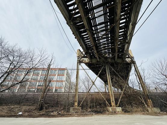
Reunited with my fav Chicago bridge! https://en.m.wikipedia.org/wiki/Kinzie_Street_railroad_bridge


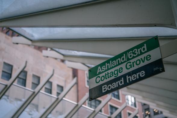
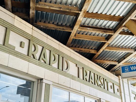
The typography on the vintage Quincy loop elevated station, restored to resemble its former 19th-century glory.
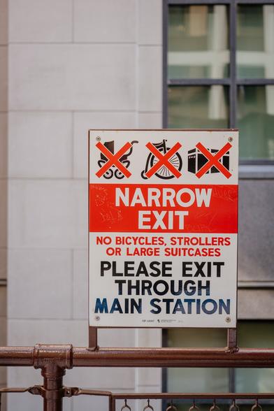
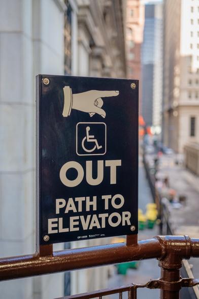
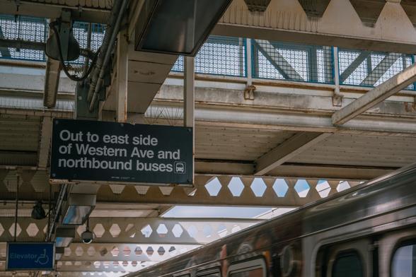
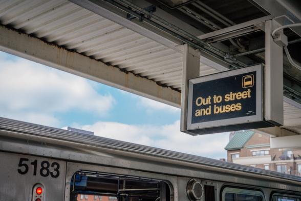
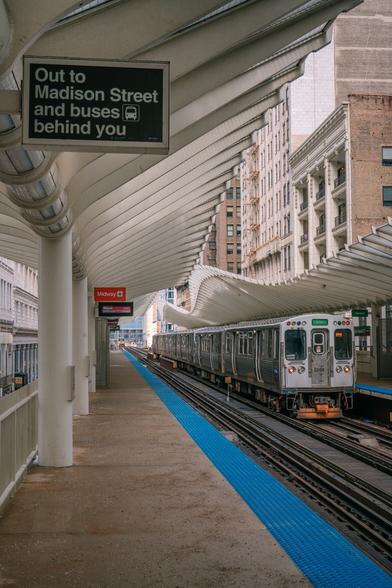
Contrast with the more modern equivalent and (I think) still the house style of Chicago’s Transit Authority.
Alright, so this was a lot more fun than I expected. (Even though the weather is bad.)
@mwichary It's almost unfair how photogenic that city is. Love it!
@mwichary What is it with American public transport and Helvetica. There are other typefaces!
@garethpotter Isn’t it the same with Europe and Frutiger? 🤣
@mwichary Not to quite the same extent, but yes, I suppose so.
@mwichary wow these are amazing. I love the idea of modern transit stations occasionally having a station using such a vintage style like this!
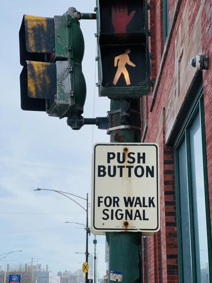
@mwichary The pointing finger and the larger type size of OUT really makes it feel like the station is banishing you 🙂
@mwichary I appreciate these photo collections you’ve been doing
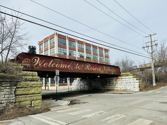
@mwichary The condo building behind the Roscoe Village overpass is/was called The Pencil Factory, and there was a water tower atop it which had a nice mural of sharpened pencils as if in a cup. I'll have to look on my next L ride downtown to see if it's still there....
@mwichary what camera do you use?
@kubabaran iPhone 14 Pro for these
@mwichary Always great to be present at the birth of a new Kickstarter project. 😇
some ideas for what will come after Shift Happens:
- sounds (https://www.conservethesound.de)
- badges (https://chromeography.com/)
🤣

@mwichary I use to have records. I hear they're making a comeback.
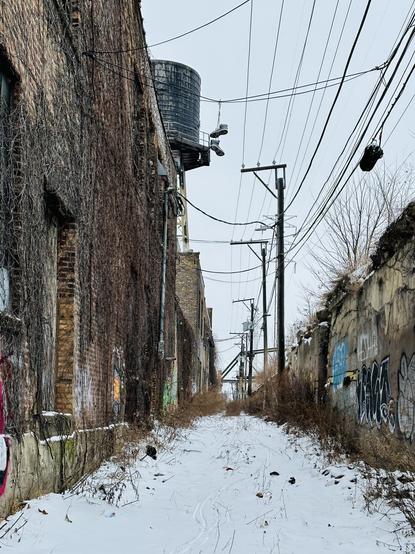
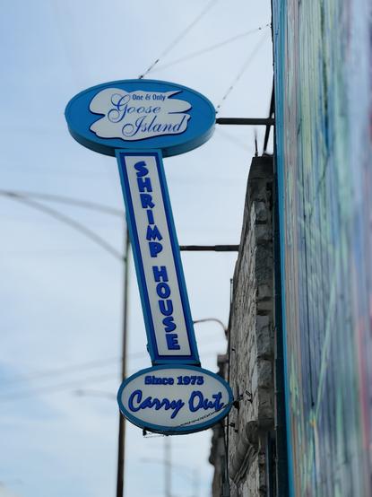
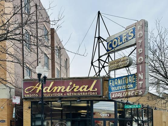
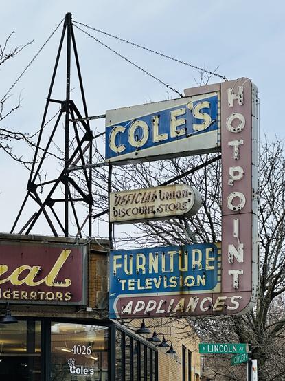
@mwichary Something I always admired (and planned to make a photographic series of but never managed to find the time to do) is the Eiffellian structural frames that hold up all these signs (that I love the signs themselves goes without saying!). Like that Cole’s frame.
You'll see a lot of them remaining around Chicago as vestigial metal sculptures with the actual signs they were built to hold now long gone.
@mwichary Someone call Mike Wolfe at American Pickers!
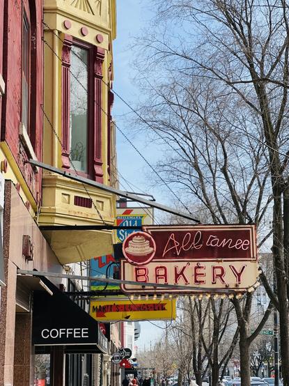
@mwichary Wow, Admiral radio/TV/appliances. That’s an old brand I haven’t seen in a long time.
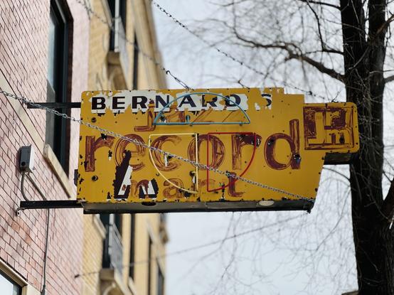
@mwichary ugh that Alt text. Axelrod Music
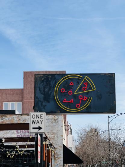
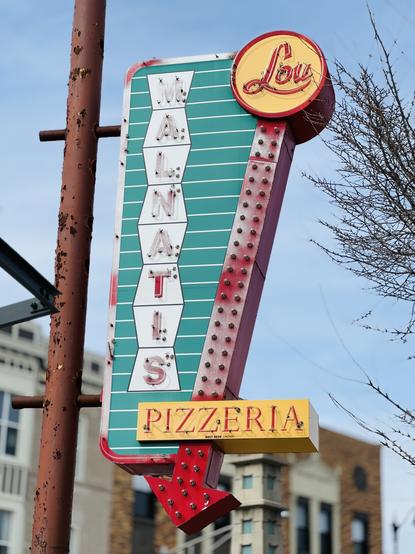
@mwichary The pizza sign! 😍

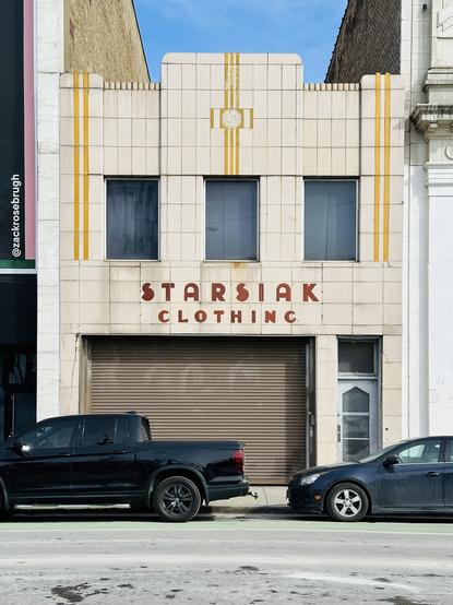
Starsiak: A Chicago Font — The Chicago Neighborhoods
Font #1 Starsiak, an Art Deco display font, was inspired by the Starsiak Clothing signage that was uncovered near the intersection of Division and Milwaukee. The font features 91 different glyphs, including 12 alternate letters, numbers 0–9, and a whole bunch of common punctuation. The purchase
@mwichary The whole font series he did is brilliant.
@mwichary I always love how otherworldly images from other countries or indeed cities can sometimes feel - thank you for these little glimpses.
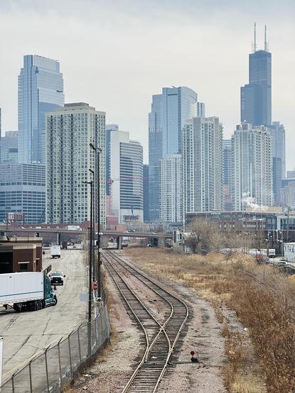
@mwichary having spent god knows how many hours in Flight Simulator as a kid, I’ll recognise the Sears Tower anywhere, despite never having been to Chicago (except virtually, taking off from Meigs Field)
@mwichary I ❤️ this series.
@heyitsbob @mwichary Absolutely loving all of this
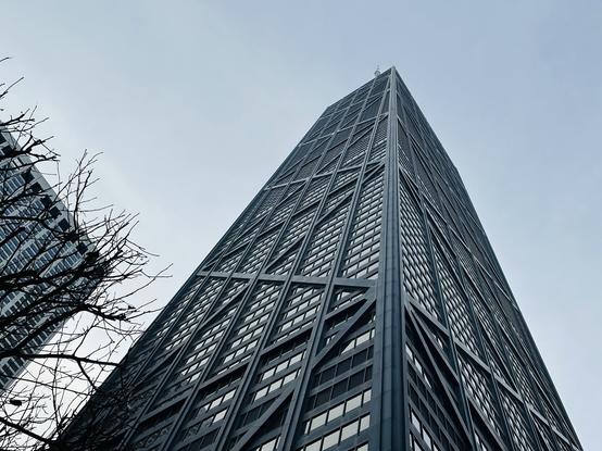
@mwichary Loving all of these and missing Chicago a lot. Particularly that Hancock Center & Water Tower Place shot, with the ramp up to the Hancock car park. The John Hancock Center is my favourite skyscraper in Chicago. Sometimes if I needed to park downtown, I’d deliberately choose JHC for parking, just for the crazy reason that I could drive up inside and around my favourite building. It seemed a particularly American situation.
@practise we got engaged in front of the john hancock center
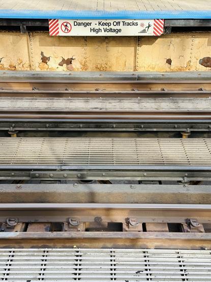
@mwichary nice shot of the under-track shadows. I was biking around today and was delighted there was enough sun to actually have shadows again 😄
@mwichary You're new urban environment seems to suit you well.
@mwichary have you explored Chicago’s underground city / Pedway yet? https://www.bbc.com/travel/article/20171128-chicagos-underground-city-thats-becoming-a-design-star

@mwichary such a photogenic city
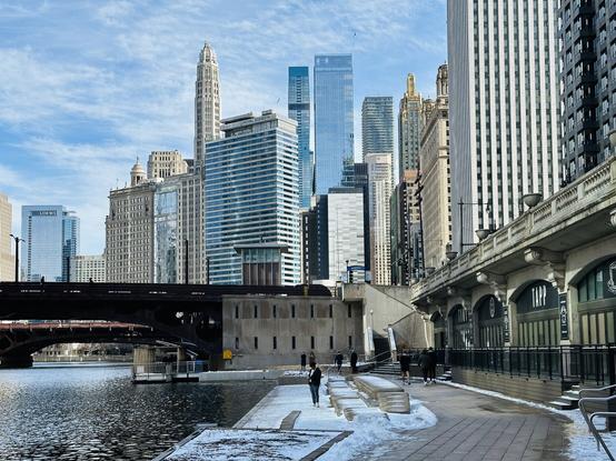
@mwichary This arranged of the photos appeared in my feed. It gave me a momentary illusion that the buildings were perched on top of the bridge. 🙂
@mwichary
Love the window shadows!
Love the window shadows!
@mwichary great shots
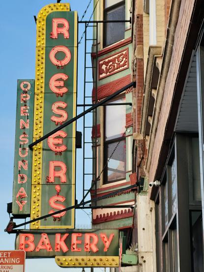
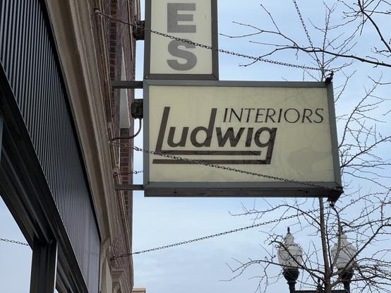
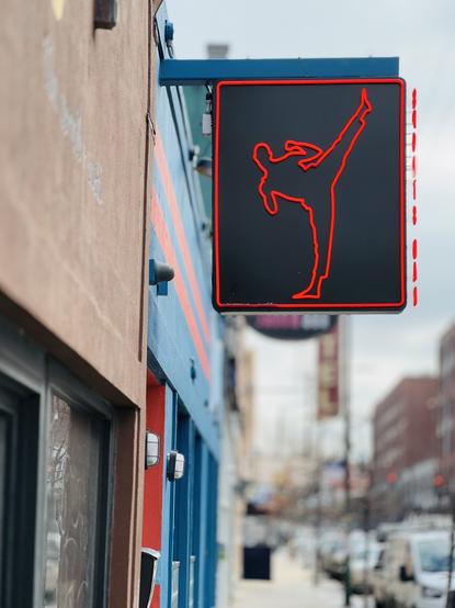
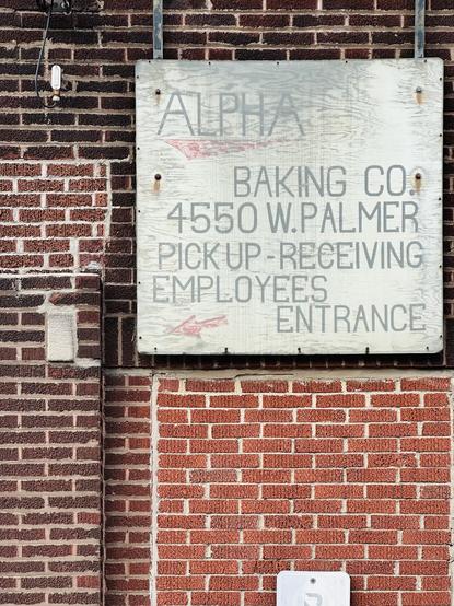
@mwichary Quite nice! Love that sign.
@mwichary Gene's! In the summer, they have a rooftop beer garden, great spot to enjoy a nice afternoon with some German beers and grilled brats