Fontra
Fontra
Fontra is an open-source, browser-based, cross-platform, variable-first font editor, developed by Black[Foundry] and Just van Rossum with support from Google.
https://fontra.xyz/ #OpenSource #FontEditors #VariableFonts #VariableFirst
Andrew Bellamy from the Otherwhere Collective built Relay, a fontdrop website. It’s in beta stage and he asks for your feedback (via mail):
#typedesign #fonteditor #fonts #variablefonts
Featuring the fonts by the typo.social citizens @fontspectrum, @typearture, @letterror, and @AnnaKhorash among others.
https://tdc.org/news/movement-matters-variable-fonts-new-tonal-expressions/
#typedesign #typography #variablefonts #fonts
Contrast Foundry made a write-up on “How to design a variable font”.
#ContrastFoundry #VariableFonts
All three of our fonts are featured as examples 🥳
#PurpleHaze #ElectricBlue and #SilverCoil
https://contrastfoundry.com/projects/how-to-design-a-variable-font
Out of the Black and White: Unveiling the LGM 2026 Visual Identity
The black-and-white placeholder is gone. The new visual identity for LGM 2026 is live. We re:wired classical halftone printing into a real-time digital effect. The new design is built on custom WebGL2 shaders, algorithmic variable fonts, and animated screen angles.
Read the full announcement: https://libregraphicsmeeting.org/2026/news/2026-02-19_0001-design-update/
#LGM26 #LGM2026 #LibreGraphicsMeeting #LGM #WebGL #VariableFonts
Thank you so much @AleksandraSamulenkova for featuring #SilverCoil in your #TypeDirectorsClub story on moving type.
Movement Matters: Variable Fonts’ New Tonal Expressions
Tiny fact check: “While a built-in slider to move between masters might seem like a basic requirement for contemporary font editors, it only appears to be available in Fontra.”
@fontlab has native slider(s) since version 6.
In version 5, one could even find one in the Metrics Window, that was the #MultipleMaster technique though, and not #VariableFonts.
https://tdc.org/news/movement-matters-variable-fonts-new-tonal-expressions/
#Development #Techniques
Typographic scales and technical pens · Consistent stroke widths for type and icons https://ilo.im/169lln
_____
#Icons #Fonts #VariableFonts #Typography #Design #WebDesign #WebDev #Frontend #SVG #CSS
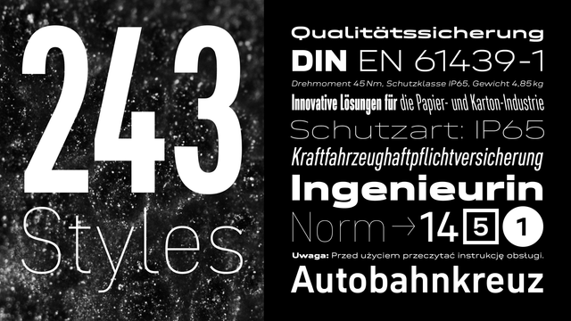
Neue DIN breaks new ground again with Italic & Retalic.
Despite the large size of Neue DIN, italics were missing. Not only because we wanted to design them with care, we also wanted to break new ground when it comes to something natural as italics. So we added not ‘only’ the 81 normal oblique fonts, but also the same number of backslanted variants. These Retalics offer novel possibilities in display contexts, for example.
This update increases the number of static fonts to a whopping 243. For those who prefer a more manageable approach, the variable font has been given a third axis for slanting in both directions. This one is especially fun. Try it out for yourself: https://fontwerk.com/fonts/neue-din


