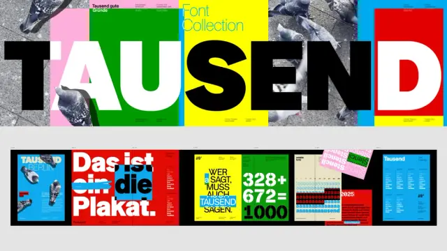
Tausend Font Family by Fontwerk
Tausend Font Family: How One Humble ‘a’ Sparked a Typographic Revolution
Some of you might have seen our selection of the 10 best Helvetica alternatives. To be honest, the Tausend typeface would have been a great fit for that list. But hey, the font family gets its dedicated review this way instead. So feel free to consider this an official addition to that selection.
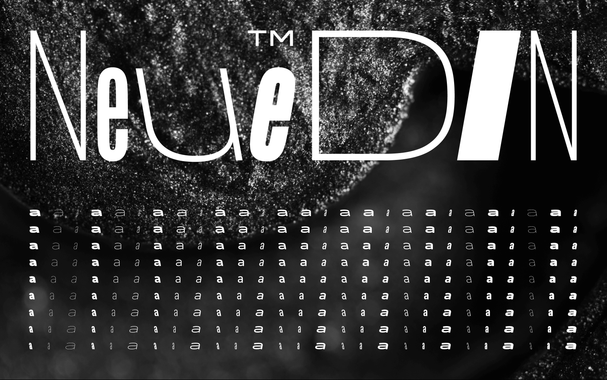
It all began with a single letter. An ‘a’. Not just any ‘a’, but one sketched with a particular character that felt both familiar and entirely new. This is the origin of the Tausend font family, the groundbreaking new release from the Berlin-based foundry, Fontwerk. This typographic system is the brilliant result of a collaboration between two pioneers in type design, Christoph Koeberlin and Gabriel Richter. Tausend is more than just a collection of letters; it is a comprehensive and stunningly versatile system designed to push the boundaries of modern typography.
The story starts three years ago. Christoph Koeberlin, while engrossed in a different project, drew an ‘a’ that captured his imagination. It had roots in the strong tradition of German grotesque typefaces. Yet, it also held a certain charm, a smile, and a wink hidden within its curves. These promising details became the seed. Koeberlin, alongside Gabriel Richter, began to explore and expand this single idea into an entire typographic universe. The result is a testament to how a small spark of inspiration can evolve into something truly monumental.
Tausend Font Family by Fontwerk
Purchase the typeface at Fontwerk A Homage, Not a Revival
Let’s be clear about one thing. While the Tausend font family honors the legacy of static grotesque typefaces, it is not a simple revival. Instead, it is a respectful and innovative homage. You can see the history in its DNA. Notice the small apertures, the subtle top-heaviness of the characters, and the uniquely curved feet. These elements give Tausend a proud, loud, and confident voice.
However, its ‘angular’ curves introduce a contemporary sharpness that sets it apart. It feels robust and honest. Koeberlin and Richter have crafted a typeface that feels both classic and perfectly suited for today’s design challenges. Have you ever looked at a font and felt its personality? Tausend’s is unmistakable. It doesn’t whisper; it speaks with conviction. This isn’t just a tool for setting text. It’s a partner in communication that brings its own distinct character to the table.
Exploring the Expansive Tausend Font Family System
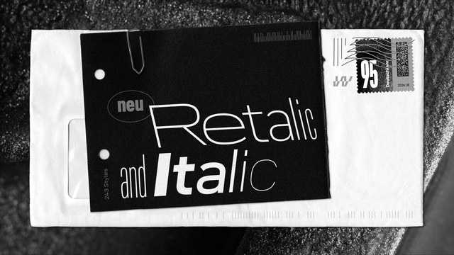
Versatility is at the core of this typeface. The complete Tausend font family is not a single style but a suite of six distinct subfamilies. This provides designers with an incredible palette for a vast range of projects. Each subfamily offers a different flavor, yet they all share the same foundational DNA, ensuring they work together harmoniously.
The collection includes:
- Tausend: The core of the family. A powerful and clear grotesque perfect for everything from body text to headlines.
- Tausend Plakat: Bolder and more impactful. Its design is optimized for posters and display use where you need to grab attention immediately.
- Tausend Soft: This version features rounded terminals, giving it a friendlier, more approachable feel without losing its confident structure.
- Tausend Plakat Soft: The best of both worlds. It combines the impact of Plakat with the gentle, rounded finish of the Soft variant.
- Tausend Stencil: A utilitarian and industrial take on the design. It’s perfect for creating a raw, mechanical, or military-inspired aesthetic.
- Tausend Shaded: This decorative style adds depth and dimension, offering a three-dimensional effect that makes typography pop off the page or screen.
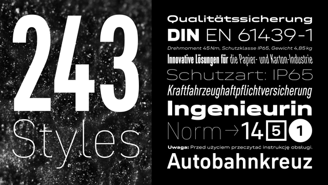
This structural breadth means you can tackle complex branding projects, editorial layouts, and web designs using a single, cohesive family. Furthermore, with its broad language support and an array of stylistic features, the Tausend font family is built for a global and demanding design environment.
The Power of Over 1000 Possibilities
The most revolutionary aspect of Tausend is its use of variable font technology. This isn’t just a buzzword; it’s a practical game-changer. The Tausend font family offers users over 1000 weights and glyphs to play with. What does this actually mean for you, the designer?
Imagine you are designing a website. In the past, you might have loaded separate font files for Regular, Medium, Bold, and Black. This adds to the page’s load time. With a variable font like Tausend, you load one single, efficient file. From there, you can use a slider to select any weight you desire between the lightest and the heaviest extremes. Need a weight that’s just a touch bolder than your body copy for a subheading? You can dial it in precisely. This level of control is simply not possible with traditional static fonts. Consequently, it unlocks a new level of typographic nuance and performance.
Ivo Gabrowitsch, the founder of Fontwerk, puts it perfectly. He says, “Tausend breaks the rules and pushes the limits of variable technology, providing designers with a multi-talented, Jack-of-all-trades font that can stand the test of big and complex project briefs.”
A Voice for Brutally Honest and Confident Brands
A typeface is the voice of a brand. So, what kind of brand does Tausend speak for? According to its creators, “Our new typeface is brutally honest, proud and confident. If that is what brands or products are, they will find the right team player in Tausend.”
This is a powerful statement. It suggests that the Tausend font family is not for the timid. It is for brands that have a strong point of view and are not afraid to express it. Think about the values your project needs to convey. Is it integrity? Strength? A forward-thinking attitude? Tausend can help you articulate those values visually.
Richter and Koeberlin add a crucial reminder: “It is not enough to put your own values and demands into the world at some point… they need to be lived continuously. Especially in design.” This philosophy is embedded in the font itself. Its consistency across a massive range of weights and styles allows a brand to maintain its voice, whether in a tiny footnote or a massive billboard.
Purchase the typeface at Fontwerk Ultimately, Tausend is more than just a font; it’s a strategic choice. As Ivo Gabrowitsch concludes, “It really packs a punch, one that pays homage to heritage and traditions of good old German grotesques yet takes bold and brave new leaps into this ever-evolving era of technology and design.” Choosing the Tausend font family is an investment in a system that is built to last, adapt, and make a statement. It’s a tool for designers who are ready to build brands with unwavering confidence.
All images © Fontwerk. Don’t hesitate to browse WE AND THE COLOR’s Fonts category to find other professional typefaces.
#font #fontFamily #Fontwerk #sansSerif #Tausend #TausendFont #TausendTypeface #typeface