Download a Company Profile Presentation Template for Adobe Illustrator That Actually Works
Most presentation templates fail before anyone opens them. They promise versatility, deliver visual noise, and force you to spend hours overriding decisions someone else made badly. The Monono company profile presentation template takes the opposite approach — and the result is something worth paying close attention to.
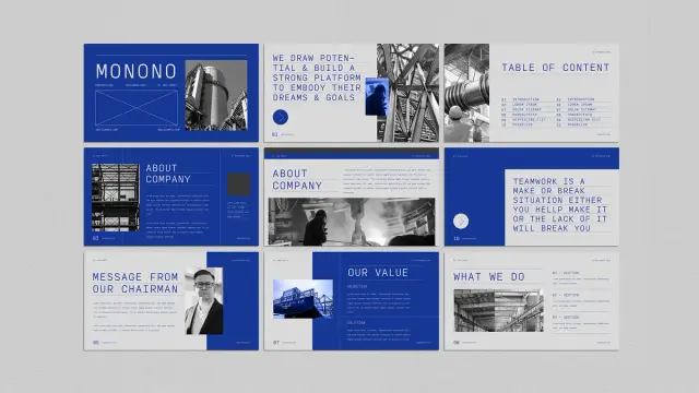
Designed by Adobe Stock contributor Guuver, this Illustrator template operates at 1920 × 1080 px, the native resolution of screen presentations. Every slide feels deliberate. The bold cobalt blue palette, uppercase editorial typography, and structured white space aren’t decorative choices — they’re functional. They signal authority. They create visual hierarchy without trying hard.
Strong company profile presentations don’t just share information. They build trust, establish credibility, and leave an impression. Monono does all three. Here’s exactly why it works — and why it deserves a place in your design toolkit.
Download the template from Adobe StockPlease note that to edit this template, you need professional graphic design software like Adobe Illustrator installed on your computer. You can get the latest version from the Adobe Creative Cloud website. Just have a look here.
Download this Adobe Illustrator Company Profile Presentation Template by Guuver. Download the template from Adobe StockWhat Makes a Company Profile Presentation Template Worth Using in 2025?
That’s the honest question every buyer should ask before downloading anything. Templates are everywhere. Most are generic. So what separates a useful company profile presentation template from one that wastes your time?
Three things: structural clarity, visual restraint, and flexibility. Monono delivers all three in a single 22-slide package designed specifically for Adobe Illustrator. It covers every standard section a professional company profile needs — introduction, about the company, mission and values, project portfolio, team, pricing, testimonials, Q&A, and a contact slide.
Each section has its own distinct layout. Yet the overall presentation feels cohesive. That’s harder to pull off than it sounds. Many templates achieve variety at the cost of unity. Monono maintains both through a disciplined design language built on bold typography, high-contrast imagery placement, and a blue-and-black color system that commands attention without exhausting it.
The minimalist approach isn’t minimalism for its own sake. It’s minimalism as a professional strategy. When your slides are clean, your content gets the attention — not the background gradients or animated transitions.
The Design Language: A Framework for Authoritative Presentations
Let’s define something useful here. Call it the Authority Architecture — a three-part design framework that explains why this template works where others don’t.
1. Chromatic Dominance
Monono uses a striking cobalt blue as its dominant color. This isn’t just an aesthetic decision — it’s a psychological one. Blue communicates trust, stability, and competence in corporate contexts. The Monono Illustrator template applies this color with confidence, using it in large blocks rather than subtle accents. The result reads as bold and assured rather than timid or decorative.
Pair that blue with black-and-white photography and clean white text, and you get a palette that photographs well, projects clearly, and looks polished on any screen.
2. Typographic Authority
The template leans on uppercase, wide-spaced display typography. Headlines like “TEAMWORK IS A MAKE-OR-BREAK SITUATION” take up space intentionally. They don’t whisper. They anchor each slide and give the viewer something to hold onto visually.
This typographic approach aligns with what design critics increasingly call editorial brutalism — the use of raw typographic scale and weight to create hierarchy without ornamentation. It works especially well in company profile presentations where perceived authority matters as much as visual appeal.
3. Structural Modularity
Every slide in Monono is independently functional. Swap out placeholder images, replace the lorem ipsum copy, and each slide works as a standalone unit. Yet nothing breaks the overall flow. This modularity is the product of thoughtful grid architecture — something Guuver executes with real precision throughout the template.
Slide-by-Slide: What the Monono Company Profile Presentation Includes
A professional company profile presentation template is only as good as its slide coverage. Monono covers the full scope of a corporate presentation without padding or unnecessary repetition.
Introduction and Title Slides
The opening slides are designed to project a strong first impression. The title slide uses the brand name in oversized uppercase typography over a full-bleed blue background. Supporting text sits small and subordinate — letting the company name do the work.
A table of contents slide follows, structured cleanly with numbered sections. This is a detail many templates skip. Monono includes it because professional presentations need navigational clarity.
About the Company and Chairman’s Message
Two critical slides that most company profile presentations either rush or over-design. Monono gives each its own layout — one image-forward, one text-forward — so you can balance visual and written content naturally.
The chairman’s message slide features a portrait placeholder alongside a text column. The layout communicates leadership presence without resorting to clichéd headshot-and-quote formats.
Values, Mission, and What We Do
These slides use a split-column approach with numbered sections. The formatting is clean enough to present complex information without overwhelming the viewer. The “What We Do” slide organizes services into four labeled sections — a practical structure for agencies, consultancies, and enterprise businesses alike.
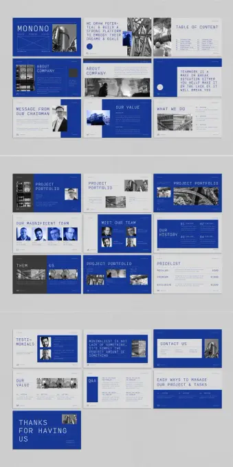
Project Portfolio
Three distinct portfolio layouts appear across the template. Some are image-dominant, others text-dominant, and one uses a dual-image approach that works well for before-and-after or comparison storytelling. This variety gives you options without forcing you to redesign anything.
Team and Culture Slides
“Our Magnificent Team” and “Meet Our Team” provide two different framings of the same content. One uses a grid of headshots with names. The other shows a closer, more personal layout. Both feel editorial rather than corporate-stock-photo generic.
History, Pricing, and Testimonials
A timeline-style history slide, a structured pricing table with three tiers, and a testimonials slide with portrait placeholders cover the commercial and social proof aspects of a company profile presentation. These are conversion-critical slides. Monono treats them with appropriate visual weight.
Q&A, Contact, and Closing
The Q&A slide uses a split-question format, which is unusual and practical for workshops or investor meetings. The contact slide is minimal and functional. The closing slide — “Thanks for Having Us” — lands with warmth rather than corporate formality.
Why Adobe Illustrator Is Still the Right Tool for Company Profile Presentations
PowerPoint and Keynote dominate the presentation space. So why choose an Adobe Illustrator template for a company profile?
Control. As the most advanced graphic design software, Illustrator gives designers absolute precision and flexibility that slideshow software simply can’t match. For company profile presentations that need to look polished in print as well as on screen, Illustrator is a professional solution.
Monono takes full advantage of Illustrator’s strengths. The template keeps headers and footers consistent across all 22 slides. Typography is set with real attention to tracking and leading — details that matter in high-stakes presentations.
The 1920 × 1080 px format makes it directly exportable to PDF for screen use, or printable at A4/letter size with minimal adjustment. That dual-use flexibility is a genuine advantage for design-conscious teams.
Who Should Use This Company Profile Presentation Template
Monono isn’t for every business. Its visual identity is bold and confident — best suited to industries where design credibility matters.
Architecture firms, creative agencies, product studios, tech consultancies, and corporate strategy teams will all find the template useful. The editorial tone of the typography communicates seriousness without stuffiness. The blue palette reads as modern and professional rather than traditional or conservative.
Startups pitching to investors will find the clean structure valuable — it lets the content breathe rather than burying it in visual clutter. Established companies refreshing their corporate identity will appreciate the template’s maturity. It doesn’t feel like a student project. It feels like something a seasoned creative director signed off on.
Customization: Replacing Placeholders Without Breaking the Design
The Monono company profile presentation template uses placeholder images and lorem ipsum text throughout. All placeholders are fully replaceable in Adobe Illustrator. The design system holds together even when you change every visual element.
That’s the test of a well-built template — whether it survives contact with real content. Monono passes. The underlying grid and typographic hierarchy are strong enough to anchor any content you drop in.
Here’s a practical workflow for customizing this Illustrator template without losing the design integrity:
Step 1 — Establish Your Color System First
Before touching a single slide, decide whether you’re keeping the cobalt blue or replacing it with your brand color. Illustrator’s swatches panel makes global color changes fast. Update the primary color swatch, and the change cascades across all slides instantly.
Step 2 — Replace Images in Batches
Swap all placeholder images before touching copy. This gives you an accurate visual read on the final presentation before you start writing. Use high-contrast, editorial-style photography to maintain the template’s aesthetic vocabulary.
Step 3 — Edit Copy Hierarchically
Start with headlines, then subheadings, then body copy. This preserves the layout hierarchy while you work and prevents you from losing your place in complex multi-column slides.
Step 4 — Export and Review at Full Screen
Export to PDF and view at 100% on the screen you’ll present from. The 1920 × 1080 px format is optimized for this — but fonts and images that look fine at 25% zoom sometimes surprise you at full size. Review before your presentation date, not the morning of.
The Minimalist Presentation Paradox: Why Less Converts More
Here’s a perspective worth holding onto. Most presenters believe more information equals more persuasion. Research and real-world experience both say otherwise.
Cognitively dense slides exhaust viewers. When every pixel fights for attention, nothing gets it. The Monono company profile presentation resolves this through what I’d call the Signal Clarity Principle — a design philosophy where visual restraint actively increases message retention.
Each Monono slide carries one primary message. Supporting details exist, but they’re subordinate. The typographic hierarchy enforces this — the headline always wins. As a result, viewers remember what you intended them to remember. That’s not an accident. It’s a strategic design.
The slide that reads “MINIMALIST IS NOT LACK OF SOMETHING. IT’S SIMPLY THE PERFECT AMOUNT OF SOMETHING” isn’t just a motivational quote. It’s a design philosophy statement embedded in the template itself. Guuver isn’t hiding the thesis — it’s on the slide.
How Monono Compares to Other Company Profile Presentation Templates
The Adobe Stock library contains hundreds of company profile presentation templates. Most fall into predictable categories: overly illustrative, color-heavy, icon-dependent, or visually timid.
Monono occupies a different position. Its closest aesthetic relatives are high-end agency decks and architectural pitch presentations — documents that prioritize spatial design and typographic authority over decorative elements.
What sets it apart in practical terms:
First, the color commitment. Most templates use color as an accent. Monono uses it architecturally — blue occupies entire slides, not just borders or icons.
Second, the typographic scale. Oversized headlines in a presentation template require confidence. Guuver commits to scale without apology. The result looks expensive.
Third, the photography integration. Placeholder image frames are sized and positioned to work with real editorial photography — industrial, architectural, and portrait content all fit naturally within the established layouts.
Long-Term Value: When a Company Profile Presentation Template Pays for Itself
A well-designed company profile presentation template isn’t a one-use purchase. The Monono template scales across use cases — client pitches, investor decks, internal strategy presentations, conference talks, and partnership proposals all fit within its structural framework.
For agencies and studios with multiple clients, the template’s modular slide architecture means each new presentation requires adaptation rather than reconstruction. That’s hours saved per project. Over a year, across multiple clients, the economics are clear.
Download the template from Adobe StockThe Adobe Illustrator format also future-proofs your investment. Illustrator files are the industry standard for professional graphics. Your presentation can become a printed brochure, a PDF download, or an exported slide deck without redesigning anything from scratch.
Frequently Asked Questions About the Monono Company Profile Presentation Template
What software do I need to use this template?
You need Adobe Illustrator. The template is built natively for Illustrator and won’t open correctly in PowerPoint or Keynote. An active Adobe Creative Cloud subscription gives you access to the latest version of Illustrator.
Can I use this template for multiple clients?
Yes. Standard Adobe Stock licensing covers commercial use across multiple projects. Review Adobe’s licensing terms for specific limitations, but for most agency and freelance use cases, a single purchase covers multiple client applications.
Is this template print-ready as well as screen-optimized?
The native format is 1920 × 1080 px, optimized for screen presentations. With minor adjustments to document size and bleed settings in Illustrator, you can adapt it for print output. The design translates well to A4 landscape format.
How long does it take to customize the full template?
For a practiced Illustrator user, a full 22-slide customization takes two to four hours, including image replacement and copy editing. For users new to Illustrator, budget half a day. The template’s clear structure makes the process straightforward even without advanced Illustrator experience.
What industries suit the Monono company profile presentation template best?
Architecture, engineering, creative agencies, technology consultancies, financial services, and corporate strategy teams all align well with the template’s visual identity. Industries where design credibility signals professional competence will find the most value here.
Where can I download the Monono Illustrator template?
The template is available directly through Adobe Stock. An Adobe Stock subscription gives you access to millions of other creative assets — making it a cost-effective choice for designers who regularly need high-quality templates, stock photography, and creative resources.
A Final Thought on What Good Presentation Design Actually Does
Every slide is a beat in a story you’re telling — and the design either supports that story or competes with it.
The Monono company profile presentation template understands this. It creates a visual environment that puts the presenter in control. The bold typography gives you authority. The clean layouts give your content space to breathe. The consistent color system gives your audience a visual anchor across every slide.
That’s what a great Illustrator template actually delivers — not just good-looking slides, but a design system that works for you in the room. Monono earns that description honestly.
If your current company profile presentation is doing the visual equivalent of shouting over itself, this template is the reset you’re looking for. Add your content, trust the grid, and let the design do its job.
Check out other professional graphic design templates here at WE AND THE COLOR.
#companyProfile #design #graphicDesign #illustratorTemplate #presentation #presentationTemplate