Truppe Rebranding: How Holman Design Turned a Product-Trapped Brand Into a Scalable Identity
Some brands are born too small for their own ambition. They start with a name that fits a single product, a single shelf, a single season — and then they grow, and suddenly the name becomes a cage. Truppe, an artisanal confectionery based in Pelotas, Brazil, knew that feeling intimately. The original brand was solid. The product was good. But the name? It pointed in only one direction.
That’s the kind of strategic constraint that most small businesses either ignore or paper over with a new logo. Felipe Corrêa Holman of Holman Design did neither. Instead, he dismantled the brand from the ground up and rebuilt something designed to last — and to grow. The result is a Truppe rebranding project that deserves serious attention from anyone working in brand strategy, visual identity, or artisanal food packaging.
This is a case study worth studying closely. Not because it’s flashy — though it absolutely is — but because every decision in it connects back to a strategic reason. That combination is rarer than it should be.
What Does It Mean When a Brand Is “Product-Trapped”?
The term is worth coining because the condition is extremely common. A product-trapped brand is one whose name, visual identity, or positioning is so tied to a specific item or category that expansion feels like a contradiction. Customers associate the brand with one thing. The name reinforces that thing. And so, over time, the brand becomes a ceiling rather than a platform.
For Truppe’s predecessor, this was the central problem. The original name locked the brand into a single product association. Launching cookies alongside brownies — let alone expanding into retail, gifting, or franchising — would have required customers to mentally override everything the name already told them.
This is also one of the most underdiagnosed problems in artisanal food branding. Makers focus on the product first, the name second, and the brand architecture almost never. By the time growth becomes a real goal, the brand is already fighting against itself.
Holman’s process began with deep market research, competitor analysis, and direct engagement with customer perceptions. The insight that emerged was clarifying: there was a real opportunity to differentiate through professional design in a category where most competitors relied on generic, interchangeable aesthetics. The gap was there. The question was how to fill it with something that could actually scale.
The Strategic Logic Behind the Name “Truppe”
Naming is arguably the hardest single decision in a rebrand. Get it right, and it carries the whole identity forward. Get it wrong, and no amount of visual design can compensate.
“Truppe” earns its name on two levels simultaneously. First, it references the idea of a troupe of performers — a collective, a crew, a group of people who show up together to create something joyful. That instinct toward togetherness and celebration aligns precisely with what an artisanal confectionery is supposed to feel like. You don’t buy a brownie alone. You share it. You bring it somewhere.
Second, the name draws from the Italian expression è troppo, meaning roughly “it’s too much” in the best possible sense — overwhelming, extraordinary, more than expected. For a premium artisanal brand, that’s exactly the emotional register you want to hit. The product should feel indulgent. The experience should feel generous.
Together, these two references create a name that works on a gut level without requiring explanation. It sounds right before you understand why. That phonetic and conceptual alignment is the hallmark of strong strategic naming in artisanal food brand identity.
Why Naming Needs to Come Before Visual Design
This sequencing matters more than most rebranding discussions acknowledge. Holman’s process treated naming as a strategic output of research, not a creative exercise that runs parallel to logo design. The name came from a positioning decision, and the visual identity came from the name.
That’s the right order. And it’s not always how it happens.
When studios jump to visual design before the naming and positioning are locked, the result is often a brand that looks cohesive but feels arbitrary. The colors are nice. The typeface is interesting. But nothing explains why this brand sounds the way it does, or why it behaves the way it does across different contexts. Truppe avoided that trap by doing the strategic work first.
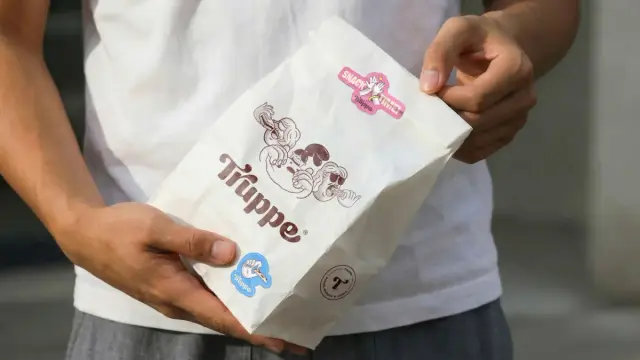
Truppe rebranding project by Felipe Corrêa Holman.How the Visual Identity System Translates Strategy Into Form
Once the name and positioning were established, Holman’s team built a visual identity system that carries the brand’s personality across every surface. The core elements — a custom logotype, a bold color palette, and an exclusive illustration system — work together to create what I’d call shelf-disruptive coherence.
That phrase is intentional. Most artisanal food brands choose between two failure modes: either they’re so minimal they disappear on a crowded shelf, or they’re so busy they look chaotic and untrustworthy. Truppe threads that needle through a system that is simultaneously bold and organized.
The custom logotype gives the brand a singular, ownable mark — something that doesn’t look like it came from a font library. Custom lettering at the brand level signals craft and investment in a way that a standard typeface never can. It also ensures that competitors can’t accidentally echo your identity by choosing the same font.
The color palette commits to vibrancy without tipping into noise. This is harder than it sounds. Bold palettes require discipline — knowing which colors anchor the system and which ones activate it situationally.
The Illustration System as a Differentiation Engine
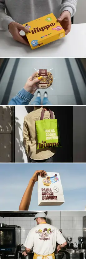
This is the decision that stands out most clearly from a strategic design perspective. Rather than using photography or generic graphic elements, Holman built an exclusive illustration system where each product category — cookies and brownies — gets its own dedicated illustration.
This solves multiple problems at once. It creates clear product differentiation within a unified brand language. It gives the brand a visual signature that is completely proprietary. And it builds toward a future where new product categories can simply receive new illustrations, expanding the brand without requiring a redesign.
That last point is crucial. The illustration system isn’t just a design choice — it’s a growth infrastructure decision. Every new product line Truppe eventually launches already has a design logic waiting for it. That kind of forward-thinking is what separates brand strategy from brand decoration.
Packaging Design as the Brand’s Primary Customer Touchpoint
For an artisanal confectionery brand, packaging isn’t marketing collateral. It is the brand. The moment a customer picks up a Truppe box, everything they think about the product — its quality, its price point, its emotional register — is shaped by what they’re holding.
Holman treated packaging design accordingly, making it a central focus rather than an output of the visual identity work. The resulting system does something specific and important: it prioritizes the brand over the individual product.
This is a deliberate inversion of how many artisanal food brands structure their packaging. The instinct is usually to lead with the product — “Dark Chocolate Brownie,” “Hazelnut Cookie” — and treat the brand as secondary. That approach makes sense for product launches. It makes much less sense for brand building.
By leading with Truppe and letting the product information follow in a clear hierarchy, the packaging trains customers to build loyalty to the brand rather than to any single SKU. When Truppe eventually launches a new product, customers will trust it before they’ve even tried it. That’s brand equity working exactly as it should.
Scalability as a Design Principle in Artisanal Food Packaging
The packaging system was also built explicitly for scale. This is worth calling out as its own principle: scalable packaging architecture means designing a system that can absorb new products, new sizes, and new retail contexts without requiring a visual overhaul.
Truppe’s system organizes information hierarchically, uses the illustration system for product differentiation, and maintains a consistent visual language across all SKUs. Adding a new product line means creating a new illustration and slotting it into an existing template — not starting from scratch.
For a brand with ambitions that include new product lines, physical retail, and eventual franchising, this isn’t a nice-to-have. It’s a foundational requirement. Holman built that requirement into the system from day one.
The Truppe Rebranding and the Concept of Emotional Architecture
I want to introduce a framework here that I think captures what Holman achieved across the full project. I’m calling it Emotional Architecture — the deliberate construction of brand elements that create consistent emotional responses across every customer interaction, from first sight to repeat purchase.
Most brands manage to create emotional resonance at one or two touchpoints. The logo looks great. The packaging feels premium. But the name doesn’t connect to either of those feelings, or the in-store experience breaks the spell, or the social media presence doesn’t carry the same energy.
Truppe is different because every layer of the brand communicates the same thing: joyful, collective, indulgent, artisanal, high-quality. The name says it. The illustrations show it. The packaging reinforces it. The color palette broadcasts it from across a room. That alignment isn’t accidental — it’s the product of strategic work done before any visual decisions were made.
When emotional architecture is done right, customers don’t need to consciously process why they trust a brand. They just do. That trust is the compounded result of consistent emotional signals, and it’s what makes brands scalable across new products, new markets, and new formats.
What This Rebranding Reveals About the Future of Artisanal Brand Strategy
The Truppe project points toward something broader happening in artisanal food branding right now. The gap between craft-scale production and professional brand strategy is closing. For a long time, the assumption was that strategic branding was for big companies — the kind of investment that only made sense with a significant marketing budget.
That assumption is becoming obsolete. Independent studios like Holman Design are proving that brand strategy and visual identity at the highest level are accessible to artisanal producers. And the brands that invest early in that strategic foundation are building structural advantages over competitors who treat design as a finishing touch.
Here’s a prediction worth making explicitly: within the next five years, the artisanal food brands that don’t invest in strategic brand architecture — naming, positioning, visual identity systems, and scalable packaging design — will find themselves unable to compete in the channels they want to enter. Retail buyers, specialty distributors, and franchise operators will increasingly filter for brand professionalism as a basic qualification.
Truppe has already cleared that bar. That’s not a small thing.
The Holman Design Approach: Strategy-First, Aesthetics as Output
Felipe Corrêa Holman’s work reflects a methodology that deserves its own name. I’d call it strategic visual immersion — a process that refuses to separate design decisions from business decisions, and that treats aesthetics not as a starting point but as the output of deep strategic thinking.
This isn’t new as a concept, but it’s remarkably rare in execution. Many studios claim to be strategy-first. Few actually sequence their work that way. When you look at the Truppe project from the initial research phase through the naming decision to the visual identity system and the packaging architecture, the strategy-first commitment is visible in every layer.
That’s the standard worth holding brand work to — not just whether it looks good, but whether every visual decision has a strategic reason behind it.
The Long-Term Potential Embedded in the Truppe Brand
Let’s talk about where Truppe goes from here. The rebranding didn’t just solve the product-trapped problem — it built a brand that is structurally prepared for significant expansion.
The naming positions Truppe as an experiential brand, not a product brand. That distinction matters enormously when you’re thinking about physical retail. An experiential brand can justify a dedicated retail concept. It can support a gifting line, a seasonal collection, a limited-edition collaboration. A product brand can only sell more of the same product.
The illustration system is infinitely expandable. New product categories get new illustrations. The brand stays coherent while the assortment grows. That’s a packaging system that can support a hundred SKUs without losing visual identity.
The franchise potential the brief mentions is actually quite credible for a brand that has done this strategic work. Franchise systems live and die on brand consistency. A brand with a clear visual system, a defined emotional register, and a scalable packaging architecture is exactly what franchise operators need. Truppe has all of that now.
What comes next depends on execution, on distribution, on all the things that happen outside the design studio. But the brand infrastructure is there. That’s more than most artisanal confectionery brands can say.
Lessons for Brand Designers and Small Business Owners Alike
The Truppe rebranding offers clear takeaways that apply well beyond artisanal food. Whether you’re a brand designer thinking about how to structure your process, or a business owner wondering whether your current brand is limiting your growth, there’s something here for you.
First: naming is a strategic decision, not a creative one. The name “Truppe” didn’t emerge from a brainstorming session. It emerged from research, from positioning work, from a clear articulation of what the brand needed to communicate and to whom. That sequence matters.
Second: visual identity systems are investments, not expenses. A custom logotype and an exclusive illustration system cost more than a template-based identity. They also create a proprietary visual language that no competitor can replicate. The return is measured in brand recognition, customer loyalty, and market positioning — over years, not months.
Third: packaging hierarchy is a strategic choice. Leading with the brand rather than the product is a decision about what kind of loyalty you’re trying to build. If you want customers to come back for Truppe, you lead with Truppe. Every time.
Fourth: design for scale from day one. The illustration system wasn’t built for the current product range — it was built for the brand Truppe intends to become. That forward-looking design discipline is what separates brand work that lasts from brand work that needs to be redone in three years.
Frequently Asked Questions About the Truppe Rebranding Project
What is the Truppe rebranding project?
The Truppe rebranding project is a complete brand transformation for an artisanal confectionery based in Pelotas, Brazil. It was designed and executed by Felipe Corrêa Holman of Holman Design. The project covered strategic repositioning, naming, visual identity design, and packaging design, with the goal of transforming a product-trapped brand into a scalable, emotionally resonant identity prepared for long-term growth.
Why did Truppe need a rebrand?
The original brand name was strongly associated with a single product, which limited the company’s ability to expand into new product categories, retail environments, or a potential franchise model. The rebrand addressed this structural limitation by creating a name, positioning, and visual identity system that supports growth rather than constraining it.
What does the name “Truppe” mean?
The name “Truppe” draws from two references. First, it evokes the concept of a troupe of performers — a collective, playful, and expressive group aligned with the brand’s celebratory personality. Second, it references the Italian expression è troppo, which means “it’s amazing” or “it’s too much” in the most indulgent sense. Together, these references create a name that communicates energy, togetherness, and premium quality.
What is an exclusive illustration system in branding?
An exclusive illustration system is a set of custom-designed illustrations created specifically for a brand, where each illustration corresponds to a product category or subcategory within the brand’s lineup. In Truppe’s case, cookies and brownies each have their own dedicated illustration. This creates clear product differentiation within a unified visual language and also provides a framework for future expansion — new product categories simply receive new illustrations without requiring a brand redesign.
How does Truppe’s packaging design support brand growth?
Truppe’s packaging was designed as a scalable system from the start. It organizes information hierarchically, leading with the brand name rather than individual product names. This trains customer loyalty toward the brand rather than any single SKU. The system also accommodates future product lines, new sizes, and new retail formats without requiring a visual overhaul, making it a long-term packaging architecture rather than a one-time design solution.
Who is Felipe Corrêa Holman?
Felipe Corrêa Holman is a brand designer and strategist with over a decade of experience in building high-impact brands. He is the founder of Holman Design, an independent strategic branding studio that partners with companies to create distinctive brand identities rooted in strategy. His work spans visual identity systems, packaging design, and brand strategy for businesses across various industries. You can explore his work at holman.design.
What is the difference between brand strategy and brand design?
Brand strategy defines the positioning, personality, naming, and long-term direction of a brand — it answers the questions of who the brand is for, what it stands for, and how it differentiates from competitors. Brand design translates that strategy into visual form: logos, color systems, typography, illustration systems, and packaging. The most effective brand work treats strategy and design as sequential steps rather than parallel processes, with strategy firmly preceding visual execution. The Truppe project is a clear example of that sequencing done correctly.
Can artisanal food brands benefit from a professional brand strategy?
Absolutely — and the benefit is arguably greater for artisanal brands than for large ones. Artisanal producers compete in premium and specialty channels where visual differentiation and brand credibility are critical purchase drivers. A professionally designed brand identity signals quality before the customer has even tried the product. It also creates the structural foundation for retail partnerships, gifting lines, and future expansion that artisanal brands with informal identities often struggle to access.
What is “scalable packaging architecture” in artisanal food branding?
Scalable packaging architecture refers to a packaging design system built to accommodate future growth without requiring a complete visual redesign. Key elements include a clear information hierarchy, a consistent brand-forward visual system, and a modular approach to product differentiation — such as Truppe’s illustration system — that can absorb new products by following an established design logic. This approach treats packaging as brand infrastructure rather than one-time design work.
What can other brands learn from the Truppe rebranding?
Several principles from the Truppe project are broadly applicable. Naming should emerge from strategic positioning rather than creative brainstorming in isolation. Visual identity systems should be built for the brand you intend to become, not just the brand you are today. Packaging hierarchy shapes customer loyalty — lead with the brand, not the product. And design for scalability from day one, so that growth feels like a continuation of the brand rather than a disruption of it.
All images © Felipe Corrêa Holman. Check out other inspiring Graphic Design, Branding, and Packaging Design projects here at WE AND THE COLOR.
#branding #design #FelipeCorrêaHolman #graphicDesign #HolmanDesign #PackagingDesign