 WE AND THE COLOR
The Cantina Riviera Font Duo by Nicky Laatz Brings Mediterranean Vintage Charm to Modern Design
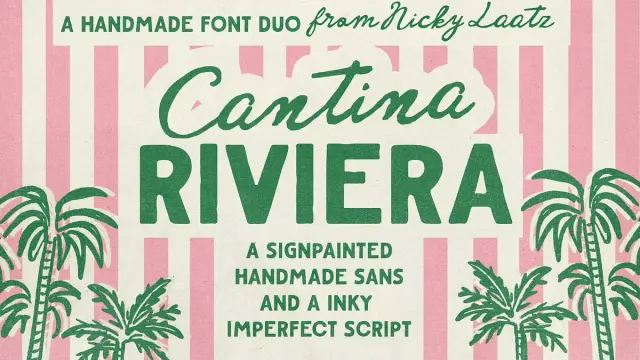
Some fonts arrive quietly. Cantina Riviera does not. The moment you set the Cantina Riviera font duo on a page, something shifts — the design suddenly smells like sun-baked stucco, coastal menus hand-lettered in the 1950s, and matchbooks left on a bar counter in the south of France. That specific sensory pull is rare in type design. Nicky Laatz, the South Africa-based independent type designer behind this release, has built an entire creative economy on that kind of emotional precision. Cantina Riviera is one of her most compelling arguments yet for why tactile, character-rich typography still wins in a world increasingly dominated by sterile geometric sans-serifs.
Download the typeface from Creative MarketThe timing couldn’t be sharper. Across branding, editorial, packaging, and social media, the appetite for what I’d call Warm Vintage Authenticity — typefaces that feel hand-touched, regionally rooted, and deliberately imperfect — has never been stronger. Cantina Riviera lands squarely inside that moment. The Cantina Riviera aesthetic exceeds the trend, though, because the duo is engineered with enough technical sophistication to serve serious commercial work, not just mood boards.
Cantina Riviera Font Duo by Nicky Laatz Download the typeface from Creative MarketSo what exactly makes Cantina Riviera worth your attention? Let’s break it down properly. And why, specifically, does the Cantina Riviera font duo outperform most vintage-inspired alternatives on the market right now?
What Is the Cantina Riviera Font Duo, and Why Does It Work So Well?
Cantina Riviera is a font duo — two complementary typefaces designed to work together as a visual system. The first is a bold, rough-edged all-caps sans. The second is a fluid, inky, imperfect script. Laatz describes the Cantina Riviera pairing with a phrase that’s almost too accurate: “Opposites attract.” She’s right. The structural tension between these two styles is precisely what gives the duo its energy.
The sans carries the weight. It draws from a tradition of hand-painted signage — the kind of sturdy, unapologetic lettering you’d find stenciled onto wooden crates, fishing boats, or the awning of a decades-old cantina on the Italian coast. Rough edges break the uniformity of each letterform. No two strokes feel mechanically identical. That deliberate roughness is not a flaw; it’s the entire point. It communicates craft, age, and a confidence that only comes from doing something with your hands.
The script is its counterpart — loose, inky, and alive. Where the sans stands firm, the script breathes. It references 1950s matchbook lettering and the kind of handwritten annotation a designer might scrawl beside a headline to soften it. Together, they operate as a classic typographic contrast pair: structure and flow, weight and grace, permanence and movement.
This is a principle I call the Contrast Harmony Framework in font duo selection: the most effective pairings are not those that match, but those that negotiate. Cantina Riviera negotiates beautifully.
The Historical DNA of Cantina Riviera
Understanding where Cantina Riviera comes from makes the design choices click into place. Laatz explicitly draws from two reference points: traditional vintage sign painting and 1950s matchbook typography. Both are rich, underexplored design traditions.
Sign painting — the craft of hand-lettering storefronts, trucks, and public signage — reached its commercial peak between the 1920s and 1960s. Sign painters worked quickly, with practiced hands, building letterforms that were both legible at a distance and visually distinctive up close. The roughness in those letters wasn’t accidental. It came from brush drag, surface texture, and the physical limits of the medium. The Cantina Riviera sans preserves that quality digitally — a technique I’d describe as Analogue Trace Translation, where digital type design deliberately encodes the physical evidence of its original medium into the final letterforms.
Matchbook typography from the 1940s and 50s operated under similar constraints. Tiny print surfaces, cheap paper, and mass production created a distinctive visual language: bold, confident headings paired with fluid, handwritten-style scripts for names, slogans, and addresses. That combination — assertive caps and casual script — is the exact DNA Cantina Riviera inherits and modernizes.
A Closer Look at the Cantina Riviera Caps: Rough, Bold, and Built to Lead
The caps font in the Cantina Riviera duo is the anchor. It commands the headline, the label, and the poster title. the poster title. Think of it as the sign above the door — something that sets the tone before a single word of body text appears.
Laatz offers several variants within the caps to give designers genuine flexibility. The standard version carries that signature rough edge — textured, imperfect, and full of personality. For projects that need a cleaner finish without abandoning the retro spirit entirely, a smoother version is included. There’s also an outline version, which opens up layering possibilities. Add a lighter weight to the mix, and you have a small internal type system within a single font file.
That layering potential is significant. Outline and solid variants of the same typeface allow designers to build depth into a single typographic element — stacking the outline behind the solid version, shifting colors between layers, or using the lighter weight for a secondary line beneath a bold headline. This approach, which I call Intra-Font Layering, turns a single font purchase into a compositional tool that rivals full display families costing five times as much.
The rough caps work especially well at large sizes. At display scale, every texture detail becomes visible — the slight drag on a stroke end, the gentle irregularity in a curve. These imperfections are the typographic equivalent of grain in a photograph: they confirm that something human made this.
The Cantina Riviera Script: Inky, Natural, and Technically Precise
The script in Cantina Riviera earns its place as more than decoration. Laatz built it with genuine technical care, and the results show in how naturally the letters connect. show in how naturally the letters connect.
The most important feature here is the inclusion of OpenType double-letter ligatures. These are custom-designed glyph combinations that replace standard letter pairs — like “ff,” “ll,” or “tt” — with a single unified form. In lesser scripts, repeated letters create an awkward stutter, a visual hiccup that breaks the illusion of handwriting. With ligatures active, the script flows. It reads as something genuinely written, not typed.
The font is also PUA encoded, meaning the special characters and alternates are accessible even in software that doesn’t support OpenType features natively — programs like Cricut Design Space, certain versions of Word, or older creative tools. For designers working across multiple platforms, this is a practical advantage that often goes unmentioned but matters enormously in daily workflow.
Additionally, Laatz includes a few extra script variants with subtle differences in slant and weight. This gives designers the ability to add visual variation across a layout — slightly adjusting the feel of a tagline versus a menu item, for example — without introducing a wholly different typeface. It’s a thoughtful, production-aware design decision.
Cantina Riviera in Practice: Where This Font Duo Belongs
The right question with any typeface isn’t “is it beautiful?” It’s “does it do the job?” Cantina Riviera does several jobs extremely well. Here’s where it earns its keep.
Branding and Logo Design
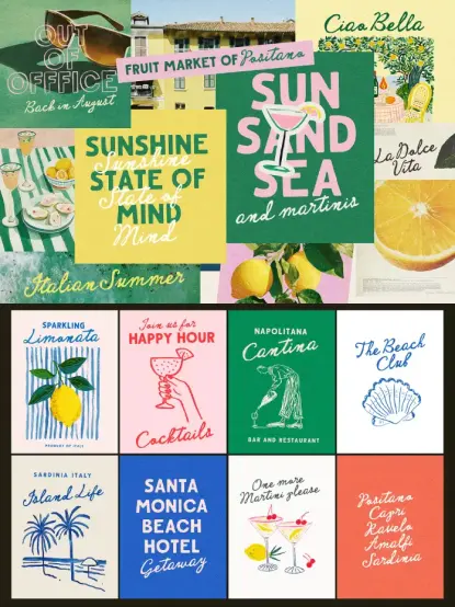
The Cantina Riviera caps make a strong primary wordmark at any size. The rough texture communicates craft and heritage — qualities that are commercially valuable for food and beverage brands, hospitality businesses, lifestyle labels, and artisan producers. Pair the caps with the script for a subline or tagline, and the brand identity gains immediate typographic depth. The combination signals hand-made quality without sacrificing legibility.
This is particularly effective for what I’d term Heritage Brand Positioning — the strategic use of vintage visual language to communicate longevity, craftsmanship, and authenticity, even for newly launched businesses. Consumers consistently associate rough-edged, hand-painted typography with trustworthiness and quality. Cantina Riviera gives newer brands access to that visual equity.
Retro and Vintage Editorial Design
Magazine layouts, editorial spreads, and zine-style publications benefit enormously from the duo. The caps work as section headers or pull-quote treatments. The script handles bylines, captions, or decorative initials. Together they create layouts that feel curated and considered — designed rather than assembled.
The Mediterranean vintage tone of Cantina Riviera also makes it a natural fit for travel editorial: destination features, hotel guides, food culture journalism, and lifestyle content about coastal or European subjects.
Packaging Design
Retro packaging is one of the strongest commercial applications for this duo. Wine labels, olive oil tins, hot sauce bottles, specialty food packaging — anything that wants to look like it has been on a shelf since 1958 will benefit from the Cantina Riviera type system. The caps handle product names. The script manages variety descriptors, producer names, or tasting notes. The rough texture communicates small-batch artisan production, which is among the most bankable visual signals in contemporary food and beverage marketing.
Handwritten Menus and Hospitality Design
Restaurant and café menus are a natural territory for Cantina Riviera. The script feels genuinely handwritten at menu-scale body sizes, while the caps create clear category headers. The summery, Mediterranean vintage aesthetic fits hospitality concepts ranging from coastal Italian to French bistro to Southern European wine bar. This is the typeface for the restaurant that wants its menu to feel like it was written by someone who actually cooks the food.
Posters and Social Media Graphics
Large-format poster design rewards high-character display typefaces, and Cantina Riviera delivers at that scale. Event posters, concert announcements, market signage — the duo handles them all. For social media, the visual distinctiveness of the Cantina Riviera rough sans against the flowing script creates images that stop the scroll. Both styles read clearly even at thumbnail size, which matters more than many designers realize.
Wedding Invitations and Stationery
The script, particularly, has obvious applications in wedding and celebration stationery. It carries warmth and personalization without tipping into overly formal territory. For couples who want something with more personality than a traditional calligraphic script — something with a hint of summer, coast, and adventure — Cantina Riviera offers a genuinely distinctive alternative.
Language Support and Technical Specifications
Cantina Riviera supports seven languages: English, French, Danish, Spanish, Swedish, German, and Swiss German. For independent designers and agencies working across European markets, this multilingual coverage removes a common friction point. You won’t need to swap fonts for a French client or hunt for a German-compatible alternative mid-project.
The technical package breaks down as follows:
- Caps — Standard (Rough): The primary display weight with the signature textured edges
- Caps — Smooth: A cleaner version for applications requiring a more refined finish
- Caps — Outline: For layering and multi-color typographic treatments
- Caps — Light: A reduced-weight option for secondary hierarchy
- Script — Primary: The main inky, flowing script with OpenType ligatures active
- Script — Variants: Additional versions with subtle slant and weight differences
PUA encoding across the script ensures that alternate characters remain accessible in non-OpenType environments. OpenType-capable software — Adobe Illustrator, InDesign, Photoshop, Affinity Designer, and similar tools — will automatically activate the double-letter ligatures when the feature is enabled.
The Nicky Laatz Approach: Why Her Font Duos Feel Different
Nicky Laatz has built one of the most recognizable independent type design presences online. Her catalog — available through her own site at nickylaatz.com and on Creative Market — leans consistently toward character-rich, emotionally warm typefaces with strong narrative identities. Cantina Riviera is consistent with that signature approach, but it’s also one of her more technically layered releases.
What distinguishes her work is the combination of strong visual storytelling with genuine production-level thinking. The ligatures, the PUA encoding, the multiple caps variants in Cantina Riviera — these aren’t features added as marketing checkboxes. They reflect real awareness of how designers work across different tools and project types. Laatz designs for people who actually use fonts under real-world conditions, and that shows.
Her reference points also tend to be specific rather than vague. “Vintage” is a broad category. “1950s matchbook typography” is precise. That specificity allows her to make more intentional design decisions — every letterform choice, every texture calibration, every spacing decision responds to a clear historical and aesthetic brief. The result is fonts that feel authored rather than assembled.
The Cantina Riviera Aesthetic: Defining Riviera Vintage Typography
Let me coin a working term here: Riviera Vintage Typography. This is a distinct aesthetic cluster — different from generic retro, different from Americana, different from Art Deco revival. It draws from the following specific coordinates:
- The hand-painted signage of mid-century Southern European coastal towns
- The bold, confident lettering of the 1940s–1950s matchbooks and ephemera
- The warmth and imprecision of authentic craft lettering versus mechanical typesetting
- A color vocabulary that implies sun, salt, and aged surfaces — ochre, terracotta, faded cream, deep navy
- A sensibility that feels relaxed but not casual, confident but not aggressive
Cantina Riviera is, to my knowledge, one of the clearest digital expressions of this specific aesthetic available as a commercial typeface. Other fonts touch parts of this territory. Few inhabit the Cantina Riviera zone so completely.
I expect Riviera Vintage Typography to grow as an aesthetic category through 2025 and 2026. The broader cultural appetite for analogue authenticity, Mediterranean lifestyle content, and craft-anchored branding shows no sign of receding. Cantina Riviera arrived at exactly the right moment to become a reference point for this category.
How to Pair Cantina Riviera with Other Typefaces
The Cantina Riviera duo is already a complete primary typographic system for most projects. However, you may need a supporting text face for body copy in longer documents. Here’s how to think about extending the Cantina Riviera system.
The rough, warm texture of the Cantina Riviera caps calls for a neutral, readable text companion — something that steps back and lets the display fonts lead. A clean humanist sans-serif works well in this role: something with slightly informal proportions but strong legibility. Avoid anything too geometric or corporate; it will clash tonally. Also, avoid other textured or distressed typefaces in the body — the texture budget is already spent by the display fonts.
If you need a serif for more traditional editorial applications, a slightly informal old-style serif — something with calligraphic roots — harmonizes better than a rigid transitional or modern serif. The key is finding a text face that carries some warmth without competing for attention.
The script should rarely, if ever, appear in extended body text. Reserve it for headlines, short phrases, bylines, or decorative moments. It was designed as an accent, and it performs best in that role.
My Take: Cantina Riviera Is a Reference Font for the Vintage Revival Era
Here’s my honest editorial position on Cantina Riviera: this is not a trend font. It’s not built around a passing aesthetic moment that will feel dated in two years. The Cantina Riviera duo taps a deeper typographic lineage — the entire tradition of hand-crafted, place-specific lettering that predates digital design entirely — and brings it forward with enough technical sophistication to remain genuinely useful in contemporary commercial work.
The script is one of the more convincingly natural inky scripts currently available at this price point. The ligature system works. The PUA encoding is a practical benefit that many designers will use immediately. The caps variants give you a micro type-system within a single font. And the overall aesthetic — that summery, sun-worn, Mediterranean quality — is specific enough to be distinctive without being so narrow that it only fits one type of project.
Nicky Laatz has made many strong fonts. Cantina Riviera belongs near the top of that list.
Download the typeface from Creative MarketIf you work regularly in branding, packaging, hospitality design, or editorial, the Cantina Riviera font duo deserves a permanent home in your active font library. Not your archive. Your active library — the one you reach for on real projects.
Frequently Asked Questions About the Cantina Riviera Font Duo
What is the Cantina Riviera font duo?
Cantina Riviera is a vintage-inspired font duo by designer Nicky Laatz. It pairs a bold, rough-edged all-caps sans-serif with a fluid, inky handwritten script. The duo draws from traditional sign painting and 1950s matchbook typography, giving it a summery Mediterranean vintage aesthetic suited to branding, packaging, editorial design, and social graphics.
Who designed the Cantina Riviera font?
Cantina Riviera was designed by Nicky Laatz, an independent type designer and illustrator. Her work is available through her own shop at nickylaatz.com and through Creative Market. She specializes in character-rich, emotionally warm typefaces with strong narrative identities.
Where can I buy the Cantina Riviera font duo?
Cantina Riviera is available directly from Nicky Laatz’s website at nickylaatz.com and through her Creative Market shop. The duo is priced at $28 at full retail, with periodic promotional discounts available.
What styles are included in the Cantina Riviera font package?
The package includes the rough-edged caps in its standard textured version, a smoother caps variant, an outline caps version, and a lighter caps weight. The script comes as a primary version plus additional variants with subtle differences in slant and weight. All versions include language support for English, French, Danish, Spanish, Swedish, German, and Swiss German.
Does Cantina Riviera support OpenType features?
Yes. The script includes OpenType double-letter ligatures that activate automatically in OpenType-capable software like Adobe Illustrator, InDesign, and Photoshop. These ligatures replace repeated letter pairs with unified forms that look more natural and handwritten. The font is also PUA encoded, so alternate characters remain accessible in software without OpenType support.
What is the Cantina Riviera font best used for?
Cantina Riviera works best for bold branding and logo design, retro and vintage packaging, restaurant and café menus, hospitality design, editorial layouts with a Mediterranean or retro theme, event posters, social media graphics, and wedding invitations. It suits any project that calls for warmth, craft authenticity, and vintage character.
What languages does Cantina Riviera support?
The font duo supports English, French, Danish, Spanish, Swedish, German, and Swiss German. This multilingual coverage makes it practical for designers and agencies working across European markets.
How does the Cantina Riviera script look at body text sizes?
The script is a display and accent typeface, not a body text font. It reads best at headline sizes and for short phrases, bylines, taglines, or decorative elements. Avoid using it for extended paragraphs of body copy, where legibility decreases significantly.
Can I use Cantina Riviera in Canva or Cricut?
PUA encoding in the script means that alternate characters are accessible even in software that doesn’t support OpenType features natively, which improves compatibility with tools like Cricut Design Space. Canva compatibility depends on the platform’s font upload capabilities. For best results with the full feature set — including ligatures and alternates — use the font in OpenType-capable software such as Adobe Illustrator or Affinity Designer.
Is Cantina Riviera suitable for luxury or premium branding?
Cantina Riviera suits premium branding in categories where craft, heritage, and Mediterranean lifestyle associations add value — hospitality, artisan food and beverage, travel, lifestyle, and fashion. It is not a conventional luxury serif typeface and doesn’t suit ultra-minimalist or corporate premium aesthetics. It performs best where warmth and character are brand assets rather than liabilities.
Find other trending typefaces in the Fonts section here at WE AND THE COLOR.
#CantinaRiviera #font #fontDuo #fonts #handDrawn #handmade #NickyLaatz #typeface #vintage #vintageFonts