 WE AND THE COLOR
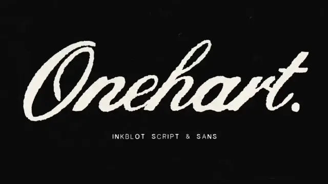
Onehart Script and Sans Font Duo by The Branded Quotes: Where Raw Texture Meets Typographic Intent
Script fonts are everywhere. Most of them feel the same — elegant loops, polished curves, and a kind of manufactured warmth that looks good in a mockup and says absolutely nothing in real life. Onehart Script and Sans, designed by The Branded Quotes, is a different proposition entirely. It doesn’t chase refinement. Instead, it leans into imperfection with real purpose, and that distinction matters more than it might seem at first glance.
The Onehart script and sans font duo draws its visual language from something tactile and cultural — DIY screen-printing on ripped denim. That’s not a metaphor. That’s the literal design brief. The ink bleeds slightly. The line weights shift unpredictably. The letterforms carry the kind of organic inconsistency that only comes from fabric, pressure, and human hands. Digitally refined, but never digitally sanitized. The result is a font duo that feels alive on screen in a way that most typefaces simply don’t.
Download the duo for a low budget from Creative MarketTypography is having a cultural moment right now. Brands across fashion, music, wellness, and independent retail are moving away from geometric sans-serifs and corporate polish toward something rawer and more expressive. The Onehart font duo lands exactly in that shift. It’s timely not because it’s trendy, but because it speaks to a genuine appetite for authenticity in visual communication.
Onehart Script and Sans Font Duo by The Branded Quotes Download the duo for a low budget from Creative MarketWhat Makes the Onehart Script and Sans Font Duo Different From Other Script Typefaces?
Let’s start with what most people notice immediately: the line weight variation in Onehart Script is not a design accident. It’s a structural feature. Traditional calligraphic scripts achieve weight variation through pen angle and pressure. Onehart Script achieves it through something closer to textile printing logic — the way ink transfers unevenly onto fabric, pooling in some places and thinning in others.
This creates what you might call textural rhythm: a visual cadence within a word or phrase that isn’t metronomic but still feels coherent. Each letterform holds its own weight independently rather than following a single stroke-contrast system. The effect is that even a single word set in Onehart Script carries visual interest across its full length. You don’t need elaborate layouts or complex graphic elements to make it work.
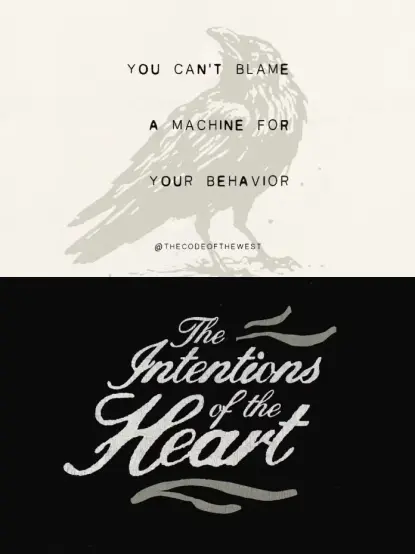
Onehart Sans operates differently but complements the script with precision. Where the script is expressive and variable, the sans is grounded. Its defining feature is deliberate line gaps — subtle interruptions in strokes that echo the ink blot aesthetic of the script without replicating its texture. The sans doesn’t imitate the script. Instead, it creates a visual conversation with it. Together, they establish a typographic system that feels complete.
The DIY Denim Aesthetic as a Design Framework
Understanding Onehart means understanding its source material. DIY screen-printing on denim is a specific subculture with its own visual codes. The prints are bold but imprecise. The colors are saturated but not perfectly registered. The overall effect communicates individuality, craft, and a deliberate rejection of mass production values. That’s a rich set of associations to carry into a typeface.
Call this the Craft Authenticity Principle: the idea that designed imperfection, when rooted in a real physical process, reads as genuine rather than gimmicky. Onehart Script passes this test because its irregularities aren’t random noise added in post-production. They reflect the actual behavior of ink on fabric — a behavior that anyone who has ever screen-printed knows intuitively. That grounding gives the font a cultural honesty that purely digital typefaces rarely achieve.
This matters enormously for branding. Consumers in 2025 are extraordinarily good at detecting performed authenticity. A font that looks hand-done but feels factory-made registers immediately as a mismatch. Onehart avoids that trap because the imperfection is structural, not cosmetic.
How to Use the Onehart Script Font in Brand Typography
Onehart Script is remarkably versatile despite its strong visual character. The key is understanding its strengths and not fighting them. The font shines brightest in short-form applications: brand names, taglines, product labels, social media headers, and pull quotes. The organic line weight variation means that even minimal text — two or three words — creates a complete visual statement without requiring additional graphic support.
For brand typography specifically, Onehart Script works particularly well for brands in the following spaces: streetwear and apparel, independent food and beverage, music and entertainment, artisan goods, creative agencies, and lifestyle brands with a strong point of view. These aren’t the only valid use cases, but they represent the territory where the font’s cultural DNA aligns naturally with audience expectations.
Layering Onehart Script in Digital Presentations
One of the more interesting applications The Branded Quotes suggests is layering Onehart Script over digital presentations. This deserves some elaboration because it’s not an obvious use case for a textured script font.
The key insight here is contrast layering: placing a high-texture typeface over a clean, minimal background creates a visual tension that draws the eye immediately. The script becomes the focal point precisely because it’s different from everything around it. In presentation design, this technique works especially well for title slides, section dividers, and data-forward slides where a typographic moment helps maintain audience engagement.
Practically, this means setting Onehart Script at larger sizes — 60pt and above — where the ink texture is clearly visible. At smaller sizes, the detail collapses, and you lose the characteristic that makes the font compelling. Always use Onehart Script for emphasis rather than body text. It’s a headline instrument, not a paragraph font.
Onehart Sans: The Underrated Half of This Font Duo
In most font duos, one typeface gets the attention, and the other serves as functional support. With the Onehart font duo, both halves deserve independent consideration. Onehart Sans is, as The Branded Quotes describes it, “easily intriguing and fun,” which is accurate but undersells what makes it interesting typographically.
The ink blot details in Onehart Sans are subtle enough that they don’t read as decoration at a glance. Instead, they add a slight irregularity to the overall texture of a text block that makes it feel more alive than a standard geometric or humanist sans. This is a sophisticated design choice. The blots aren’t decorative flourishes. Their structural texture is built into the letterforms themselves.
The line gap feature is equally considered. In typography, letter-spacing and line-height decisions are often treated as afterthoughts. The Branded Quotes built the line gap directly into the font’s DNA. The spacing feels balanced without being mechanical — another echo of the hand-crafted source material.
Best Use Cases for Onehart Sans in Visual Messaging
Onehart Sans is particularly strong for quote graphics, social media visual messaging, packaging secondary text, and editorial subheadings. Its character makes it readable at a range of sizes while retaining enough visual personality to function as a design element rather than just a text carrier.
For social media specifically, the combination of Onehart Script and Onehart Sans creates what designers might call a Dual-Texture Hierarchy — a typographic system where both the headline and the supporting text carry visual interest, but at different registers. The script commands attention. The sans sustains it. Together, they keep the viewer engaged across the full composition rather than dropping attention after the headline.
Technical Specifications of the Onehart Font Duo
The Onehart Script and Sans font duo ships with a comprehensive set of file formats that cover virtually every use case across print, digital, and web environments. Each typeface is available in OTF and TTF for desktop applications, and in WOFF1 and WOFF2 for web embedding. The WOFF2 format in particular is the current standard for performant web typography, and its inclusion makes Onehart immediately ready for production web use without additional conversion.
Feature-wise, both typefaces include a full basic alphabet, numerals, and punctuation. Onehart Script additionally supports multilingual characters, which extends its usability significantly for international brands and multilingual campaigns. The ink blot elements and random weight variations are built into the font files themselves rather than applied as OpenType features — this means consistent behavior across all applications without requiring software that supports advanced OpenType functionality.
Why Random Weights Are a Feature, Not a Bug
The “random weights” specification listed in the font features is worth pausing on. In conventional type design, consistency of stroke weight within a typeface is considered a quality marker. Onehart deliberately inverts this convention and builds weight variation into the font as an intentional feature.
This represents what you could call Structural Variability Design: the practice of encoding controlled unpredictability into a typeface so that every use feels slightly different without losing coherence. The variation operates within a defined range rather than producing genuinely random results — there’s a system underneath the apparent disorder. This is analogous to the way a skilled screen printer develops control over an intentionally imprecise medium. The imperfection is managed, not accidental.
For designers, this means that Onehart Script at display sizes will show slightly different characteristics depending on which specific letterforms appear in a given word. Two different words set in the same font at the same size will feel visually distinct. That quality is genuinely rare in digital typefaces and gives the font an almost analog responsiveness to content.
How the Onehart Font Duo Fits Into Current Typography Trends
The broader typography landscape in 2025 is defined by a tension between algorithmic precision and human texture. Variable fonts, AI-generated typefaces, and parametric design tools have made highly refined, mathematically precise typography accessible to anyone. The counterreaction to this precision is a renewed interest in imperfection, texture, and the visual evidence of process.
Onehart sits comfortably in this counterreaction. But unlike some “handmade” typefaces that feel like they’re performing roughness for its own sake, Onehart’s texture is disciplined. The DIY denim origin story gives it a cultural anchor that prevents the imperfection from reading as arbitrary. It’s rough because screen-printing on denim is rough. That cause-and-effect relationship gives the font integrity.
Looking ahead, expressive script fonts with strong tactile qualities will continue to gain traction as brands seek differentiation from the clean, minimal aesthetics that dominated the 2010s. The appetite for visual authenticity isn’t a passing trend — it reflects a structural shift in how audiences relate to brand identity. Fonts like Onehart Script will become increasingly important tools for designers working in this territory.
Onehart and the Rise of Cultural Typography
There’s a concept worth naming here: Cultural Typography — typefaces that carry legible references to specific subcultures, materials, or practices, and use those references as a branding signal. Onehart Script is a clear example. Its visual language speaks directly to audiences who know and value DIY aesthetics, streetwear culture, and the craft of physical making.
This is different from a font that simply looks “handmade.” Cultural typography creates genuine resonance with specific communities because it reflects their actual visual codes rather than a generalized idea of authenticity. When a streetwear brand uses Onehart Script, it’s not just choosing a pretty font — it’s signaling cultural fluency. That signal has real value in brand communication.
Pairing Onehart Script and Sans: A Practical Approach
Getting the most from the Onehart font duo requires understanding the relationship between the two typefaces rather than using them interchangeably. The script and sans are designed to work together, but that doesn’t mean they should appear in equal weight or at similar sizes in a given composition.
A reliable starting framework: use Onehart Script for the primary message — the name, the headline, the emotional hook — and Onehart Sans for supporting content: dates, locations, taglines, or descriptive text. This creates a clear visual hierarchy where the script draws attention, and the sans delivers information. The shared ink aesthetic keeps the two typefaces visually coherent even as they serve different functions.
Size contrast is also important. When both typefaces appear in the same composition, a significant size difference — at minimum a 2:1 ratio between script and sans — prevents the two from competing for attention. The script should dominate. The sans should support. When they’re too close in size, the composition loses direction.
Color Considerations When Using the Onehart Font Duo
The ink-on-fabric origin of Onehart Script suggests some natural color directions. High contrast combinations — black on white, white on black, or dark ink tones on light fabric colors — honor the screen-printing aesthetic and let the font’s texture read clearly. Muted, earthy palettes also work well: ochre, rust, forest green, and faded indigo all reference the material culture that the font draws from.
Avoid using Onehart Script in very light weights of color or at low opacity. The font’s character depends on legible texture, and anything that compromises that texture works against the font’s core strengths. Similarly, highly saturated neon palettes can overwhelm the subtler textural details in both the script and the sans. The font family rewards palette choices that let the letterforms themselves carry the visual energy.
Who Should Add the Onehart Font Duo to Their Design Library?
Honestly? Most designers who work with brand identity, social media content, or packaging should own this duo. Its range is broader than its DIY aesthetic might suggest. The font family works beautifully for obviously on-brand applications — streetwear, music, independent retail — but it also brings unexpected depth to categories where the association is less direct. A wellness brand that wants to communicate craft over clinical precision. A food brand that wants to signal small-batch quality. A creative agency that wants its own identity to feel less corporate.
The multilingual support in Onehart Script extends its utility for international design work without sacrificing the font’s essential character. This is a meaningful consideration for designers working with clients across different markets. The WOFF formats make web implementation straightforward for developers working with web typography.
If you’re regularly asked to deliver brand identities, social media template systems, or presentation templates, the Onehart font duo is the kind of versatile, character-rich tool that earns its place in a permanent design toolkit rather than sitting in the downloads folder for a single project.
Final Thoughts on the Onehart Script and Sans Font Duo
The best typefaces do two things simultaneously: they communicate effectively, and they carry meaning beyond communication. Onehart Script and Sans manages both. It’s a font duo that sets text cleanly and clearly while also saying something specific about the culture it comes from — the DIY creativity, the material craft, the deliberate imperfection of screen-printing on denim.
That double function is harder to achieve than it looks. Most expressive fonts sacrifice legibility for character. Most functional fonts sacrifice character for legibility. The Branded Quotes found a genuine balance in Onehart, and that balance is what makes this font duo worth a closer look for any designer serious about expressive brand typography.
Download the duo for a low budget from Creative MarketScript fonts with this level of cultural specificity and technical thoughtfulness don’t come along constantly. Onehart is one of those typefaces that will age well precisely because it doesn’t chase a generic idea of what a script font should look like. It knows exactly what it is and executes that vision with confidence. That’s rare. And it shows.
FAQ: Onehart Script and Sans Font Duo
What is the Onehart Script and Sans font duo?
Onehart Script and Sans is a creative font duo designed by The Branded Quotes. It draws inspiration from DIY screen-printing on denim, producing letterforms with organic line weight variation and ink blot details. The duo includes Onehart Script, an expressive display script, and Onehart Sans, a complementary typeface designed for visual messaging and supporting text.
Who designed the Onehart font duo?
The Branded Quotes created the Onehart Script and Sans font duo. The design concept originates from the visual language of hand-printed clothing — specifically, the imperfect beauty of DIY screen-printed art on ripped denim.
What file formats does the Onehart font duo include?
Each typeface in the Onehart duo comes in four file formats: OTF and TTF for desktop use, and WOFF1 and WOFF2 for web embedding. The WOFF2 format is the current web performance standard and makes both fonts ready for immediate production web use.
What languages does Onehart Script support?
Onehart Script includes multilingual character support, making it suitable for international projects and multi-language brand identities. Both typefaces also include a full basic alphabet, numerals, and punctuation.
Is Onehart Script suitable for body text?
No. Onehart Script is a display typeface designed for headlines, brand names, taglines, and short-form emphasis text. Its organic line weight variation and ink texture are most effective — and most legible — at larger display sizes. For body text, Onehart Sans is the appropriate choice within the duo.
What are the best use cases for the Onehart font duo?
The Onehart font duo works particularly well for brand identity design, streetwear and apparel branding, social media quote graphics, packaging, editorial subheadings, digital presentations, and any context where a tactile, craft-oriented aesthetic aligns with brand values. The script excels at short display text while the sans handles supporting visual messaging.
How should I pair Onehart Script and Onehart Sans together?
Use Onehart Script for your primary message or headline and Onehart Sans for supporting content at a smaller size. A minimum 2:1 size ratio between the script and sans helps maintain a clear visual hierarchy. High-contrast color combinations — particularly dark ink tones on light backgrounds — let both typefaces display their textural details at their best.
What makes the Onehart font duo unique compared to other script fonts?
Onehart Script’s random weight variation is a structural feature encoded directly into the font, not a post-production effect. This creates a controlled, organic unpredictability where each word or phrase set in the font feels slightly unique. The design traces directly to the physical behavior of ink on fabric during screen-printing — giving the imperfection a cultural and material grounding that most “handmade” digital fonts lack.
Where can I use the Onehart font duo online?
The included WOFF1 and WOFF2 files make Onehart Script and Onehart Sans ready for web embedding via CSS @font-face declarations. Both formats are supported by all major modern browsers, making them suitable for websites, web apps, email templates, and digital presentations.
Is the Onehart font duo suitable for commercial use?
Licensing terms are set by The Branded Quotes and should be confirmed directly through the purchase platform at the time of acquisition. Standard commercial licensing for this type of font typically covers branding, advertising, packaging, and digital design work, but always review the specific license included with your purchase.
Check out other trending typefaces in the Fonts section here at WE AND THE COLOR.
#font #fontDuo #fonts #Onehart #TheBrandedQuotes #typeface #Typefaces