 WE AND THE COLOR
TAN Allegory Font Duo by TanType
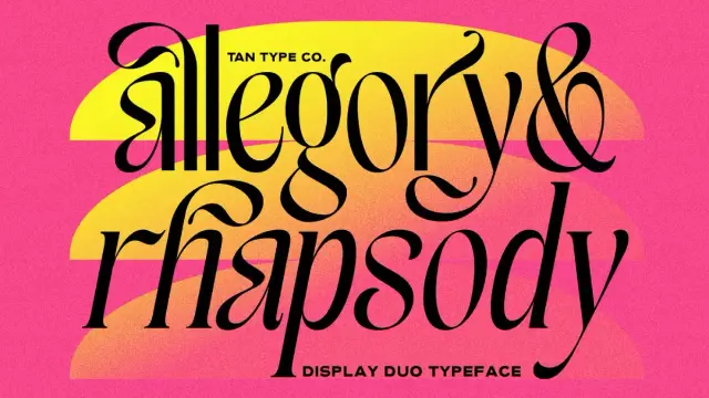
Let’s Talk About How TanType’s Allegory Font Duo Brings Editorial Luxury, Fun, and Quiet Precision to Modern Type Design.
The TAN Allegory font duo pairs a high-contrast editorial serif with a clean, restrained sans serif — and the result feels less like a font release and more like a considered design statement. If you work in branding, editorial, or packaging, this is a pairing worth your full attention.
Honestly, font duos are everywhere. Most promise harmony and deliver compromise. TAN Allegory does something different — it commits to a visual philosophy rather than just a visual match. The serif leads with drama. The sans serif holds the structure. Together, they create a system that works at headline scale and at body size without losing its personality at either end.
Get the duo from Creative MarketSo what makes this particular TAN Allegory font duo worth writing about at length? It comes down to specificity. TanType didn’t try to make a typeface for everyone. They made one for designers who know exactly when a typeface is doing the heavy lifting — and when it needs to get out of the way.
TAN Allegory Font Duo by TanType Get the duo from Creative MarketWhat Makes the TAN Allegory Font Duo Different From Other Serif-Sans Pairings?
Most serif-sans pairings rely on optical similarity — same x-height, similar proportions, matching weight distribution. TAN Allegory takes a different approach. It uses intentional contrast as its pairing logic. The serif is expressive and dramatic. The sans is functional and neutral. That tension is the whole point.
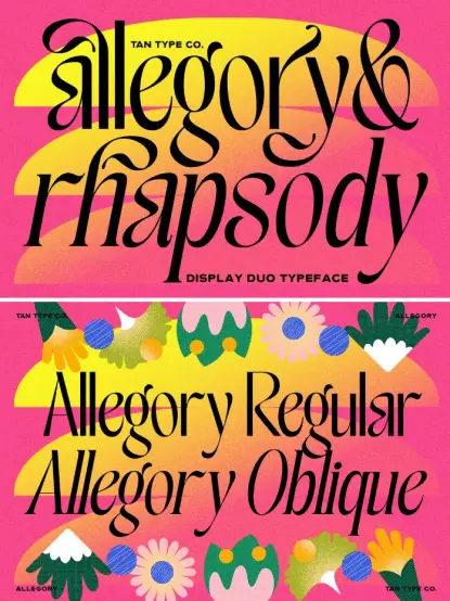
The serif component — Allegory Regular and Allegory Oblique — carries heavy design intention in every detail. Its high contrast axis creates sharp transitions between thick strokes and hairline-thin connections. The terminals are crisp rather than rounded, giving the letterforms a sense of precision that keeps the expressiveness from tipping into decorative excess. Meanwhile, the flowing swashes and elegant alternates add a layer of editorial luxury that feels specific to print-influenced design language.
This is what I’d call the Tension-Led Pairing Principle: the idea that a font duo performs best not when both typefaces agree with each other, but when they each hold their ground independently. Allegory’s serif doesn’t soften itself to accommodate the sans. The sans doesn’t try to match the serif’s drama. Instead, each plays its own role clearly — and the system benefits from that clarity.
For designers working in competitive visual categories like luxury branding or premium packaging, this matters. A pairing that blurs its own internal contrast ends up blurring the hierarchy of your layout too. TAN Allegory keeps both voices distinct while keeping them in conversation.
The Allegory Serif: High Contrast, Sharp Terminals, Graceful Rhythm
Look at the serif in isolation, and you notice several things immediately. The stroke contrast is high — substantially higher than most editorial serifs in the contemporary market. The thick strokes are full and confident. The thin strokes are almost delicate. That range creates a typeface that reads as both bold and refined simultaneously, which is a difficult effect to achieve without tipping into either excess or weakness.
The sharp terminals deserve particular attention. Where many contemporary serifs soften their endings to feel approachable and digital-friendly, Allegory keeps them crisp. This is a deliberate choice. Crisp terminals read as intentional. They carry an editorial confidence that rounded, friendly terminals simply cannot replicate. When you set Allegory at display sizes — magazine covers, packaging headers, brand wordmarks — those terminals assert themselves as design decisions rather than defaults.
The graceful rhythm of the letterforms also deserves notice. This is a serif with genuine calligraphic roots. The spacing feels considered rather than mechanical. Letters breathe. The ligatures and alternates — included in both the Regular and Oblique cuts — allow for further customization without introducing visual inconsistency. A good ligature set is a quiet luxury that most readers never consciously notice but always feel.
The Oblique cut functions as a modern companion to the Regular rather than a simple slanted version. It carries its own character, which makes it genuinely useful for emphasis and hierarchy rather than just conventional italic applications.
The Sans Serif: Grounded, Versatile, Intentionally Quiet
The sans component of the TAN Allegory font duo is where restraint becomes a design virtue. It’s clean without being cold. It carries no flourish, no personality-driven quirks, no design decisions that would compete with the serif for visual attention. That’s exactly what it needs to be.
A sans serif in a duo exists primarily to serve the system. Its job is to provide readability at sizes and contexts where the serif would overwhelm or overcomplicate. Caption text. Body copy. Interface labels in editorial digital contexts. The Allegory sans handles all of these comfortably without drawing attention to itself — and without looking generic.
The proportions of the sans align well enough with the serif that both can share a layout without visual tension. But they remain distinct enough that readers immediately understand the typographic hierarchy. This is harder to achieve than it sounds. Many duos collapse this relationship and produce pairings where both typefaces feel interchangeable. TAN Allegory maintains the distinction.
From a practical production standpoint, the clean geometric structure of the sans also means it holds its quality across output types — screen, print, and large format. For designers working across packaging and social content simultaneously, that versatility is genuinely valuable.
The Dual Personality Framework: How TAN Allegory Balances Personality and Function
There’s a concept worth naming here — call it the Dual Personality Framework. It describes typeface systems that carry two distinct visual registers simultaneously: one expressive, one functional. The expressive register handles communication that requires emotional weight or aesthetic identity. The functional register handles communication that requires clarity and legibility above all else.
Most design briefs require both. A luxury brand needs to feel beautiful and be readable. A magazine needs to be visually distinctive and informationally clear. A packaging label needs to attract and inform. The TAN Allegory font duo addresses this split directly by assigning each register to a typeface with a clear mandate.
This framework is why TAN Allegory works particularly well for:
- Brand identity and logo design — the serif drives visual identity while the sans handles supporting type at smaller scales
- Editorial layout and magazine design — headline serif creates impact, sans handles body copy and captions without friction
- Premium packaging design — high-contrast serif commands shelf presence, sans keeps ingredient and technical copy readable
- Social media graphics — the contrast between the two styles creates visual dynamism that works at small screen sizes
- Invitations and event materials — the oblique cut of the serif adds ceremony; the sans anchors dates and logistics
This isn’t an arbitrary use case list. Each application maps directly to the typographic logic built into the duo’s design. The pairing wasn’t assembled — it was engineered with these contexts in mind.
TAN Allegory in Branding: Why High-Contrast Serifs Are Having a Moment
The broader design culture is relevant here. High-contrast serifs are experiencing a genuine resurgence in brand identity work — and it’s not a trend built on nostalgia. It’s a response to a specific visual fatigue.
The decade of geometric sans dominance in branding — clean, neutral, optimized for digital — has produced a market saturated with typefaces that communicate little beyond functional modernity. Brands that want to differentiate now look toward type choices that carry more intrinsic personality. High-contrast serifs deliver that personality clearly.
What makes this current resurgence distinct from earlier serif revivals is the context. Today’s high-contrast serifs — and TAN Allegory fits this description — are designed with digital output in mind alongside print. They perform at screen resolution. They hold their contrast at small sizes. They work in motion graphics and video titles. Earlier editorial serifs were optimized for print alone and suffer in digital contexts as a result.
The TAN Allegory font duo sits squarely in this contemporary approach. Its details — the terminal crispness, the swash design, the oblique construction — all show awareness of how the typeface will actually be used across modern design workflows.
For branding designers, this is an important distinction. A typeface that looks extraordinary in a pitch deck but degrades on a website header is a liability, not an asset. TAN Allegory avoids that liability.
Using the Allegory Oblique: When the Slant Becomes a Statement
The Oblique cut is worth its own moment of attention. Oblique typefaces in the serif category tend to fall into one of two categories: mechanical slants that retain all the characteristics of the upright, or genuine drawn italics with their own letterform construction. Allegory Oblique functions closer to the latter in spirit — it carries a distinct character rather than simply tilting the Regular.
This makes it genuinely versatile as an expressive tool. Use it as you would use an italic in traditional editorial typography — for emphasis, pull quotes, captions, and secondary headlines. But also consider it as a standalone display choice. Set in isolation, the Oblique carries enough personality to function as a primary headline style without the Regular present at all.
For social media content creators and brand designers working in visual formats where variety matters quickly, having two distinct expressions within the serif alone — before you even reach for the sans — is a significant practical advantage. The elegant alternates and ligatures available in both cuts extend this flexibility further.
The Romance and Precision Spectrum: Where TAN Allegory Sits Stylistically
It helps to have a mental model for placing typefaces on stylistic axes. One useful axis runs from romance to precision — from expressive, fluid, calligraphically-influenced letterforms at one end, to geometric, constructed, systematically rigorous letterforms at the other.
Most contemporary editorial serifs cluster in the mid-range — they borrow enough calligraphic energy to feel warm, but enough geometric structure to feel contemporary. TAN Allegory’s serif component is positioned further toward the romance end than most of its peers. The swashes, the flowing rhythm, the dramatic contrast — all of these push it firmly into the expressive zone.
The sans counterpart, by contrast, sits comfortably at the precision end. It’s constructed, not calligraphic. It’s systematic, not expressive. The full duo therefore spans an unusually wide range of this axis, which is why it works so well for contexts requiring both warmth and clarity simultaneously.
This is what I call the Full-Spectrum Pairing Theory: the idea that the most versatile font duos cover the maximum possible range of the romance-precision axis, rather than clustering two similar typefaces in the same zone. TAN Allegory is a textbook example of this principle in practice.
Multilingual Support and Technical Specifications Worth Knowing
From a technical standpoint, TAN Allegory comes equipped for professional production work. Both OTF and TTF formats are included, which means it slots directly into professional design environments like Adobe InDesign, Illustrator, and Photoshop, as well as web design tools and digital production workflows.
The multilingual support is a production-level feature that often goes underappreciated in type reviews. For designers working in international markets — or for studios and agencies handling multilingual brand systems — this removes a significant constraint. The expressive quality of the serif doesn’t have to disappear when the brief requires extended Latin characters or diacritical marks.
The inclusion of elegant alternates and ligatures in both the Regular and Oblique cuts also deserves practical emphasis. Alternates give designers the ability to customize letterform combinations that would otherwise produce awkward visual rhythms. Ligatures reduce friction between letter pairs that would otherwise clash. Together, these features make the typeface behave more like a custom type solution than an off-the-shelf purchase.
For designers building comprehensive brand systems — not just setting a headline — these features matter enormously. They’re the difference between a typeface that works and a typeface that works for you.
Who Should Buy TAN Allegory — And Who Shouldn’t
Honesty here is more valuable than enthusiasm. TAN Allegory is a specific typeface designed for a specific design sensibility. It’s not for everyone — and knowing that sharpens the recommendation.
Buy TAN Allegory if your work regularly involves visual contexts where expressive type makes a meaningful contribution — luxury branding, high-end packaging, editorial design, premium event collateral, or social content where visual identity carries commercial weight. Buy it if your clients expect type choices that signal taste and intentionality rather than neutrality. Buy it if you’re building a brand system that needs to sustain visual character across a wide range of applications.
Consider carefully if your primary output is utilitarian — technical documentation, functional interfaces, information-dense reports. TAN Allegory’s serif is not designed for extended body text. It’s a display and headline serif first. The sans provides functional support, but the full duo earns its purchase price in expressive contexts, not functional ones.
Also consider your audience. The serif’s stylistic character — romantic, editorial, luxury-adjacent — works beautifully for certain brand personalities and creates genuine dissonance for others. A fintech startup probably needs a different type system. A botanical skincare brand, a fine dining restaurant, a fashion editorial, a wedding stationery studio — these are TAN Allegory’s natural environments.
Forward-Looking: Where This Typeface Style Is Heading
Here’s a prediction worth putting on record. The high-contrast editorial serif category is moving toward greater stylistic diversity within individual families — more weights, more expressive variation, more digital-native variants designed for specific output contexts. TAN Allegory’s current form — two serif styles and a clean sans — represents one particularly coherent snapshot of where this category is right now.
As AI-generated design assets flood the mid-market, the premium on specificity in type design increases. Typefaces that feel generic — that could have been produced by an algorithm optimizing for average aesthetic preferences — will lose their commercial value rapidly. Typefaces that carry genuine design intelligence and stylistic commitment — like TAN Allegory — will hold and likely increase in value as differentiators.
This is the Specificity Premium Hypothesis: as design tool access democratizes further, the typefaces that survive as premium choices are those whose personality is too particular, too considered, and too specific to be replicated by generalized systems. TAN Allegory is positioned well for this shift.
The font duo format itself — a matched pair designed as a system rather than two separate purchases — is also gaining recognition as a design deliverable rather than just a sales mechanism. Designers increasingly understand that the relationship between typefaces matters as much as the quality of each one in isolation. TAN Allegory demonstrates that relationship clearly.
My Personal Take: What This Font Duo Gets Right That Others Miss
I’ve spent a lot of time with font duos over the years. Most of them hedge. They aim for maximum applicability by minimizing stylistic commitment. The result is typefaces that are technically compatible but emotionally inert — pairings that work without doing anything memorable.
TAN Allegory makes a different choice. It commits. The serif has a clear personality and doesn’t apologize for it. The sans knows its role and plays it without overreaching. The relationship between them is defined by purpose rather than similarity, and that purpose-driven design logic shows in how the duo actually performs in layout.
What I find most admirable is the oblique. TanType could have included a straightforward slanted version and called it an italic. Instead, the Oblique carries its own construction logic and its own expressive character. That decision adds real value to the system. It says that the designers were thinking about how the typeface would actually be used in complex multi-style layouts rather than just what would photograph well in a specimen sheet.
Get the duo from Creative MarketIf I were building a brand system for a premium lifestyle client right now, TAN Allegory would be in serious contention. It has the expressive range to carry visual identity work and the structural discipline to support it with readable, functional type. That combination is rarer than the market currently recognizes.
Frequently Asked Questions About the TAN Allegory Font Duo
What is the TAN Allegory font duo?
The TAN Allegory font duo is a matched typeface system by TanType that pairs a high-contrast display serif with a clean, functional sans serif. It includes Allegory Regular, Allegory Oblique, and a companion sans serif, all designed to work together as a complete typographic system for branding, editorial, and packaging design.
What file formats does TAN Allegory include?
TAN Allegory comes in both OTF (OpenType) and TTF (TrueType) formats, making it compatible with the full range of professional design software, including Adobe Creative Cloud applications, Figma, Sketch, and web-based tools. Both formats support the full character set, including alternates, ligatures, and multilingual characters.
Is TAN Allegory suitable for body text?
TAN Allegory’s serif is primarily a display and headline typeface. Its high stroke contrast and expressive character work best at larger sizes, where the details read clearly. The sans serif companion performs well at smaller sizes for captions, subheadings, and supporting copy. For extended body text at small sizes, the duo is best used with a third typeface chosen specifically for legibility at text scale.
What design styles suit TAN Allegory best?
TAN Allegory works best in visual contexts where expressive type contributes meaningfully to the overall aesthetic — luxury branding, premium packaging, high-fashion editorial, fine dining identity, wedding and event collateral, and sophisticated social media content. Its stylistic character is editorial and romantic, which aligns with brand personalities in the premium lifestyle, beauty, hospitality, and fashion sectors.
What is the difference between Allegory Regular and Allegory Oblique?
Allegory Regular is the upright serif cut, designed for display headlines and primary brand typography. Allegory Oblique is a companion italic-style cut that carries its own distinct letterform construction rather than being a simple mechanical slant of the Regular. Both cuts include elegant alternates and ligatures, making them individually versatile and functionally distinct within the same typographic system.
Does TAN Allegory support multiple languages?
Yes. TAN Allegory includes multilingual support across extended Latin character sets, making it suitable for professional projects in multiple languages across European and Western markets. This extends the usability of the typeface for international branding and publishing projects without requiring a substitute typeface for non-English content.
How does TAN Allegory compare to other premium font duos on the market?
TAN Allegory distinguishes itself through its deliberate use of stylistic contrast as a pairing principle. Rather than matching two similar typefaces for visual cohesion, it pairs a highly expressive serif with a deliberately restrained sans. This tension-led approach creates a broader usable range within the duo and produces a stronger visual hierarchy in complex layouts. The inclusion of a genuinely distinct Oblique cut — rather than a slanted version of the Regular — adds further depth that many comparable font duos don’t offer.
Where can I purchase or license TAN Allegory?
TAN Allegory by TanType is available through major font marketplaces. Check Creative Market and the TanType portfolio for current licensing options for personal, commercial, and extended use. Licensing terms vary by platform, so review the specific use rights relevant to your project scope before purchase.
Don’t hesitate to find other trending typefaces here at WE AND THE COLOR.
#font #fontDuo #fonts #TANAllegory #TanType #typeface #Typefaces #Typography