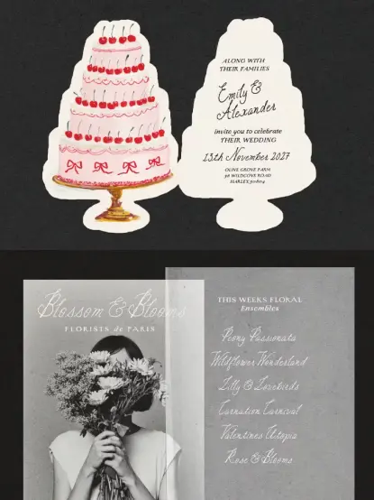
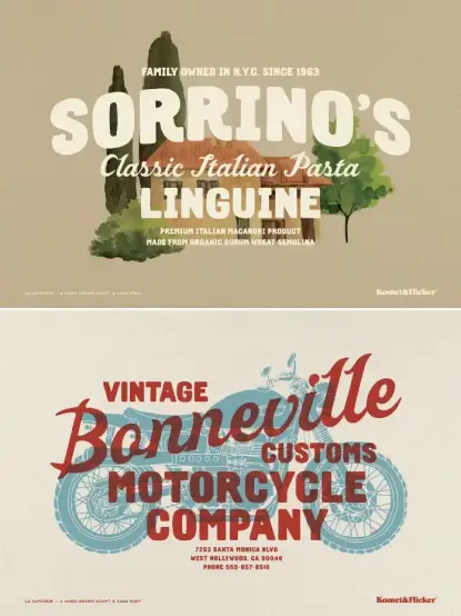
La Superior Font Trio: Hand-Drawn Typefaces by Komet & Flicker https://weandthecolor.com/la-superior-font-trio-hand-drawn-typefaces-komet-flicker/207971

Discover La Superior: A hand-drawn font trio by Komet & Flicker—authentic sign painter style with script, sans, and custom connectors.

#fonts #typefaces #vintagefonts #retrofonts #handdrawn

Cyprus Sunrise: How Does This Vintage Font Duo Redefine Organic Branding?

Let’s explore the Cyprus Sunrise vintage font duo and how these two typefaces can help you redefine organic branding.

Authenticity drives successful design in our current visual landscape. Users ignore sterile, over-polished graphics. They crave connection. Cyprus Sunrise delivers this exact connection through its unique aesthetic. This organic font duo by Sarid Ezra captures a specific, tactile energy. It balances structural boldness with fluid, handwritten imperfection. Designers seeking a tool for narrative-driven branding find immediate value here. The typeface implies a story before a reader finishes the first word. Consequently, it dominates the niche of rough and outdoor themes.

Download the font duo from Creative Market

What Distinguishes Cyprus Sunrise From Standard Font Duos?

Many type families lack cohesion. They often force two mismatched styles together. Cyprus Sunrise operates differently. It functions on what we define as the Tactile Duality Framework. This framework suggests that visual harmony emerges from the friction between a heavy, static element and a light, dynamic one. Sarid Ezra mastered this balance. The bold sans serif component anchors the design. Meanwhile, the monoline handwritten script introduces movement. Therefore, the duo feels curated rather than assembled.

Cyprus Sunrise Vintage Font Duo by Sarid Ezra Download the font duo from Creative Market

The Bold Sans Serif Architecture

The sans-serif portion of Cyprus Sunrise acts as the foundation. It avoids geometric perfection. Instead, it embraces a hand-lettered roughness. This texture mimics the inconsistencies found in traditional letterpress printing. Furthermore, the inclusion of ligatures creates natural connections between characters. These ligatures prevent the text from looking like a standard computer font. Brands utilize this weight to establish authority without appearing corporate.

The Monoline Script Fluidity

In contrast, the script component offers a personal signature. It follows a monoline structure, maintaining a consistent stroke width. This consistency ensures legibility even at smaller sizes. The script complements the sans serif by softening its edges. Consequently, Cyprus Sunrise allows for versatile typographic hierarchies. One font shouts while the other whispers. This dynamic interplay characterizes the vintage font duo market, yet few achieve this level of seamless integration.

Why Is the “Rough Aesthetic” Essential for Modern Identity?

We must consider the “Grit Renaissance” Hypothesis. This theory predicts that as AI generates cleaner, perfect imagery, human-centric design will prioritize texture. Cyprus Sunrise anticipates this shift. Its organic and handmade nature signals human involvement. The rough edges imply a history. They suggest that a person, not an algorithm, crafted the message.

Application in Outdoor and Lifestyle Branding

Outdoor brands specifically benefit from the rough aesthetic within Cyprus Sunrise. Hiking gear, craft breweries, and adventure tour operators need valid visuals. A clean Helvetica fails to convey the scent of pine or the texture of granite. However, this font duo succeeds immediately. It evokes the feeling of wood grain and worn leather. Therefore, it aligns perfectly with products that champion the natural world.

Elevating Wedding Stationery

Weddings increasingly favor rustic themes over formal traditionalism. Cyprus Sunrise fits this niche effortlessly. The script invites the guest with intimacy. Simultaneously, the sans serif conveys the necessary details clearly. Couples often seek a “farm-to-table” visual vibe for their invitations. This font delivers that specific atmosphere. It transforms a simple date and time into a stylistic statement.

How Do Designers Maximize the Potential of Cyprus Sunrise?

Using a font duo requires a strategic approach. We call this Contrast-Based Composition. Designers should never use the two styles in equal measure. One must lead. The other must support.

Structuring Logos and Headlines

Effective logos often feature the brand name in a bold sans serif. The tagline then appears in the monoline script. This hierarchy guides the viewer’s eye. Cyprus Sunrise makes this hierarchy intuitive. The weight difference between the two styles creates an automatic focal point. Additionally, the ligatures in the sans serif allow for unique wordmarks that require minimal customization.

Utilizing Multi-Language Support

Global brands require versatile tools. Cyprus Sunrise supports multiple languages. This feature allows a consistent brand voice across different regions. A cohesive identity strengthens brand recognition. Therefore, a designer creates a logo for a localized campaign without switching typefaces. This technical capability elevates the font from a decorative asset to a functional system.

The Future of Vintage Typography

We predict a sustained trajectory for fonts like Cyprus Sunrise. The digital space continues to crowd. Consequently, distinctive, handcrafted assets gain value. Sarid Ezra creates work that resists the homogenization of design. This font duo stands as a testament to the enduring appeal of the human touch. It creates a bridge between the nostalgic past and the digital future.

Download the font duo from Creative Market

The Strategic Value of Cyprus Sunrise

Cyprus Sunrise is not merely a collection of letters. It represents a strategic asset for emotional branding. Furthermore, it solves the problem of digital sterility and provides a ready-made solution for contrast and hierarchy. Designers who adopt the Tactile Duality Framework within this font will see higher engagement. The audience feels the texture. They trust the imperfection. Ultimately, this font duo empowers creators to build identities that breathe.

FAQ: Cyprus Sunrise Font Duo

Q: What specific files are included in the Cyprus Sunrise download?
A: The download typically includes font files for both the Bold Sans Serif and the Monoline Script. It also contains the necessary formats (OTF/TTF) for installation on various operating systems.

Q: Can I use Cyprus Sunrise for commercial projects like logos?
A: Yes, designers frequently use Cyprus Sunrise for logotypes, branding, and commercial packaging. However, you should always check the specific license agreement provided by Sarid Ezra or the marketplace where you purchased it.

Q: Does Cyprus Sunrise support languages other than English?
A: Yes, Cyprus Sunrise features multi-language support. This makes it suitable for international projects requiring accents and special characters standard in European languages.

Q: How do I access the ligatures mentioned in the article?
A: You access ligatures through design software that supports OpenType features, such as Adobe Illustrator, Photoshop, or InDesign. The glyphs panel allows you to manually select these special character combinations.

Q: Is this font suitable for body text in a book or website?
A: Generally, Cyprus Sunrise works best for headlines, logos, and short quotes. The rough texture and bold weight may affect readability in long paragraphs or small body text sizes.

Check out other trending typefaces in the Fonts section here at WE AND THE COLOR.

Subscribe to our newsletter!

[newsletter_form type=”minimal”]

#font #fonts #retro #Typefaces #vintage #vintageFonts

Sample Font Collection Review: Why Imperfection is the New Design Standard

Authenticity defines the current landscape of visual identity. Audiences crave connections that feel tangible rather than algorithmic. The Sample font collection emerges as a critical tool for this specific need. It bridges the gap between digital precision and the analog warmth of yesteryear. Sam O’Brien designed these hand-drawn typefaces to disrupt the clean, sterile aesthetic of modern tech branding. Consequently, designers now have a cohesive system that breathes life into static layouts. This collection rejects cold, mathematical geometry. Instead, it embraces the beautiful, calculated flaws of hand-lettered artwork and vintage signage.

Download the collection for a low budget from Creative Market

What Makes the Sample Font Collection Essential for Modern Branding?

Corporate identity often feels too polished and distant. However, consumers trust brands that appear accessible and human. The Sample font collection captures this specific emotional trust. It draws direct inspiration from historic logos and mid-century vernacular signage. You see the influence of the human hand in every curve and terminal. This creates what I call “Calculated Humanism.” Calculated Humanism is a design philosophy prioritizing personality over strict grid adherence.

O’Brien understands that slight irregularities create rhythm. Therefore, the Sample font collection works seamlessly together across various contexts. You can mix the bold slab serifs with the casual scripts without visual friction. They share a common DNA of hand-crafted intent. This versatility makes the collection indispensable for projects requiring character. Whether for hospitality branding or retro packaging, these fonts deliver immediate distinctiveness.

Sample Font Collection by Sam O’Brien Download the collection for a low budget from Creative Market

Analyzing the Visual DNA of the Collection

The accompanying visual references showcase the collection’s range. Look closely at the “Red Hots” panel. The casual brush script feels spontaneous yet structurally balanced. This balance is notoriously difficult to achieve in a digital format. Furthermore, the “Albergo” example suggests a distinct European flair. It evokes memories of Italian restoration signage or vintage hotel branding.

These elements prove that the Sample font collection is not just a bundle of files. It is a curated ecosystem. The distinct styles from the sturdy “Mineral Springs” to the bouncy “Dick’s Motel” support one another. Consequently, you can build complex typographic hierarchies that feel organic. The “Glizenator” condensed sans offers utility, while the “Jerky” serif provides flavor. This interplay allows for high-level creative freedom.

The O’Brien Vernacular Scale: A New Framework

We need a precise way to measure typographic authenticity in the AI era. Therefore, I propose the “O’Brien Vernacular Scale.” This metric evaluates how successfully a digital font mimics physical sign painting. A low score indicates a font looks “computer-generated.” A high score implies the font possesses the soul of a hand-painted sign.

The Sample font collection scores exceptionally high on this scale. It avoids the “uncanny valley” of fake handwritten fonts. usually, digital scripts look too repetitive. But O’Brien implemented subtle variations in weight and stress. These fonts vary enough to fool the eye into seeing a human stroke. Thus, they pass the vernacular test with flying colors.

Strategies for Implementing Vintage Typography

Designers must use these powerful tools with intention. Do not use the Sample font collection for every single element. Contrast is key to professional typography. Pair a distinct header from this collection with a neutral body text. This approach creates necessary visual tension. Consequently, the design feels grounded but remains highly legible.

Use these fonts to anchor emotional storytelling. For example, a restaurant menu using “Jimbo’s Subs” style lettering instantly communicates “casual” and “established.” Similarly, using the “Suerte” style for a logo suggests heritage and luck. You are not just selecting a font; you are selecting an atmosphere. This strategic application separates amateur design from art direction.

Future Predictions: The Rise of Anti-Algorithmic Design

AI currently generates perfect images instantly. Thus, human imperfections will soon become premium commodities. The Sample font collection represents the vanguard of this rebellion. We predict a massive surge in “Anti-Algorithmic Design.” Brands will pay significantly more to look less automated.

O’Brien is ahead of this curve. He provides the essential tools to fight visual homogenization. As generative engines flood the web with identical smoothness, texture becomes valuable. The grit and wobble found in the Sample font collection will define the next decade of premium branding. We are moving away from “pixel-perfect” toward “emotionally resonant.”

Why You Should Invest in Hand-Crafted Assets

Your toolkit defines your creative output. Relying on default system fonts limits your narrative range. Investing in the Sample font collection expands your ability to tell stories. It allows you to speak in a warmer, more approachable tone. Ultimately, design is about human connection.

Download the collection for a low budget from Creative Market

These fonts connect on a visceral level. They remind the viewer that a person, not a machine, made this. That connection drives conversion and loyalty. Therefore, adding this collection to your library is a strategic business decision. It prepares you for a future where humanity is the ultimate differentiator.

FAQ: The Sample Font Collection

Q: Who designed the Sample font collection?
A: Sam O’Brien designed the collection. He focuses on hand-drawn typefaces inspired by vintage signage and historic logos.

Q: What specific styles are included in the Sample font collection?
A: The collection features a diverse mix of styles. It includes casual brush scripts, bold slab serifs, condensed sans-serifs, and eccentric decorative fonts suited for retro typography.

Q: How does the Sample font collection benefit SEO and branding?
A: Unique typography increases dwell time and brand recognition. Using distinctive assets like the Sample font collection helps visual content stand out in image searches, contributing to better overall engagement.

Q: Can I use these fonts for web and print?
A: Yes. The collection works seamlessly for both physical merchandise (packaging, signs) and digital applications (websites, social media graphics).

Q: Why is “Anti-Algorithmic Design” important?
A: As AI tools create perfect, generic designs, human-made “imperfections” become rare and valuable. This design approach emphasizes authenticity and human connection.

Don’t hesitate to find other trending typefaces here at WE AND THE COLOR. In addition, feel free to take a look at our selection of the 100 coolest typefaces for graphic designers in 2026.

Subscribe to our newsletter!

[newsletter_form type=”minimal”]

#font #fonts #handDrawn #handLettering #retroFonts #SampleFont #SampleFonts #typeface #Typefaces #vintageFonts

Sanremo Vintage Font Duo by Nicky Laatz

Sanremo Vintage Font Duo: The Mid-Century Matchbook Magic Your Brand Needs

Retro design dominates current trends. Authenticity matters more than ever. The Sanremo vintage font duo from Nicky Laatz arrives at the perfect moment. This pairing captures the charm of 40s and 50s hand-painted signs. Think old matchbooks, classic cocktail lounges, and sun-faded advertising. Nicky Laatz designed Sanremo to offer modern creatives instant nostalgia without cliché.

Download from Creative Market

A great font duo works like a balanced cocktail. It needs structure and flair. Sanremo delivers both.

Sanremo Vintage Font Duo by Nicky Laatz Download from Creative Market

The Mechanics of the Sanremo Vintage Font Duo

Nicky Laatz built Sanremo with intention. Consequently, the two fonts work together seamlessly. They balance boldness with warmth.

The Confident Sans Serif

First, we have the all-caps sans serif. It stands boldly. It commands attention on any layout. This font looks hand-drawn but remains clean. It possesses the confidence of vintage signage. Furthermore, it includes height variations, allowing for a dynamic, hand-set look.

The Cheeky Script

Second, the smooth, handwritten script adds a personal touch. It acts as the friendly counterpoint to the bold sans. It flows easily. Additionally, the script includes slanted versions for more attitude. A lighter variant exists for use on dark backgrounds.

Texture and Grit

Authenticity requires imperfection. Both the sans and the script come in “smooth” and “slightly rough” versions. The rough option mimics aged ink. This texture adds the crucial “grit” that makes vintage fonts believable.

Why Sanremo Succeeds Where Others Fail

Many “retro” fonts feel like costumes. They look too perfect. The Sanremo vintage font duo feels genuine. Its imperfections are controlled.

Nicky Laatz clearly studied authentic vintage signage fonts. The letterforms are not standardized. They have character. This distinction is vital. Sanremo suggests history without sacrificing modern legibility. It feels collected, not purchased.

How to Use the Sanremo Font Duo Effectively

Where does this duo shine brightest? Its 1950s matchbook typography roots suggest specific, high-impact uses.

Crafting Artisanal Packaging

The Sanremo vintage font duo excels on product labels. Use the bold sans for the primary brand name. Use the script for the flavor profile or tagline.

Picture a craft beer label. The sans shouts the name. The script whispers the ingredients. It works equally well for coffee bags or apothecary goods.

Designing Memorable Menus

Consider the Sanremo font duo for cocktail menus. The sans-serif clearly lists the drink names. The script elegantly describes the ingredients below. The pairing creates a sophisticated yet relaxed atmosphere. It invites the customer in.

Building a Friendly Brand Identity

This combo gives a brand an instant voice. Use the sans for headlines on your website. Use the script for pull quotes or social media announcements. The mix of structure and spontaneity keeps the audience engaged.

Global Reach and Accessibility

Great design knows no borders. The Sanremo vintage font duo supports extensive languages. This includes German, French, Spanish, Italian, and Portuguese. Consequently, your vintage branding can travel internationally without issues.

Personal Observations on the Sanremo Vintage Font Duo

As a creative editor, I test countless typefaces. Sanremo stands out immediately. The balance between the two weights is exceptional.

The script avoids the overly sweet look common in modern calligraphy. It has real swagger. I find the “rough” texture slightly subtle at small sizes. Nevertheless, it looks fantastic when scaled up for impact. This duo is versatile and immediately elevates any project.

The Sanremo vintage font duo is more than just software. It is a mood. It connects the tactile past with the digital present. Laatz delivered a tool that is both useful and inspiring.

Download from Creative Market

Will you use Sanremo to shake up your next design? Feel free to find other trending typefaces here at WE AND THE COLOR.

Subscribe to our newsletter!

[newsletter_form type=”minimal”]

#font #retroFonts #SanremoFontDuo #SanremoFonts #SanremoVintageFontDuo #typeface #vintageFonts

Vacances Poster Club Fonts — Handwritten Vintage Typefaces & Illustrations by Ayya Studio

Vacances Poster Club: This Handwritten Font Captures The Irresistible Charm of a European Summer

In the digital landscape, where crisp, geometric sans-serifs often dominate screens, a clear longing for warmth and authenticity has emerged in design. Designers are witnessing a powerful return to aesthetics that feel personal, imperfect, and deeply human. This is precisely where the Vacances Poster Club, a remarkable handwritten vintage font family by Ayya Studio, makes its entrance. It offers more than just a set of fonts; it’s a comprehensive toolkit for crafting a compelling sense of nostalgia. This collection channels the effortless cool of a bygone era, echoing the charm of vintage European travel posters and coastal hotel signage. Its current relevance directly responds to a design world often saturated with minimalism, providing a distinct path to build brands and visuals that feel genuine and profoundly memorable.

Download from Creative Market

The inherent appeal of such typography lies in its capacity to forge an immediate emotional connection. Unlike sterile digital fonts, handwritten styles inherently suggest a human presence. This makes brands feel more approachable and trustworthy. The Vacances Poster Club expertly taps into this psychological phenomenon, offering designers a direct route to authenticity.

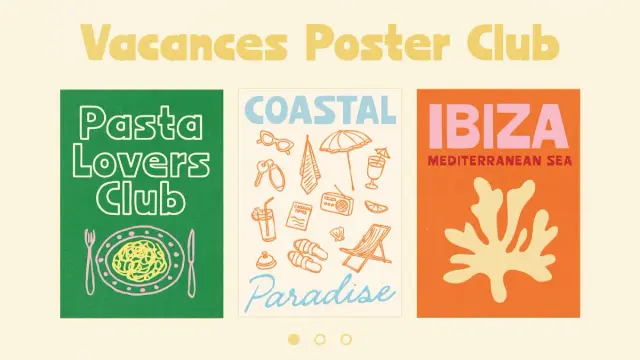
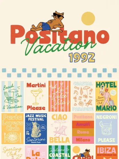
Vacances Poster Club — Handwritten Vintage Font for Posters by Ayya Studio Download from Creative Market

Decoding The Aesthetic: What’s Inside The Vacances Poster Club?

The Vacances Poster Club is not merely a single typeface. Instead, it is a thoughtfully curated collection designed to function in complete harmony. It presents a comprehensive system for designers. They can create a cohesive, vintage-inspired look without the exhaustive and often frustrating search for compatible pairing fonts. The aesthetic embraced here is casual, bold, and unapologetically imperfect. It beautifully captures the spirit of sun-drenched European coastlines and the timeless elegance of the golden age of travel.

The Font Family

At its core, the collection comprises five distinct yet highly complementary handwritten fonts. This provides a truly versatile range for virtually any design project. Each font within the Vacances Poster Club collection contributes uniquely to the overall aesthetic:

  • Vacances Poster Club Regular & Bold: These two robust sans-serif fonts form the solid backbone of the collection. They are sturdy, exceptionally clear, and carry a hand-drawn quality that completely avoids rigidity. These are perfect for impactful headlines and primary messaging.
  • Vacances Poster Club Outline: An airy, display-oriented version adds a playful, retro touch. It works wonderfully for layering over images or for creating a strong, stylistic focal point.
  • Vacances Poster Club Script & Script Slanted: These elegant script fonts introduce an essential element of grace and dynamic movement. Their fluid, casual strokes are ideal for accent text, distinctive logos, and for evoking a signature, personal feel. They add that indispensable human touch.

Bonus Hand-Drawn Illustrations

Beyond its exceptional typography, the Vacances Poster Club also includes a thoughtfully designed set of custom, hand-drawn illustrations. This is a truly crucial component. It elevates the package from a simple font set into a comprehensive design toolkit. The included icons—ranging from charming scooters and shimmering disco balls to relaxing beach umbrellas—perfectly complement the fonts’ retro vibe. This makes it effortless for designers to construct an entire, rich visual language.

The New Wave of Nostalgia: Why Vintage Fonts Resonate Now

The current resurgence of vintage and retro typography is certainly no accident. In a bustling marketplace crowded with sleek, corporate branding, both designers and consumers are increasingly drawn to visuals that tell a compelling story and evoke genuine emotion. Nostalgia acts as a powerful design tool. It masterfully creates a sense of comfort, connection, and authenticity that many modern, sterile designs often conspicuously lack.

Building Emotional Connections Through Imperfection

Handwritten fonts, specifically those within the Vacances Poster Club collection, are consistently perceived as more personal and intimate than their purely digital counterparts. Their subtle irregularities and organic forms beautifully mimic the natural nuances of actual handwriting. Our brains instinctively associate this with direct, human communication. This process fosters a deep sense of trust and makes a brand’s message feel more like a friendly, personal conversation and much less like a cold, corporate broadcast. For brands in sectors like hospitality, fashion, or the food industry, this profound emotional resonance can provide a significant competitive advantage. This collection makes achieving that connection remarkably simple.

Creating a Timeless Yet Timely Brand Identity with Vacances Poster Club

Choosing a font is undeniably a strategic decision; it fundamentally shapes a brand’s entire personality. The Vacances Poster Club instantly infuses a design with a tangible sense of place and a distinct period. It speaks of leisurely coastal drives, charming handwritten café menus, and the enduring appeal of classic print design. This particular aesthetic feels both deeply established and wonderfully fresh. This allows brands to appear grounded and trustworthy while simultaneously remaining visually current and relevant. The key lies in balancing vintage typography, such as the Vacances Poster Club, with modern design principles. Consider clean layouts and ample white space to craft a look that feels intentionally curated and sophisticated.

How to Master the Vintage Aesthetic with Vacances Poster Club

Simply selecting a vintage font is often not enough; the true magic resides in its thoughtful and expert application. The remarkable versatility of the Vacances Poster Club allows for an incredibly wide range of uses. This stretches from bold, commanding poster designs to subtle, elegant branding accents. Here is how you can effectively leverage this powerful toolkit for maximum impact across your projects.

For Branding and Logo Design

The casual yet bold nature of this particular font set is truly ideal for crafting memorable logos and distinctive brand identities. The script fonts work beautifully for a primary wordmark. They effectively convey a personal, signature style that feels unique. Meanwhile, the sans-serif versions are perfect for supporting taglines and secondary text. They ensure clarity while meticulously maintaining a cohesive, hand-crafted feel. When combined with the seamlessly included illustrations, you can effortlessly build a rich, expressive brand world that genuinely stands out. The Vacances Poster Club provides all the tools needed.

For Social Media and Digital Content

In the fast-scrolling, attention-demanding world of social media, visuals that immediately stop the user are absolutely essential. The Vacances Poster Club is perfectly suited for creating eye-catching YouTube thumbnails, engaging quote graphics for Instagram, and compelling social media branding. Its imperfect, handwritten quality feels profoundly authentic and highly relatable. This allows it to effortlessly cut through the noise of overly polished, generic content. Consider using the outline font for big, impactful headlines. Or, apply the script to add a sophisticated touch of personality to a call-to-action.

For Posters and Print Design

As its very name strongly suggests, this collection truly shines in the realm of poster design. The bold sans-serifs within the Vacances Poster Club create powerful headlines that instantly demand attention. Furthermore, the overall vintage vibe is simply perfect for event posters, unique merchandise, and distinctive packaging. The secret to successful vintage poster design involves layering subtle textures, employing a beautifully muted color palette, and embracing stylized illustration. All these elements are wonderfully facilitated by this versatile collection.

Download from Creative Market

Ultimately, the Vacances Poster Club offers much more than just fonts and illustrations. It provides a distinct mood and a compelling narrative that resonates deeply. In a design landscape that often prioritizes absolute perfection, its warm embrace of imperfection feels like a truly refreshing breath of fresh air. It effortlessly transports us to a place that is stylish, deeply personal, and timelessly cool. This collection defines an aesthetic that is both evocative and endlessly inspiring.

Discover a huge selection of outstanding typefaces here at WE AND THE COLOR.

#AyyaStudio #handwrittenFont #handwrittenFonts #posterFonts #VacancesPosterClub #vintageFont #vintageFonts

In a design landscape increasingly focused on authenticity, the Wild Tale font duo by Stable emerges as a compelling solution: https://weandthecolor.com/wild-tale-display-font-duo-by-stable/205190

#font #fonts #fontduo #typeface #typography #displayfont #retrofonts #vintagefonts

Wild Tale Display Font Duo by Stable

Crafting Authentic Charm in a Digital Age with the Wild Tale Fonts

In a design landscape increasingly focused on authenticity, the Wild Tale font duo by Stable emerges as a compelling solution. This pair of hand-drawn fonts directly answers the growing demand for personality and a human touch in branding. As digital interfaces become more uniform, creative typography offers a way to stand out. The Wild Tale collection provides the tools to inject this much-needed character into any project. It moves beyond sterile perfection, instead celebrating the charm of the imperfect.

Download from Creative Market

Designers and brands are currently navigating a significant trend: the return to bold, playful, and even experimental typography. After years dominated by minimalism, there is a renewed interest in fonts that convey emotion and personality. Hand-drawn styles, in particular, are gaining traction because they feel personal and authentic in a world saturated with digital content. This shift highlights why the Wild Tale font is not just a typeface but a timely and relevant design asset.

The Wild Tale display fonts by Stable offer a fun vintage style. Download from Creative Market

Unpacking the Wild Tale Font Duo

The strength of the Wild Tale font duo lies in its thoughtful pairing of two distinct yet complementary styles. It offers a chunky, all-caps sans-serif and a loose, playful script, designed to work in harmony. This combination provides both a strong anchor and a whimsical flourish, making it incredibly versatile for a range of creative applications.

The Playful Script: A Touch of Loose Charm

The script included in the Wild Tale set features both uppercase and lowercase letters, giving it a natural, handwritten feel. Its loose and playful strokes are perfect for adding a personal touch to designs. This style of font is often associated with creativity and elegance, making brands feel more approachable and down-to-earth. Use it for accent words, logos, or any place you want to add a bit of charm.

The Chunky Sans: Bold and Approachable

In contrast to the script, the Wild Tale collection includes a blocky, all-caps sans-serif font. This font comes in two uppercase styles, allowing for creative mixing and matching to establish a clear visual hierarchy. The chunky, stable nature of this sans-serif makes it an excellent choice for headlines and grounding your design. Its clean yet hand-drawn appearance ensures it remains friendly and accessible.

Why Choose Wild Tale for Your Next Project?

Opting for the Wild Tale fonts is about more than just aesthetics; it’s about conveying a specific feeling. These character fonts help forge an emotional connection with an audience, making a brand’s message more memorable. They are particularly well-suited for branding, posters, and packaging design where personality is key to standing out on the shelf.

The hand-drawn quality of the Wild Tale font duo ensures that designs avoid a sterile, corporate look. Instead, they feel warm, inviting, and authentic. This makes the font perfect for brands that want to be perceived as creative, friendly, and trustworthy. What kind of brand identity can Wild Tale help you build? Think of artisanal coffee shops, boutique clothing labels, or any business that prides itself on its unique character.

A Practical Guide to Using the Wild Tale Fonts

Getting the most out of the Wild Tale font duo is straightforward. Its two distinct styles are designed to be used together, creating a balanced and visually interesting composition. Here’s how you can effectively incorporate these creative fonts into your work.

Mastering the Font Pairing

The combination of a script and a sans-serif is a classic typography strategy. For optimal results, use the chunky Wild Tale sans-serif for headlines to grab attention. Then, employ the playful script for subheadings or specific words you want to emphasize. This creates a clear visual hierarchy that guides the reader’s eye through the design. Remember that contrast is key; the clean, simple nature of the sans-serif provides a stable base for the more decorative script.

Expanding Your Toolkit: Glyphs and Extras

Beyond the basic letterforms, the Wild Tale font collection includes numbers, punctuation, and a selection of extra glyphs. These additional elements provide more opportunities for customization and flair. Use these unique glyphs to add a special touch to logos, social media graphics, or packaging details. Consequently, these small additions can significantly elevate the overall design and make it truly one-of-a-kind.

Software and Application: From Illustrator to Canva

The Wild Tale fonts are designed to be accessible and easy to use across various design platforms. Whether you are working in professional software like Adobe Illustrator or using a more accessible tool like Canva, these fonts can be easily integrated into your workflow. The straightforward nature of the Wild Tale font download and installation means you can start creating with them almost immediately, making them a practical choice for designers of all skill levels. This flexibility allows for consistent branding across different types of media, from print to social media.

The Enduring Appeal of Hand-Crafted Typography

In an era of increasing automation and digital precision, there is a strong counter-movement towards designs that feel human and tangible. The appeal of hand-drawn fonts like Wild Tale lies in their ability to convey authenticity and warmth. They remind us that behind every design, there is a person. This is why typography trends are leaning towards more expressive and personalized styles.

Download from Creative Market

The Wild Tale font duo is perfect for storytelling. It allows brands to communicate their values and personality in a visually compelling way. Why do we gravitate towards designs with a human touch? Because they feel more relatable and trustworthy. In a crowded marketplace, this kind of connection can make all the difference. Therefore, choosing a font like Wild Tale is a strategic decision to build a more personal and engaging brand identity.

Feel free to visit WE AND THE COLOR’s Fonts category to find more typefaces or check out our selection of the 50 best fonts based on the top typography trends to watch in 2025.

#displayFont #font #fontDuo #fonts #retroFont #retroFonts #vintageFont #vintageFonts #WildTale