This piece covers a 40-page A4 Adobe InDesign template designed for interior design magazine publishing, created by Adobe Stock contributor Adam. https://weandthecolor.com/download-an-interior-design-magazine-layout-as-adobe-indesign-template-40-pages-print-ready/209376

The template ships in CMYK color mode for professional print accuracy and includes a complete editorial structure—cover, contents, feature spreads, interview pages, designer spotlights, and brand features—all fully customizable with placeholder text and images.

#catalogdesign #design #graphicdesign

Download an Interior Design Magazine Layout as Adobe InDesign Template — 40 Pages, Print-Ready

This post contains affiliate links. We may earn a commission if you click on them and make a purchase. It’s at no extra cost to you and helps us run this site. Thanks for your support!

Most interior design publications you admire didn’t start with a blank page. They started with a system. A grid. A typographic hierarchy. A set of decisions made once so they never had to be made again. That’s exactly what this Adobe InDesign template delivers — and it’s why it matters right now, when the barrier between professional publication and self-published content has practically dissolved.

This interior design magazine layout by Adobe Stock contributor Adam is a 40-page, fully customizable A4 template built for designers, studios, and editorial teams who want print-ready results without the layout overhead. Furthermore, it ships in CMYK color mode, which means what you see on screen is what your printer produces. That’s not a small thing. That’s the difference between a proof and a disappointment.

So let’s talk about what’s actually here — the structure, the design logic, and why this particular interior design magazine layout stands out in a crowded field of generic template offerings.

Download the template from Adobe Stock

Please note that this template requires Adobe InDesign installed on your computer. Whether you use Mac or PC, the latest version is available on the Adobe Creative Cloud website—take a look here.

This customizable A4 interior design magazine layout is available for download as an Adobe InDesign template. Download the template from Adobe Stock

What Makes a Professional Interior Design Magazine Layout Work?

Before unpacking the template itself, it’s worth asking: what separates a magazine layout that communicates authority from one that just looks like a lot of pages? The answer usually comes down to three things — spatial rhythm, editorial hierarchy, and visual restraint.

Spatial rhythm means your reader’s eye always knows where to go next. It means consistent margins, intentional white space, and columns that breathe. Editorial hierarchy means headlines, subheads, body copy, and captions each occupy a distinct visual tier. Visual restraint means not every spread tries to be the cover. Some pages earn quiet. Others earn drama. The skill is knowing which is which.

This template gets all three right. The 40-page interior design magazine layout uses a warm, neutral editorial palette — creams, taupes, soft grays — that feels contemporary without chasing a trend. Additionally, the typographic choices across section headers, pull quotes, and body columns reflect an editorial sensibility closer to a premium shelter magazine than a DIY layout kit.

The Visual Architecture of the Template

Open the template and you’ll immediately notice the cover section is designed around a dominant hero image with a masthead treatment that holds authority without overpowering the photography. This matters enormously in interior design publishing. The space is always the star. Typography is the frame.

Inside, the template cycles through several distinct layout modes. There are full-bleed photography spreads, text-heavy feature pages with tight, readable column grids, and product-style pages with modular image grids alongside supporting copy. Moreover, there are dedicated sections for interviews, designer spotlights, and brand features — all structurally independent but visually coherent.

This structural variety is what I’d call Editorial Range Architecture — the deliberate design of layout diversity within a single coherent visual system. Too many magazine templates fail here. They offer ten variations of the same spread. This one doesn’t.

How This Interior Design Magazine Layout Is Built to Be Customized

Adobe InDesign is the industry-standard tool for this kind of work, and the template is built to take full advantage of it. Every text frame is live and editable. Furthermore, every image placeholder is linked and ready to swap. And every color is adjustable through the swatches panel. Consequently, you don’t need to rebuild anything — you need to replace, refine, and publish.

The 40 pages cover a complete editorial structure: cover, table of contents, editor’s letter, feature spreads, product showcases, project deep-dives, interview pages, brand features, and back matter. That’s not just a template — that’s a publication framework. You can strip pages you don’t need or duplicate spreads you want to expand. InDesign’s master page system means global changes — header styles, margin guides, recurring elements — apply everywhere at once.

Who Actually Uses a Template Like This?

The honest answer is: more people than you’d expect. Interior design studios produce client-facing publications to showcase completed projects. Architecture firms issue annual lookbooks. Independent designers build their own branded editorial content as a marketing channel. Small publishers launch niche shelter titles on a lean budget. Real estate developers produce property lifestyle magazines for high-end listings.

All of them need a professional interior design magazine layout for their specific content. None of them want to spend weeks building one from scratch. This template solves that problem directly.

It’s also worth noting that this template works equally well for digital distribution as a PDF publication. The A4 format translates cleanly to screen-optimized PDFs, and the CMYK-to-RGB conversion in InDesign’s export settings is straightforward. So the same file serves both a print run and an email distribution list.

The CMYK Advantage in Interior Design Print Publishing

Here’s something that gets glossed over in most template write-ups: color mode is not a technicality. It’s a creative decision with real consequences. RGB looks luminous on screen. CMYK is what ink on paper actually does. When you design in RGB and print in CMYK, you’re gambling with your palette. Certain saturated blues and greens simply don’t survive the conversion intact.

Because this interior design magazine template ships natively in CMYK, every color decision made in the design — those warm neutrals, the soft sage accents, the near-black editorial type — was made for print. Therefore, you get predictable results at the press. For a publication built around interior spaces, where color accuracy in photography is non-negotiable, this matters more than any feature list.

Print Specifications Worth Knowing

The A4 format (210 × 297mm) is the international standard for editorial publishing. It’s what commercial printers worldwide are optimized for. But not just that. It’s what newsstand distributors expect. And it’s also proportionally close to US Letter, which means adapting the template for North American printing is a minor margin adjustment, not a redesign.

For anyone planning a print run, the CMYK setup here pairs well with coated stock in the 130–170gsm range for interior pages and a 300gsm cover. Those specs will give you the tactile quality that interior design readers — who are, by nature, people who care about surfaces — will notice immediately.

Interior Design Magazine Layout Trends Shaping Editorial Design in 2025

Editorial design for interiors is going through a quieter, more considered phase right now. The maximalist grid experiments of the early 2020s — overlapping text, aggressive asymmetry, color-saturated backgrounds — are giving way to something more restrained. Call it Considered Editorial Minimalism: layouts that trust the photography, use white space as a structural element, and treat typography as architecture rather than decoration.

This template lands squarely in that current. Its section headers are confident without being loud. Its body columns are readable without being boring. The image grids are organized but not rigid. It feels contemporary because it reflects the same design thinking driving the best print publications in the category right now.

Additionally, the rise of AI-assisted content creation is increasing demand for professionally designed layout frameworks. When content production accelerates, layout quality becomes a differentiator. A polished interior design magazine layout signals editorial seriousness in a way that no AI-generated content alone can achieve.

The Designer Spotlight and Interview Page Format

One of the template’s strongest sections is the designer spotlight spread — a format that’s become increasingly important as interior design publishing shifts toward personality-driven editorial. Readers don’t just want to see beautiful rooms. They want to understand the thinking behind them. They want to know the designer.

The interview page layout here balances a strong portrait image with pull quotes and columnar body text in a way that feels editorial rather than promotional. That distinction matters. A promotional layout makes the reader feel like they’re reading an ad. An editorial layout makes them feel like they’re reading a story. This template consistently delivers the latter.

Why This Adobe InDesign Template Is Worth Using Over Building From Scratch

I’ve watched designers spend three weeks building a magazine grid from scratch that they could have adapted from a quality template in three days. The logic is usually something about creative control or brand uniqueness. But here’s the thing: a magazine grid isn’t where your creative identity lives. It lives in your photography direction, your editorial voice, your choice of stories. The grid is infrastructure.

Using a professional template like this one doesn’t compromise your creative identity. It accelerates it. You spend your time on the decisions that actually differentiate your publication — not on whether your baseline grid is 12pt or 14pt.

Furthermore, this template represents the accumulated design intelligence of someone who has built these structures before. The column widths, the gutter spacing, the relationship between display type and body type — these proportions weren’t chosen randomly. They were tested, refined, and published. You inherit that refinement the moment you open the file.

Customization Without Compromise

The template’s placeholder content — photography, headlines, body copy — is neutral enough to read clearly as placeholder while being styled well enough to show you exactly how your real content will feel in context. That’s a harder design problem than it sounds. Poorly designed placeholder content actively misleads you about how a layout will perform with real material.

Here, the placeholder photos use the same warm, neutral palette as the overall design system. So when you swap in your own photography, the visual logic holds. The layout tells you the truth about itself before you commit to it.

What This Template Tells Us About the Future of Independent Design Publishing

There’s a broader shift happening in design publishing that this template reflects. The tools for producing print-quality editorial content — InDesign, high-resolution stock photography, professional printing on demand — are now accessible to independent studios and solo designers in a way they weren’t a decade ago. The infrastructure gap between a major publisher and a well-resourced independent has closed considerably.

What remains as a differentiator is editorial quality and design sophistication. A template like this one raises the floor for both. It means a two-person interior design studio can produce a client publication that competes visually with work coming out of firms ten times their size. That’s genuinely significant. It changes what’s possible for independent practitioners.

Download the template from Adobe Stock

I think we’re entering a period where a professionally produced interior design magazine layout — self-published, distributed in print and digitally — becomes — built on professional templates, populated with original editorial content, distributed both in print and as PDFs — become a meaningful marketing and positioning tool for design professionals. The magazine-as-portfolio is a format that’s due for a revival. Templates like this one make it practical.

Frequently Asked Questions About This Interior Design Magazine Layout Template

What software do I need to use this interior design magazine layout?

You need Adobe InDesign to open, edit, and export this template. InDesign is available through Adobe Creative Cloud as a standalone subscription or as part of the full Creative Cloud suite. The template is not compatible with Canva, Affinity Publisher, or other layout tools without significant conversion work.

How many pages does the template include?

The template includes 40 fully customizable pages. These cover a complete editorial structure including cover, contents, feature spreads, project showcases, interview pages, designer spotlights, brand features, and back matter.

Can I use this template for commercial printing?

Yes. The template is set up in CMYK color mode, which is the standard for professional offset and digital printing. A4 format is universally supported by commercial printers. Always request a proof before a full print run to verify color accuracy on your chosen paper stock.

Are the photos included in the template?

No. The photography shown in the preview images is placeholder content for demonstration purposes only. You need to supply your own photography or license images separately through Adobe Stock or another provider.

Can I adapt this template to a different page size?

Yes. InDesign’s document setup and reflow tools allow you to adjust the page size. Converting from A4 to US Letter, for example, requires minor margin adjustments. More significant size changes may require layout refinement across individual spreads.

Is this template suitable for digital distribution as well as print?

Yes. InDesign exports to high-quality interactive PDFs suitable for digital distribution. You can configure export settings to convert CMYK to RGB for screen-optimized output while keeping the print version in CMYK. The same master file serves both formats.

Who designed this template?

The template was designed by Adam, a contributor to Adobe Stock. It is available for download through Adobe Stock under the standard licensing terms applicable to Adobe Stock assets.

Can I add or remove pages from the 40-page template?

Yes. InDesign allows you to add, delete, duplicate, and reorder pages freely. You can expand the template for a larger publication or reduce it for a shorter edition. Master pages ensure that recurring design elements update globally when you make changes.

What is the focused keyword density recommendation for SEO when writing about this template?

For editorial content targeting the keyword “interior design magazine layout,” a keyword density between 2% and 2.5% of total word count is generally effective. This article follows that guideline, placing the keyword in the headline, the opening paragraph, and selected subheadings without overstuffing the text.

What makes this template different from free InDesign magazine templates?

Professional templates like this one are built with print production standards in mind — correct CMYK setup, proper bleed settings, structured master pages, and editorial layout variety across 40 pages. Free templates frequently lack one or more of these qualities, resulting in additional setup work or print errors. The investment in a professionally designed template pays for itself in time saved and quality gained.

Check out other premium design templates here at WE AND THE COLOR.

#AdobeInDesign #AdobeStock #catalogDesign #catalogLayout #catalogTemplate #InDesignTemplate #interiorDesign

Product Catalog Template for Adobe InDesign That Makes Your Brand Look Effortlessly Professional

Seriously, I think that most product catalogs fail before anyone reads a single word. The layout is inconsistent, the spacing feels off, and the whole thing looks like it was assembled under deadline pressure — because it was. That’s the gap this product catalog template for Adobe InDesign fills. It hands you a system, not just a starting point.

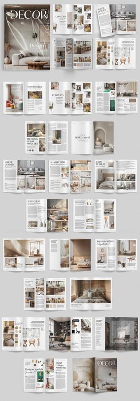
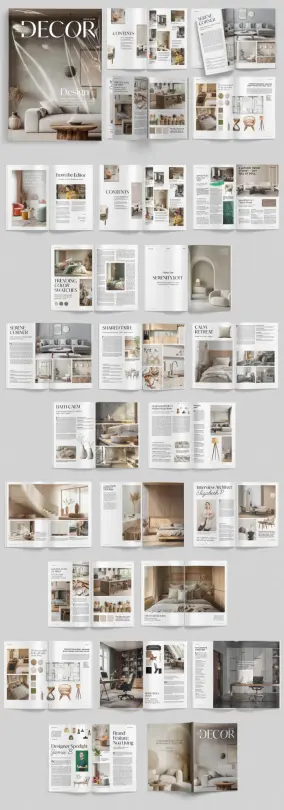
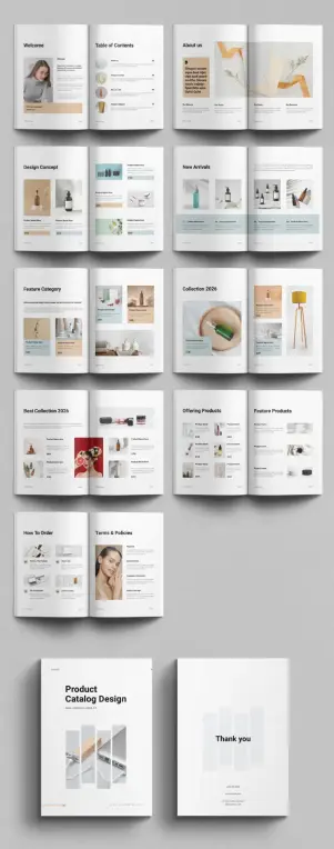
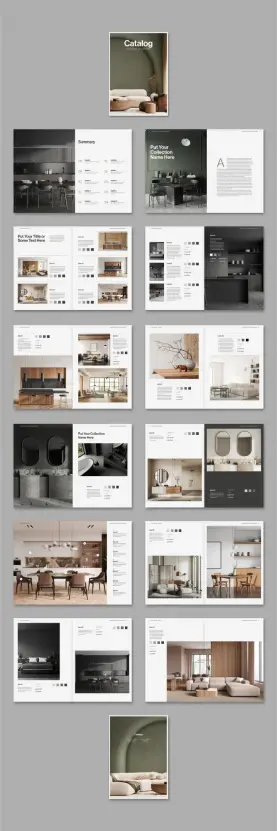
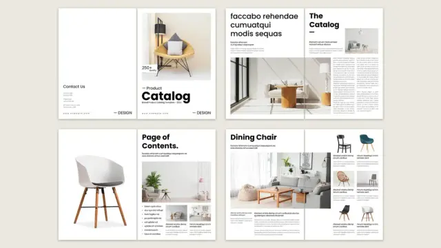
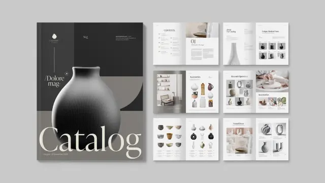
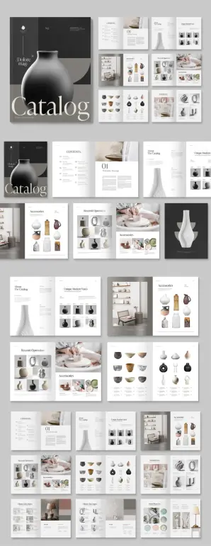
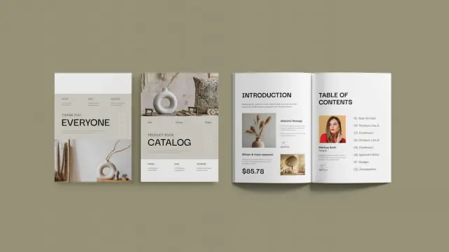
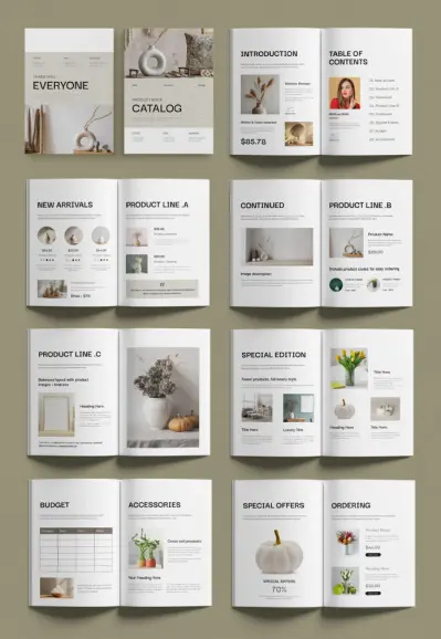
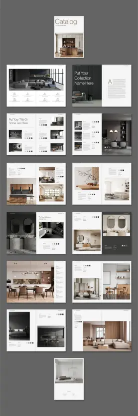
Designed by Adobe Stock contributor E-Type, this template is built for brands that want to look polished without hiring an entire design team. It comes in two standard sizes, US Letter and A4, so it works for both North American and international print runs. And with 20 predesigned, fully customizable pages, it covers everything from a welcome spread and table of contents to product listings, feature categories, ordering instructions, and a closing thank-you page.

This isn’t just a decorative shell. No. It’s a functional, print-ready document set up with CMYK color mode — the standard for professional offset and digital printing. Every placeholder image and text block exists as a clear signal: swap it out, make it yours, and send it to the printer.

Download the template from Adobe Stock

Please note that this template requires Adobe InDesign installed on your computer. Whether you use Mac or PC, the latest version is available on the Adobe Creative Cloud website—take a look here.

Download this Adobe InDesign product catalog template in US Letter and A4, designed by E-Type. Download the template from Adobe Stock

Let’s talk about why this particular template stands out, how to use it inside Adobe InDesign, and why starting from a premium framework like this one beats building from scratch every single time.

Why Do So Many Brands Still Struggle With Product Catalog Design?

The answer is surprisingly simple: structure is harder than aesthetics. You can pick beautiful fonts and colors in minutes. But building a layout system that stays visually consistent across 20 pages — while accommodating different product types, image sizes, and copy lengths — takes real expertise.

Most small and mid-sized brands don’t have an in-house designer fluent in grid systems and typographic hierarchy. So they either spend weeks trying to figure it out, or they settle for something that looks fine on screen and terrible in print. Neither outcome is acceptable when a catalog is a direct sales tool.

This is exactly where a professionally designed InDesign catalog template changes the equation. Instead of building a layout logic from scratch, you inherit one that already works. The grid is set. The spacing relationships are calibrated. The hierarchy between product names, prices, and descriptions is already established.

What you bring is your content and your brand identity. The template does the structural heavy lifting.

What’s Inside This Product Catalog Template

Twenty pages sounds modest. But the page count isn’t the point — the layout logic is. Each spread in this template serves a distinct editorial function, and together they form what I call a Complete Catalog Architecture: a structured document framework where every page type has a clear role in the reader’s journey from brand introduction to purchase decision.

Here’s how the pages break down:

The Opening Sequence

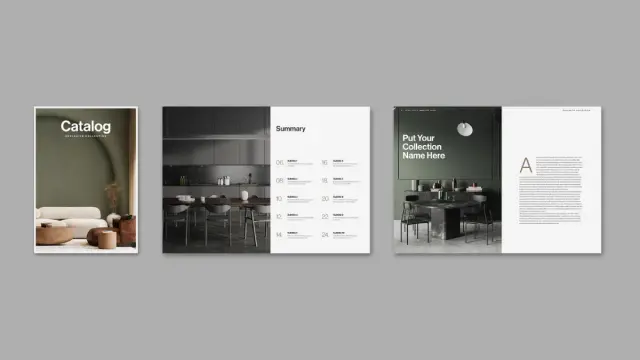
The template opens with a Welcome page and a Table of Contents. These two pages do something most brands overlook — they set expectations. A reader who knows what’s coming stays engaged longer. The welcome layout includes a portrait image slot and a brief message area. The table of contents uses a clean, scannable structure with page references.

Following those, an About Us spread provides space for mission, vision, and brand story content. This is where you give the catalog a human face before diving into products.

Product Display Pages

The core of the template is its product layout system. Multiple spread types handle different product presentation needs:

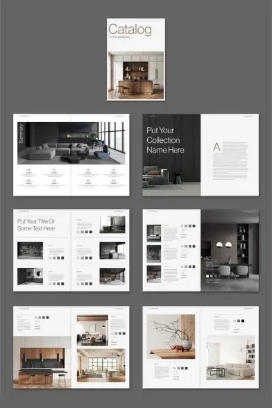
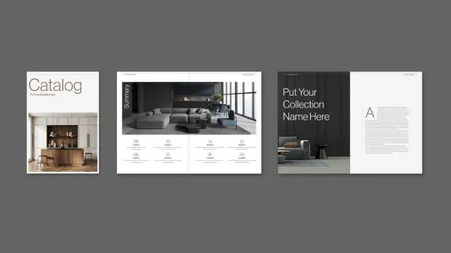
The Design Concept spread uses a modular grid with large image areas and short product descriptions — ideal for hero products or lifestyle-oriented SKUs. The New Arrivals spread supports a higher product density, fitting four to six items per spread with thumbnail images, names, and price tags. The Feature Category pages combine editorial image placement with a tighter product grid, perfect for seasonal or curated collections.

A dedicated Collection spread handles showcase presentations. This is the layout you use when a product needs room to breathe — fewer items, larger images, more white space.

Supporting Pages

Beyond product listings, the template includes an Offering Products spread, a Feature Products spread, a How to Order page, and a Terms & Policies spread. These pages transform the catalog from a product sheet into a complete sales document. The closing Thank You page ends the reader journey on a clean, professional note with contact and address details.

The Adaptive Layout System Explained

One of the most technically interesting aspects of this template is what I’d describe as its Adaptive Uniform Grid (AUG) — a layout philosophy where every page uses the same underlying grid, but the visual weight shifts based on content type.

On high-density product pages, that grid accommodates six or more items. On showcase spreads, the same grid opens up to let two or three products dominate. The proportions stay consistent. The visual rhythm doesn’t break. This is what separates a coherent catalog from a collection of individual pages that happen to be stapled together.

The clean, modern aesthetic reinforces this. Neutral backgrounds, restrained typography, and structured white space create what designers call a low-noise environment — a layout where product imagery carries all the visual weight. Nothing competes with the products themselves. That’s exactly what a sales catalog needs to do.

How to Use This Product Catalog Template in Adobe InDesign

Adobe InDesign remains the industry standard for multi-page document design — and for good reason. No other tool handles long-document typography, master pages, print preflight, and image linking with the same level of control. If you’re producing a professional print catalog, InDesign isn’t a preference; it’s the professional baseline.

Here’s how to get this template working for your brand.

Step 1 — Open and Inspect the Document

After downloading from Adobe Stock, open the .indd file in Adobe InDesign. Before changing anything, go through each page spread to understand the layout logic. Note how Master Pages are applied, how the grid is structured, and which text and image frames are used consistently across pages.

Step 2 — Set Up Your Brand Colors and Fonts

Navigate to the Swatches panel to review the document’s color palette. Replace placeholder swatches with your brand’s CMYK values. For typography, open the Character Styles and Paragraph Styles panels. Update the font choices there — every styled text element in the document will update automatically.

This is one of InDesign’s most powerful features. You don’t manually reformat text across 20 pages. You update a style definition once, and the change propagates everywhere that style is applied.

Step 3 — Replace Placeholder Images

All image frames in the template contain placeholder content. To replace them, right-click any image frame and select Place, then navigate to your product photography. InDesign links images rather than embedding them, keeping file sizes manageable and making updates easy.

Use the Content Fitting options to scale images proportionally within their frames. For consistent visual results across the catalog, shoot your product photography at a consistent ratio or crop to match the frame dimensions before placing.

Step 4 — Edit Text Content

Click into any text frame with the Type tool and replace placeholder copy with your product names, descriptions, prices, and brand messaging. The Paragraph Styles applied to each text block will maintain the typographic hierarchy automatically.

For the Table of Contents, update page number references manually or use InDesign’s built-in Table of Contents generation feature if your headings are styled consistently.

Step 5 — Preflight and Export

Before exporting, run InDesign’s Preflight check to catch missing fonts, unlinked images, or out-of-gamut colors. Then export to PDF using the PDF/X-1a or PDF/X-4 preset for print, or a standard PDF preset for digital distribution. Since the template is already set up in CMYK, print color accuracy is built in from the start.

Why Adobe InDesign Is the Right Tool for Professional Catalog Design

Canva has its place. So does Affinity Publisher, and even Google Slides in a pinch. But when print quality, typographic precision, and multi-page document control are non-negotiable, InDesign has no real competitor.

Here’s what makes it irreplaceable for catalog work specifically:

Master Pages and Document Architecture

InDesign’s Master Pages let you define recurring layout elements — page numbers, running headers, column guides — once and apply them globally. Change the master, and every page using it updates automatically. For a 20-page catalog with consistent margins and footers, this alone saves hours of manual adjustment.

Paragraph and Character Styles

Professional typographic consistency across a long document is only possible through styles. InDesign’s Styles system is the deepest in the industry. You define how a product name looks once — font, size, tracking, leading, color — and apply it uniformly everywhere. Edits cascade instantly.

CMYK and Color Management

Unlike screen-first tools, InDesign was built around print. Its CMYK color support is native and accurate. When you export to PDF for a commercial printer, what you see in InDesign is what comes off the press. That fidelity matters enormously for brand-critical color matching.

Linked Assets and Package Feature

InDesign links rather than embeds images by default, keeping documents lean. The Package function collects all linked assets, fonts, and the document itself into a single folder — making handoffs to printers or collaborators clean and complete.

Premium Template vs. Building From Scratch: A Practical Comparison

Let me be direct: building a professional 20-page product catalog layout from scratch in InDesign, at a level comparable to what E-Type has delivered here, requires significant design experience and time investment. We’re talking grid system planning, typographic scale decisions, consistent spacing logic, and print-safe color setup — before you write a single word of product copy.

That’s not a knock on building from scratch. For agencies with dedicated art directors, it’s the right call. But for most brands, the math doesn’t support it.

Consider what this template provides out of the box: a print-ready CMYK document, 20 coordinated layout spreads, a working typographic hierarchy, a consistent visual system, and both US Letter and A4 format support. What would it take to build independently? Realistically, eight to fifteen hours of skilled design work — not counting revision cycles.

What I call the Template Leverage Ratio is simple: the ratio between the design value you inherit and the time you invest in customization. A well-designed premium template like this one offers an extraordinarily high ratio. You get 80% of the design work done before you open the file.

The remaining 20% — your brand identity, your products, your voice — is the part only you can provide.

The CMYK Print Readiness Advantage

This point deserves its own section because it trips up so many first-time catalog creators. CMYK color mode is the standard for professional printing. RGB is for screens. When you design in RGB and convert to CMYK at the last step, colors shift — sometimes dramatically. Blues go muted. Vibrant oranges dull down. What looked perfect on screen looks flat in print.

Because this template is already set up in CMYK, that problem is eliminated from the start. Every color decision you make inside the document is being made in the same color space the printer will use. There are no surprises at the final output stage.

For brands printing product catalogs at volume — whether through offset lithography or high-quality digital print runs — CMYK print readiness isn’t a bonus feature. It’s a requirement. This template bakes it in.

Who Should Use This InDesign Catalog Template

The honest answer is: any brand producing physical or digital product catalogs that needs to look professional without a full in-house design team.

More specifically, this template works best for:

Retail and E-Commerce Brands

Seasonal lookbooks, new collection catalogs, and wholesale line sheets all benefit from a structured, repeatable layout system. This template’s multiple product spread types handle everything from a single hero product to six-item grids within the same visual framework.

Beauty, Lifestyle, and Wellness Products

The template’s neutral aesthetic — warm whites, soft accent tones, generous white space — is particularly well-suited to beauty, skincare, home goods, and lifestyle product categories. The clean, modern, uniform visual language lets product photography carry the emotional weight.

B2B Brands and Manufacturers

Wholesale catalogs, trade show materials, and distributor line sheets all benefit from the structure this template provides. The Terms & Policies and How to Order pages are especially useful for B2B contexts where purchase process clarity matters.

Freelance Designers

If you’re a designer producing catalog work for clients, starting from this template dramatically reduces the structural setup time. You spend your billable hours on brand-specific refinements, not baseline grid construction.

What Makes This Template Visually Distinctive

There are thousands of catalog templates available. What sets this one apart is its editorial restraint. Many templates try to impress through decorative complexity — elaborate borders, heavy graphic elements, loud color accents. This template makes the opposite choice.

The layout earns authority through discipline. Consistent column structures, calibrated white space, and a muted, sophisticated color palette create a document that feels curated rather than assembled. The product photography — even with placeholder content — reads as the visual center of every spread. That’s exactly right.

I’d describe the aesthetic as Structural Minimalism with Commercial Intent: a design approach where every layout decision serves the product presentation rather than the design itself. It’s confident enough to let the content lead.

Customization Depth: How Far Can You Take This Template?

The short answer is: as far as you need. Because the template is built in InDesign — and because all elements are fully editable — you’re not locked into E-Type’s aesthetic choices.

Want to apply a bold color accent to the category headers? Update the Paragraph Style. Want to swap the neutral background on the collection spreads for a brand-specific tone? Edit the background frame fill. Want to add additional product pages by duplicating an existing spread? InDesign’s Pages panel makes that a ten-second operation.

The template is not a cage. It’s a calibrated starting structure. You inherit the grid logic, the spacing system, and the typographic hierarchy. Everything else is yours to define.

That said, I’d recommend restraint on wholesale aesthetic overhauls. The visual coherence of this template is one of its core assets. Make brand-specific refinements — colors, fonts, imagery — rather than structural rewrites, and the document will reward you with a consistently professional result.

Forward-Looking Perspective: Where Catalog Design Is Heading

Print catalogs are not dying. They’re differentiating. In an era of algorithmically identical digital experiences, a well-designed physical catalog is a tangible brand signal. It communicates investment, permanence, and craft in a way that a product page never quite manages.

At the same time, the same InDesign file that produces a print catalog can export a high-quality interactive PDF for digital distribution — with bookmarks, hyperlinks, and a navigable table of contents. One template, two delivery channels.

I predict we’ll see a resurgence of premium print catalog investment among mid-market brands over the next few years, driven by exactly this dynamic: as digital advertising costs rise and attention gets harder to buy, physical touchpoints become more valuable. A catalog sent to a wholesale buyer or a loyal customer list is a deliberate brand moment that a retargeting ad cannot replicate.

Download the template from Adobe Stock

Templates like this one democratize access to that level of presentation. They make professional catalog design achievable for brands that previously couldn’t afford it.

Frequently Asked Questions About This Product Catalog Template

What software do I need to use this template?

You need Adobe InDesign. The template is distributed as an .indt file, which is InDesign’s native format. An active Adobe Creative Cloud subscription that includes InDesign is required to open and edit it.

What sizes does this product catalog template come in?

The template is available in two standard sizes: US Letter (8.5 × 11 inches) and A4 (210 × 297 mm). Both are standard print formats accepted by commercial printers worldwide.

Is this template ready for professional printing?

Yes. The template is set up in CMYK color mode, which is the industry standard for professional offset and digital print production. Export to PDF/X-1a for most commercial print workflows.

How many pages does the template include?

The template includes 20 predesigned pages covering a welcome spread, table of contents, about us section, multiple product display layouts, a how-to-order page, terms and policies spread, and a closing thank you page.

Can I add more pages to the template?

Yes. In InDesign, you can duplicate any existing spread via the Pages panel and add it to the document. The new page inherits the Master Page settings and maintains visual consistency with the rest of the catalog.

Do I need design experience to customize this template?

Basic familiarity with Adobe InDesign is helpful. You need to know how to place images, edit text frames, and navigate the Swatches and Paragraph Styles panels. No advanced design skills are required for standard customization. If you need to make structural changes to layouts, intermediate InDesign knowledge will serve you better.

Where can I get this product catalog template?

This template is available through Adobe Stock, where it is sold by contributor E-Type. Adobe Stock subscribers with a standard asset plan can access it as part of their subscription.

What kinds of businesses benefit most from this template?

Retail brands, e-commerce businesses, beauty and lifestyle product companies, B2B manufacturers, and freelance designers producing catalog work for clients all benefit from this template. Its neutral, clean aesthetic adapts well to a wide range of product categories.

Can I use this template for digital catalogs as well as print?

Yes. InDesign can export to both print-ready PDF and interactive PDF formats. The same document can serve as the source for a physical print run and a digital catalog distributed by email or download link.

What is the advantage of starting from a premium template over using a free one?

Premium templates like this one are built to print-production standards — CMYK color mode, proper bleed setup, clean Master Page architecture, and professionally calibrated typographic hierarchies. Free templates frequently lack these technical foundations, which creates problems at the print or export stage. The investment in a premium starting point pays off in saved revision time and professional output quality.

Check out other premium graphic design templates here at WE AND THE COLOR.

#AdobeInDesign #AdobeStock #catalogDesign #catalogTemplate #design #graphicDesign #productCatalog

Download an InDesign Catalog Layout That Makes Designer Furniture Look Unmissable

Presentation sells. That’s not an opinion — it’s a truth every furniture brand eventually learns the hard way. You can have the most beautifully crafted sofa or the most architecturally precise shelving unit on the market. But without a catalog that communicates that quality, the product remains silent. This InDesign catalog layout by Tom Sarraipo changes that conversation entirely. It gives sophisticated design brands a visual system that matches their product ambitions — right out of the box, fully customizable, and ready for professional print.

This template isn’t for everyone, and that’s exactly the point. It targets a specific kind of brand: one that values restraint over excess, editorial clarity over flashy decoration. Moreover, it speaks directly to designers, art directors, and brand managers who already know InDesign and need a structured starting point that doesn’t waste their time.

You can download the template from Adobe Stock

Please note that this template requires Adobe InDesign installed on your computer. Whether you use Mac or PC, the latest version is available on the Adobe Creative Cloud website—take a look here.

Download a fully customizable Adobe InDesign catalog layout in A4 by Tom Sarraipo. You can download the template from Adobe Stock

What Makes This InDesign Catalog Layout Different From Generic Templates?

Most catalog templates solve a layout problem. This one solves a brand positioning problem. Tom Sarraipo’s design operates within what I’d call the Editorial Restraint Framework — a visual philosophy where negative space does as much work as the content itself. The result feels closer to a luxury editorial spread than a product sheet.

The template includes 26 predesigned, fully customizable A4 pages. Each spread balances large-format photography with structured product data — item names, color swatches, and descriptive text fields. Furthermore, it opens with a clean summary index page, transitions through collection chapters, and closes with a back cover that mirrors the front. That structural consistency is rare in off-the-shelf templates.

The color palette is neutral and intentional. Deep charcoal, warm ivory, and muted sage anchor every page without competing with product photography. Additionally, the typography hierarchy is clear — bold display text for collection names, light-weight body copy for specs, and generous spacing throughout. Nothing fights for attention. Everything guides the eye.

The Catalog Structure Framework: How 26 Pages Tell a Brand Story

Structure is narrative. A catalog without a logical page flow is just a brochure with ambitions. Sarraipo’s layout follows what I’d define as the Three-Phase Catalog Arc — a sequencing model built around orientation, immersion, and resolution.

Phase One: Orientation

The opening pages establish the brand world immediately. A full-cover image introduces the aesthetic, while the summary page maps the catalog structure. Consequently, the reader knows exactly where they are and where they’re going.

Phase Two: Immersion

The middle section carries the product weight. Grid-based spreads display multiple items per page, each with color-chip swatches, item labels, and layered photography. Importantly, these pages use a modular grid system — meaning you can swap images, shuffle items, or expand a collection chapter without breaking the visual logic.

Phase Three: Resolution

The closing pages slow the pace. Full-bleed lifestyle imagery dominates, pulling the reader back into the brand atmosphere before the back cover closes the loop. This pacing isn’t accidental — it mirrors how luxury print editorials move through their content.

CMYK Color Mode and the Print-Ready Advantage

Digital-first designers often overlook print specifications until it’s too late. This InDesign catalog layout is built in CMYK color mode from the ground up. That means every element — backgrounds, typography, swatches — is calibrated for professional offset and digital print reproduction. Therefore, what you see on screen translates faithfully to paper.

For furniture brands printing high-volume catalogs through commercial printers, this matters enormously. RGB-to-CMYK conversions can shift warm tones and neutrals in ways that misrepresent materials like linen, walnut, or brushed brass. Because this template skips that conversion step entirely, you start from a trustworthy baseline.

Additionally, A4 format is globally standardized — making this template immediately usable across European and international print suppliers without resizing or reformatting headaches.

How to Customize This InDesign Catalog Layout in InDesign

The customization workflow is straightforward. All images in the preview are placeholder visuals — you replace them using InDesign’s place command or by dragging directly into the existing image frames. Text fields work the same way. Click, replace, style. Consequently, you spend your time on brand decisions, not technical problem-solving.

Color System Customization

The template’s neutral palette is a starting point, not a constraint. You can adapt the background tones to match your brand’s primary and secondary colors using InDesign’s swatches panel. Moreover, the typographic system uses clean sans-serif and serif pairings that you can swap for your brand fonts with a few paragraph style updates.

Grid Flexibility

Each page uses a consistent underlying grid. However, the modular structure allows you to reorder pages, duplicate spreads, or remove sections without visual inconsistency. This Plug-and-Play Grid Logic — my term for template systems that allow structural changes without visual collapse — is one of this design’s strongest technical features.

Who Should Use This InDesign Catalog Layout?

The obvious answer is furniture brands. But the template’s visual language works equally well across a broader category of sophisticated, object-driven brands. Think ceramic studios, lighting designers, architectural hardware companies, or high-end kitchen brands. Essentially, any brand that sells considered objects benefits from a catalog system.

Freelance designers working with interior brands or product manufacturers will also find immediate value here. Furthermore, the template gives clients a tangible, professional deliverable without requiring months of custom development. You present this mockup, align on customization scope, and proceed from a solid foundation.

Small studios launching their first printed catalog should pay particular attention. Starting from a professionally structured InDesign catalog layout like this one eliminates one of the most common first-catalog mistakes: inconsistent page rhythm. Sarraipo’s template builds that rhythm in by default.

The Visual Grammar of Luxury Catalogs

Luxury print design operates on a specific set of visual rules. Understanding them helps you customize this template more intelligently. I’d summarize these rules as the Five Signals of Print Authority.

1. Proportional breathing room. High-end catalogs never crowd the page. Generous margins and internal padding signal confidence in the product.

2. Photography hierarchy. One dominant image per spread, supported by smaller contextual shots. Hierarchy creates visual gravity.

3. Typographic restraint. Fewer typefaces, more weight variation. This template nails this with its two-family typographic system.

4. Consistent swatch language. Color chips alongside product entries establish a design-literate visual shorthand that your audience recognizes and trusts.

5. Structural repetition with controlled variation. Every spread follows a recognizable pattern, but no two pages feel identical. That balance between predictability and surprise keeps readers engaged across all 26 pages.

Why Print Still Matters for Design Brands in 2025

Screen fatigue is real. Trade show visitors, interior designers, and specification-led buyers still respond to physical catalogs in ways that PDFs can’t replicate. A well-produced print catalog communicates permanence, investment, and brand confidence. Additionally, physical catalogs have a longer lifespan than digital assets — they sit on desks, get referenced months later, and circulate through studios organically.

This template is optimized for both. You can export it as a print-ready PDF for your commercial printer or as an interactive PDF for digital distribution. Both outputs benefit from the CMYK foundation and the clean layout architecture Sarraipo built in.

The trend toward hybrid catalog strategies — print for trade and clients, digital for reach — makes a template like this one especially practical. You build once and deploy across both channels without duplication of effort. That’s genuine workflow intelligence built into the file structure.

Tom Sarraipo’s Design Sensibility: Reading the Template as a Design Statement

Good templates reveal their designer’s thinking. Sarraipo’s choices throughout this InDesign catalog layout reflect a clear editorial sensibility — one that prioritizes material honesty, spatial calm, and typographic precision over decorative complexity. This is Scandinavian-influenced design logic applied to Italian-quality print format.

The sage green accent on the cover and back isn’t decorative. It anchors the catalog in a contemporary color conversation that connects with interior design trends without following them slavishly. Similarly, the charcoal page backgrounds in product sections create a dark-mode visual contrast that elevates warm-toned furniture photography dramatically.

Personally, I find the summary page particularly strong. Most catalog templates treat the table of contents as a functional necessity. Sarraipo treats it as a design moment — pairing index entries with small product thumbnails in a grid that previews the catalog’s visual richness before the reader turns the page. That’s editorial thinking, not template thinking.

Practical Tips for Getting the Most Out of This Template

First, shoot or source your photography at high resolution — 300 DPI minimum for print. The template’s image frames are sized for print output, so low-res images will look soft. This matters most on the full-bleed lifestyle spreads.

Second, finalize your product list before you start placing content. The 26-page structure accommodates a specific number of collection entries. Consequently, knowing your full product range upfront prevents mid-project restructuring.

Third, use InDesign’s master pages to manage repeating elements — headers, footers, page numbers — across the document. The template already has this logic baked in. Don’t override it manually unless you have a specific reason to do so.

Fourth, when printing commercially, request a proof before your full print run. Even CMYK-calibrated files can shift slightly across different paper stocks and press configurations. A physical proof protects your investment.

You can download the template from Adobe Stock

Frequently Asked Questions

What software do I need to use this InDesign catalog layout?

You need Adobe InDesign to open and edit this template. Any recent version of InDesign that supports A4 document formats and CMYK color mode will work. Adobe Creative Cloud subscribers have full access through their plan.

Is this template suitable for digital distribution as well as print?

Yes. You can export the completed catalog as a print-ready PDF for commercial printing or as an interactive PDF for email and digital channels. The CMYK color setup is optimized for print, but the layout works cleanly in digital PDF format as well.

Can I use this InDesign catalog layout for products other than furniture?

Absolutely. The template’s editorial visual language works well for any brand that sells sophisticated, design-led objects — including lighting, ceramics, architectural hardware, kitchen products, and premium lifestyle goods.

How many pages does this catalog template include?

The template includes 26 predesigned, fully customizable A4 pages. These include a cover page, summary index, collection chapter spreads, product detail pages, lifestyle imagery sections, and a back cover.

Are the images in the template included for commercial use?

No. All images in the preview are placeholder visuals for demonstration purposes only. You replace them with your own licensed photography or product imagery inside InDesign.

How difficult is it to customize this template if I’m not an expert in InDesign?

The template is built for efficient customization. You replace placeholder images using InDesign’s place command and update text fields directly. Basic InDesign familiarity is sufficient. Additionally, the modular grid structure means you can reorder or duplicate pages without disrupting the visual system.

Is this template compatible with both Mac and Windows versions of InDesign?

Yes. Adobe InDesign is cross-platform, and this template functions identically on both Mac and Windows systems.

What color mode does this InDesign catalog layout use?

The template uses CMYK color mode throughout. This makes it immediately compatible with professional offset and digital print workflows without requiring color profile conversion.

Feel free to find other high-quality graphic design templates here at WE AND THE COLOR.

#AdobeInDesign #AdobeStock #catalogDesign #catalogTemplate #design #graphicDesign #InDesignTemplate

This Adobe InDesign Catalog Template is the Standard for Modern Minimalist Curation

Design often suffers from noise, yet this Adobe InDesign catalog template by BrandPacks proves that silence captures attention. Curators and designers frequently search for layouts that balance functionality with aesthetic restraint. This specific template does not merely hold content; it elevates the subject matter through a framework we can call “Silent Grid Architecture.” BrandPacks has crafted a tool that prioritizes the user’s visual journey over decorative excess. The layout serves professionals who require a printable portfolio design that speaks with authority. We must analyze why this specific Adobe InDesign catalog template succeeds where others fail.

Download the template from Adobe Stock

Please note that this professional branding template requires Adobe InDesign installed on your computer. Whether you use Mac or PC, the latest version is available on the Adobe Creative Cloud website—take a look here.

A fully customizable Adobe InDesign catalog template by BrandPacks in A4 and US Letter. Download the template from Adobe Stock

How does Silent Grid Architecture define this layout?

You might wonder what separates a chaotic brochure from a high-end publication. The answer lies in the invisible structure. This Adobe InDesign catalog template utilizes a rigid, albeit flexible, underlying grid. We define “Silent Grid Architecture” as a layout system that guides the eye without revealing its mechanics. BrandPacks employs this technique across all 20 distinct pages. Consequently, the viewer focuses entirely on the product, whether it is ceramic art or architectural hardware.

The design relies heavily on negative space. This is not empty space; it is active “breathing room.” By isolating images against stark backgrounds, the template forces the viewer to engage with the texture of the product. Furthermore, the typography acts as a navigational beacon rather than a distraction. Bold headers contrast sharply with delicate serif body text. This creates a visual rhythm. Readers scan the page effortlessly. Therefore, the Adobe InDesign catalog template functions as a museum wall rather than a grocery flyer.

Technical Precision in Adobe InDesign

Adobe InDesign remains the industry standard for a reason. This software handles multi-page documents with a precision that Illustrator or Photoshop cannot match. BrandPacks delivers this Adobe InDesign catalog template in two critical formats: A4 and US Letter. This ensures global compatibility for printing. Moreover, the file operates in CMYK color mode. This guarantees that physical prints match the digital preview.

Designers appreciate the inclusion of master pages. These allow for rapid, global changes to headers, footers, and page numbers. Additionally, the template uses a layer-based organization system. You can separate text, images, and background elements easily. This speeds up the workflow significantly. For a professional catalog layout, efficiency is as vital as beauty. The template provides fully editable placeholders. You simply drag and drop your imagery. InDesign automatically scales the content to fit the pre-defined frames.

Why is “Tactile Digitalism” crucial for modern catalogs?

We live in a screen-first era, yet we crave physical texture. This layout champions a concept I call “Tactile Digitalism.” The design aesthetic mimics the feeling of matte paper, stone, and raw material, even on a screen. The Adobe InDesign catalog template achieves this through careful image masking and muted color palettes. Although the download features placeholders, the styling suggests a clear direction. It favors organic, high-contrast photography.

Consider the typography choices. The fonts suggest a blend of classical editorial design and modern brutalism. This juxtaposition creates tension. Tension keeps the reader interested. Consequently, a furniture designer or a ceramicist will find this product brochure layout ideal. It complements organic shapes. The text does not fight the image; it supports it. This is the essence of a successful Adobe InDesign catalog template. It provides a stage, not a show.

The Strategic Advantage of Pre-Designed Assets

Some purists argue that custom design is the only path. However, a high-quality, customizable InDesign file offers a strategic advantage. It saves time. Designing a 20-page grid from scratch takes days. Using this Adobe InDesign catalog template reduces that time to hours. You focus on content creation rather than margin alignment.

BrandPacks has already solved the difficult problems. They determined the optimal font sizes. But not just that. They calculated the margins and balanced the image-to-text ratios. You are acquiring a design system, not just a file. For small agencies or freelancers, this is vital. It allows you to deliver a corporate brochure template quality at a fraction of the cost. The template acts as a sophisticated container. You pour your brand identity into it.

Is this Adobe InDesign Catalog Template right for your brand?

You must evaluate your content before choosing a layout. This Adobe InDesign catalog template favors high-quality imagery. If your photos are low-resolution, this design will expose them. The minimalism leaves no place to hide. Therefore, this layout suits brands with strong visual assets.

Think about your narrative. The flow of the 20 pages allows for storytelling. You can alternate between full-page mood shots and detailed product specifications. This versatility makes it a powerful creative agency portfolio. It also works as a minimalist lookbook. The adaptability is the key feature. Furthermore, the neutral style absorbs any brand color. You can change the black and grey accents to match your corporate identity.

A Critical Perspective on Layout Pacing

A good catalog has a heartbeat. We call this “Layout Pacing.” It is the speed at which a user flips the pages. This Adobe InDesign catalog template manages pacing exceptionally well. It alternates between dense information pages and open visual spreads. This prevents reader fatigue.

Download the template from Adobe Stock

When you open the file, notice the sequence. It starts with an introduction, moves to highlight features, and ends with a contact section. This is a classic narrative arc. BrandPacks understands that a catalog is a sales tool. It must convince the buyer. The structure leads the viewer to a conclusion. Thus, the Adobe InDesign catalog template becomes an active participant in the sales process.

Frequently Asked Questions

What software do I need to edit this template?
You need Adobe InDesign. The file is compatible with CS4 and higher versions. It uses the .INDD and .IDML formats.

Does the Adobe InDesign catalog template include the photos?
No. The images in the preview are for display purposes only. The file contains grey placeholders where you place your own images.

Can I print this design on a home printer?
Yes, but professional printing yields better results. The file uses CMYK color mode, which standard home printers might not replicate perfectly.

Is it difficult to change the fonts?
No. You can use the “Find/Replace Font” feature in InDesign. This allows you to swap the template fonts for your brand fonts instantly.

Can I add more pages to the Adobe InDesign catalog template?
Absolutely. You can duplicate existing spreads using the Pages panel. The master pages ensure the layout remains consistent.

What is the difference between A4 and US Letter?
A4 is the standard paper size in Europe and Asia. US Letter is the standard in North America. This download includes both.

Is this template suitable for a fashion lookbook?
Yes. The minimalist brochure template style works perfectly for fashion. It places the focus entirely on the clothing and photography.

Check out other recommended graphic design templates here at WE AND THE COLOR. Our professional reviews will help you to find exactly what you are looking for.

Subscribe to our newsletter!

[newsletter_form type=”minimal”]

#AdobeInDesign #AdobeStock #catalog #catalogDesign #catalogLayout #catalogTemplate #InDesignTemplate

The Perfect InDesign Product Catalog Template for Your Brand’s Visual Storytelling

In a marketplace saturated with digital noise, the tangible appeal of a well-crafted product catalog remains a potent tool for brands. A thoughtfully designed catalog does more than just list products. It tells a story, builds an identity, and creates a tactile connection with customers. For businesses aiming to present their offerings with elegance and professionalism, this InDesign product catalog template, created by Adobe Stock contributor DesignCoach, offers a sophisticated and streamlined solution.

Download from Adobe Stock

Please note that this professional graphic design template requires Adobe InDesign installed on your computer. Whether you use Mac or PC, the latest version is available on the Adobe Creative Cloud website—take a look here.

Modern InDesign Product Catalog Template for Business and Branding by DesignCoach Download from Adobe Stock

Why a Professional Catalog Still Matters

The conversation around marketing collateral often circles back to digital platforms. Yet, the physical catalog holds a unique authority. It provides an immersive, distraction-free experience that online platforms struggle to replicate. A professionally designed catalog also communicates permanence and quality. It powerfully reinforces your brand’s image in a way that transient digital ads cannot. The catalog becomes a reference point, a source of inspiration that customers can return to, fostering a deeper engagement with your products.

This particular InDesign product catalog template is engineered for businesses that understand this value. It provides the perfect framework for creating marketing material that is not only visually stunning but also highly effective. By leveraging a pre-designed template, companies can save significant time and resources without compromising on a high-end, bespoke feel.

Deconstructing the DesignCoach InDesign Product Catalog Template

Crafted with a minimalist and modern aesthetic, this template is a versatile tool for a wide range of industries. It works beautifully for fashion, home decor, technology, and artisan goods. Its clean layouts, balanced use of white space, and elegant typography ensure that the products themselves remain the central focus.

Key Features of This Professional Catalog Design:

  • Standard A4 Size: The template is designed in the universally recognized A4 format. This makes it practical for both printing and digital distribution.
  • 16 Fully Customizable Pages: With 16 pre-designed pages, it offers a comprehensive structure for a variety of content. You can feature introductions, new arrivals, special offers, and detailed product lines.
  • Print-Ready CMYK Color Mode: The template is built in CMYK color mode. This ensures that the colors you see on screen will be accurately reproduced in print, eliminating costly color-matching issues.
  • User-Friendly Customization: Created for Adobe InDesign, the industry standard for page layout, the template is exceptionally easy to edit. Users can seamlessly replace placeholder images and text with their own content. This makes creating a professional catalog a swift and efficient process.

How to Maximize the Impact of Your Catalog

Simply having a beautiful template is just the beginning. The real art lies in how you utilize it to tell your brand’s story and entice your audience. How can you make your catalog truly unforgettable?

Curate High-Quality Imagery

Your product photography is the hero of the catalog. Therefore, high-resolution, professionally shot images are non-negotiable. This template’s minimalist design provides the perfect canvas for stunning visuals to shine. It allows the quality and detail of your products to capture the customer’s attention immediately.

Craft Compelling and Concise Copy

While images draw the eye, well-written copy seals the deal. Product descriptions should be informative, engaging, and concise. You should utilize the template’s clean typographic hierarchy. This helps present key features, benefits, and pricing in a way that is easy to scan and digest.

Maintain Brand Consistency

A catalog is a powerful tool for reinforcing your brand identity. This InDesign product catalog template allows for easy customization of colors and fonts. You can align every detail with your existing branding guidelines. Consistency across all your marketing materials builds recognition and trust with your audience.

A Personal Take on This Design Tool

From a design critic’s perspective, the strength of the DesignCoach template lies in its intelligent restraint. It does not rely on flashy gimmicks. Instead, it employs a sophisticated, grid-based layout. This structure brings a sense of order and calm to the presentation. It guides the reader’s eye naturally through the pages, creating a seamless and enjoyable browsing experience. This is not just a template; it is a well-considered piece of design. It empowers businesses to present themselves with confidence and clarity.

The versatility is another key aspect. While it is presented with a neutral, earthy palette, one can easily envision it transformed. Imagine it with bold, vibrant colors for a tech brand or soft pastels for a children’s boutique. The underlying structure is so strong that it can support a multitude of brand aesthetics without losing its inherent elegance.

Download from Adobe Stock

For any business owner, creative director, or marketing manager, the question is how to elevate the presentation of your products. How can you cut through the digital clutter to make a lasting impression? An expertly designed, tangible catalog is a compelling answer. This InDesign product catalog template provides an accessible and professional path to achieving that goal. It democratizes high-quality design, enabling even small businesses to produce marketing collateral that rivals that of established brands.

Don’t hesitate to find other high-quality graphic design templates in the reviews here at WE AND THE COLOR.

Subscribe to our newsletter!

By continuing, you accept the privacy policy

Product Catalog Design Layout: Create a Professional Sales Brochure with Tom Sarraipo’s InDesign Template https://weandthecolor.com/catalog-design-layout-professional-sales-brochure-tom-sarraipo-indesign-template/203884

#catalogdesign #catalogtemplate #adobeindesign

Product Catalog Design Layout: Create a Professional Sales Brochure with Tom Sarraipo’s InDesign Template

Creating a tangible connection with your audience is more powerful than ever. A beautifully crafted brochure or catalog does just that. It tells a story, showcases your products with elegance, and solidifies your brand identity in a way digital media often cannot. Finding the perfect catalog design layout is the crucial first step. It requires a balance of stunning visuals, clear information, and a professional structure. This is where the exceptional Adobe InDesign template by graphic designer Tom Sarraipo comes into play, offering a sophisticated and highly customizable solution for any brand looking to make a lasting impression. This isn’t just a template; it’s a foundation for building a powerful marketing tool.

Download from Adobe Stock

Please note that this template requires Adobe InDesign installed on your computer. Whether Mac or PC, the latest version is available on the Adobe Creative Cloud website—take a look here.

Download a Customizable Catalog Design Layout by Tom Sarraipo as an Adobe InDesign Template Download from Adobe Stock

Why Your Brand Needs a Superior Catalog Design Layout

In an era saturated with fleeting digital ads, a physical catalog offers a moment of focused engagement. Have you ever considered the tactile experience of a well-made catalog? The weight of the paper, the clarity of the images, and the thoughtful organization all contribute to a premium brand perception. A superior catalog design layout does more than just list products; it creates an immersive experience. It guides the customer’s eye, highlights key features, and builds a narrative around your collection. This professional brochure design can elevate your products from mere items to aspirational objects, directly influencing purchasing decisions and fostering long-term brand loyalty. It acts as a silent salesperson, representing your company’s commitment to quality and detail long after a meeting has ended or a website has been closed.

Exploring the Features of This Modern Catalog Template

This is not a generic, one-size-fits-all solution. Tom Sarraipo’s template is meticulously designed for brands that value sophistication and clarity. The template is provided in A4 size and includes 26 pre-designed pages, offering a comprehensive framework for a complete product showcase. Every page is built with a clean, modern aesthetic that puts your products in the spotlight. Notice the generous use of white space, the elegant typography, and the grid-based structure? These elements ensure the content is readable and visually appealing.

Furthermore, the template is fully print-ready, configured in CMYK color mode to guarantee that what you see on your screen translates accurately to the printed page. This attention to technical detail saves you time and prevents costly printing errors, making it a reliable tool for both seasoned designers and business owners. Whether you are showcasing high-end furniture, fashion, or architectural products, this versatile layout provides the perfect canvas.

The Power of Adobe InDesign for Your Catalog Creation

Why Adobe InDesign? For professionals in the graphic design industry, InDesign is the undisputed gold standard for creating multi-page documents like catalogs, magazines, and books. Its power lies in its precise control over typography, layout, and image placement. This is exactly why this catalog design layout is offered as an InDesign template. The software allows for seamless integration of text and graphics, management of master pages for consistency, and advanced pre-flight checks to ensure your file is perfect for printing. Using a template built specifically for InDesign means you are leveraging the full potential of professional-grade software without needing to build a complex layout from scratch. It gives you a head start with a design that already incorporates best practices for visual hierarchy and readability.

Customization Made Simple: An Easy-to-Edit InDesign Catalog Template

Perhaps the most compelling feature of this template is its remarkable ease of use. The prospect of customizing a 26-page document might sound daunting, but this catalog design layout is built for efficiency. All text and image elements are set up as simple placeholders. You can effortlessly drag and drop your own product photos, update descriptions, and input your item specifications.

The structure is intuitive. Do you need to change the color palette to match your branding? It’s a simple adjustment. Want to switch the fonts to your corporate typeface? That is also easily done. This template empowers you to infuse your unique brand identity into every page without compromising the professional integrity of the original design. This makes it an ideal resource for anyone wondering how to create a professional product catalog without investing weeks in design development. It’s a shortcut to a polished, bespoke result.

So, Who Can Benefit from This Professional Brochure Design?

The versatility of this clean catalog template makes it suitable for a wide range of industries and users.

  • Furniture and Interior Design Companies: The placeholder images already showcase how perfectly this layout complements modern furniture and decor, making it an obvious choice for businesses in this sector.
  • Small Business Owners: For entrepreneurs who need high-quality marketing materials without a massive budget, this template is a game-changer. It provides access to a top-tier design at a fraction of the cost of hiring a design agency.
  • Freelance Graphic Designers: Add this A4 print-ready catalog design to your toolkit. It’s a fantastic starting point for client projects, allowing you to deliver stunning results faster and focus more on creative strategy.
  • Marketing Agencies: Streamline your workflow by using this robust template for various clients. Its clean and adaptable design can be tailored to fit different brand aesthetics, ensuring you always have a reliable foundation for your print projects.

Ultimately, anyone who understands the value of a strong physical presence can benefit from this template. By downloading this design by Tom Sarraipo, you are not just getting a file; you are acquiring a powerful tool to elevate your brand’s story and present your products in the most compelling way possible.

Download from Adobe Stock

You want to see more design assets? If so, feel free to browse WE AND THE COLOR’s Templates category.

#AdobeInDesign #AdobeStock #catalog #catalogDesign #catalogLayout #catalogTemplate #design #graphicDesign