Unifora gets a deep dive in Typography News No. 49 by @jectives
Watch to learn how a three-story g differs from a two-story one!
https://www.youtube.com/live/QGhBMJ96I3o?si=DnRwtu3rSPQBYAPt&t=3066

| yeptype.com | https://yeptype.com |
Unifora gets a deep dive in Typography News No. 49 by @jectives
Watch to learn how a three-story g differs from a two-story one!
https://www.youtube.com/live/QGhBMJ96I3o?si=DnRwtu3rSPQBYAPt&t=3066
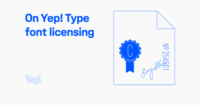
I simply wanted a font license that wouldn’t be a pain in the ass for me as a designer.
https://yeptype.com/article/on-the-yep-type-font-licensing
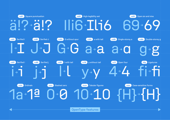
High-legibility set (ss02) on.
Unifora for signs, codes, and anywhere a misread costs you.
3 things I learned designing a uniwidth font


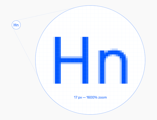
17px is the sweet spot for Unifora and Innovator Grotesk. At that size, capitals land exactly on the pixel grid.
I pre-calculated other sizes where the same thing happens, each paired with a matching line height.
Find the full table in the fonts’ user manuals.
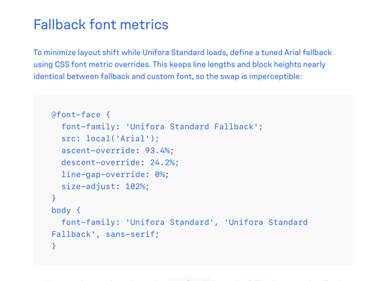
Pre-calculated CSS fallback font metrics for Unifora and Innovator Grotesk.
No more layout shift guesswork. Grab the snippets from the user manuals.
- https://www.yeptype.com/article/unifora-a-users-manual
- https://www.yeptype.com/article/innovator-grotesk-a-users-manual
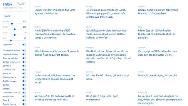
Play with it yourself. The interactive specimen lets you explore every axis, toggle every feature, and test Unifora in 22 languages.
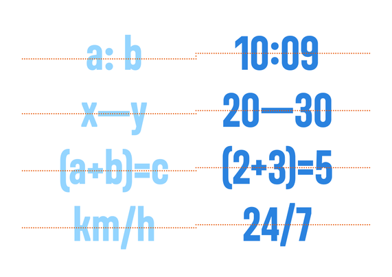
8/8 — Smart behaviors
The details you don’t expect: the colon auto-centers vertically with figures when you type a time like 9:41. The em dash does the same in ranges. Math symbols and brackets detect equation context and align themselves.
Dozens of small behaviors like this. The kind of polish you feel before you notice.
7/8 — Alternates
11 character alternates: G without spur, tailed a, single-storey a, double-storey g, open figures, and more.
Mix and match to dial the personality exactly where you need it. One font family, countless brand voices.