Join us in thanking @kontour for being a Fonts In Use sponsor!

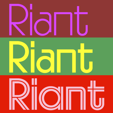
Ever since her Cholla https://fontsinuse.com/typefaces/1994/cholla-sans in 1999 for Emigre, Sibylle Hagmann has been innovating in type design. Her latest is Riant Display: https://kontour.com/typefaces/riant-display

#Fonts #ad #FontsInUseSponsors

We’d like to thank the good folks of @RTypography for supporting Fonts In Use as a sponsor.

Visit the Porto-based type foundry at https://www.r-typography.com/ and check out their latest double release: Mild Grotesk is “an unobtrusive sans-serif that bridges the gap between Neo-Grotesque rationality and humanistic warmth”. Soft Grotesk is its rounded counterpart. Both come as variable fonts with axes for weight and optical size.

#fonts #ad #FontsInUseSponsors

No one has supported Fonts In Use longer than @marksimonson!

Mark recently issued a block-rockin’ script: Heckle. Read all about it: https://www.marksimonson.com/notebook/view/introducing-heckle/

#Fonts #ad #FontsInUseSponsors

Cheers to @typotheque, a Fonts In Use core sponsor since 2024!

You can decide how they organize their next type specimen by playing their Font Expressiveness Game: https://www.typotheque.com/blog/font-expressiveness-game

#Fonts #ad #FontsInUseSponsors

Typotheque: Font Expressiveness Game

We’re creating a new type specimen and need your help ranking 200+ fonts by expressiveness — from most neutral to most characterful. Play pairwise comparison game and you might spot some unreleased typefaces.

Fonts In Use is made possible by sponsors like Darden Studio, who has supported the project for over five years!

Right now they’re celebrating the 20th anniversary of Joshua Darden’s Omnes: https://www.dardenstudio.com/omnes#info

#Fonts #ad #FontsInUseSponsors

Mass-Driver is the type foundry of Rutherford Craze, and one of the fine sponsors that make Fonts In Use possible.

Today @mass_driver has revealed its latest release: MD UI is a neo-grot in three optical sizes, complementing the monospaced MD IO. Check it out at https://mass-driver.com/typefaces/md-ui/ and read the design notes: https://mass-driver.com/article/md-ui-a-typeface-for-interfacing

#fonts #ad #FontsInUseSponsors

Fonts In Use is made possible by sponsors like Darden Studio, who has supported the project for four years now! The foundry’s latest typefaces are Gamay by Viktoriya Grabowska https://www.dardenstudio.com/gamay and Kit Rounded by Eben Sorkin and Onur Yazıcıgil https://fontsinuse.com/typefaces/230880/kit-rounded.

Please thank them by signing up for their newsletter!

#Fonts #Ad #FontsInUseSponsors

Gamay® - Display Font, Sans-Serif Workhorse - Darden Studio

True to its namesake, the grape used to make Beaujolais wine, Gamay embraces both full-bodied and affable characteristics. Inspired in part by Drogowskaz, a contentious road signage typeface prolific in Poland, Gamay is tempered by also drawing inspiration from Johnston Sans, a geometric sans most notably used by the London Underground.