Inclusive Reading Technologies

@readtech
134 Followers
956 Following
49 Posts

📚 Let's Make Reading Fun Again 📖👓

We are a non-profit focused on research with the aim of improving accessibility and visually enhanced readability for all.

Twitterhttps://twitter.com/A11yReadTech
Readability Criterionhttps://readtech.org
APCA calculatorhttps://apcacontrast.com
Colorblind Simulatorhttps://www.myndex.com/CVD/

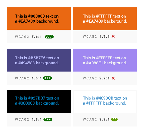
I'm working on a #SwiftUI view modifier that calculates a foreground Color that maintains sufficient contrast with the background and also takes the font into account. This can improve #accessibility without too much design-time overhead.

It's using APCA by @Myndex.

@troy_s

Elaborating on this a bit more, looking at the version with the solid bars connecting the in and out-of-shadow dots.

These bars are each the same color throughout, but notice on the grey bar that it appears to have a gradient in the area where it crosses the shadow.

The Easy Intro to the APCA Contrast Method

This is the APCA project repo on GitHub.Documentation linked below.

APCA

@marcedwards @nesevis

The few places APCA passes colors that WCAG 2 contrast rejects, are cases where the rejected colors are actually better for those with color vision deficiency.

In other words, WCAG 2 contrast isn't just wrong, its results can negatively impact readability.

@marcedwards @nesevis

APCA substantially exceeds WCAG2 contrast in terms of actual accessibility, especially for dark mode.

WCAG 2 contrast SCs are essentially unusable for dark mode, and can be harmful to actual accessibility & readability. The fact that the EU is putting WCAG2 contrast into law is unfortunate.

WCAG 2 contrast is not based on any relevant readability research. WCAG 2 contrast is not peer reviewed, and the statements made in the understanding doc lack scientific support.

@Sp3r4z

APCA is a key part of the APCA Readability Criterion, published by Inclusive Reading Technologies.

https://www.readtech.org/ARC/#visual-contrast-text

APCA Readability Criterion • Contrast

The APCA Readability Criterion (ARC) provides a range of recommendations for making visual content on illuminated displays more accessible to all users, especially with visual impairments

Inclusive Reading Technologies

@marcedwards

APCA is a key part of the APCA Readability Criterion, the draft standard from the non-profit Inclusive Reading Technologies, Inc.

https://www.readtech.org/ARC/

APCA Readability Criterion • Contrast

The APCA Readability Criterion (ARC) provides a range of recommendations for making visual content on illuminated displays more accessible to all users, especially with visual impairments

Inclusive Reading Technologies
2025 should be the year you stop using WCAG 2 colour contrast testing, and switch to APCA. This article is a few years old, and covers everything well. https://blog.datawrapper.de/color-contrast-check-data-vis-wcag-apca/
It's time for a more sophisticated color contrast check for data visualizations - Datawrapper Blog

The WCAG contrast requirements are flawed. Here's what a new approach could mean for data visualizations.

Datawrapper Blog

@aardrian

APCA is part of the APCA Readability Criterion, an open standard available from Inclusive Reading Technologies, Inc. A California non-profit, dedicated to science-based standards and research to improve readability for all.

https://www.readtech.org/ARC/

APCA Readability Criterion • Contrast

The APCA Readability Criterion (ARC) provides a range of recommendations for making visual content on illuminated displays more accessible to all users, especially with visual impairments

Inclusive Reading Technologies

@patrick_h_lauke @Kilian

Indeed: If color management is enabled (on any system, Win/Mac/Lix) the dropper may provide unpredictable results. Choosing a default sRGB profile while using the picker may help mitigate issues.

Better to use a stand alone dropper tool that is color management aware.

For MacOS, that's "Classic Color Meter" desktop app.

Discussion and best practices in our draft guidelines:

https://readtech.org/ARC/tests/visual-readability-contrast/?tn=methods#tool-setup

#contrast #color #colour

APCA Readability Criterion • Contrast

The APCA Readability Criterion (ARC) provide a range of recommendations for making visual content on illuminated displays more accessible to all users, especially with visual impairments

Inclusive Reading Technologies