2025 should be the year you stop using WCAG 2 colour contrast testing, and switch to APCA. This article is a few years old, and covers everything well. https://blog.datawrapper.de/color-contrast-check-data-vis-wcag-apca/
APCA substantially exceeds WCAG2 contrast in terms of actual accessibility, especially for dark mode.
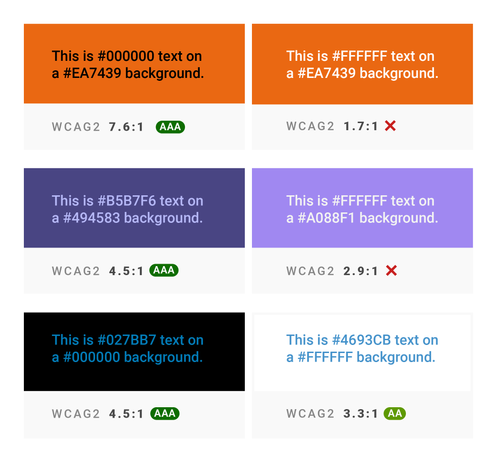
WCAG 2 contrast SCs are essentially unusable for dark mode, and can be harmful to actual accessibility & readability. The fact that the EU is putting WCAG2 contrast into law is unfortunate.
WCAG 2 contrast is not based on any relevant readability research. WCAG 2 contrast is not peer reviewed, and the statements made in the understanding doc lack scientific support.
The few places APCA passes colors that WCAG 2 contrast rejects, are cases where the rejected colors are actually better for those with color vision deficiency.
In other words, WCAG 2 contrast isn't just wrong, its results can negatively impact readability.
