Francesca

@framoriniii@vis.social
146 Followers
118 Following
190 Posts
information designer / researcher @ Metalab Berlin & Harvard, post-doc @ Filmuniversität Babelsberg Konrad Wolf / she – her 🐱
 data + journalism
Portfoliohttps://francescamorini.com/
... It seems like there is a lot of anxiety about the tool: how AI interprets this, how AI outputs that, the bias behind generative AI, etc. I am not arguing that these are not important and vital aspects of critical design research, but I wonder if and when we will be able to look elswhere again to focus on what we are designing and why.

"With our standards lowered, the shift inwards has also become more pronounced. Where industry peers were once chatting about what they were making and for whom, we now seem fixated solely on what we're building with." is such a good quote. I encountered this problem a lot in the last weeks especially in exchange with young researchers and students approaching design research for the first time...

https://robbowen.digital/wrote-about/looking-elsewhere/

Looking elsewhere - Robb Owen

Against the backdrop of mass layoffs, LLMs, site-builders and vibe coding what does it mean to conscientiously build for the web, and where do we go from here?

Robb Owen Digital

This new #stamp design by Chris Ware, celebrating #USPS’s 250th anniversary is beautifully done.

”250 Years of Delivering… is a pane of 20 stamps by cartoonist Chris Ware that invites the public to spot a fun array of familiar postal items and icons while following a mail carrier on her rounds through four seasons of the year.“

To be released in July. 📬🤓

https://about.usps.com/newsroom/national-releases/2025/0428-usps-announces-stamps-celebrating-its-250th-anniversary.htm

🔥 »I Want a Better Catastrophe« made it onto the short list of the Information is Beautiful Awards in the “Places, Spaces & Environment” category.

The flowchart by @jona combines audio narration with interactive elements as an invitation to join #AndrewBoyd on his narrative path and explore our predicament on your own: https://flowchart.bettercatastrophe.com

You can find all other short-listed entries here: https://www.informationisbeautifulawards.com/showcase?action=index&award=2024&controller=showcase&page=1&pcategory=short-list&type=awards

#IIBAwards #BetterCatastrophe #Flowchart #DataVis #InterfaceDesign #FHPotsdam

I Want a Better Catastrophe · Flowchart

A flowchart for navigating our climate predicament

What a great summary history of JavaScript by deno https://deno.com/blog/history-of-javascript
A brief history of JavaScript | Deno

In 30 years, JavaScript went from being a little scripting language to one of the world's most popular. Here are key moments to show how it has evolved and where it is headed.

Deno
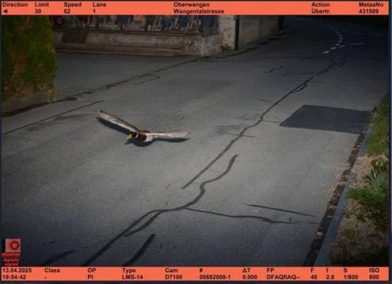
Important breaking news... A duck was flashed at 52 km/h in a 30 km/h zone by a fixed radar in Könitz near the federal city of Bern. (rts.ch) 😀

Earn more income, pay more taxes. That might be a familiar rule in your country — but it's hardly universal. Our visualization developer Luc compares how progressive European income taxes really are 🪜

https://www.datawrapper.de/blog/progressive-tax-rates-europe

Flat out unfair? A progressive take on taxes | Datawrapper Blog

Hi, this is Luc, working in the visualization team. If you like visualizing data …

Datawrapper
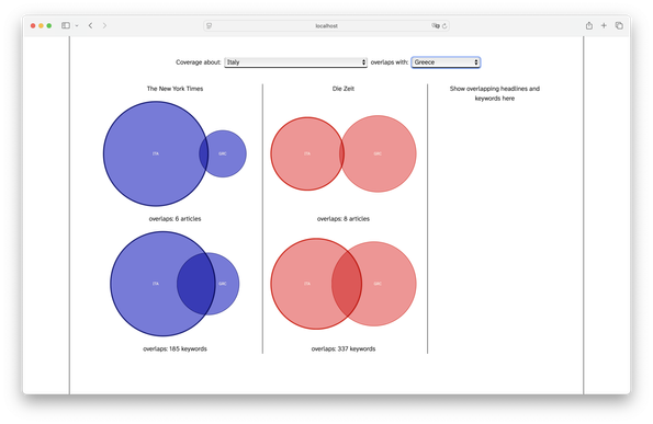
It is really not there yet, but I plan to add the headlines for shared articles and a ranking of meta-keywords on the right. The idea is to let the reader browse through the different countries and discover potential patterns in how couples of countries are discussed.
A very early UI draft: experimenting with Venn diagrams to explore how countries are discussed in relation to each other across Zeit and the New York Times. Basically, I am showing how many articles are tagged using the names of both countries and how many other meta-keywords they have in common across 1 year of news coverage from the two newspapers. 🙃 #wipwednesday