Francesca

@framoriniii@vis.social
146 Followers
118 Following
190 Posts
information designer / researcher @ Metalab Berlin & Harvard, post-doc @ Filmuniversität Babelsberg Konrad Wolf / she – her 🐱
 data + journalism
Portfoliohttps://francescamorini.com/
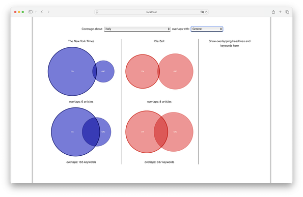
A very early UI draft: experimenting with Venn diagrams to explore how countries are discussed in relation to each other across Zeit and the New York Times. Basically, I am showing how many articles are tagged using the names of both countries and how many other meta-keywords they have in common across 1 year of news coverage from the two newspapers. 🙃 #wipwednesday
Made cookies today and they turned into an accidental Voronoï #accidentaldataviz

Some time ago I started writing a little research diary. Nothing really fancy, just some considerations about the research I am currently conducting in my post-doc, working with large collections of news data: https://francescamorini.com/articles/visualizing-news-data

Now, after some time (like 2 months :D), I decided to start a small blog on my website to store this entry and all the future ones. Let's see if I will manage to keep it updated and hopefully at least marginally interesting.

Visualizing News Data

Few months ago I started working on a research project with the idea of visualising historical and contemporary news discourses. The main idea is that we can generate insight from monitoring the unfolding discourses of contemporary digital news. This essay includes some considerations on the data scouting and preparation, a process that lead me to think very hard about news items as a data source for visualisation. I took some time to write down some of these thoughts, because the reliable access to news data would have been almost impossible, without relying on commercial services. Arguably, the lack of open archives for digital news poses an issue to historical research about contemporary news production. In the following paragraphs, I describe the state of the art of digital news data. Then, I propose three experiments that show the potential of news data for visualisation research. These example show the different perspectives of contemporary digital journalism that could be explored through collections of standardised news data.

🗻🗻🗻 #wip
Preparing for the summer climbing season be like: 🦇
Honouring my end-of-the-year tradition of getting trashed eating a ridiculous amount of Fontina cheese as Raclette.
On its own a small VW cluster. It seems like the topic is not so much connected with the overall political discussion.
Here we have a small cluster about Syria
My rudimentary experiments with linked news items go on. I did some very naive k-means clustering to understand how topics are linked with each other. This cluster here is only composed by articles discussing the FDP "D-Day", with this article being the center of the whole network: https://www.zeit.de/politik/deutschland/2024-11/christian-lindner-ampel-aus-fdp-bundesregierung
FDP: Das liberale Drehbuch für den Regierungssturz

Geheime Sitzungen, Präsentationen, Strategiepapiere: Recherchen der ZEIT zeigen, wie die FDP den Bruch der Ampel wochenlang vorbereitete. Der Name der Operation: "D-Day"

ZEIT ONLINE
Playing around with news data, I checked how articles from Zeit have been linked to each other in the month of November. And the main cluster of articles look a bit like Berlin :D