Daniel Zvinca

@danz68
43 Followers
23 Following
49 Posts
mechanical engineer, programmer, databases, BI, math, stats, dataviz

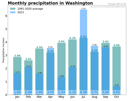
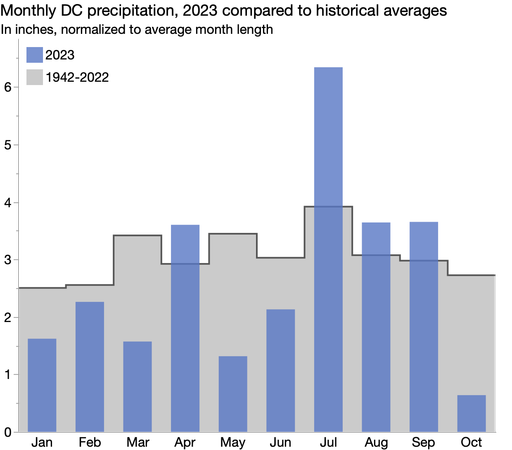
It took me too long to figure out this #WaPost DC rainfall chart with the coinciding bars and 3 labels per month. I don't think I need *any* labels to get the idea that October was dry. I made a simpler version with overlaid bars and area. #LessIsMore

Also, I couldn't help but to normalize by days-in-month. Small pet peeve is comparing monthly sums and not accounting for number of days in month.

This is fascinating! The Braille Institute has developed a font - free to download - that's designed to be clearer for readers with lower vision.

An example of one of the aspects of low legibility that they tackled attached.

It's named Atkinson Hyperlegible. Atkinson was the Institute's founder - https://en.wikipedia.org/wiki/J._Robert_Atkinson

Here's where you can read about the font and download it: https://brailleinstitute.org/freefont

#Accessibility

Via @tombofnull

J. Robert Atkinson - Wikipedia

Du wurdest vorübergehend blockiert

@xangregg

I had a closer look, and the conclusion doesn't look too bad.

Is about the red part, encoding anti-correlation and what a 12 month window finds is the same how I read the graphs. In 2009-2010 is still a strong anti-correlation, but the variation goes the other way. For both.

Do I miss something (ignoring political or financial events)?

The time scale is accurate now, in case the previous one misleaded you.

I've showed already a few cases where heatmap can enhance a line chart decoding. Here is another possible case.

Using sliding windows for encoding the strength of the correlation over time of two variables. This approach allows a nuanced interpretation of the relationships between variables.

Encoding the variation relationship. Instead of connected scatterplots.

(I admit, the 'legend" should be better, because the color encodes the differences between variations, 1st derivative, within their own ranges, similar to the visual estimation of the connected scatterplots slopes)

NYTimes best selling books.

Experimenting weighted histograms (using books popularity for that).

Even if is just a concept, sometimes I feel like another iteration is needed, so I want to keep them here as well.

Wider bandwidth, improved contrast on lines and text, ending colors coding rework, other events, title rework. And a variation...

Dual encoding variation. The heatmap enhanced line chart.

In order to work with dense data, the heatmap should not encode 1:1 the S&P daily Index variation.

I keep hearing that #Mastodon is not likely to replace #Twitter. To that I say: so what?
I've been contributing to the #Linux desktop for the last 15 years not because it's likely to replace #Windows, but because providing people with free desktop is the right thing to do.
I use and support Mastodon not because it's likely to replace Twitter, but because it's a social network done right.