Visual emotions. Art.
Subject: The country side, Romania
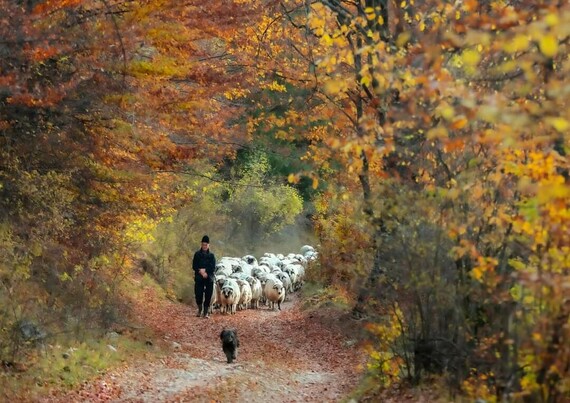


Visual emotions. Art.
Subject: The country side, Romania
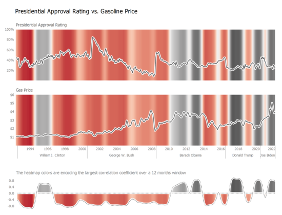
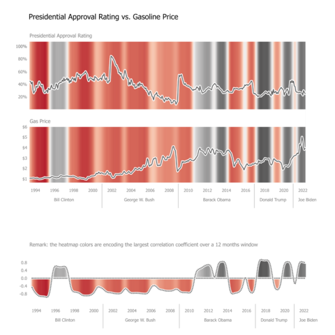
I had a closer look, and the conclusion doesn't look too bad.
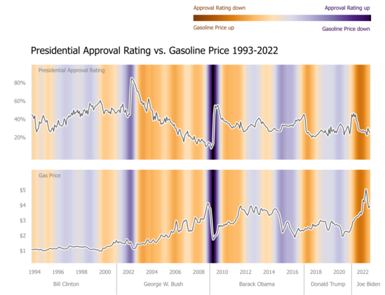
Is about the red part, encoding anti-correlation and what a 12 month window finds is the same how I read the graphs. In 2009-2010 is still a strong anti-correlation, but the variation goes the other way. For both.
Do I miss something (ignoring political or financial events)?
The time scale is accurate now, in case the previous one misleaded you.
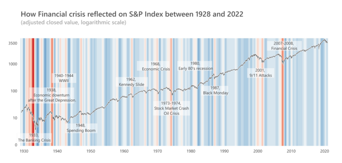
I've showed already a few cases where heatmap can enhance a line chart decoding. Here is another possible case.
Using sliding windows for encoding the strength of the correlation over time of two variables. This approach allows a nuanced interpretation of the relationships between variables.
Encoding the variation relationship. Instead of connected scatterplots.
(I admit, the 'legend" should be better, because the color encodes the differences between variations, 1st derivative, within their own ranges, similar to the visual estimation of the connected scatterplots slopes)
NYTimes best selling books.
Experimenting weighted histograms (using books popularity for that).
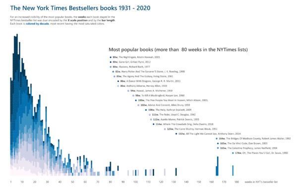
Even if is just a concept, sometimes I feel like another iteration is needed, so I want to keep them here as well.
Wider bandwidth, improved contrast on lines and text, ending colors coding rework, other events, title rework. And a variation...
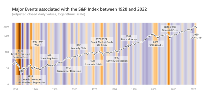
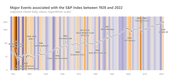
Dual encoding variation. The heatmap enhanced line chart.
In order to work with dense data, the heatmap should not encode 1:1 the S&P daily Index variation.