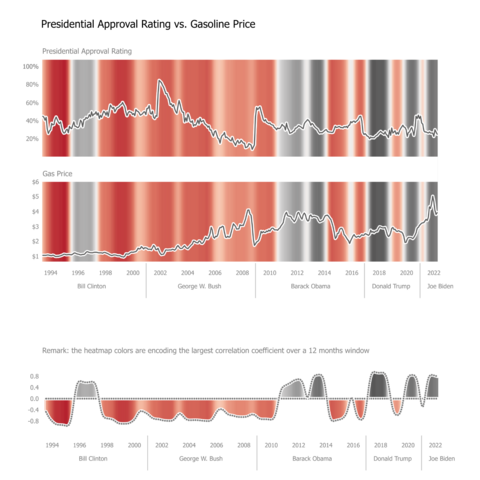
I've showed already a few cases where heatmap can enhance a line chart decoding. Here is another possible case.

Using sliding windows for encoding the strength of the correlation over time of two variables. This approach allows a nuanced interpretation of the relationships between variables.

@danz68 I finally got around to looking at this data (or some version of it -- Gallup instead of 538). Minor effect but you might want to add breaks in both the view and the analysis when presidents change.
Of course, I had to try smoothed curves. 😃

@xangregg

True, splitting data makes sense for presidential popularity. But for gasoline, not so. For multiple values in the same month, I used average.

A sliding window for correlation estimation is really helpful, I tried 6, 12, 24, 48 months. 12 gave me the best reflection of my visual perception.

CSP supporters need to come up with something consistent to beat a dual chart with the highlighted correlation. The "legend" was for explaining the color encoding, not a design proposal.

@danz68 I think you'll need different data sets to best illustrate your technique. Any real correlation here is probably short-term, than your window sizes. And the elections and other events add complexity. The apparent strong correlation in 08-09 is prices falling from financial crisis (with no change in already low approval) and then approval jumping for new president.

@xangregg
If is a too short window, than is not much stat involved, I am not excluding a variable window size and possible lags to be checked. The "best" inplace correlation coefficient (R) idea:

For a large enough sequence length to be relevant for the given set, N, compute R for all N sequences which include the studied point and choose the one with the largest abs R value. For N=Total Count, all points will score the global correlation.

One can use p-value, too, as the chosen criteria.

@xangregg
Literally using brute force (no convergence/regression assumed) may require too much CPU, yet the fact the number of calculations grows linear with the Sum(TotalCount - WindowSize - Lag_i + 1) with Lag_i varying from 0 to a few, gives a bit of a computational sense in case we want to limit it using increments others than 1.

In fact a 1:1 variation "correlation" is the 2nd graph (orange-purple palette), with the smoothing param controlling the data "noise"...

Still fun, though.

@xangregg

The "fun" part of this exercise is to give a quantifiable/statisticsl touch to our conclusions, hardly possible by visual inspection for variable, ordered/sequential linear correlations, or lags.

Intuitively, CSP supporters are trying to show just that (minus the lag part). I do believe that our visual decoding power needs to be saved for less difficult visual exercises than this. Especially for untrained audiences.

Non linear relationships are easier to grasp in scatterplots.