@xangregg

I had a closer look, and the conclusion doesn't look too bad.

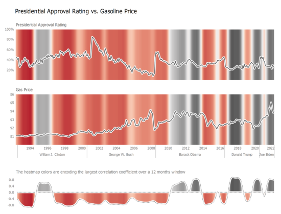
Is about the red part, encoding anti-correlation and what a 12 month window finds is the same how I read the graphs. In 2009-2010 is still a strong anti-correlation, but the variation goes the other way. For both.

Do I miss something (ignoring political or financial events)?

The time scale is accurate now, in case the previous one misleaded you.

@danz68 Yes, I agree it looks like a great technique for understanding series correlation. My qualm with this particular data (besides the political/financial events) is that the proponents of the correlation (including the WaPo article) are claiming a more immediate correlation, 1 month or less lag instead of 12 months. So it doesn't help with that angle, but I imagine it's mostly noise at that level.