Benedikt Bramböck

@bramboeck@typo.social
262 Followers
170 Following
81 Posts

Typeface designer and font technology specialist · taking care of fonts, workflows and knowledge transfer · @TypeMedia 14|15 · he/him

#TypeDesign #Typography #Fonts #Type #Tools #Typeface #Design #Python #Berlin #fedi22

🔗https://arialcrime.com/
👔https://www.swisstypefaces.com/

@paulvanderlaan I agree that Google’s AI implementation in search isn’t a positive development. Though in that specific case, I am pretty sure that’s just a normal Google search result pointing to a troll post on Reddit.

https://www.reddit.com/r/FrutigerAero/comments/1f6ot17/its_never_too_late_adrian_frutiger_was_77_years/

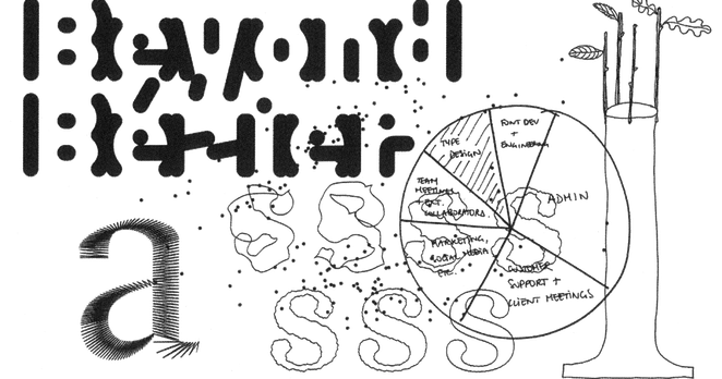
Finally online: Beyond Bézier, the research projects my dear colleagues and I undertook at Écal, where we thought about type design beyond making products that use Bézier outlines. Video lectures by Matthieu Cortat, @alicesavoie, Radim Peško, Florence Yerly, Micha Wasem and myself, as well as lots of nice bonus content.

https://beyondbezier.ch

Introduction – Beyond Bézier

Explorations of drawing methods in type design (2024-2025), Research project by Master Type Design © 2023–2025. ECAL/École Cantonale d’art de Lausanne

Beyond Bézier
Thorn and eth: how to get them right

@colinmford @jenskutilek A “Coalition for Content Provenance and Authenticity” with OpenAI and Meta in the steering comittee? Funny.
@klim The world if billion dollar companies would publicly document how they deal with fonts.
@daytonamess @nicksherman @Okay Considering that the trademark is for “Source” (at least according to what is written in the font files and the USPTO) I am not sure if it’s such a big deal. Also not a lawyer of course. I wonder if Adobe reached out to “Source Type” already …
TYPE BY: Quadraat

<p>TYPE BY Quadraat is Fred Smeijers first commercially released typeface (FF 1992). Originally designed for the eponymous Dutch design company Smeijers was a co-founding member of (currently name “het Lab”), Quadraat combines Renaissance elegance with contemporary ideas on construction and form.</p> <p>Over the past two and a half decades, several versions have been designed: Quadraat Serif, Sans, Mono, Display, and Headliner. The Quadraat fonts carry vibrant, powerful outlines, but they aren’t of the loud-mouthed, fun-font variety. Equally Quadraat didn’t fall prey to stiffly dated feel or outlines. Quadraat strives for a sort of understated noticeability we don’t see much anymore.</p> <p>The TYPE BY Quadraat Sans follows a trend which was originated by Jan van Krimpen who designed Romulus, a classical typeface and to which he added some sans serif variations. It was not until the late eighties that this idea became more popular. The well known designs from our days are ITC Stone or ff Scala for example. Both typefaces give designers the opportunity to make use of well adapted sans serif variations. Quadraat which started with a serif version follows this young tradition. Sans serif typefaces can look very much alike, especially in the bolder variations. This is certainly not the case with Quadraat Sans. Quadraat Sans is like its serif companion a typeface with a rather strong character of its own. Thus, it was not that easy for the designer Fred Smeijers to make a gesture as strong as its serif companion without neglecting traditional proportions. But he obviously succeeded in giving the sans version a lively and humane character. This can be most clearly seen in big word images and is still there in text sizes, although in a more discreet way. So Quadraat Sans has display qualities, is an efficient typeface and suitable for longer texts at the same time.</p> <p>The TYPE BY Quadraat fonts were fully remastered in 2019 and had been re-hinted to meet the demands of the current digital technology.</p> <p>Quadraat serif fonts consist of five weights of roman and italic designs, available in one, normal, width. Its character set includes small caps, stylistic alternates, and multiple figure sets. Additional features include small cap, lining and old style figures (each in tabular and proportional widths); fractions; comprehensive superiors, inferiors, numerators and denominators; case sensitive punctuation sets; mathematical and monetary symbols; arrows; standard and discretionary ligatures (with their stylistic alternates); and a complete range of accents for all Western, Central and East European languages based on the Latin script.</p> <p>Quadraat fonts are available in OTF CFF, TTF, WOFF, and WOFF2 formats. Legacy font formats are available on request.</p>

@pixelambacht There are a few directories that aim to highlight some aspects of font licensing (student license, trials, etc.). Not 100% sure that is what you are looking for.

https://typefoundry.directory/
https://typefoundries.info/
https://www.type.lol/

Type Foundry Directory

Type Foundry Directory

@typographica @klim Can’t really blame non-type people for not knowing much about the manifold world of font licensing.

I guess we’ll see a bunch more of this in the future: https://nebulasans.com/

Nebula Sans

Nebula Sans is the brand typeface for Nebula, available under the SIL Open Font License.