Home
Explore
mastodon.social
mstdn.social
infosec.exchange
mstdn.jp
social.vivaldi.net
hachyderm.io
piaille.fr
mastodon.world
troet.cafe
m.cmx.im
mastodon.uno
mastodon.gamedev.place
techhub.social
social.tchncs.de
mastodon.nl
norden.social
flipboard.social
kolektiva.social
mastoturk.org
mathstodon.xyz
nrw.social
occm.cc
tech.lgbt
defcon.social
mastodonapp.uk
mstdn.ca
universeodon.com
c.im
masto.es
sueden.social
mstdn.party
toot.community
sfba.social
mastodon.sdf.org
det.social
mastodon.scot
tkz.one
mastodon.ie
ohai.social
ruhr.social
hessen.social
mastodontech.de
mastodon.nu
pouet.chapril.org
livellosegreto.it
mastodon.au
muenchen.social
social.linux.pizza
ieji.de
indieweb.social
social.cologne
mastodon.bida.im
mastodon.eus
ioc.exchange
mastodon.green
mastodont.cat
wehavecookies.social
feuerwehr.social
social.anoxinon.de
nerdculture.de
mindly.social
ruby.social
masto.nu
mastodon.ml
cyberplace.social
metalhead.club
phpc.social
m.otter.homes
dresden.network
uri.life
mastodontti.fi
toot.wales
sunny.garden
climatejustice.social
sciences.social
noc.social
mstdn.plus
freiburg.social
tooting.ch
privacysafe.social
blorbo.social
mastodon.me.uk
furry.engineer
mastodon.com.pl
hostux.social
rollenspiel.social
woof.tech
bonn.social
gaygeek.social
mast.lat
urbanists.social
rheinneckar.social
mastoart.social
rivals.space
wien.rocks
ursal.zone
mapstodon.space
discuss.systems
mstdn.games
mastodon-belgium.be
expressional.social
h4.io
masto.pt
todon.nl
fairy.id
hcommons.social
snabelen.no
darmstadt.social
lgbtqia.space
bark.lgbt
cupoftea.social
sakurajima.moe
shelter.moe
mastodon.gal
tilde.zone
retro.pizza
glasgow.social
urusai.social
ludosphere.fr
qdon.space
muenster.im
mastodon.berlin
pawb.fun
socel.net
peoplemaking.games
toot.aquilenet.fr
bookstodon.com
union.place
mast.dragon-fly.club
veganism.social
mstdn.dk
kanoa.de
freeradical.zone
vmst.io
theblower.au
witter.cz
toad.social
eupolicy.social
famichiki.jp
masto.nyc
machteburch.social
mastodon.uy
oslo.town
tooot.im
xarxa.cloud
musicworld.social
fandom.ink
stranger.social
thecanadian.social
disabled.social
mstdn.business
gardenstate.social
cultur.social
graphics.social
pnw.zone
burningboard.net
hear-me.social
furries.club
mountains.social
mustard.blog
mastorol.es
dizl.de
musician.social
mastodon.pnpde.social
ciberlandia.pt
tea.codes
bahn.social
fedi.at
toot.kif.rocks
archaeo.social
tuiter.rocks
libretooth.gr
musicians.today
babka.social
ani.work
vkl.world
mastodon.energy
dmv.community
4bear.com
frikiverse.zone
drupal.community
tyrol.social
masto.nobigtech.es
gamepad.club
social.seattle.wa.us
mast.hpc.social
qaf.men
lou.lt
fulda.social
donphan.social
toot.si
muri.network
is.nota.live
tchafia.be
hometech.social
bzh.social
social.politicaconciencia.org
social.silicon.moe
puntarella.party
mastodon.vlaanderen
norcal.social
mograph.social
lsbt.me
wargamers.social
datasci.social
toot.re
opencoaster.net
toot.funami.tech
theatl.social
mastodon.africa
hispagatos.space
epicure.social
burma.social
est.social
elekk.xyz
devianze.city
genealysis.social
mastodon.london
apobangpo.space
kurry.social
lewacki.space
friendsofdesoto.social
leipzig.town
toot.garden
planetearth.social
mastodon.pirateparty.be
mstdn.animexx.de
mastodon.education
mastodon.cr
esq.social
indieauthors.social
colorid.es
ruhrpott.social
mastodon.wien
hoosier.social
mastodon.bot
techtoots.com
library.love
toots.nu
fribygda.no
mastodon-swiss.org
opalstack.social
frontrange.co
h-net.social
paktodon.asia
raphus.social
rheinhessen.social
poweredbygay.social
cwb.social
rail.chat
mastodon.sg
seocommunity.social
arvr.social
fairmove.net
episcodon.net
epsilon.social
camp.smolnet.org
stereodon.social
mastodon.free-solutions.org
birdon.social
mastodon.cipherbliss.com
okla.social
elizur.me
biplus.social
growers.social
masto.yttrx.com
bologna.one
k8s.social
khiar.net
mastodon.hosnet.fr
mastodon.babb.no
skastodon.com
squawk.mytransponder.com
mastodon.frl
lounge.town
balkan.fedive.rs
cville.online
social.diva.exchange
silversword.online
ailbhean.co-shaoghal.net
23.illuminati.org
kcmo.social
mastodon.iow.social
mastodon.bachgau.social
kzoo.to
mcr.wtf
synapse.cafe
mastodon.ph
nfld.me
mastodon.bahia.no
darticulate.com
social.ferrocarril.net
mastodon.ee
voi.social
troet.fediverse.at
mastodon.mg
nwb.social
social.sndevs.com
polsci.social
fpl.social
nautical.social
dariox.club
nomanssky.social
mikumikudance.cloud
ms.maritime.social
kjas.no
bvb.social
ceilidh.online
nutmeg.social
netsphere.one
wxw.moe
computerfairi.es
learningdisability.social
Log In
Viss
1d ago
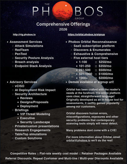
I'm putting together a 1-pager for Phobos Groups offerings this year. Any designers want to fling critiques at it?
5
7
8
Show thread
darf
@Viss
not a designer, but adding a thin black border to the text will likely make it way easier to read on a multi-color'd background.
2
0
1
Show thread
cR0w
1d ago
@darfplatypus
@Viss
Impact font.
Okay, ignore me. I'm no help.
2
1
0
Show thread
darf
1d ago
@cR0w
@Viss
googling that triggered some kind of easter egg, thanks i hate it
1
1
4
Show thread
cR0w
1d ago
@darfplatypus
@Viss
Dammit now I have to look.
0
0
0
Show thread
Fritz Adalis
1d ago
@cR0w
@darfplatypus
@Viss
Consider Franklin Gothic. Underrated typeface.
0
0
0
Show thread
Viss
1d ago
@darfplatypus
what about adding a gray fade to the text boxes with a light opacity?
1
0
0
Show thread
Phogna Bologna
1d ago
@Viss
@darfplatypus
this is what I was thinking, but only to the text blocks at the bottom right (which may be what you meant)
0
0
1