I always find this chart by Hannah Ritchie -- of Our World In Data -- deeply informative of how disjointed is our sense of personal risk
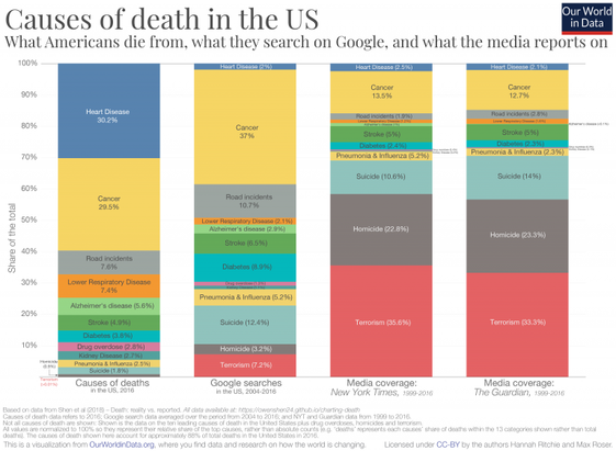
I always find this chart by Hannah Ritchie -- of Our World In Data -- deeply informative of how disjointed is our sense of personal risk
Actually, wait, they're not!
The media figures are from 1999 to 2016, before ozempic and its peers were released
Right?
People -- and media -- seem to focus with roughly-correct proportionality to cancer
But they wildly under-focus on heart disease ...
... and wildly over-focus on terrorism, homicide, and suicide -- particularly the media sources
@clive Skip the Xitter link and go straight to the referenced article here: https://ourworldindata.org/causes-of-death
(Edit: apparently doesn’t include the chart shown in the Xitter post).
I actually went originally to that piece, and went through the deck of slides ... I wanted to direct link to the graphic
but I couldn't find it
I wondered if Ritchie had made it as a special one-off just to post on xitter
(maybe I just ... missed it? is it actually there?)
In case it hasn't been mentioned already, on the Wayback Machine:
yeah true enough
Outliers are newsworthy, exactly. Also, fear sells, and we tend to be more scared of things that can be suddenly inflicted by others (violence) vs. what we self-inflict (health.)
See also: people more scared of statistically safer air travel than of car travel ("but *I'm* a good driver...")
yes, precisely
Is heart disease really self-directed though?
America is a nation designed by the fossil fuel industry to use cars for everything.
Koch Network fights initiatives like walkable cities, bike paths, & public transit.
The industry fomented "white flight" to the suburbs & got the middle class to give up billions in now-valuable real estate in inner core cities.
They funded anti-lockdown covid disinformation & back to the office narratives to keep people commuting
I was generalizing, yes, based more on perception than details.
The political and environmental climate is an external threat to health. But it's the everyday situation that most of us were born into.
We've been taught it's on us to self-help, via "food pyramids" and "Presidential Youth Fitness Programs" and commercialized individual remedies -- diets & workouts & medications -- in our faces at every ad break.
Agreed. The weaponization of "personal responsibility" narratives are pernicious.
As longevity studies have shown over & over, society plays a significant role in health determinants.
There are group solutions needed to group problems of health.
One of these is the "work until you drop" ethos promoted by billionaires, no retirement, no sick days, no work from home, no long weekends, no vacations.
yeah, also terrorism and homicide involve human intent and human activity, which holds understandable intrigue
that said, it doesn't quite explain the gulf between cancer and heart disease ... I gotta think about why that difference is so big
yeah, that’s a really good point!
and also, the things that improve heart health are things people tend to not want to do lol
It is documented here. I suspect one factor is that keywords used for heart disease are too few and unspecific (e.g. they do not include “heart attack”, “angina”, “cardiac disease”). The string “cancer” is probably most often included in articles about specific cancers, so you do not have the same problem there. (By the way, why that block-matching function, instead of regexes?)
https://github.com/owenshen24/charting-death-analysis/blob/main/FinalProject.ipynb
@clive @fuminghumanist One might also find similar bias within media reporting about specific causes of mortality and morbidity.
E.g. articles on breast cancer may focus on young women out of proportion to the actual age distribution of the disease. Articles on sepsis often focus on meningococcal disease, which causes about 0.1 % of sepsis in Sweden (but can be rapidly progressive in teenagers and young adults).
@KarlPettersson @fuminghumanist
yep, good point!
Is the purpose of media to report on causes of death?
@clive
I would like to see this chart, but with percentage of lost Quality Adjusted Life Years instead of percentage of deaths.
It would be a more realistic measurement of impact and bring suicides and accidents a bit more in line with press coverage.
@clive I agree with have a disjointed sense of personal risk (sharks etc), but disagree that these charts have anything to do with it.
1) It makes a lot of sense for various reasons to search for [cancer] or [suicide], probably not as much [heart disease]. Instead, people would search for things like [lower cholesterol] – was that lumped in those tiny blue bars up there?
2) Some causes of death are more newsworthy than others, and rightly so. 30–40% of people dying from cancer has kinda just been the way it is for many decades. Everyone knows cancer is bad; there's going to be some news coverage of shifts in frequency or new treatments and preventative measures, but what else would you expect to be in the news?
I don't get this idea that we should be collectively wringing our hands about things in proportion to death risk. e.g. of course I want to spend more time in political debates talking about terrorism or homicide than I do about diabetes; that's obvious, right?
FWIW I spend time roughly proportional to the leftmost chart on each cause when talking to my doctor.
@clive It’s interesting to explore #CausesOfDeath further, especially from a global perspective, here:
@clive As others have already said: It's *partly* understandable, maybe unavoidable. Everyone has to die of *something* eventually. So, an old person dying from a heart or respiratory disease or from cancer is not a news story in and of itself. A homicide or terrorist attack is.
I guess, the bigger problem is *how* the media coverage is done, if it helps inciting exaggerated panic and establishing policies that harm a lot of other peoples' rights while trying to prevent terrorism.