I always find this chart by Hannah Ritchie -- of Our World In Data -- deeply informative of how disjointed is our sense of personal risk
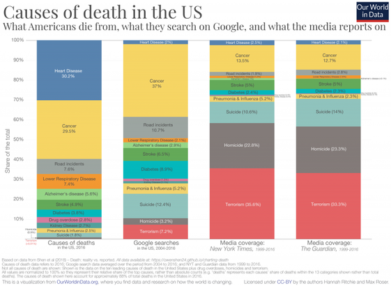
I always find this chart by Hannah Ritchie -- of Our World In Data -- deeply informative of how disjointed is our sense of personal risk
yeah, also terrorism and homicide involve human intent and human activity, which holds understandable intrigue
that said, it doesn't quite explain the gulf between cancer and heart disease ... I gotta think about why that difference is so big
It is documented here. I suspect one factor is that keywords used for heart disease are too few and unspecific (e.g. they do not include “heart attack”, “angina”, “cardiac disease”). The string “cancer” is probably most often included in articles about specific cancers, so you do not have the same problem there. (By the way, why that block-matching function, instead of regexes?)
https://github.com/owenshen24/charting-death-analysis/blob/main/FinalProject.ipynb
@clive @fuminghumanist One might also find similar bias within media reporting about specific causes of mortality and morbidity.
E.g. articles on breast cancer may focus on young women out of proportion to the actual age distribution of the disease. Articles on sepsis often focus on meningococcal disease, which causes about 0.1 % of sepsis in Sweden (but can be rapidly progressive in teenagers and young adults).
@KarlPettersson @fuminghumanist
yep, good point!
