A hallmark of iOS 26 design seems to be the consolidation of what was previously multiple toolbar buttons into a "…" button that shows a menu.

Which looks fine, I guess, but some VERY common actions are now an additional tap away!

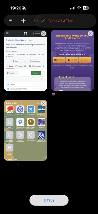
Safari is the worst offender. Want to switch tabs or close the current tab? The all-tabs view, previously the two-squares toolbar icon, is now buried in a menu, adding an extra tap and significant finger movement to possibly the most common action in Safari:

Another example is in Mail, where I'll often train my email provider's spam filter by moving spam into the Junk folder from the Inbox screen.

Before, it was Select, tap message, Move. Three taps.

Now it's four: "…" menu, THEN move finger down to Select, tap message, tap (now-unlabeled) Move icon at the bottom.

Why? What are we using all of that navigation-bar space for?

My "content”?

Comparing iOS 18's Mail to iOS 26's design, what did we gain for our "content” by burying more of its functionality behind a menu?

Almost one line of blurred text.

@marcoarment their own developer videos talk about not putting un-related actions in the same menus. Select does not belong there.
@marcoarment I filled a request to swap the Calendar picker / invite inbox buttons with the search and new event buttons. I can’t understand why buttons you only occasionally interact with are placed so prominently while more useful buttons are at the top of the screen.

@marcoarment Most of that extra line of visibility is just because the filter buttons are smaller...
Otherwise the new UI takes up the same or more space as the old one.

The whole floating control concept is so bad, it just adds visual noise and clutter without actually giving you more usable space. If content is under the 'toolbar area' it has to blur anyway because otherwise it interferes with the buttons.

@marcoarment now you can see the entirety of when the email arrived/was sent 🙃
@marcoarment We gain: REALLY BIG DROP SHADOWS. Because nothing says focus and content-first like buttons with REALLY BIG DROP SHADOWS.

@marcoarment what if ‘updated just now’ was the more salient info.

I’m in a horrible bandwidth footprint most of the time- I need to know if a mail fetch has occurred, or has failed.

A seemingly long term blind spot for Apples in house dogfooding is that they NEVER see how their apps work outside of an extremely robust signal.

@Chancerubbage @marcoarment Yes! 💯 Have you ever tried using Apple Music while, say, I don’t know, on a road trip? Possibly the best use case for access to an essentially unlimited music library and yet with spotty connectivity the app… behaves quite badly.)

@scott @marcoarment

The interstate has more robust cell signal than what I have a home, and I am seeing fewer dead spots in the boonies. More dead spots inside a structure.

@marcoarment as a small phone stan, I’ll take compact mode over having those actions always exposed
@marcoarment so much wasted space at the top. 1/4 of the page is just white space and big font for Inbox.
@marcoarment “content first” always rubbed me the wrong way because it shifts computing devices towards pure consumption devices. On the other hand, UI elements that surface useful features empower me. While there’s a balance to be found, discoverability should never suffer.
@marcoarment this is a beta, so things are subject to change.
@marcoarment Honestly it feels like learning the worst lessons from Material
@marcoarment I think I hate content now. I want tools.
@danedeasy @marcoarment I think I’m ready to go back to square corners.

@danedeasy @marcoarment WWDC 2035

Apple: “We’ve made our toolbars edge-to-edge. Your content seamlessly disappears into the background, allowing for unprecedented productivity.”

@danedeasy you hit the nail on the head.
@marcoarment better get on that new lead man
@marcoarment A side note, but I think you use Fastmail? Moving things to junk doesn’t actually flag them as junk in Fastmail; they recommend using another folder if not using their client: https://www.fastmail.help/hc/en-us/articles/1500000278142-Improving-spam-protection#spamfolders
Improving spam protection

Fastmail offers many tools to catch and stop as much spam as possible. On this page, we'll go over some steps you can take to improve your spam protection even further.  You can edit your spam prot...

Fastmail

@marcoarment you can drag with two fingers down the list to select multiple items quickly. You don’t have to go into the menu and press Select at all.

This works in most Apple apps with a multi-Select mode

@marcoarment or if you’re just moving one… long press? Why do you need to get into “Select” mode at all?
@marcoarment fyi you can bind the swipe left or swipe right to move

@marcoarment I noticed that navigation „bar" (is it even a bar anymore?) items are now MUCH larger - in my own app, my title doesn't even fit anymore with all the glass, while it was comfortable before.

I think we have a space for 2, max 3 buttons on iPhone nav bars now, so it has to be moved to more „general" menus :/

@marcoarment hope these many niggles get fixed.

Personally a big fan of the 2 finger tap to select.

2 finger tap. Move. Two taps.

@marcoarment why not do the swipey swipe? Long swipe from the right trashes a mail immediately on mine (I think the actions are somewhat configurable)
@marcoarment You can swipe left on a message and tap Move, or you can tap-and-hold on a message and tap Move Message from the pop-up menu.
@marcoarment Alternatively, just as in the previous version, swipe the message to the side and click Move. Or, for multiple, use two finger drag to select messages saving at least a click.
@marcoarment doesn’t fix that issue but might be a workaround for the moment: using two fingers to swipe on an entry or multiple selects them
@marcoarment border radii my man, circles are the least efficient shape there is. this creates visual luxury. at the expense of experiential poverty. I think it’s clear this first round of ui has not had enough people using it vs staring at it
@marcoarment amateur time. I wonder if Alan Dye ever heard of Fitts's law. So sad that my long time favorite platforms are at the mercy of empowered rookies.
@marcoarment Every time I see a "modern" UI design I hear Motorhead playing Ace of Spades, but Lemmy is singing "a waste of space, a waste of space!"
@marcoarment Not sure if you knew this already, but in many (all?) native, selectable lists, you can use two fingers to drag and select items. This also lets you select just one by dragging to select multiple and dragging back to just select the first one you touched.
@marcoarment nowdays everything goes under the … menus. Slowly apps will ship with only a big … button, which lets you type in the name of the command you want to execute. Oh wait
@marcoarment you can still do the gestures on the toolbar at the bottom, but it's not exactly discoverable. It's now extra steps for me to share or I have to reach to the top of the screen to make a new tab
@samburkhard @marcoarment For as many Apple blogs as I read and podcasts as I listen to this is the first time I’ve heard of this gesture.
@ehler I probably accidentally triggered it once and just started using it all the time

@samburkhard @marcoarment I hate when apps make hard to discover gestures the default for core functionality. Until I read your post I had no idea swiping up on the toolbar in Safari took me to the All Tabs screen. I knew about swiping left and right to switch tabs but hadn’t discovered up.

I’m not sure that the VisionOS gesture patterns make as much sense when not using a headset

@halldjack @samburkhard @marcoarment They are hard to discover. The fact that people think swiping up from the tab bar to open the tab switcher is “new” despite being around since (I think…) 2021 is proof of that.

@jimmylittle @samburkhard @marcoarment Strava requires you to shake your phone if you want to give kudos (basically a “like”) in bulk to everyone who took part in an activity.

That one feels like it was intentionally hidden.

@halldjack @samburkhard @marcoarment I don’t think hidden gestures are inherently bad. It’s not “discoverability” that’s bad, but the sheer number of things users have to learn every year.

⌘-V is not discoverable in the least, but we all learned it 30 years ago so we think it’s obvious.

Some people just get cranky about learning new things, and blame it on “discoverability”.

@marcoarment Annoying, yes, however, Safari has supported a swipe up on the tab bar to see all tabs since the bottom-oriented redesign.
@marcoarment Overall though I agree, it's bad. Just like the first time they attempted to minimize Safari
@bonney @marcoarment I always swipe up, left and right on the address box which I think works very well. But the discoverability is not great I guess.
@bonney @marcoarment 🤯 You just blew my mind. How did I not know this?
@twoframesperminute @bonney @marcoarment "How did I not know this?" Because the UI is no longer designed with visual cues to make it discoverable.
@bonney oh my god. I had no idea! This is such a useful feature. Seriously; thank you for sharing.
@bonney @marcoarment omg I never knew this. You hero
@bonney @marcoarment I had no idea about this but am happy to learn it now. Thanks!

@bonney @marcoarment

Also horizontal swipes to switch between tabs.

@bonney @marcoarment
You can also use the pinch gesture on a webpage to show all tabs.
@bonney @marcoarment you can also long-press on the address bar to get a menu with an option to ‘close this tab’ or ‘close othe tabs’. I haven’t yet found an easy ‘close all tabs’ option, though. Which I am used to using frequently.
@bonney @marcoarment found it! When you get to the view of all tabs, if you long-press on the blue check mark in the top right, there it is!
@bonney @marcoarment holy shit! I didn’t know about this!
@marcoarment the all tabs button gets out of the way so you can enjoy being fully immersed in all of your CONTENT
@marcoarment This release feels like a tribute to Jony Ive in too many ways
@outadoc @marcoarment
I think Alan Dye is worse than Jony Yve. Feels like a copy of a copy of a copy where the original’s dubious ideology is now both corrupted and exaggerated.