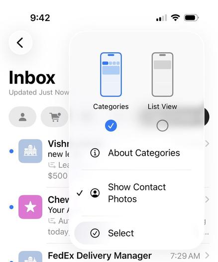
A hallmark of iOS 26 design seems to be the consolidation of what was previously multiple toolbar buttons into a "…" button that shows a menu.

Which looks fine, I guess, but some VERY common actions are now an additional tap away!

Safari is the worst offender. Want to switch tabs or close the current tab? The all-tabs view, previously the two-squares toolbar icon, is now buried in a menu, adding an extra tap and significant finger movement to possibly the most common action in Safari:

Another example is in Mail, where I'll often train my email provider's spam filter by moving spam into the Junk folder from the Inbox screen.

Before, it was Select, tap message, Move. Three taps.

Now it's four: "…" menu, THEN move finger down to Select, tap message, tap (now-unlabeled) Move icon at the bottom.

Why? What are we using all of that navigation-bar space for?

My "content”?

@marcoarment you can drag with two fingers down the list to select multiple items quickly. You don’t have to go into the menu and press Select at all.

This works in most Apple apps with a multi-Select mode

@marcoarment or if you’re just moving one… long press? Why do you need to get into “Select” mode at all?