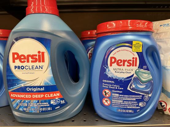
Another #WildRedesign spotted on the shelves. (New on the right, as usual.) Sadly, this feels like a logo downgrade to me — the chunky logo stood out in a wispy laundry world. What do you think?
@cabel I had no clue what this brand is but the left one screams “motor oil”
@jason @cabel Exactly! The one on the right feels way more appropriate.

@cabel
I don't mind it . . . but—and I can't believe I'm saying this—make the logo bigger?

also how do they taste? 🧐 #new

@cabel

It’s almost as if new corporate ownership or Amazon counterfeiting has taken over graphic design as has AI in more corners than many would admit.

I’ve seen life long fave branding go to the digs in more way than one as multinationals gobble them up and trade once valuable brand equity like so many poker chips.

@cabel Agree. And having the “no" warning signs on the front sends a bad subliminal message.
@robeden @cabel the warnings on the front are there because the package on the right contains pods, not liquid. astm safety recommendations for pods include placing these warnings on both the front and back.
@brhfl @cabel Ah, makes sense. Thanks!
@cabel
Reminds me of the logo difference between lab grade Pyrex and consumer grade Pyrex. (One handles temperature shock better, one is tempered for safer breaking if dropped) The trademark was licensed eon’s ago, markets bifurcated, yet both real and fake Pyrex share the same branding, differing in only their font choices.
@cabel old is better. They should have leaned into the chonk further

@cabel Not sure if I'm the only one, but I think this might be the first rebreand I've ever seen that leads me to subconsciously pronounce the brand name differently?

The old I read as "pur-sl" and the new I read as "pear-sil." Maybe the new "e" sort of visually makes my brain think of an acute accent?

@cabel huh, P&G getting into politics with “ultra” PACs. Bold move.
@cabel for some reason all of the text on the right makes it look like the back of the pack
@cabel I prefer the older logo, if only due to the fact that the chunky red ‘S’ evokes memories of the NASA worm logo
@cabel The new packaging is too busy. Looks designed by committee.
@cabel I like the older heavy geometric font. Notice that the Persil logo with it's ugly typography, e.g. bastardized "r" appears nowhere.

@cabel This falls into the trap of graphic designers (or the managers approving it) not doing proper mockups - what looks great on the screen looks bad on a billboard or product container, where it is viewed from farther away than 18 inches.

PS: it looks like they were also required to shoehorn in those warnings, and didn’t want to cut anything, so they merely shrunk the white circle to keep the logo from shrinking as well when they resized it (not a great compromise).

@cabel Arent these different products? Gel vs Pod?
@miladiir Yes, because the new logo hasn’t rolled out to every product yet.
@cabel I like this   attempt Cabel.
@talala seriously what happened there!! Haha
@cabel Everything about this is a downgrade.
@cabel New logo is definitely a downgrade, but also, what is with this trend where the words that define the product (detergent) are smaller than the legal copy?
@cabel if you asked me which of the two I thought would be a more effective cleaner, my bet would be on the left.

@cabel

The human eye prefers contrast, so a bolder variant tends to please. Underscoring this, two ligatures were made to go away… Must be some major, where-can-I-leave-my-mark fussbudgetry going on in, or near, the C-suite/s of Henkel and/or Unilever.